cy-blogging, feb 24th 2024
reviewing every pokemon shirt pattern
this will be a LONG one with a LOT of images so it might nuke your browser, warning.
it is 3 days until pokemon day, and i am so damn excited.
to show that excitement, i am reviewing every pokemon shirt pattern! yes this format has been done before. but not in text form. so this will be fun.
hover over images to enlarge them!
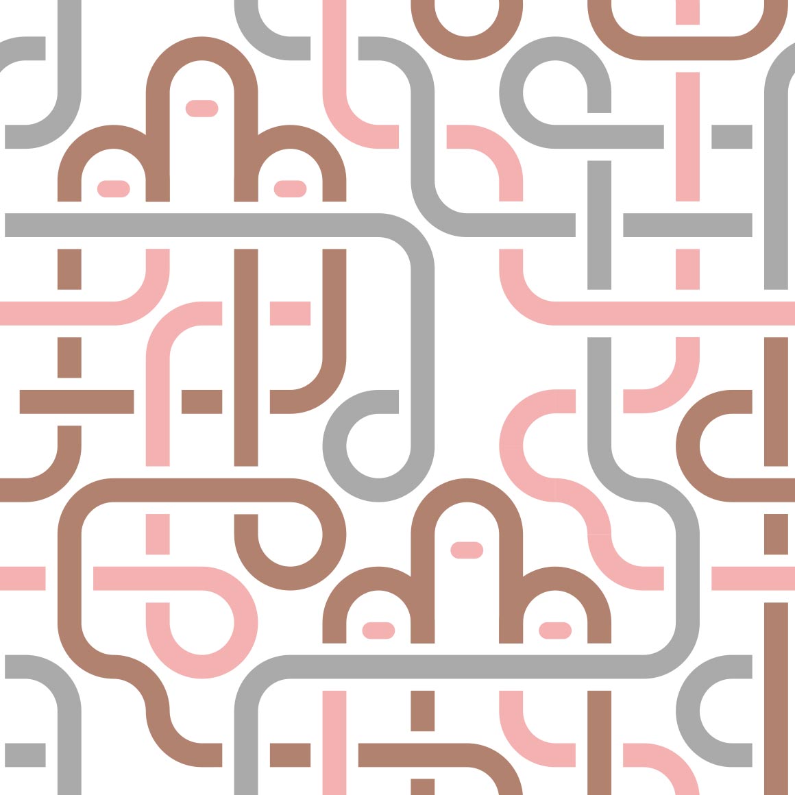
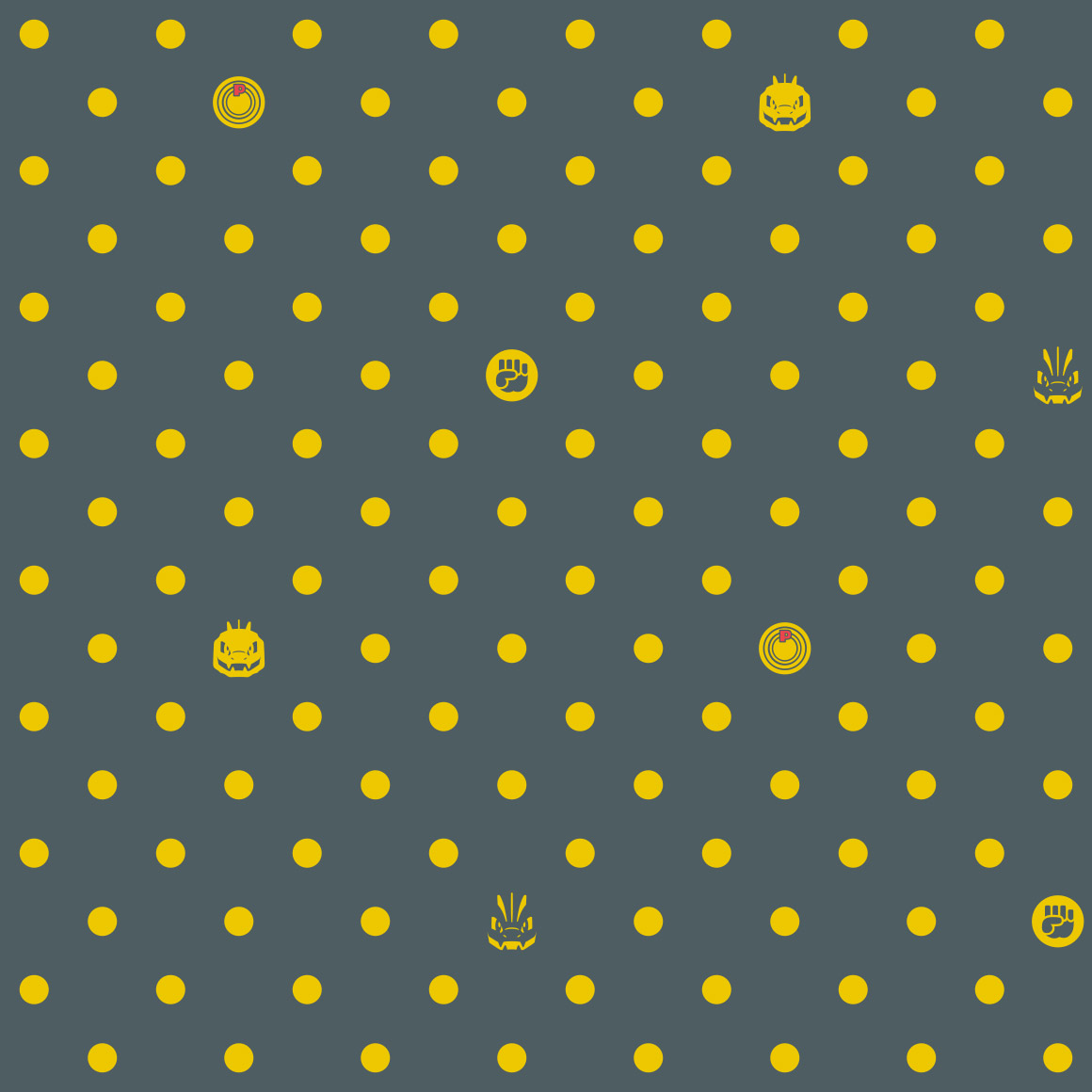
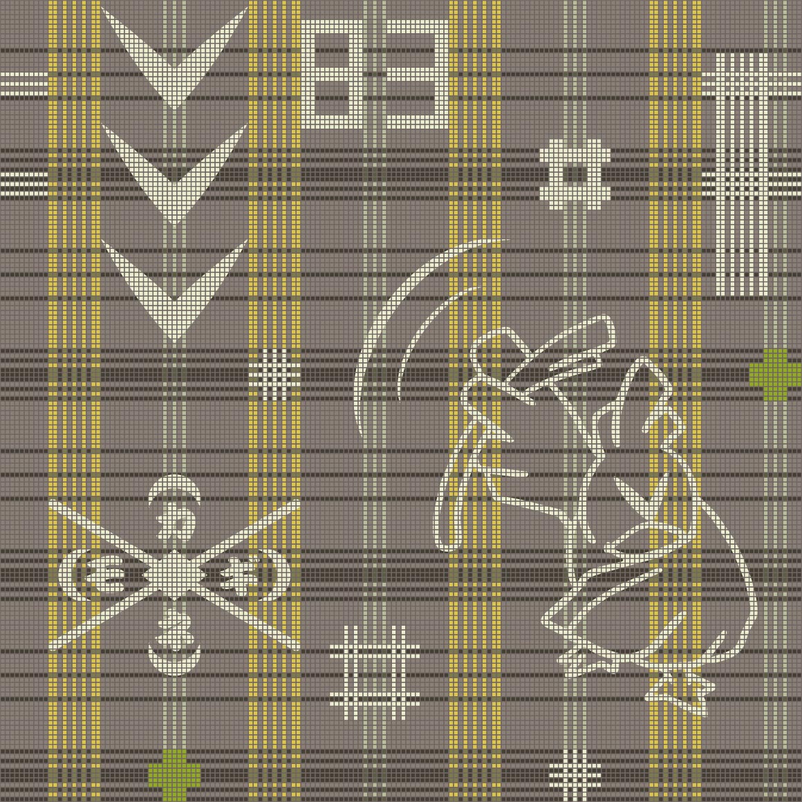
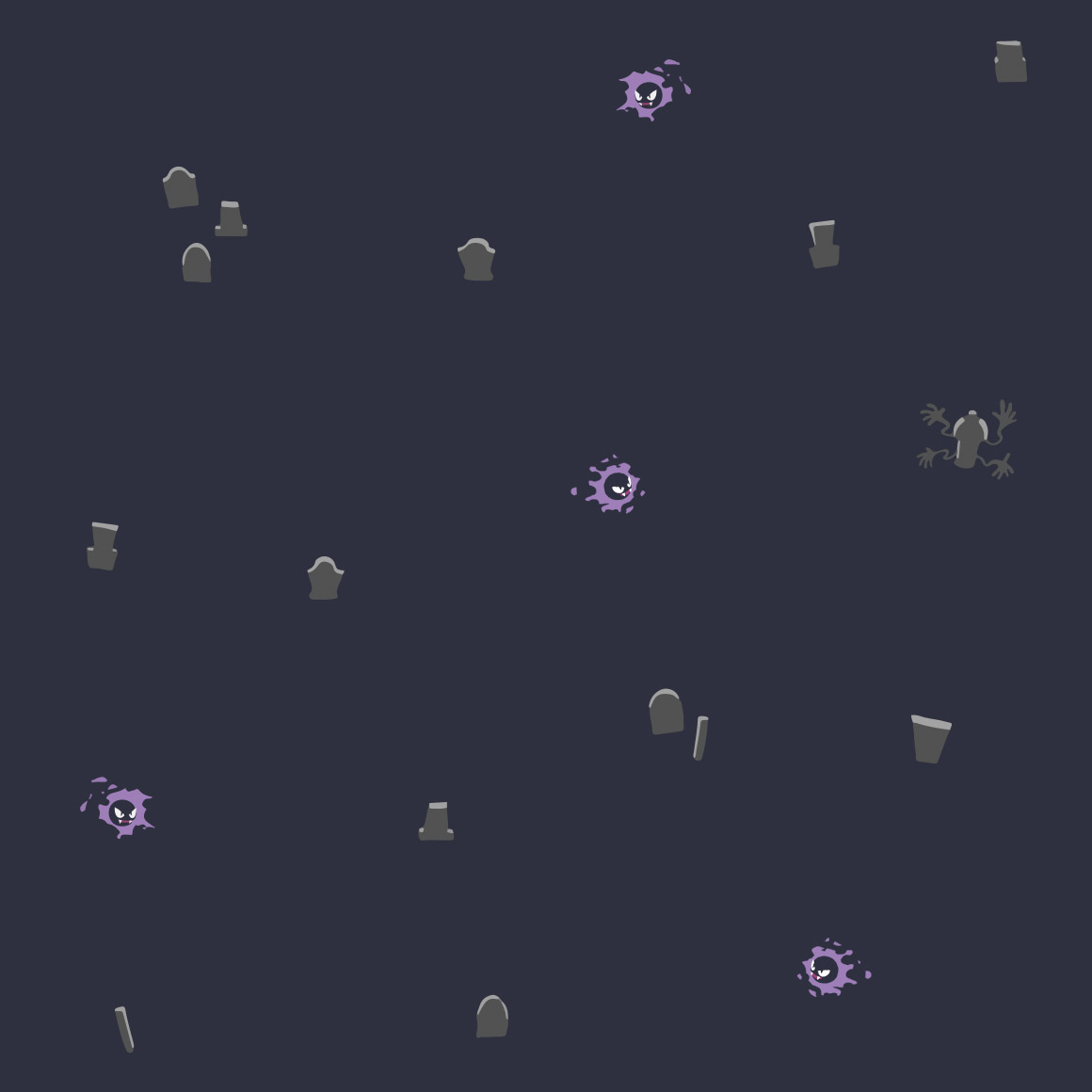
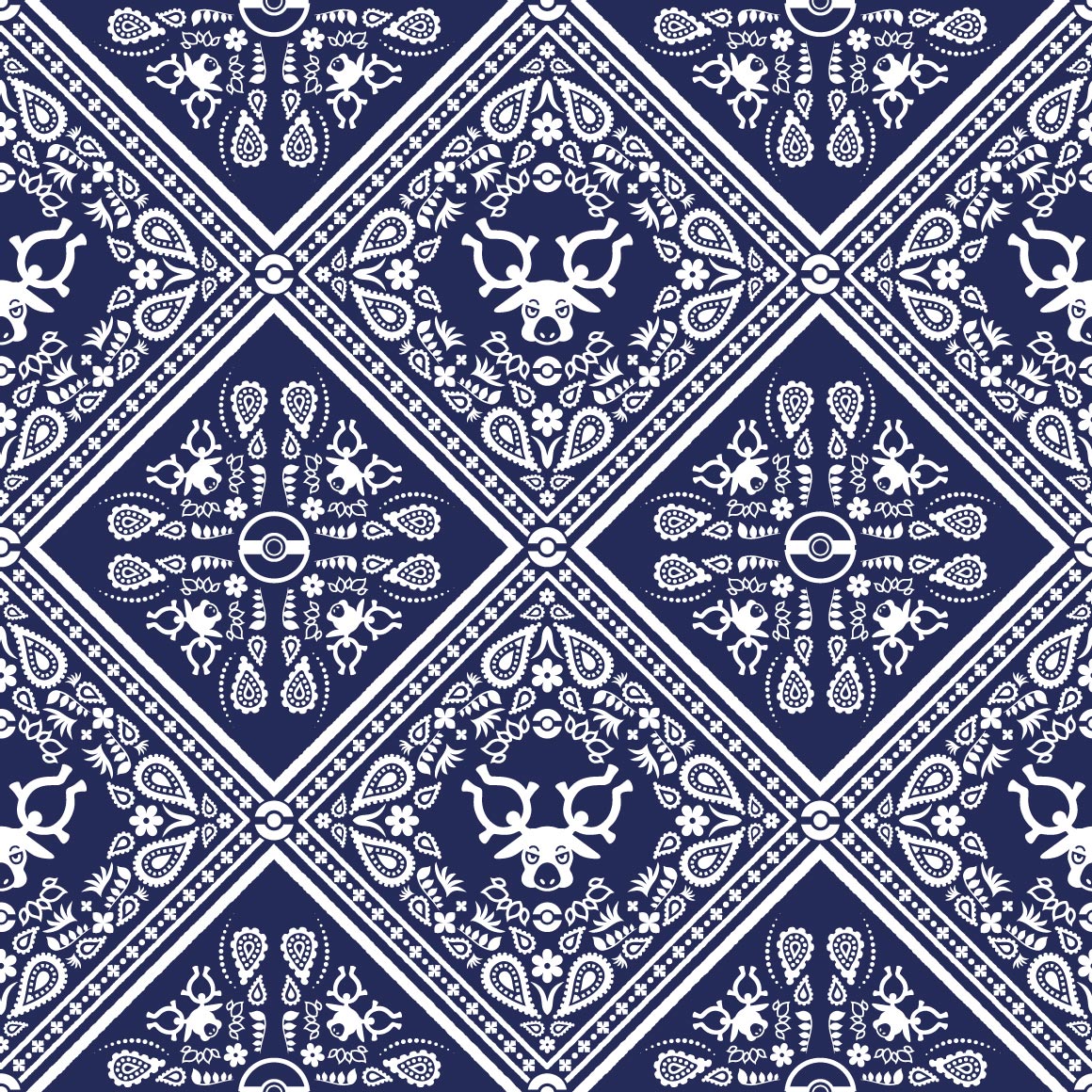
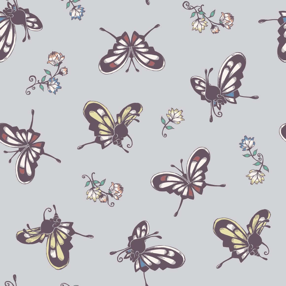
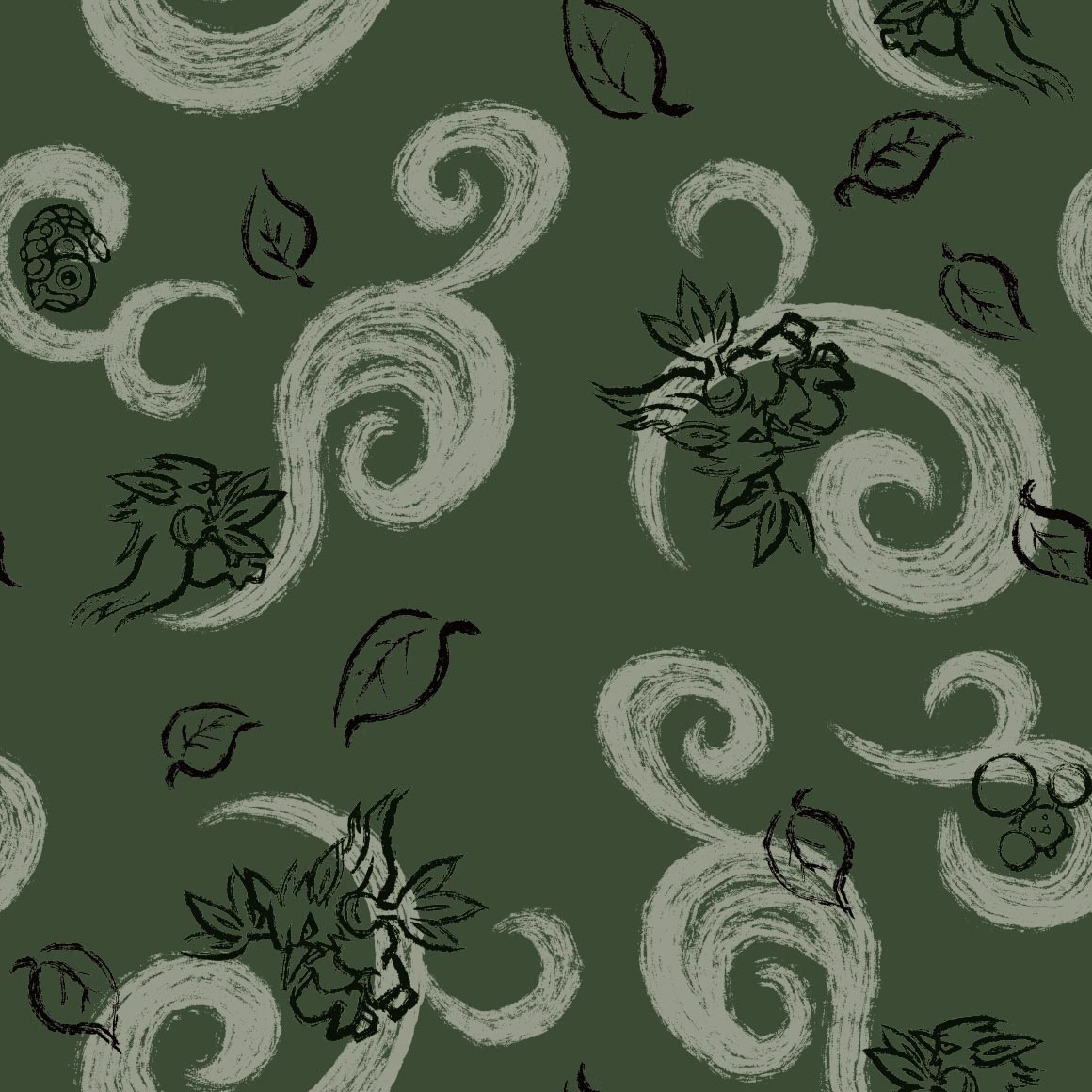
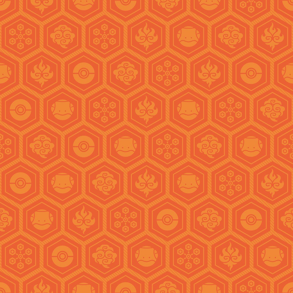
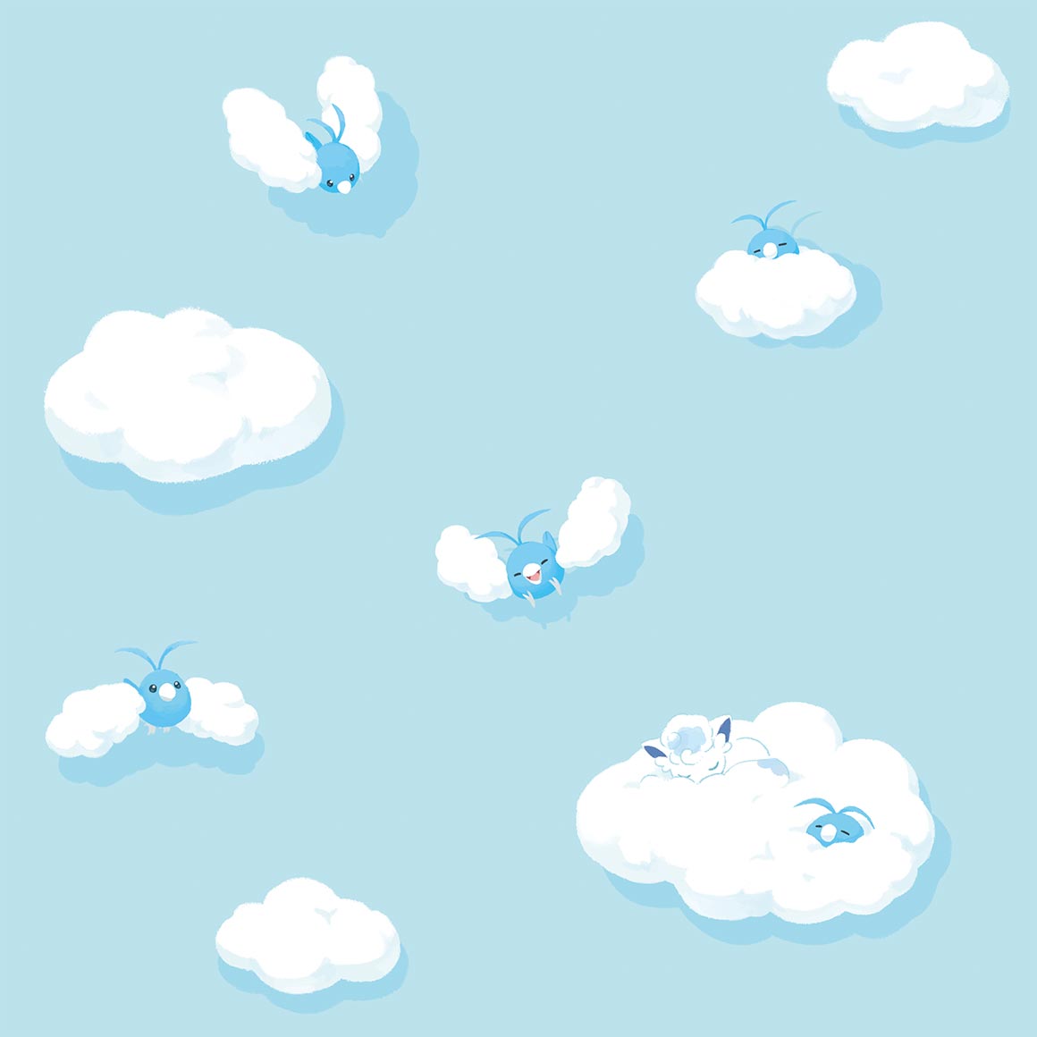
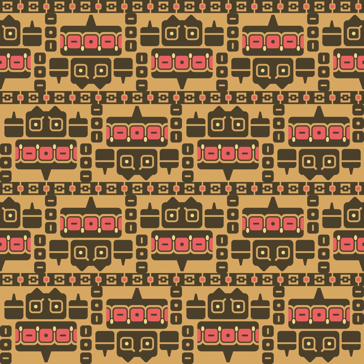
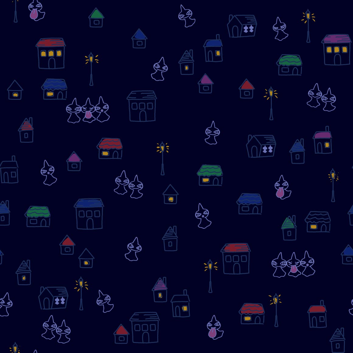
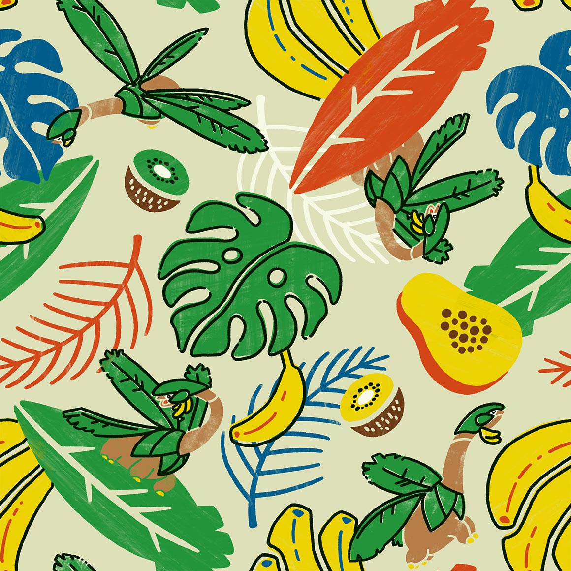
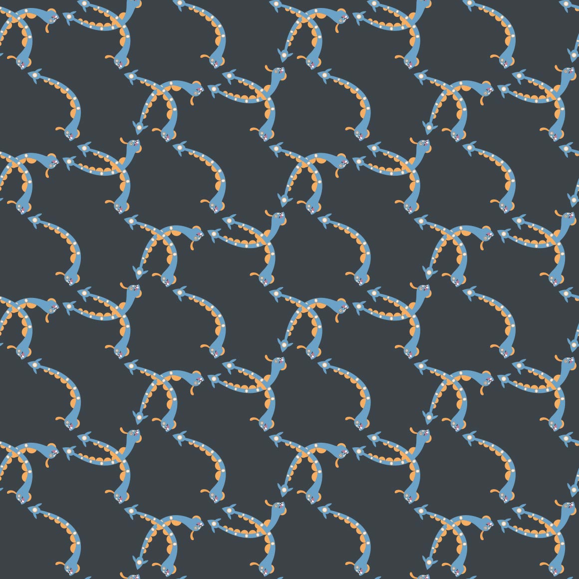
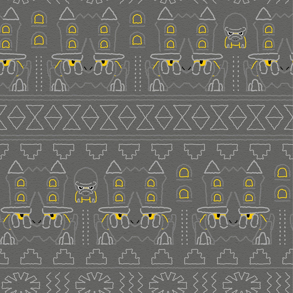
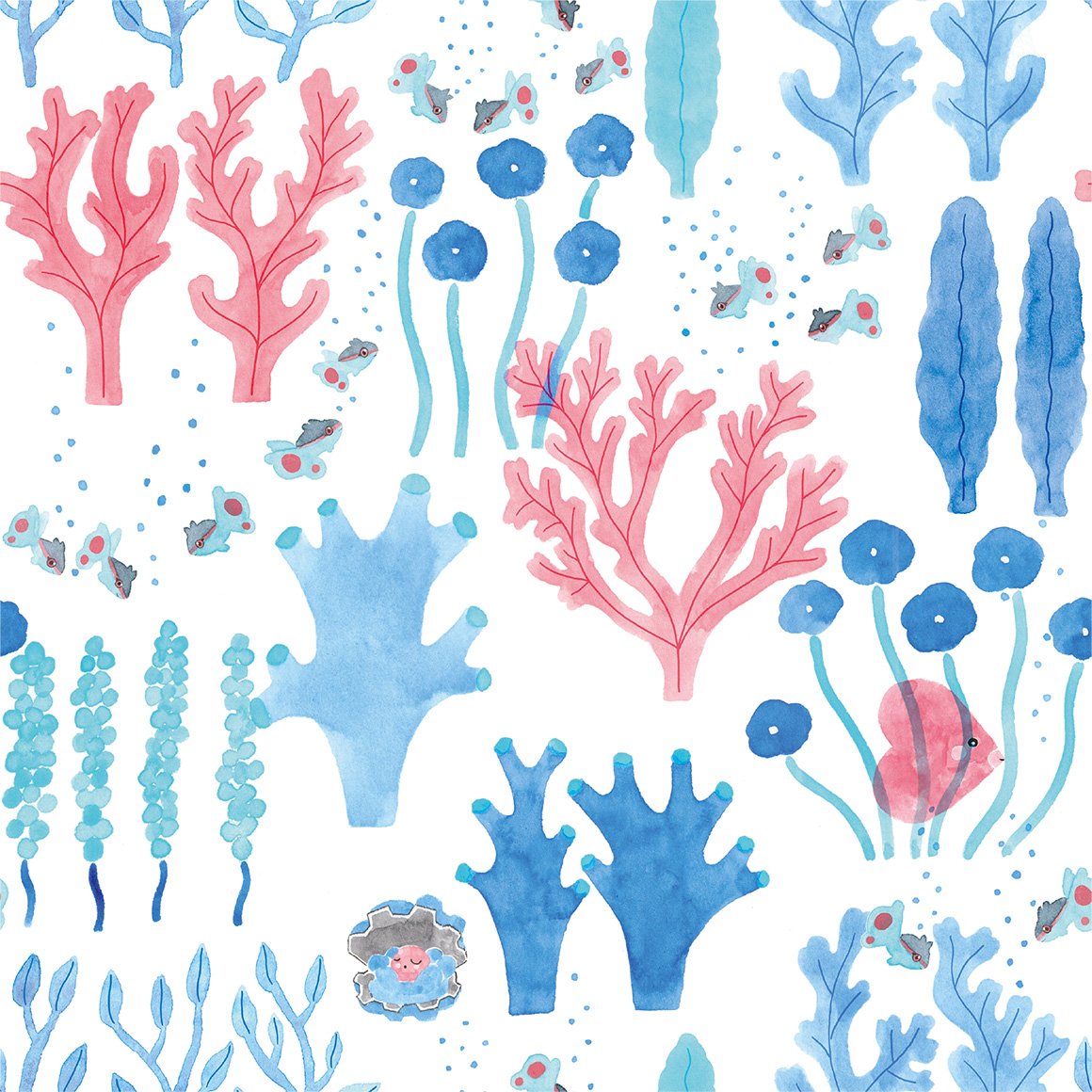
gen 1/kanto
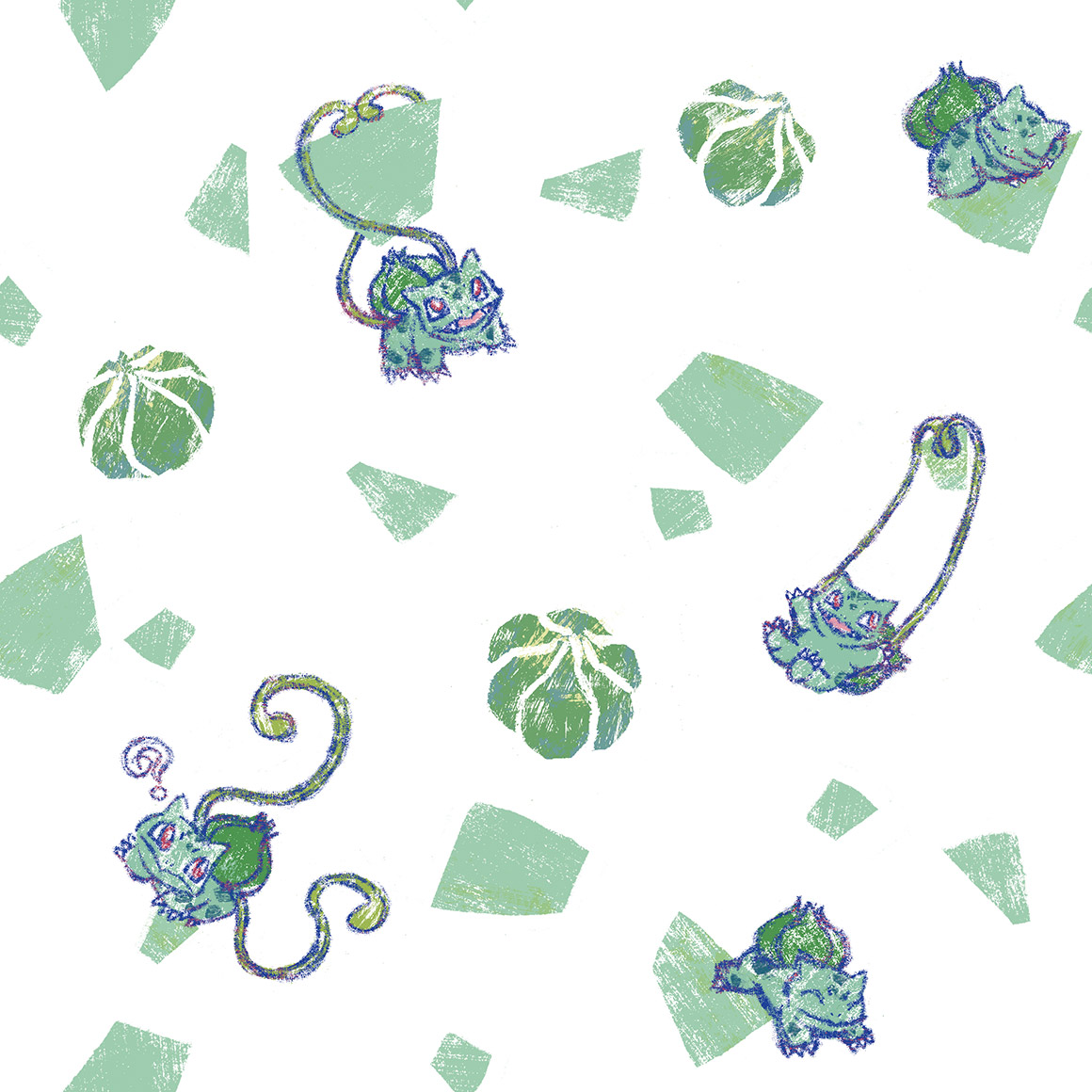
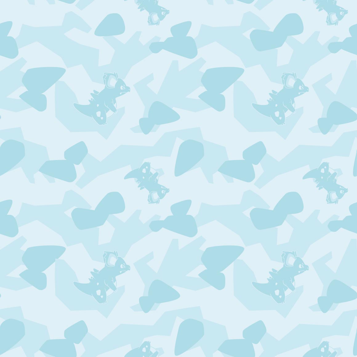
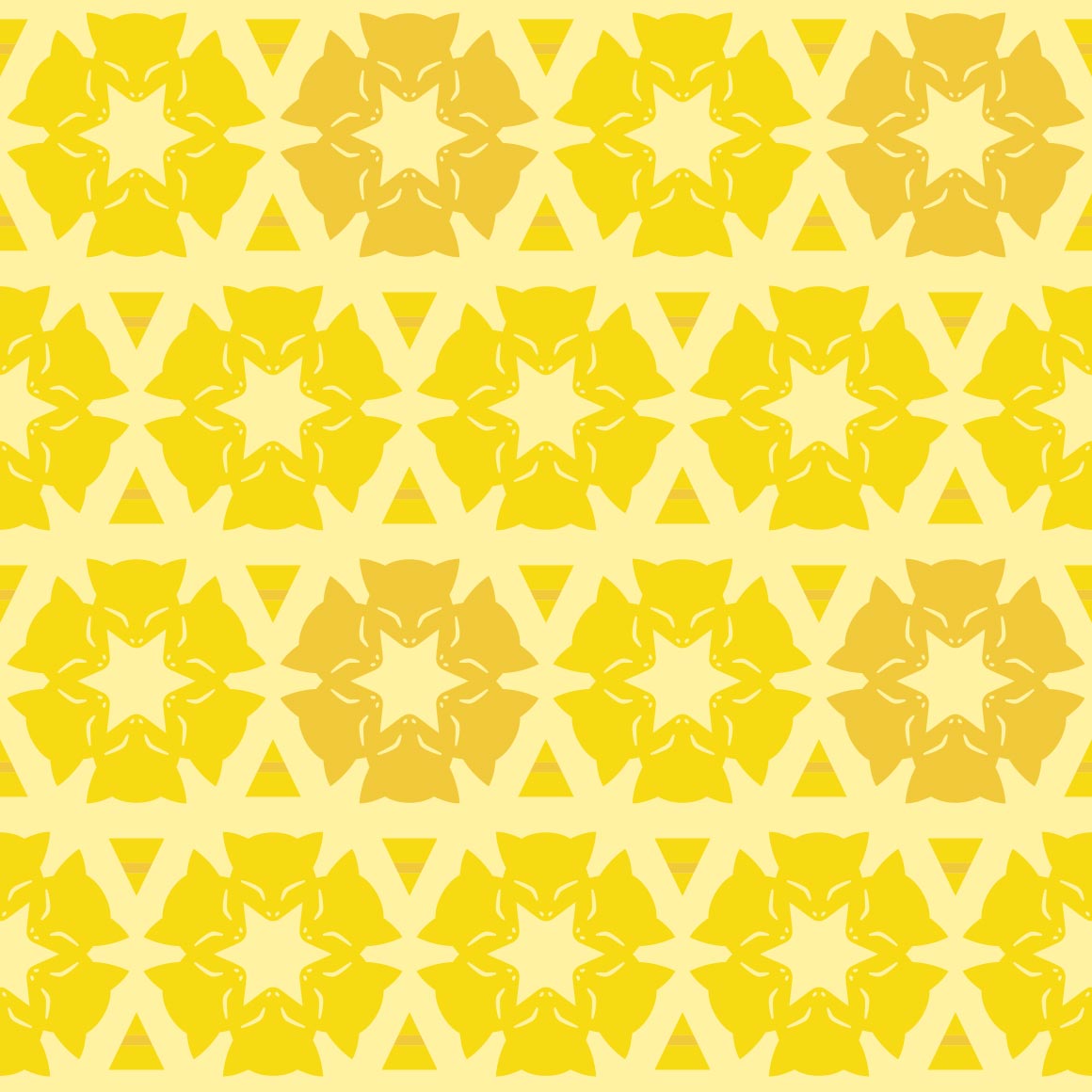
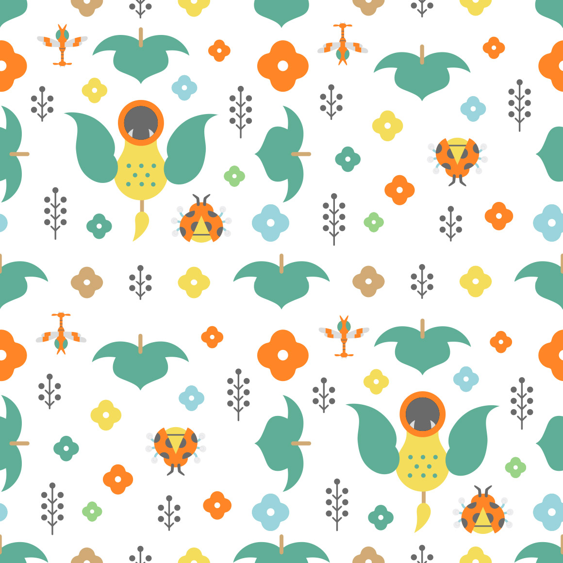
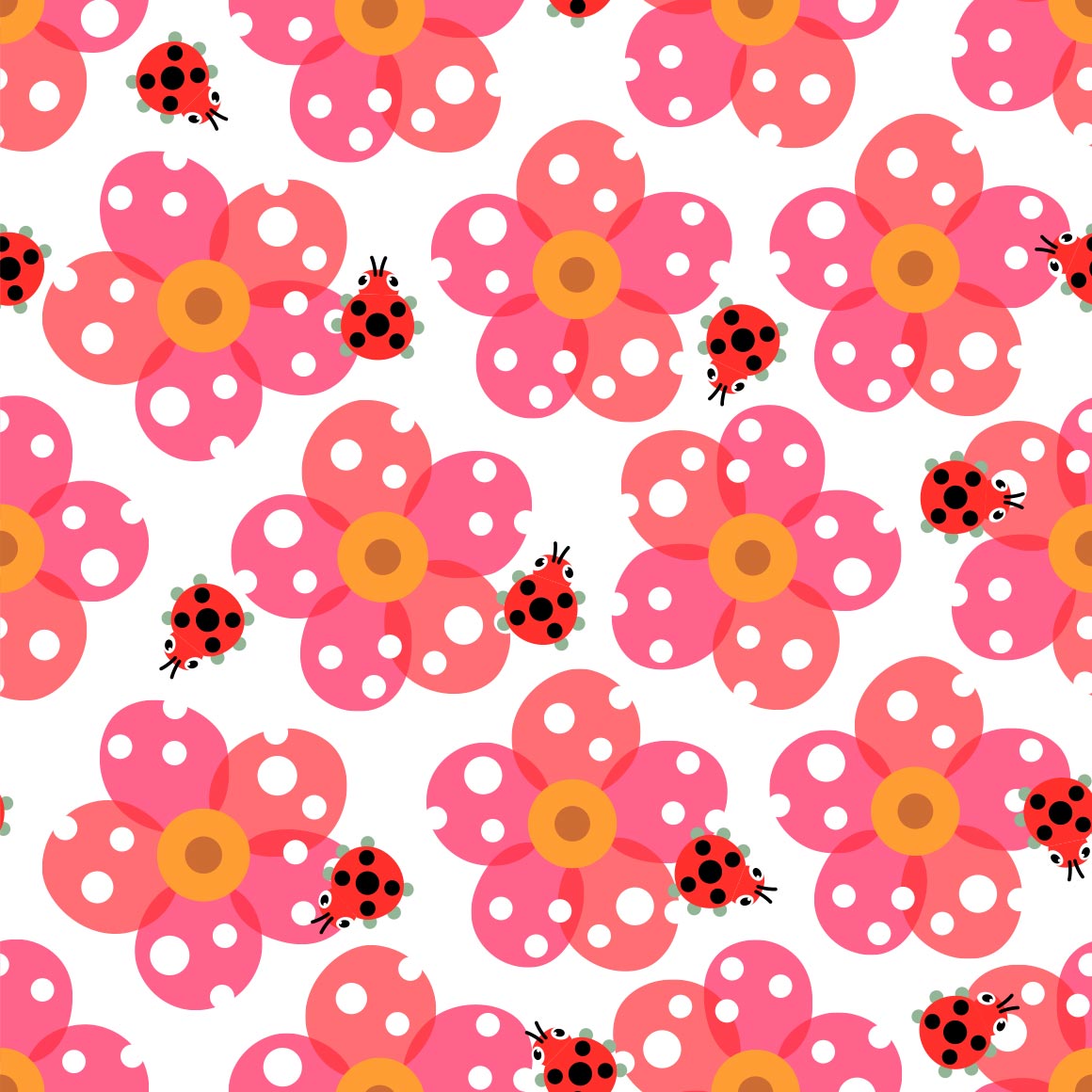
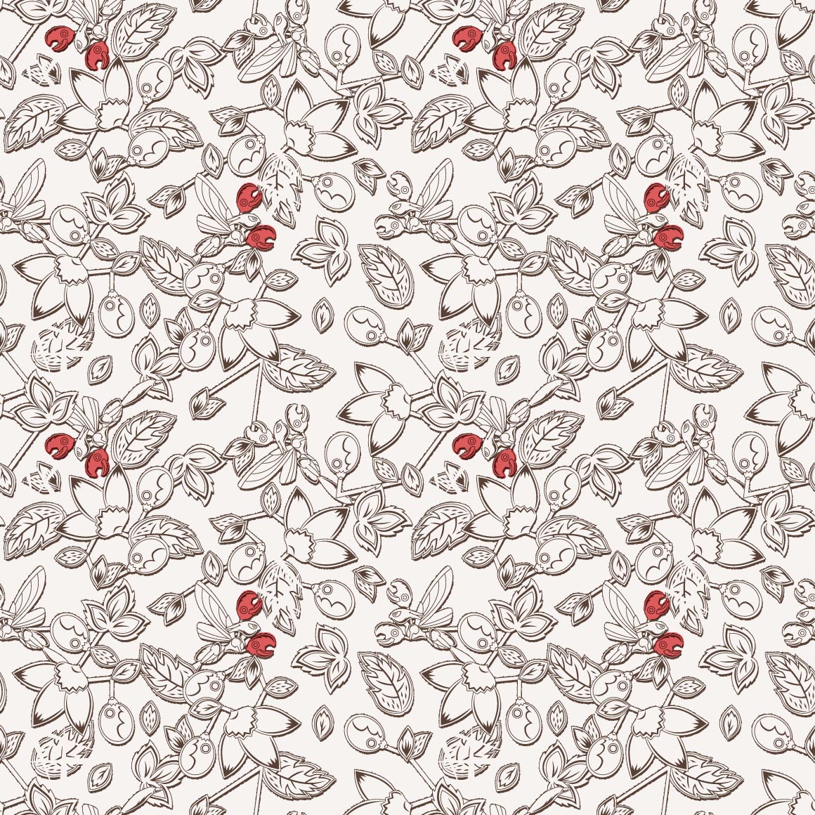
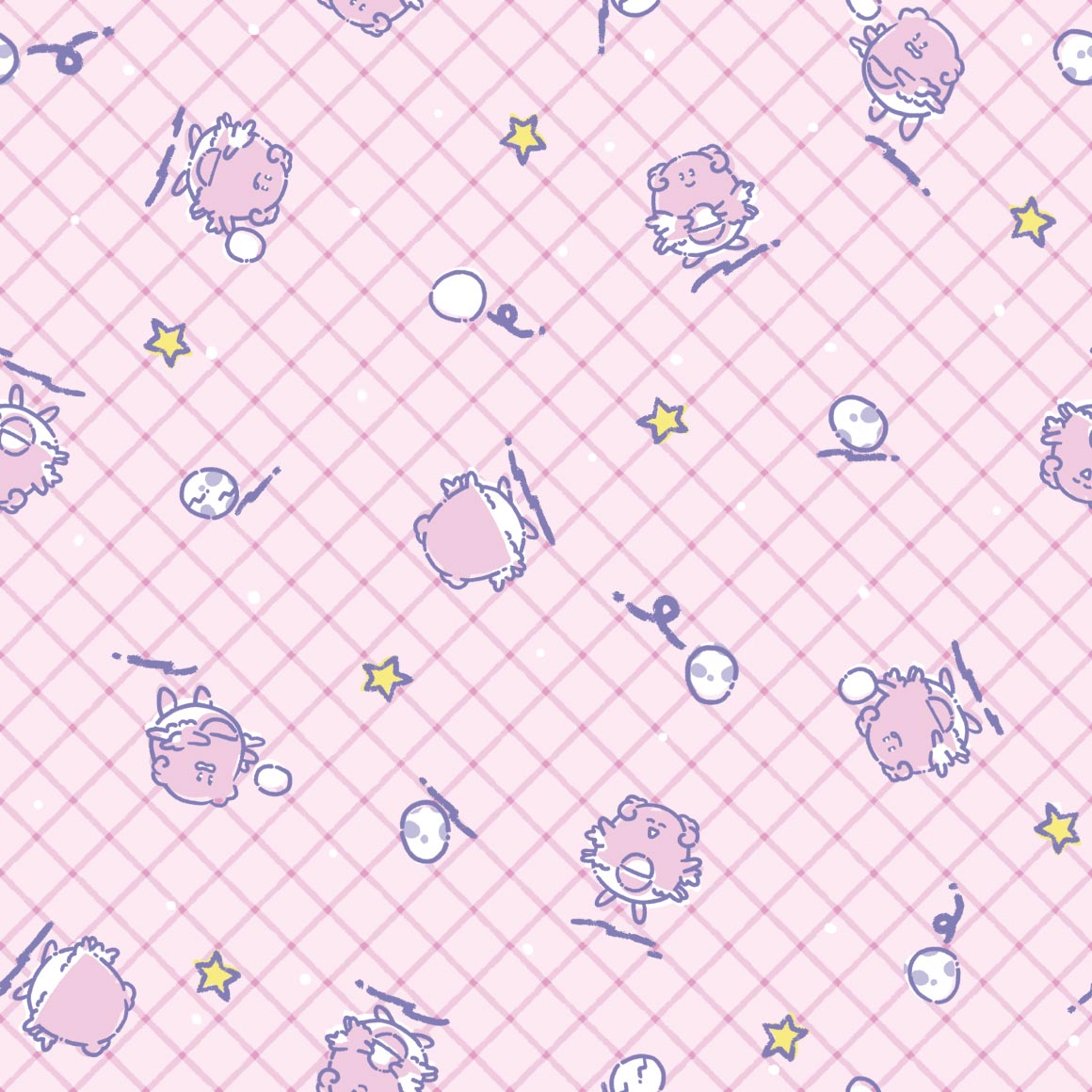
i like bulbasaur! i like how it interacts with the pattern itself (besides the pokemon)
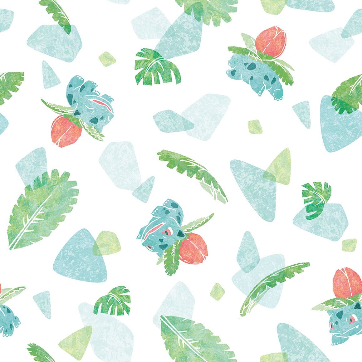
not really a fan of this one. something about it seems. off

i like the scattered petals but not the Everything else

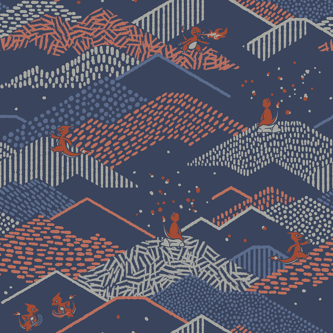
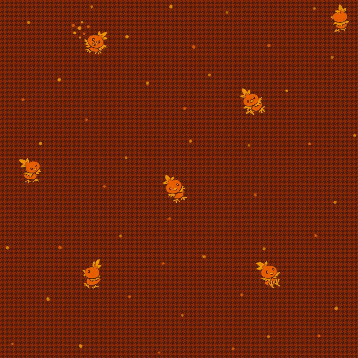
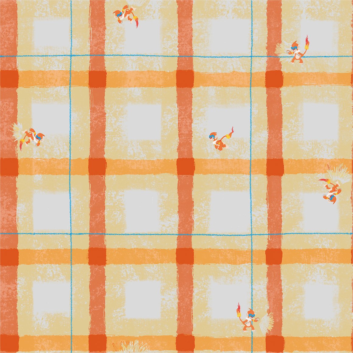
big fan of this one. im not really a charmander line fan, but i like camping.
i GUESS i like the colors but everything about it is so. corporate. to me. it doesnt work with this mon
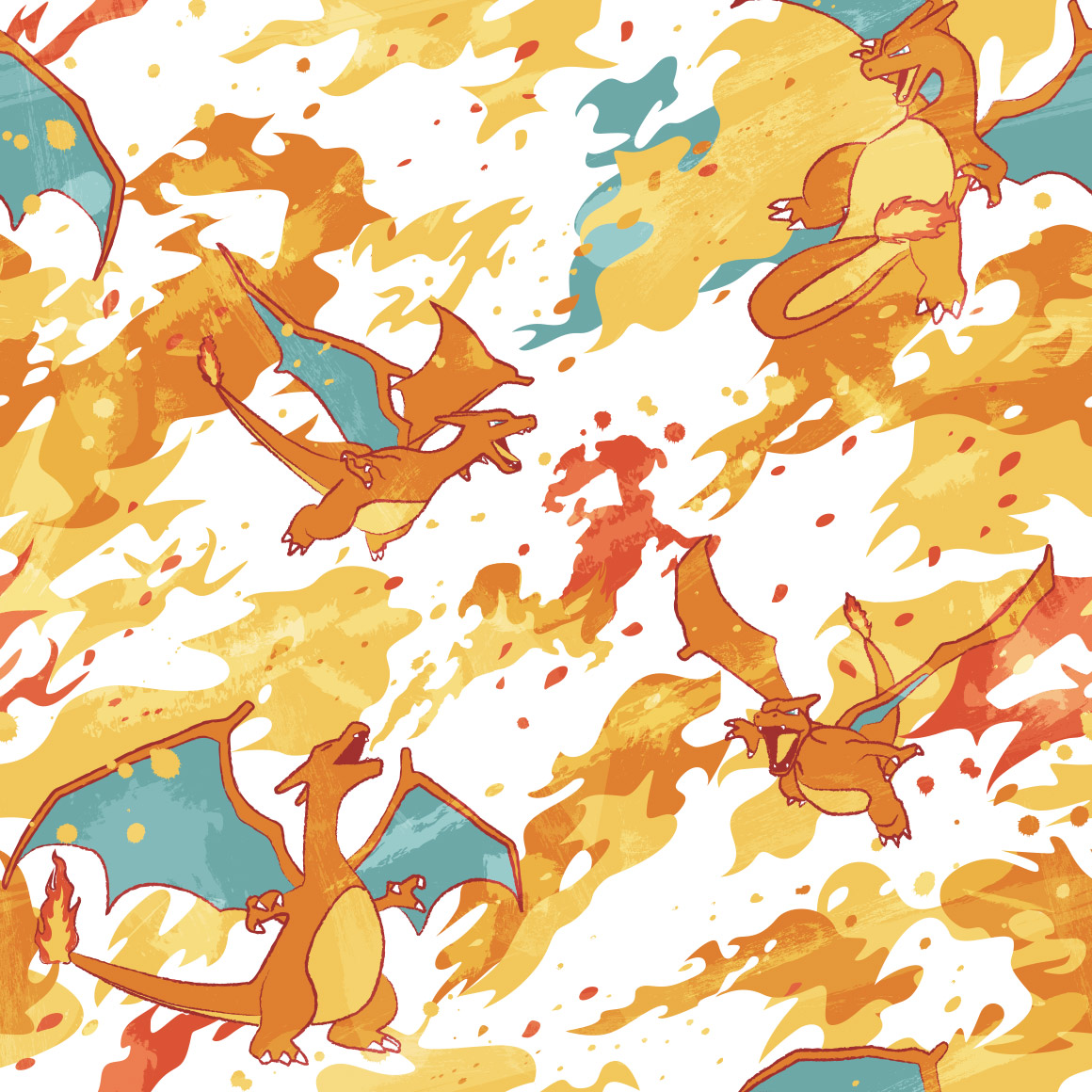
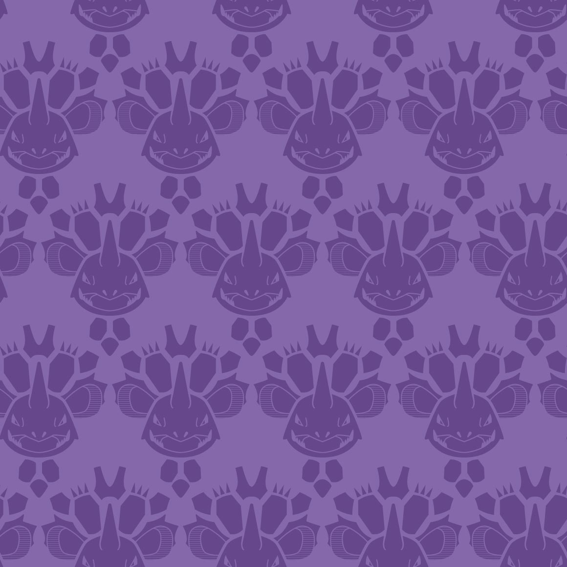
of course CHARIZARD gets really good art. its nice.
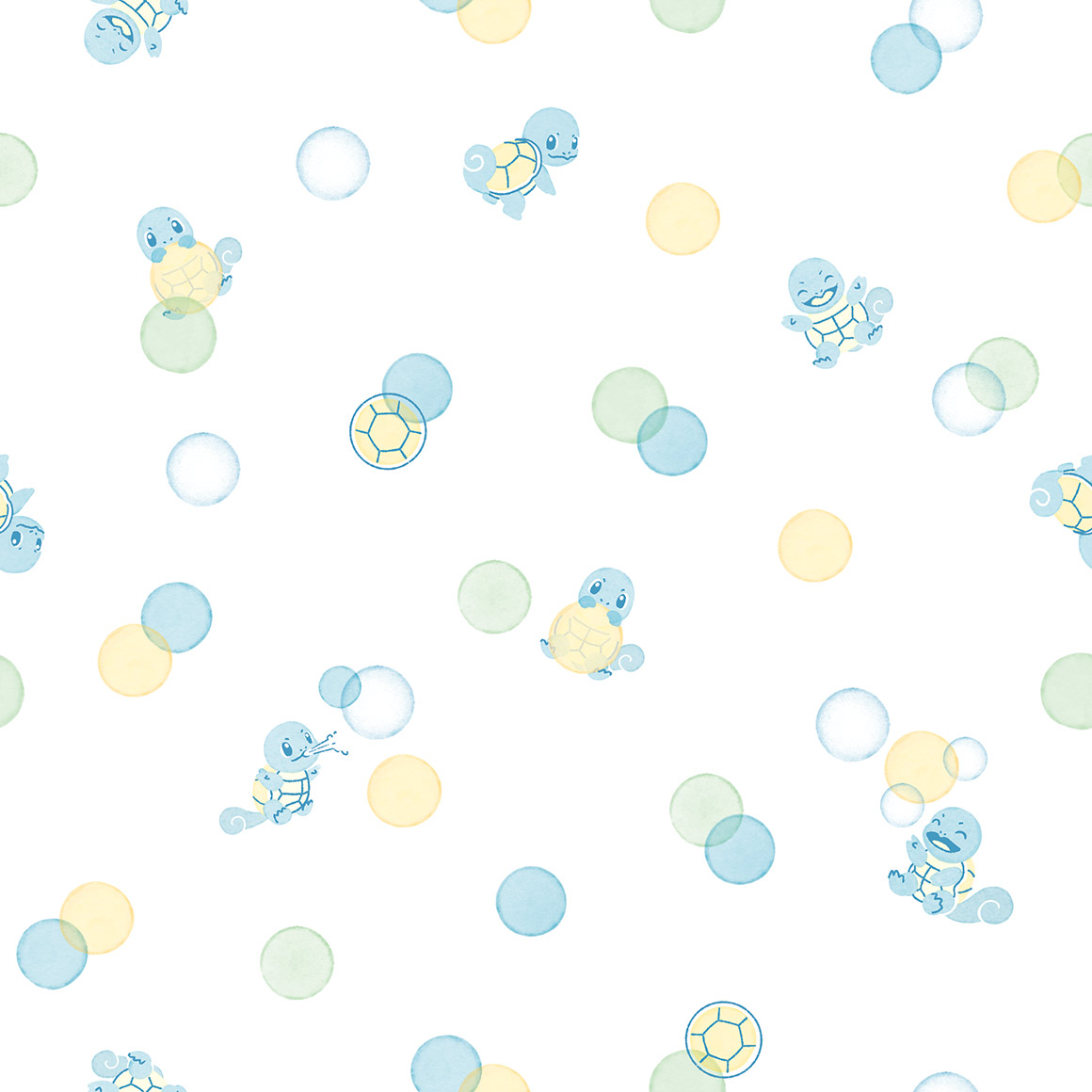
its round. like how the squirtle shells are the bubbles
DIGGING the art style here. reminds me of stickers. i like how squirtles here too!

blastoise once again gets shafted. how sad. it shouldve been steel type

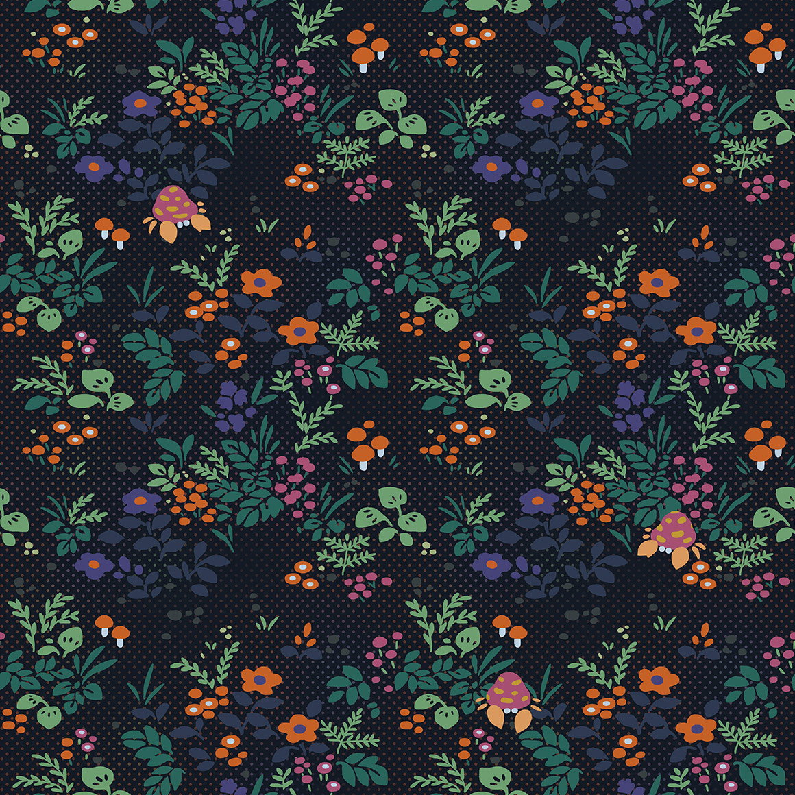
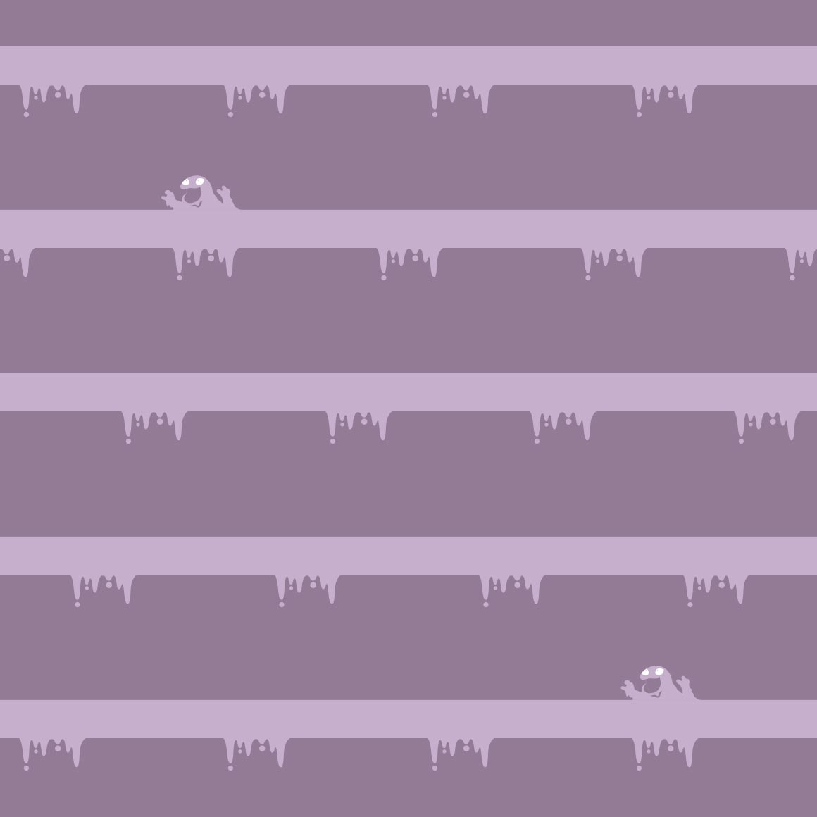
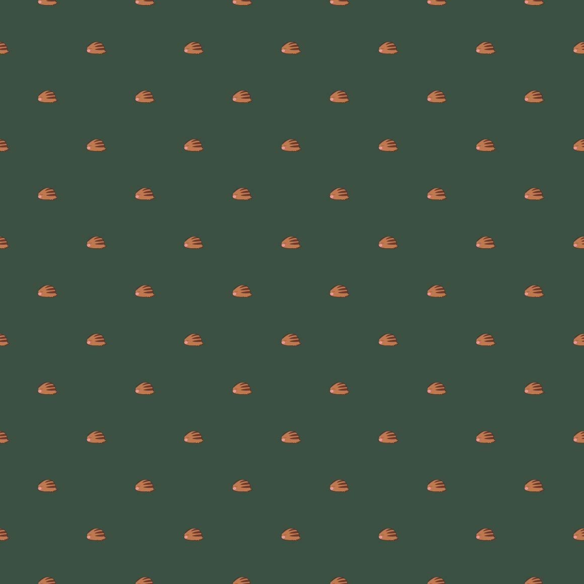
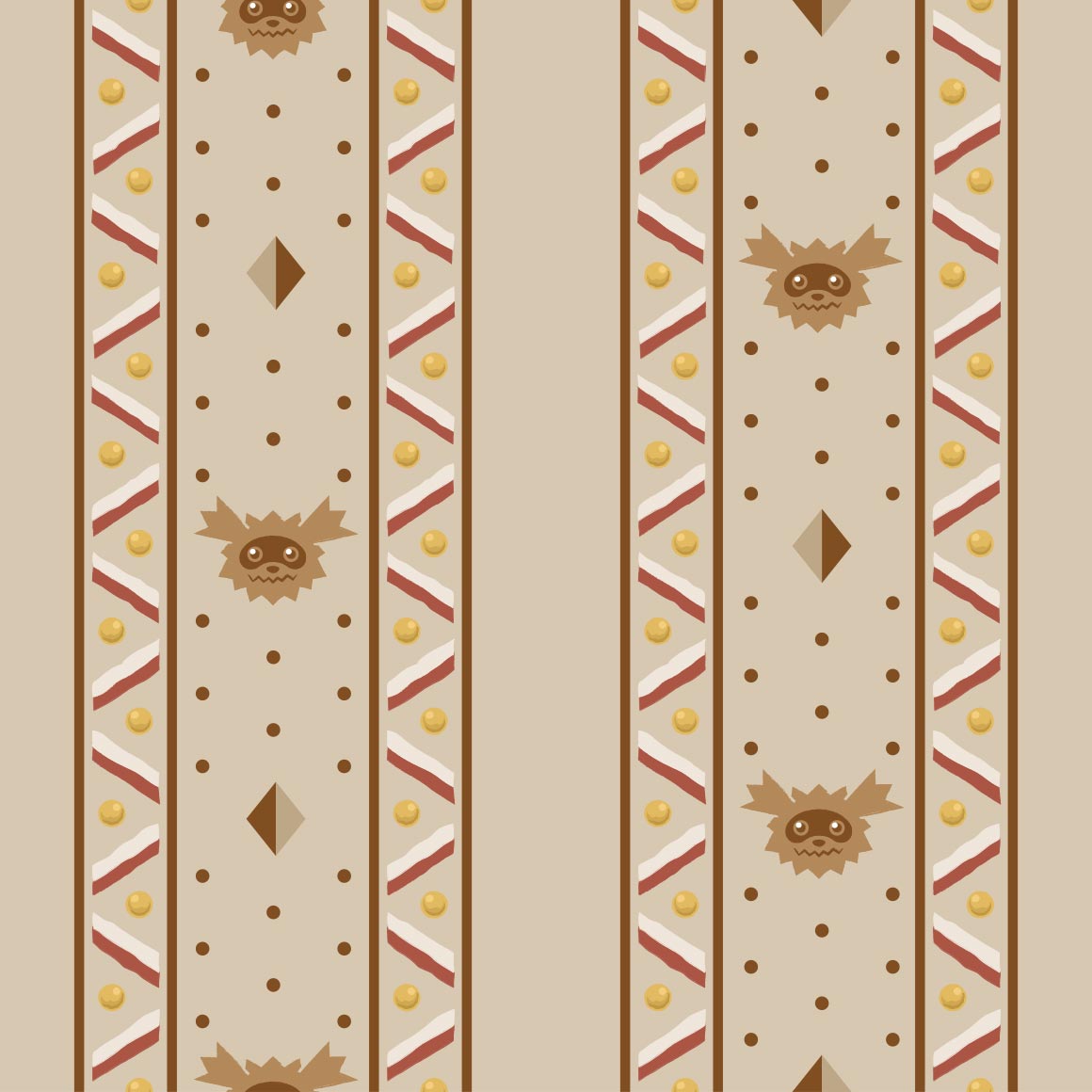
the very hungry caterpie! i love it, childrens book artstyle. id wear it
its nice but nothing to write home about
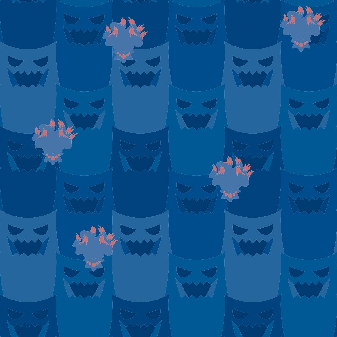
this is hurting my eyes.
again with the corporate art style. its not good
this is funky but i wouldnt wear it
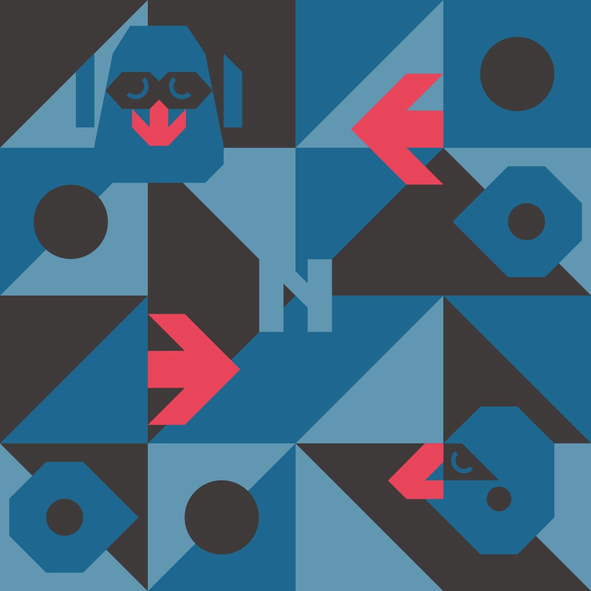
this fucks severely
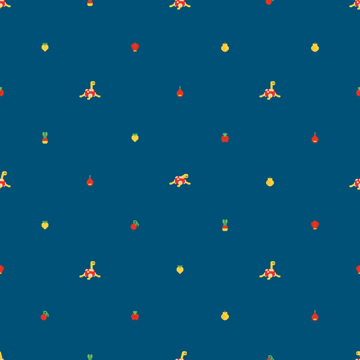
sure is shapes. would these make good cookies?
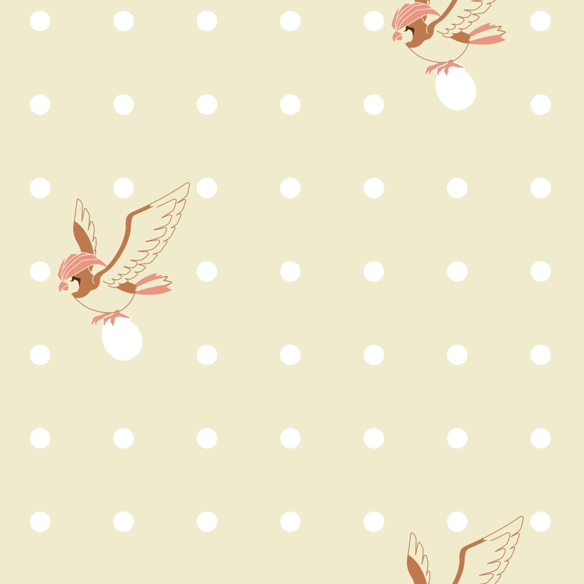
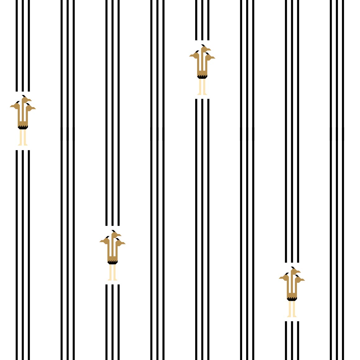
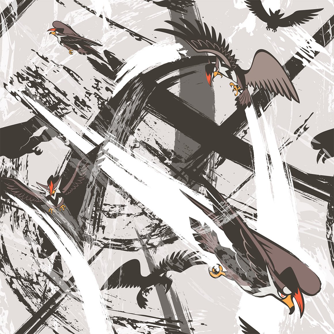
egg. and a few birds. rather boring.
i fuck with the art style.
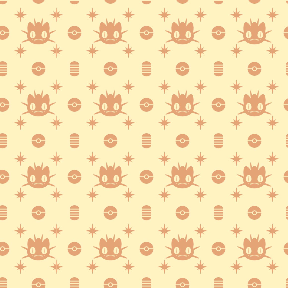
rattata didnt deserve art this good bro
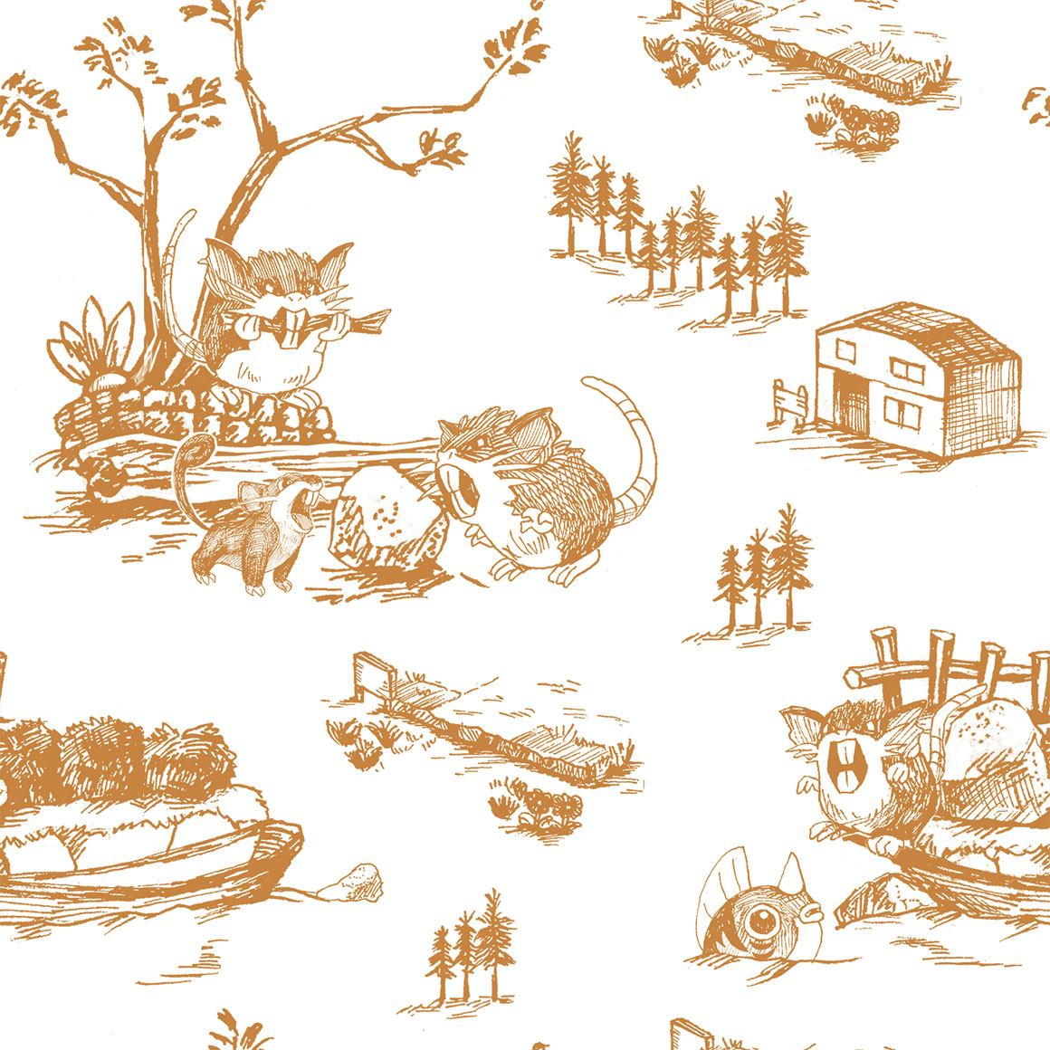
it reminds me of old biology books with drawn pictures
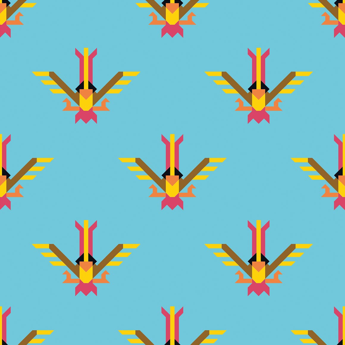
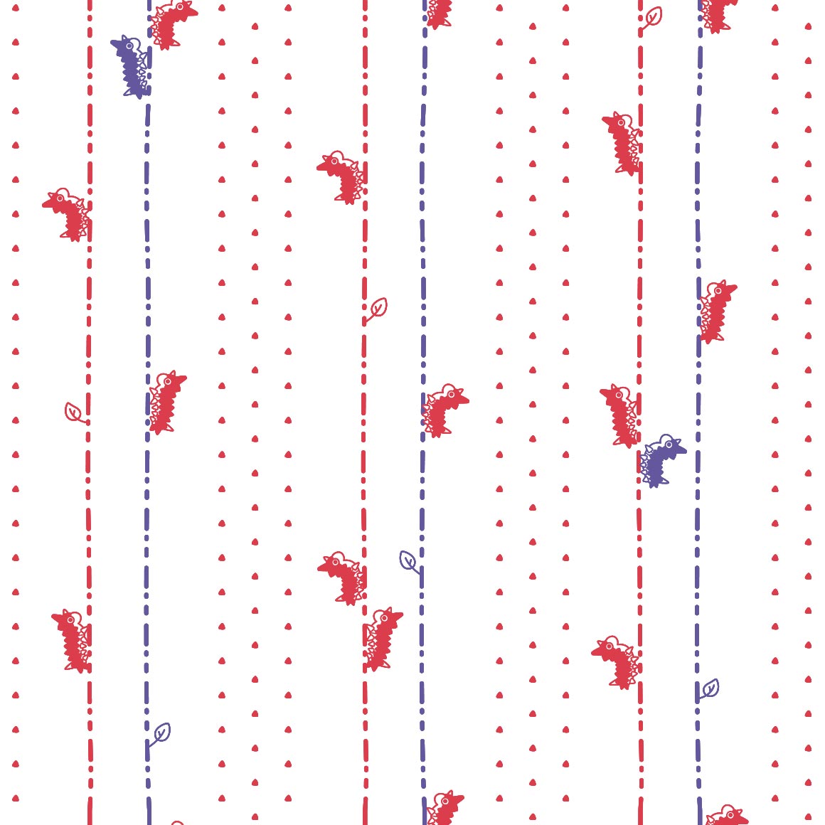
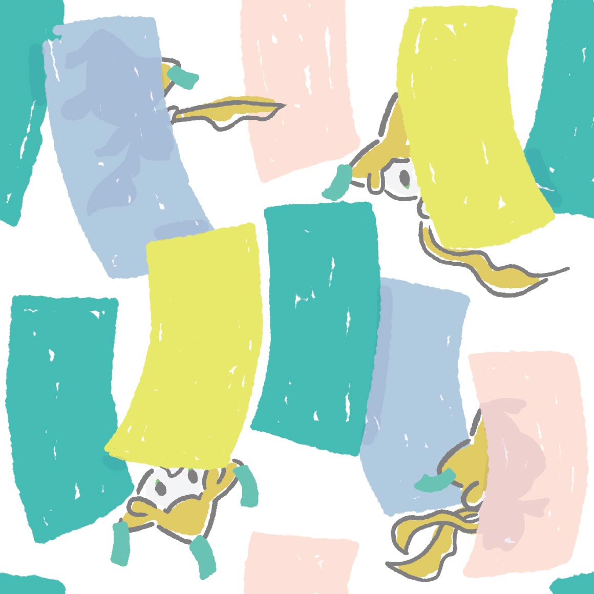
its spearow colored. i like the lineart?
this is also hurting my eyes but i like it i think? not sure
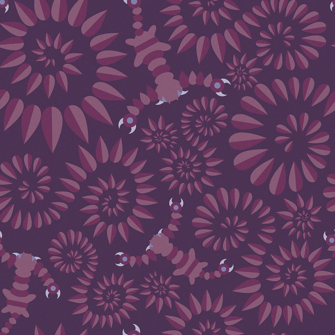
lineless art with spirals, nice
ill be honest i didnt even realise the actual pokemon was here at all
where is the background

funky! i like this pattern.
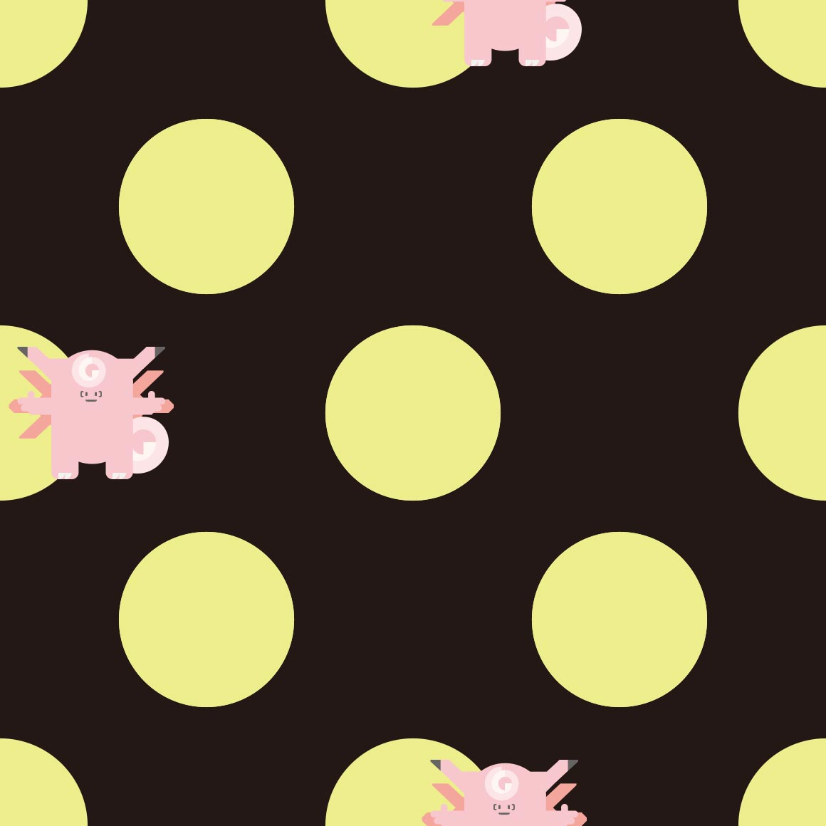
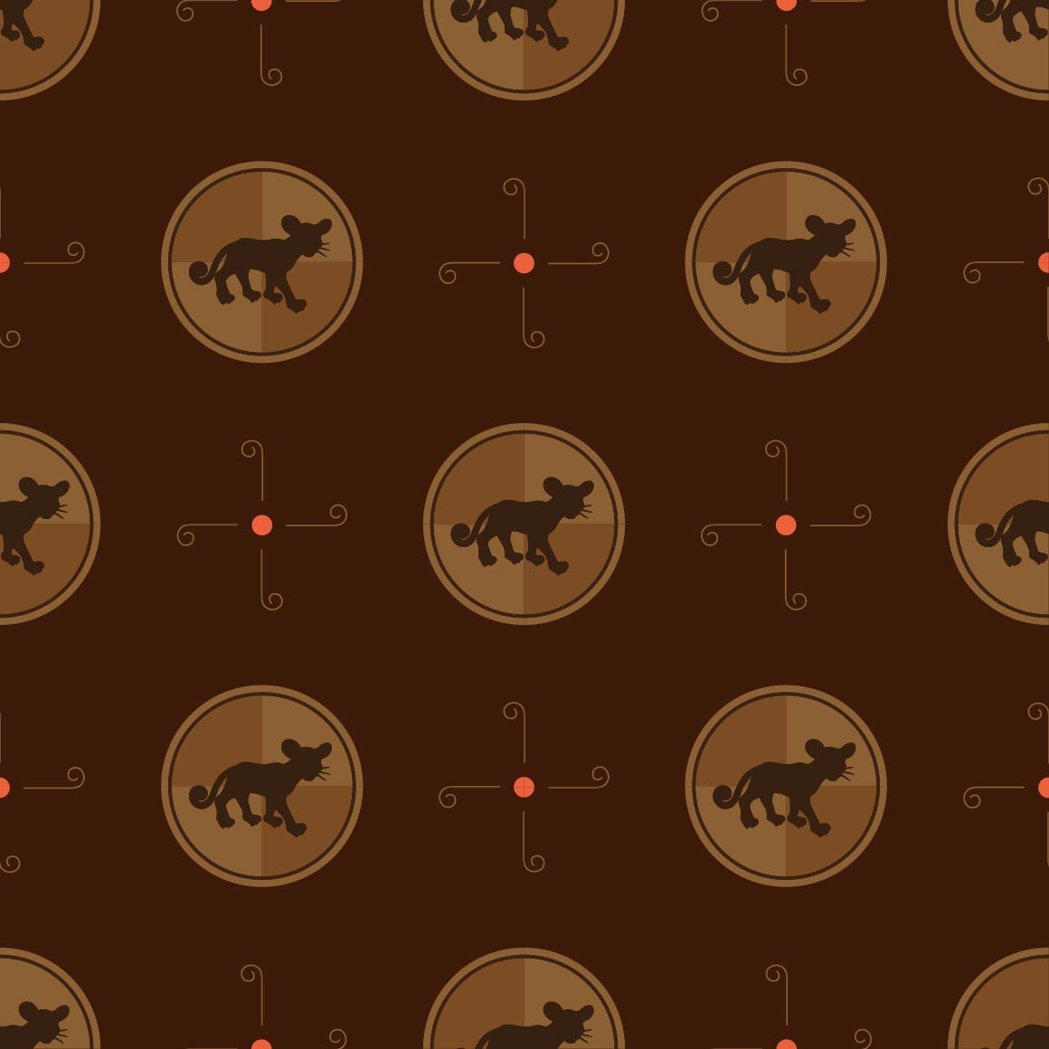
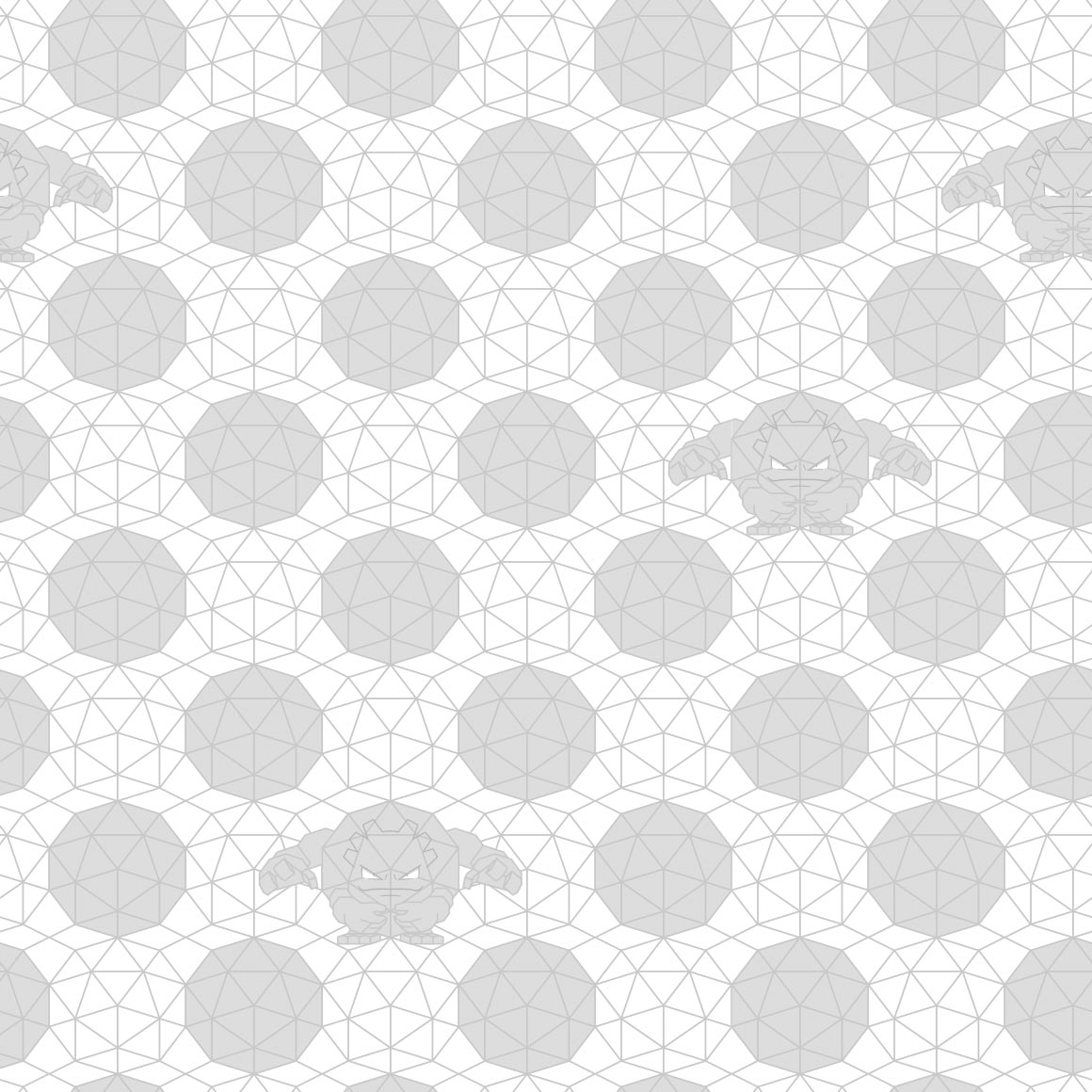
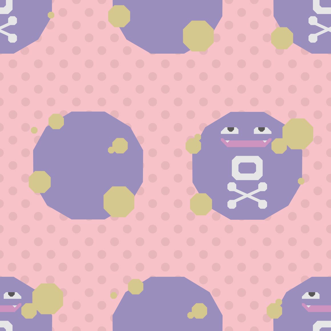
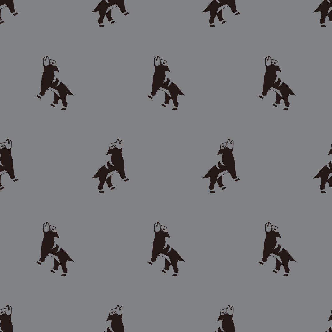
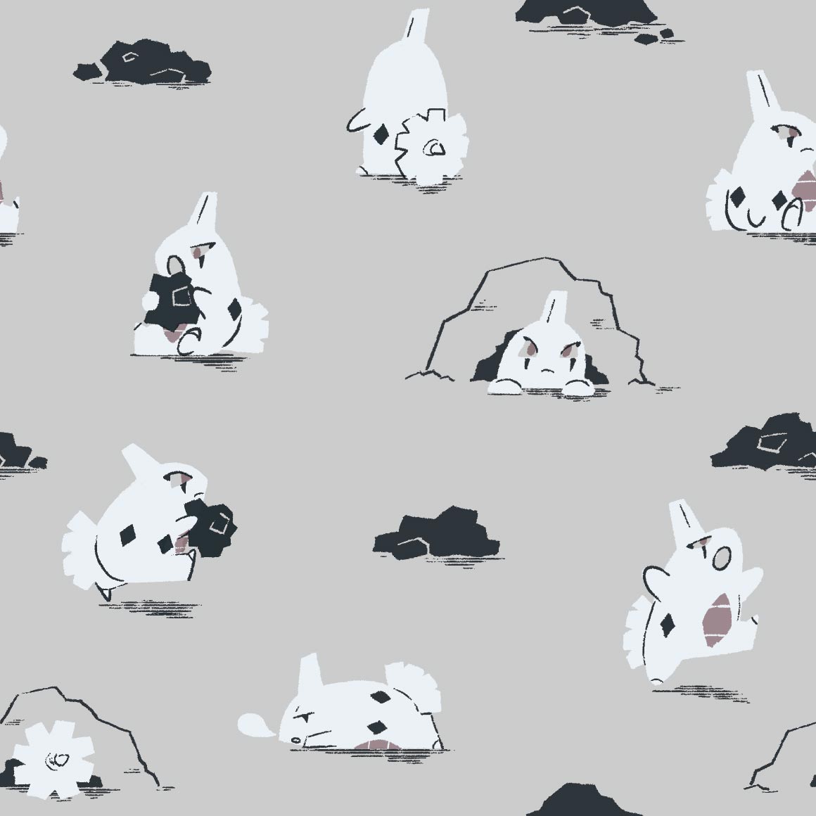
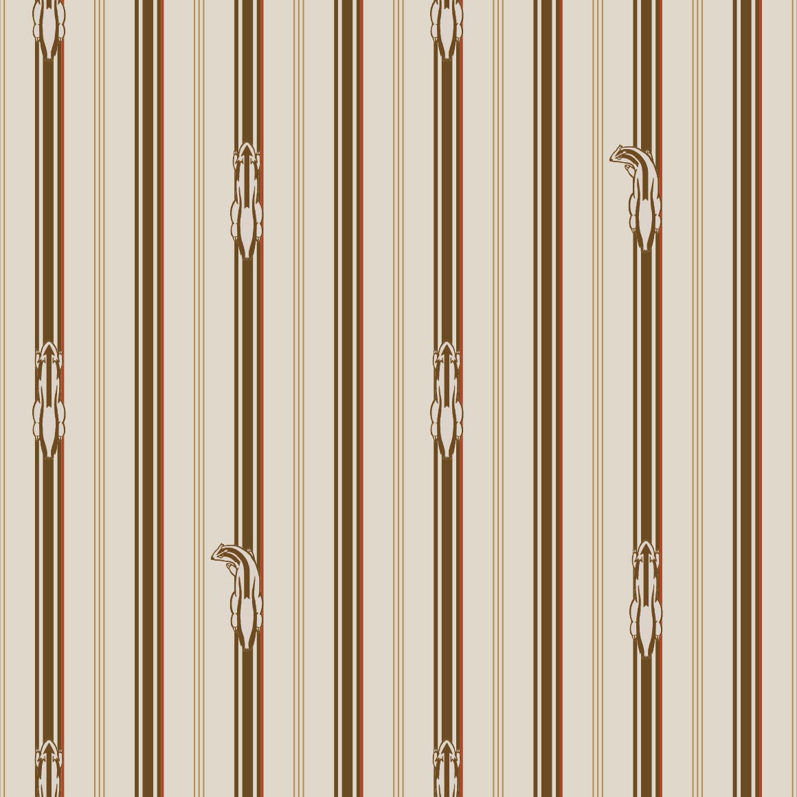
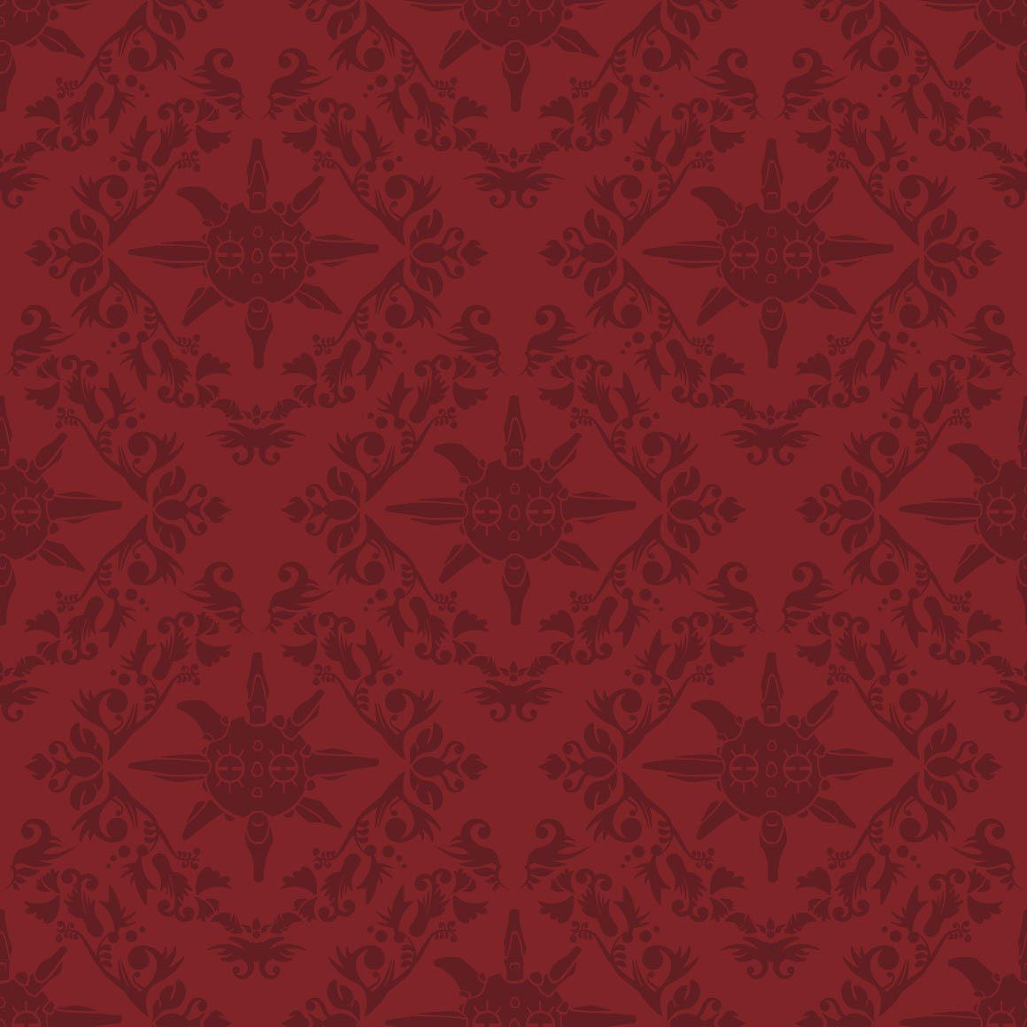
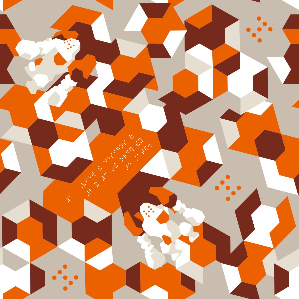
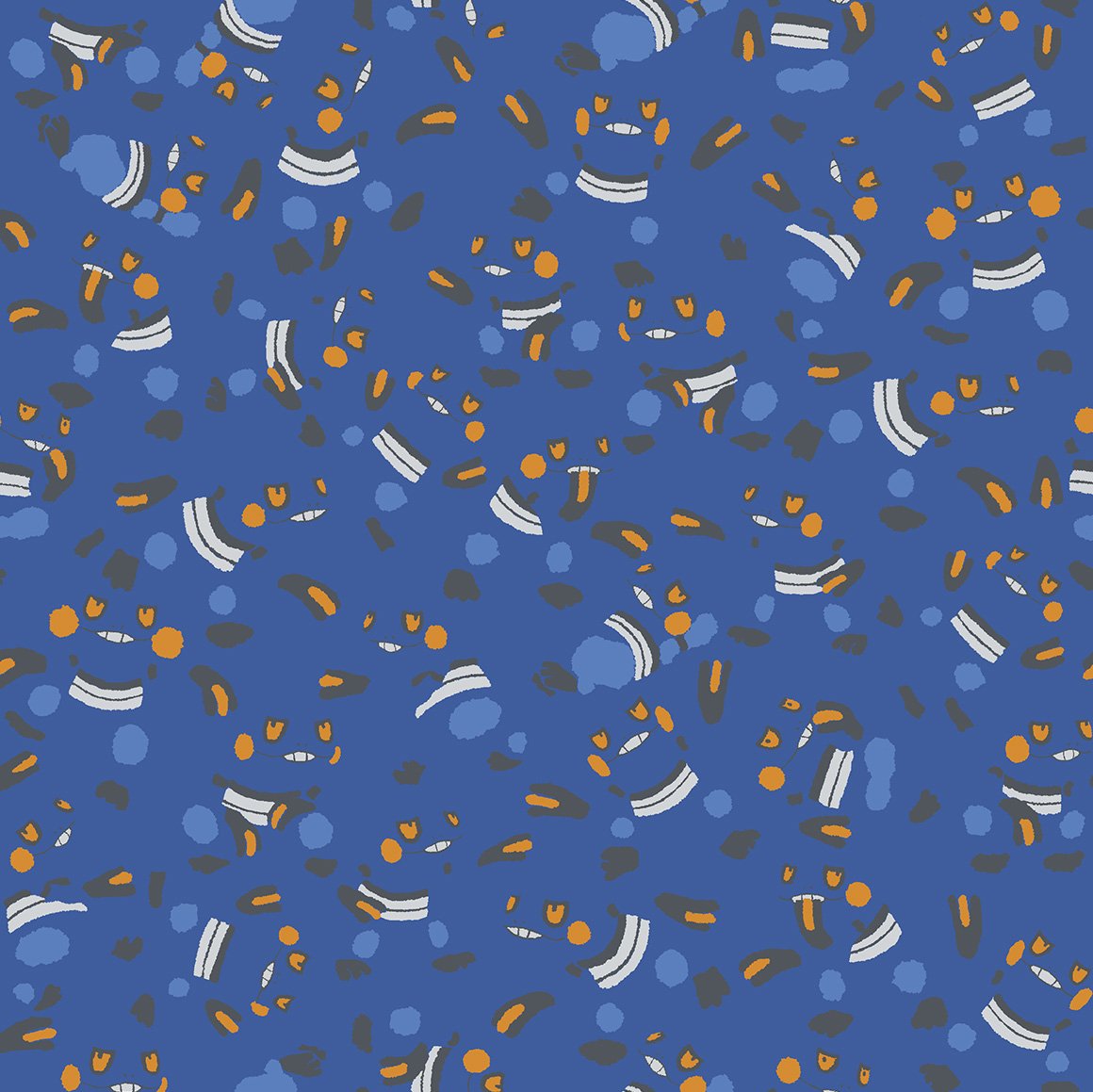
they built my sandshrew into a wall cant have shit in kanto
the only actual pokemon in this is the heads god bless
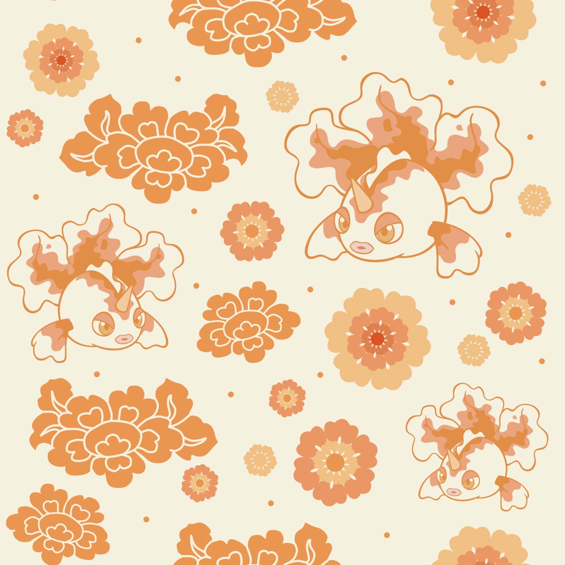
i like it! i hope nidoran male matches, its very pleasing to the eye
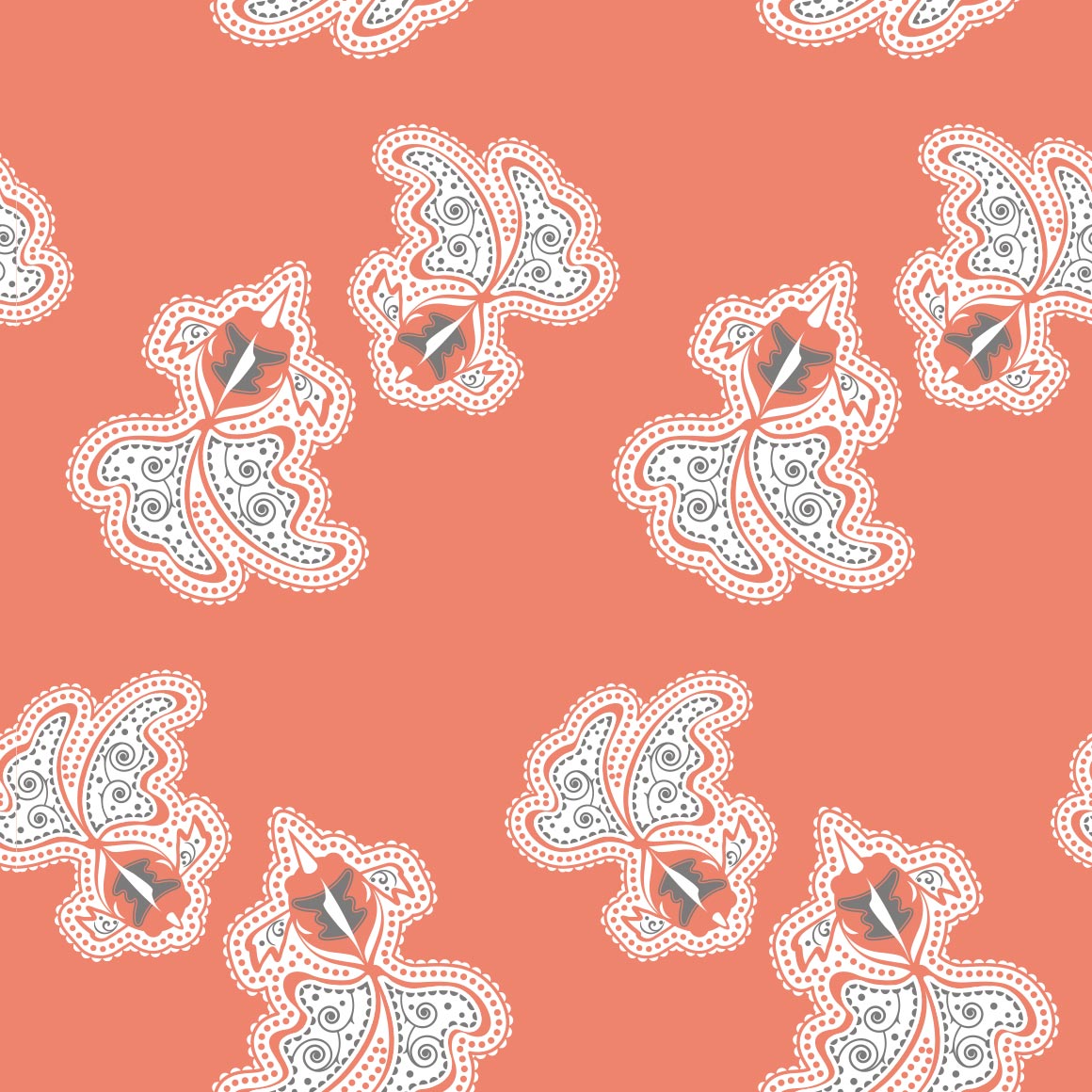
wtf is the other shape, glad we kept with the colors tho
they fumbled it.
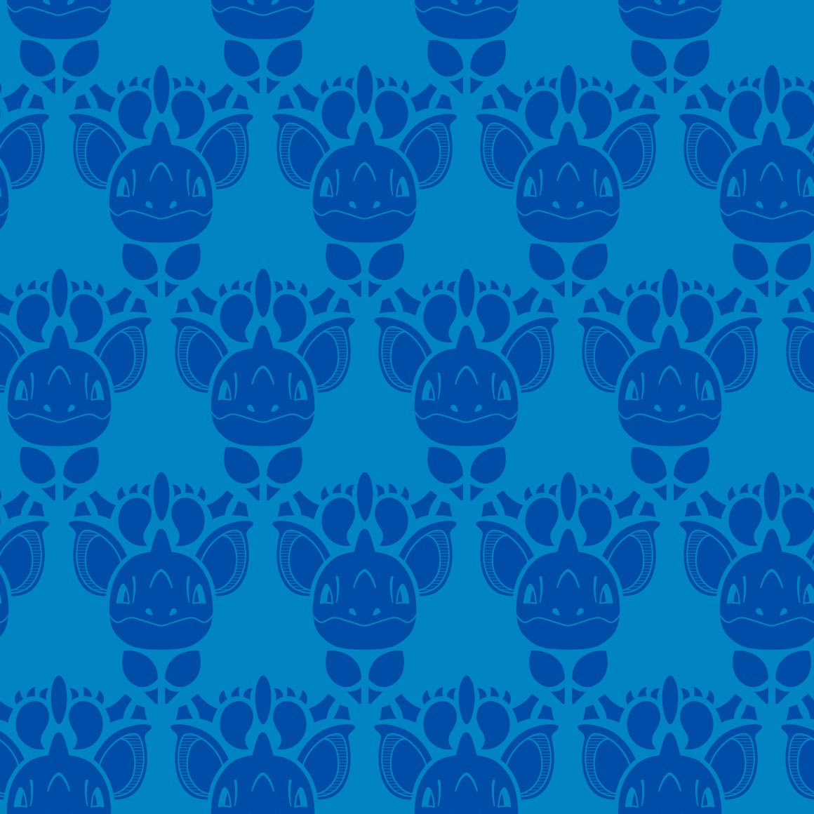
YESSSS IM SO GLAD THEY MATCH
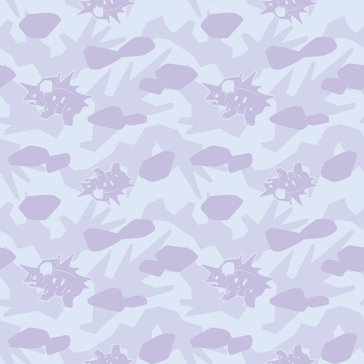
do all the nidos match? oh no nidoking will suck then
booo

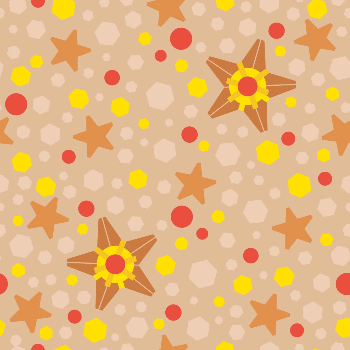
this barely looks like clefairy but i guess would make good stealthy merch
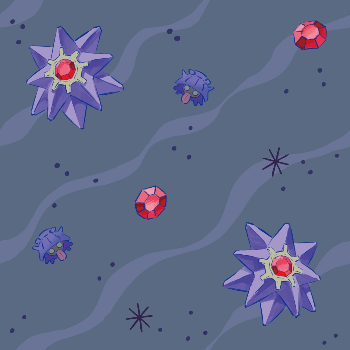
i get WHY they have the moons but it just looks strange here. especially as theres only 3 clefables
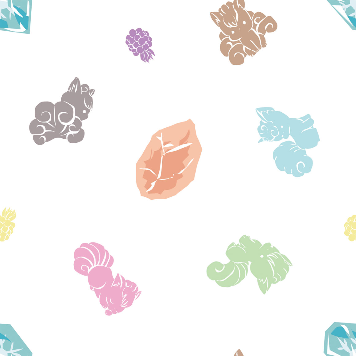
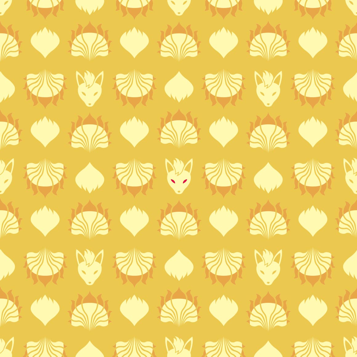
i like it! its nicely colored and i like the silohuettes of vulpix
THIS is how the nidoqueen and nidoking shirts should have done it
i like how every single space is a jigglypuff, its cute
oh a sideways variation for wigglytuff! interesting. wonder if igglybuff will be the other direction?
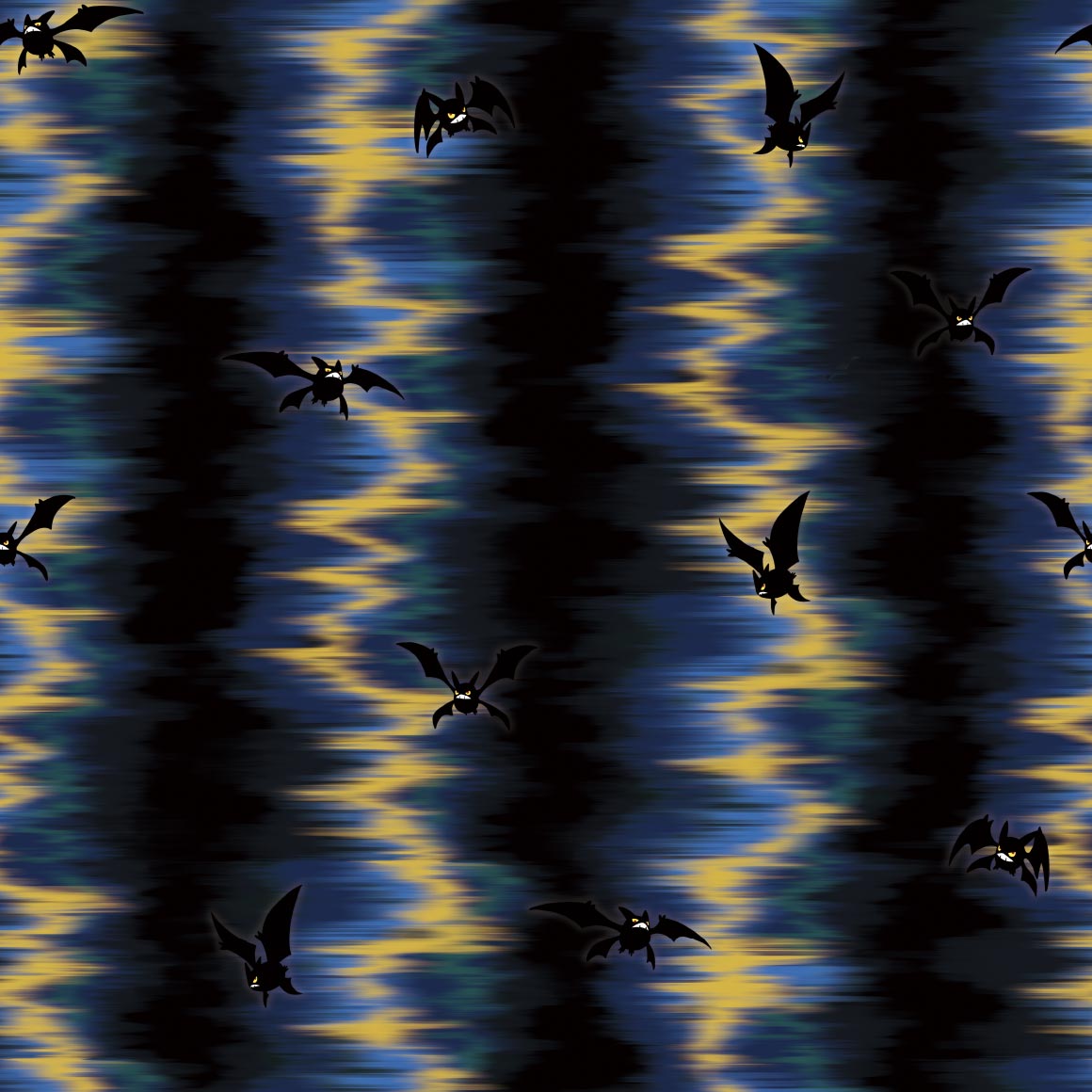
zubat looks so fucking strange without its wings out dude
as does golbat. ewww
its nice? i wish oddish featured more in it though
i like it! im not a gloom fan, but this pattern is nice and lice
not a fan.
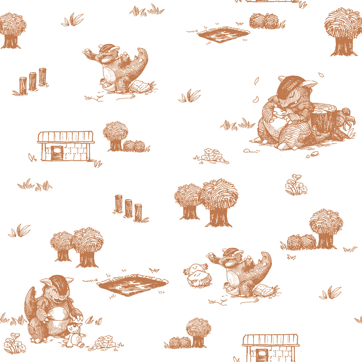
this is so nice it reminds me of old childrens books love the art here
DUDE ENTIRE PARAS LINE'S ART IS BANGER?? THIS IS NICE AS HELL TOO, possibly my favorite so far
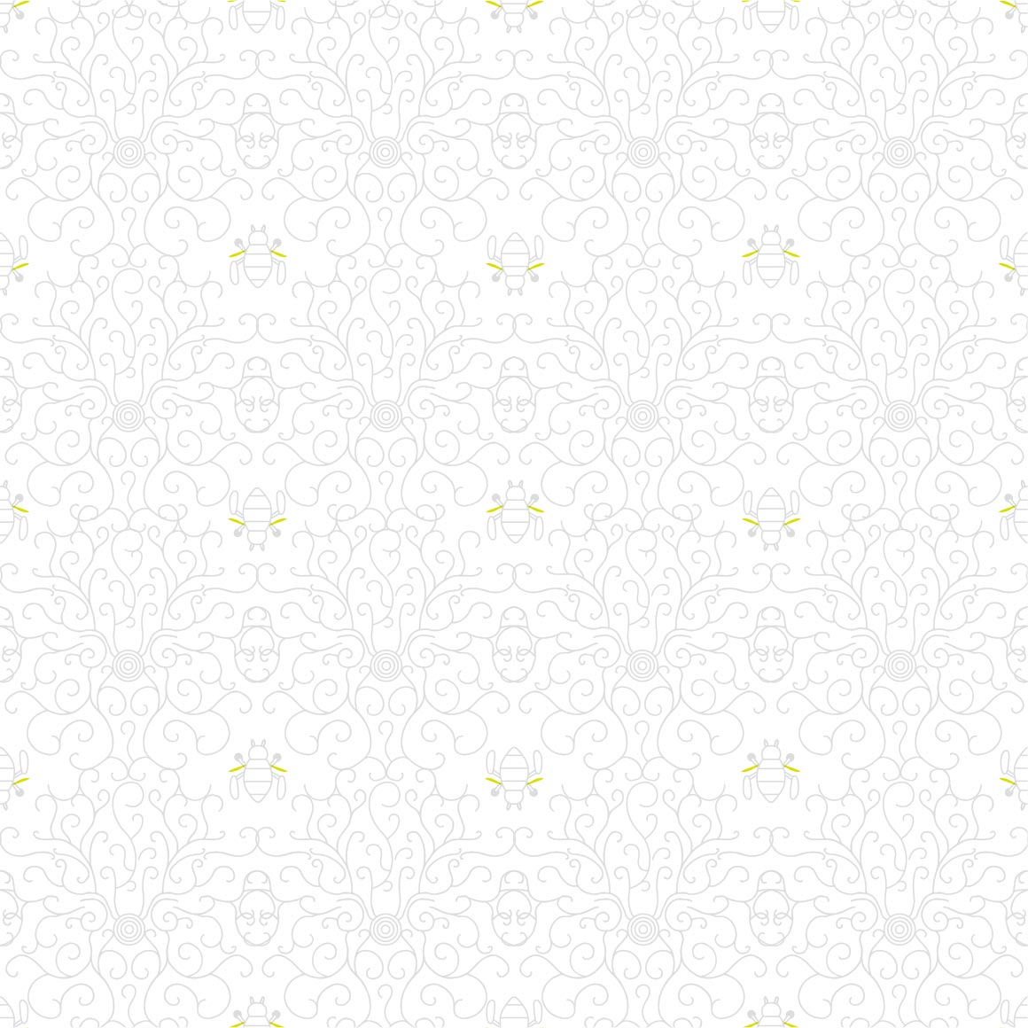
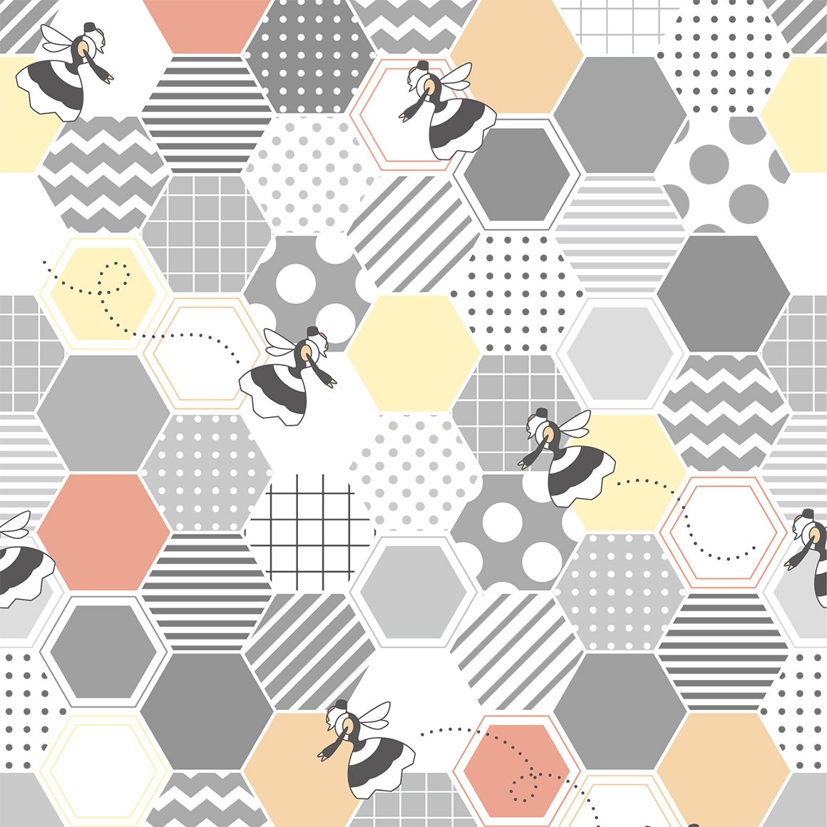
why is venonat with hexagons when its not a bee, and only there twice. colors are nice though
it just looks like the same image copypasted a bunch :sob:
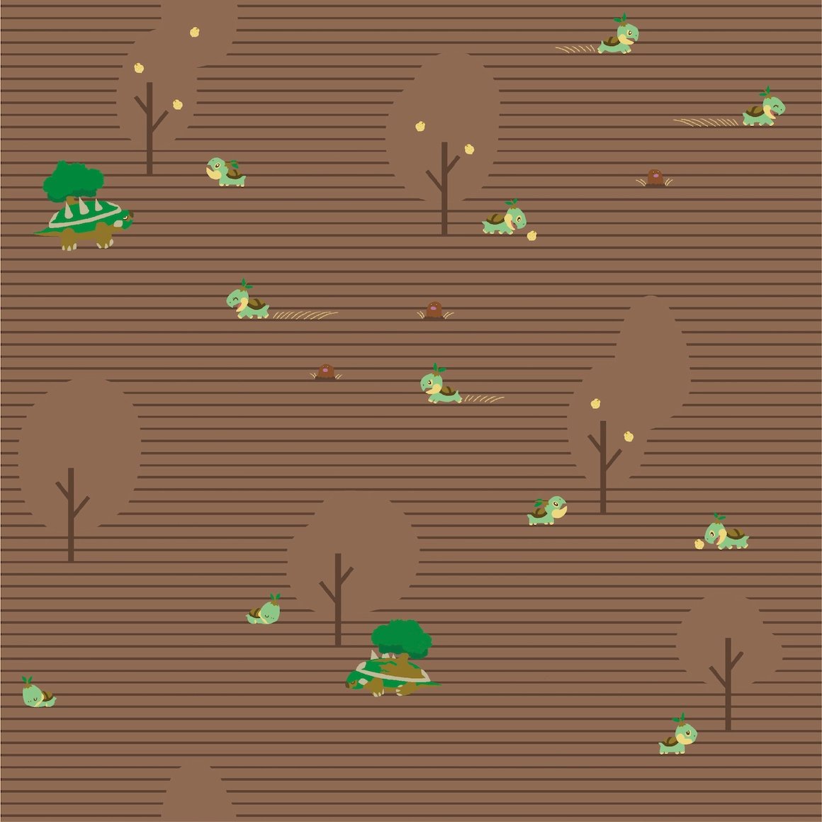
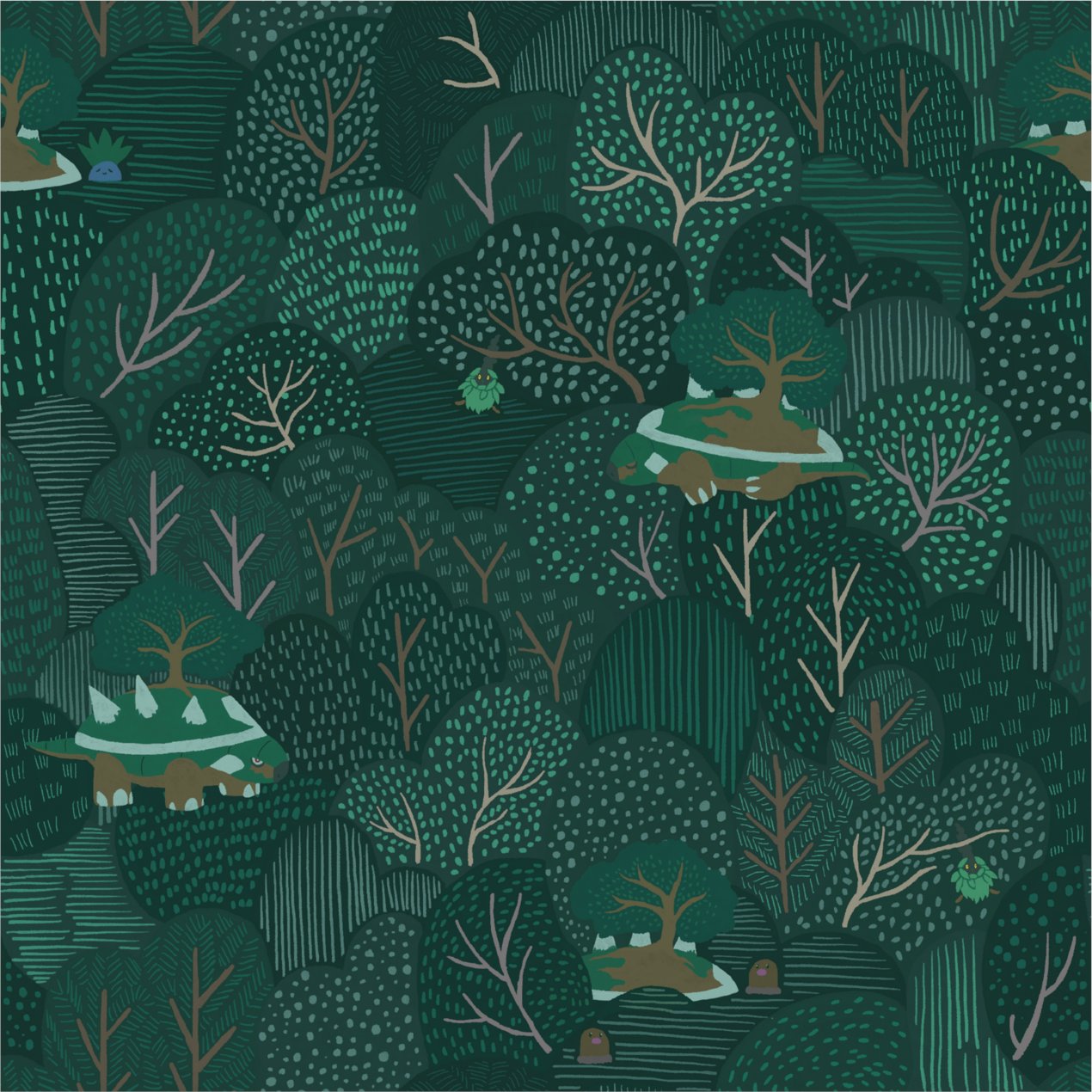
i like how the dirt is drawn lol, n the little alolan one
this art looks like something my buddy sam would make, not sure itd work as a shirt tho
i like it! the patterns nice as are the colors
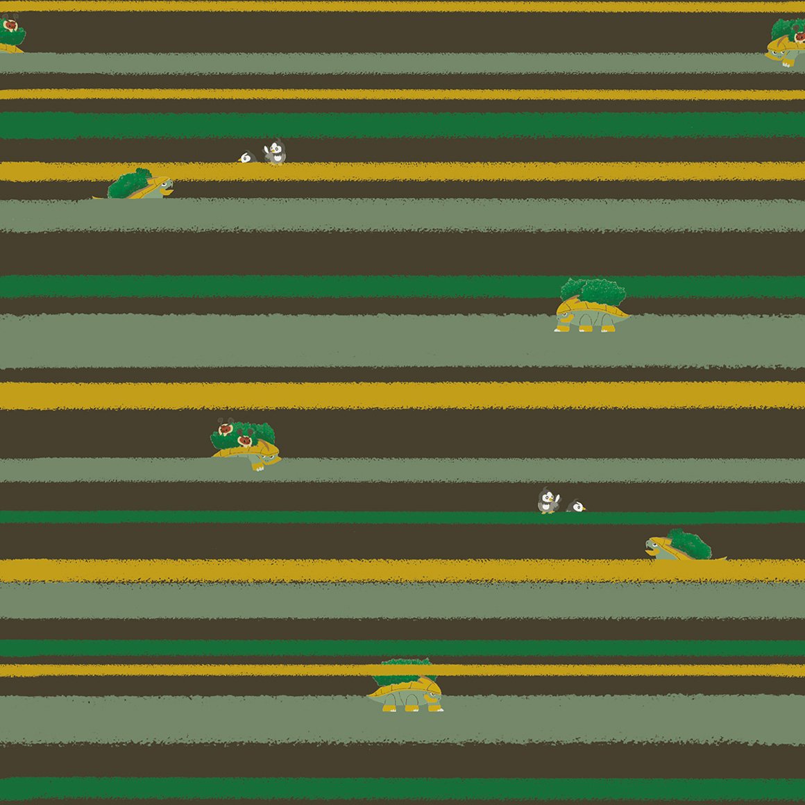
thats just a very boring silohuette
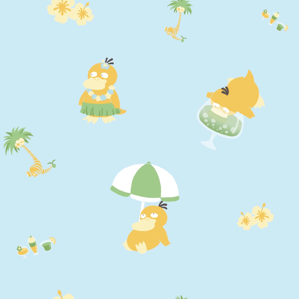
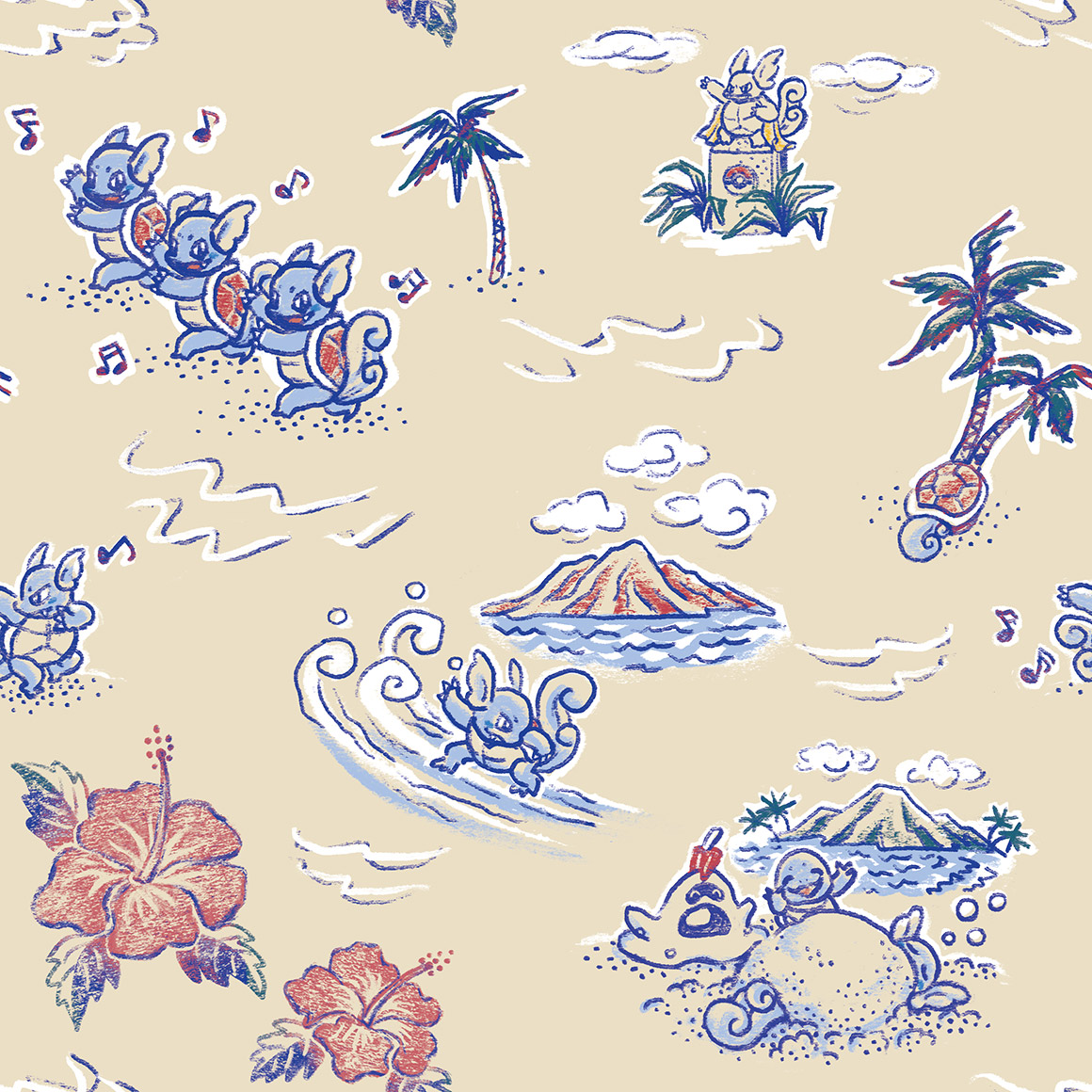
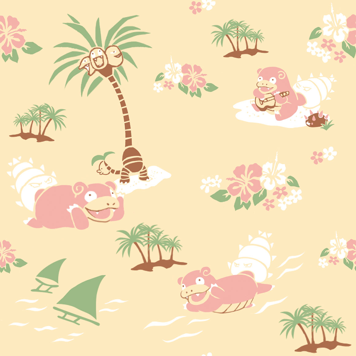
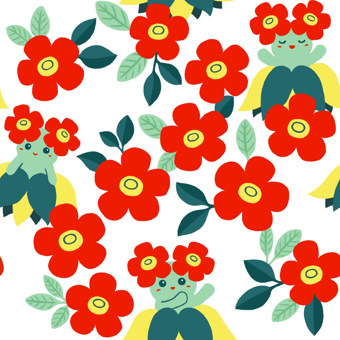
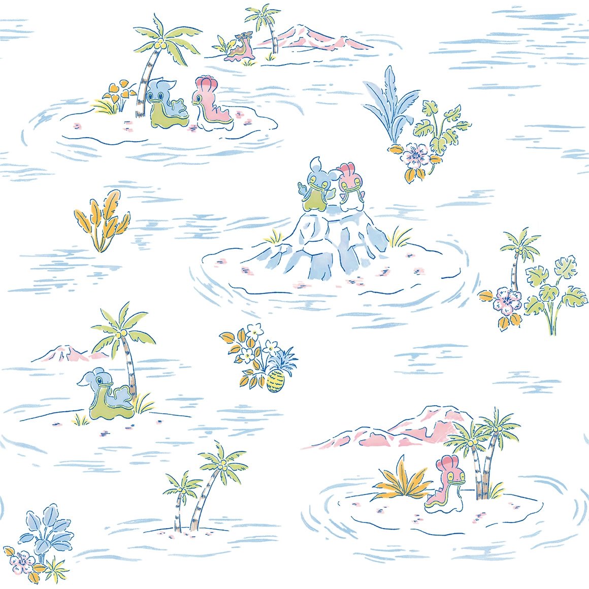
this is so pleasing to the eye! i love it when pokemon shirts patterns feature other unrelated pokemon too, so the alolan exeggutor is nice. hawaii

gross and hurts my eyes
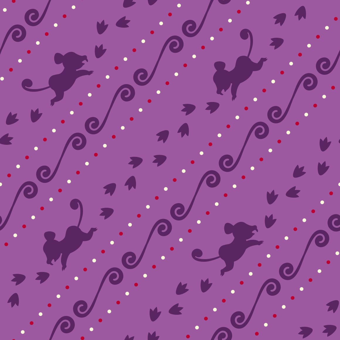
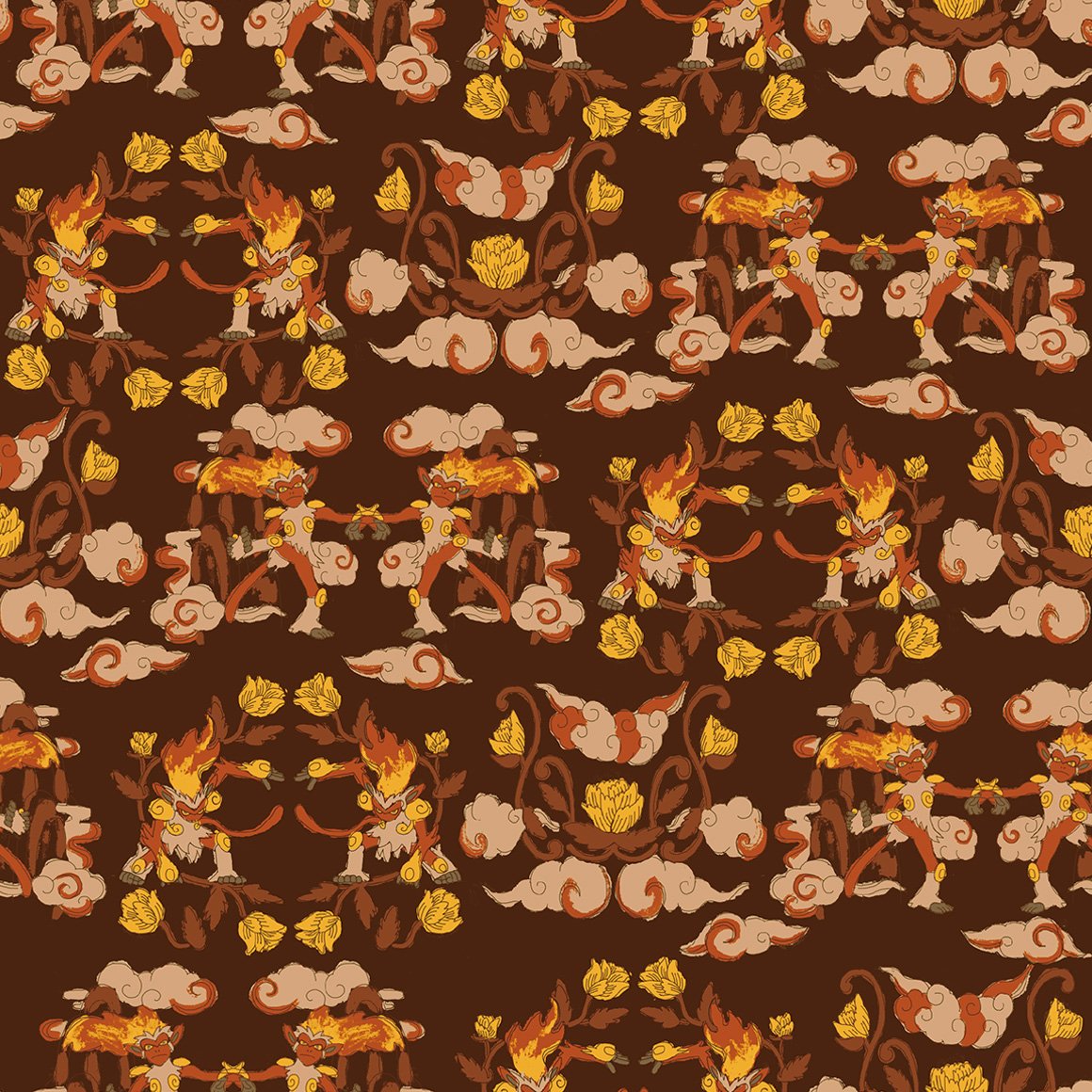
they are like monkeys in a barrel :sob: its cute and i like how they grab each other

this really pops! it would also work as stealth merch like the clefairy shirt

this looks like something my mom would have on a bandana
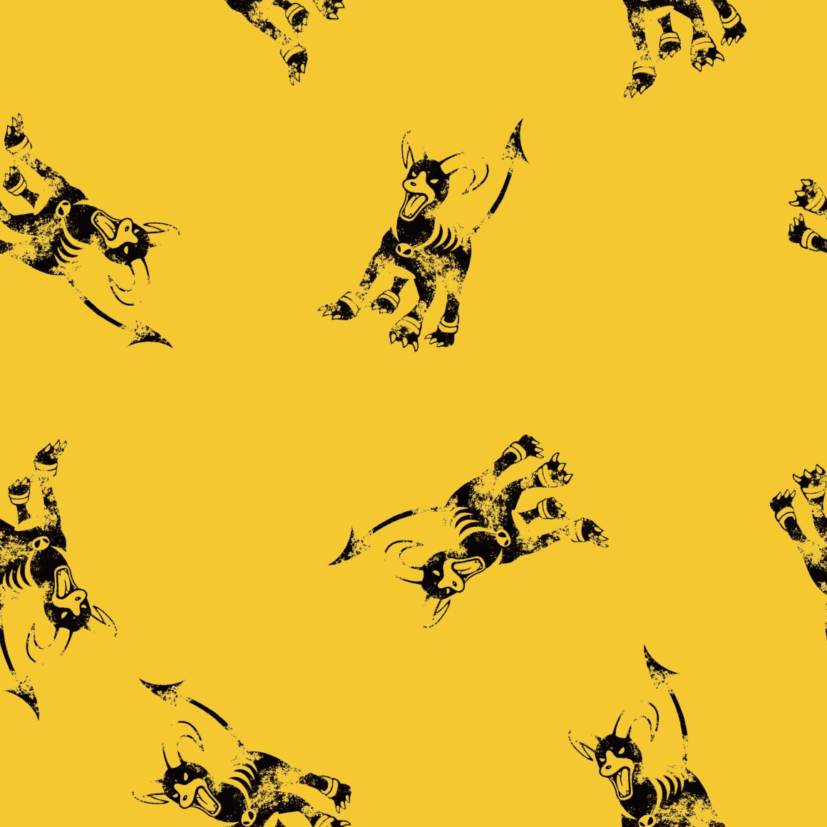
n then they fumbled arcanine. arcanine itself looks very unfitting in its OWN PATTERN

aquarium gravel type beat! i love it
i wish the silohuettes were doing Anything but just standing there
theres only two poliwraths but it works here, okay? why are the fingers like that tho
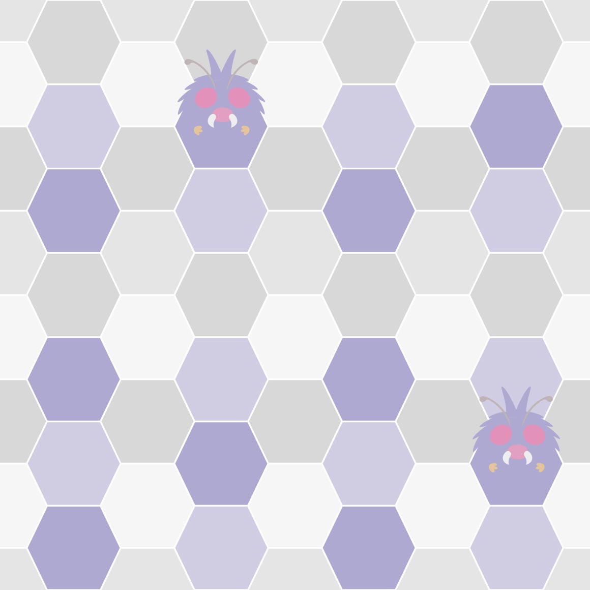
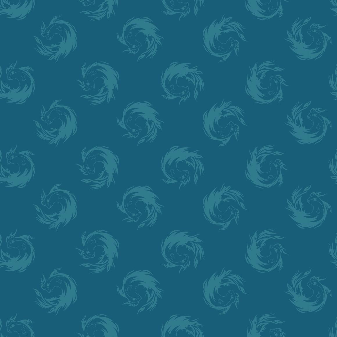
they are like a weird kaleidoscope pattern
uri geller is Quaking
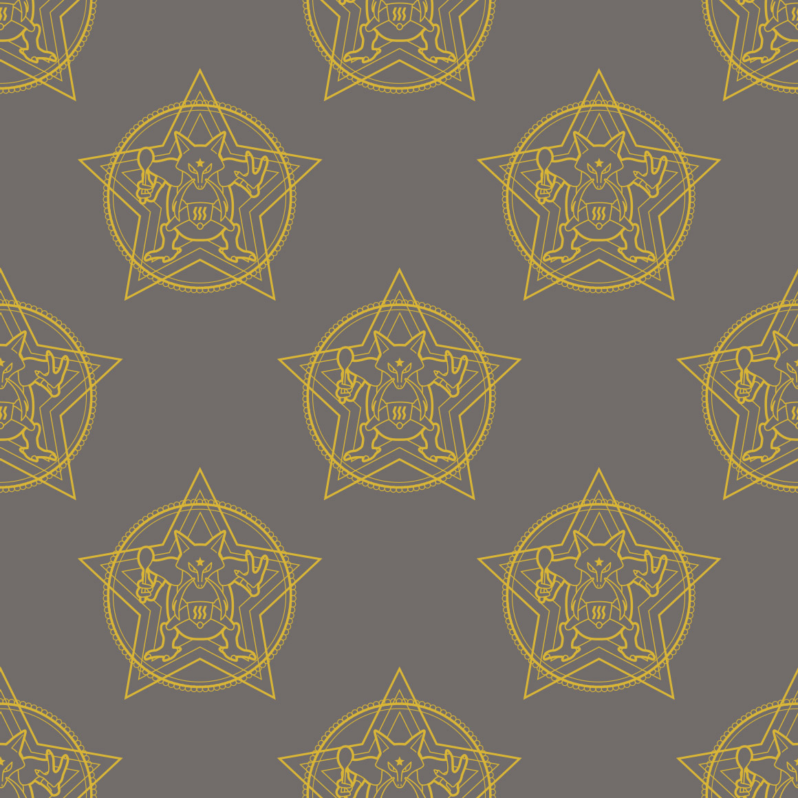
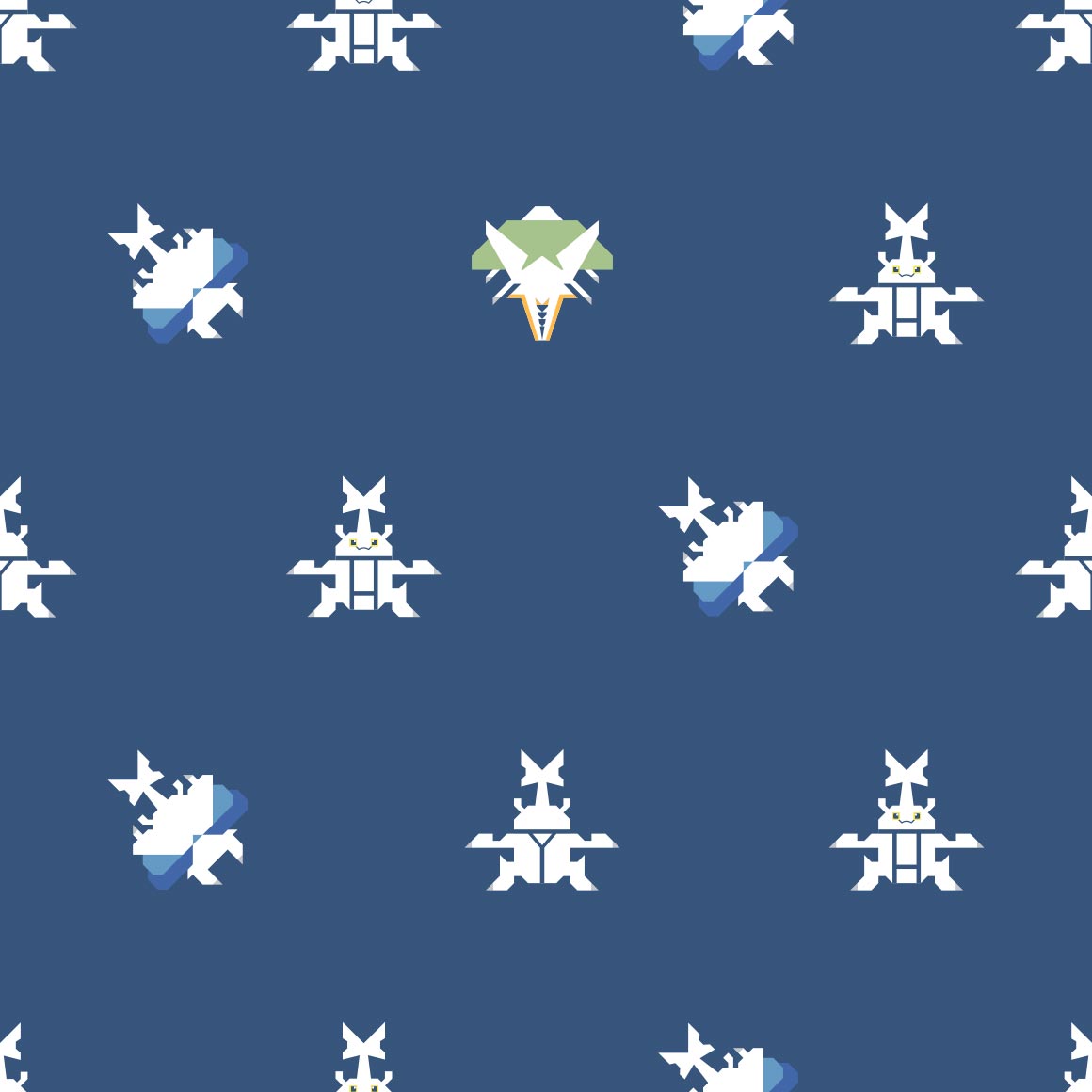
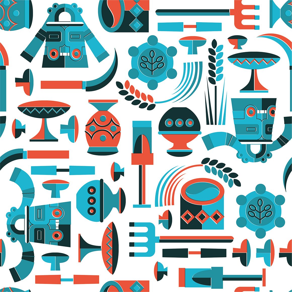
is this meant to resemble a pirates flag? but a pattern? with alakazam? interesting.
the colors are nice, i like how the fighting type icon is there?
its ok
where is the pokemon on my Pokemon Shirt
YUMMY COLORS i love this
reminds me of a neon sign
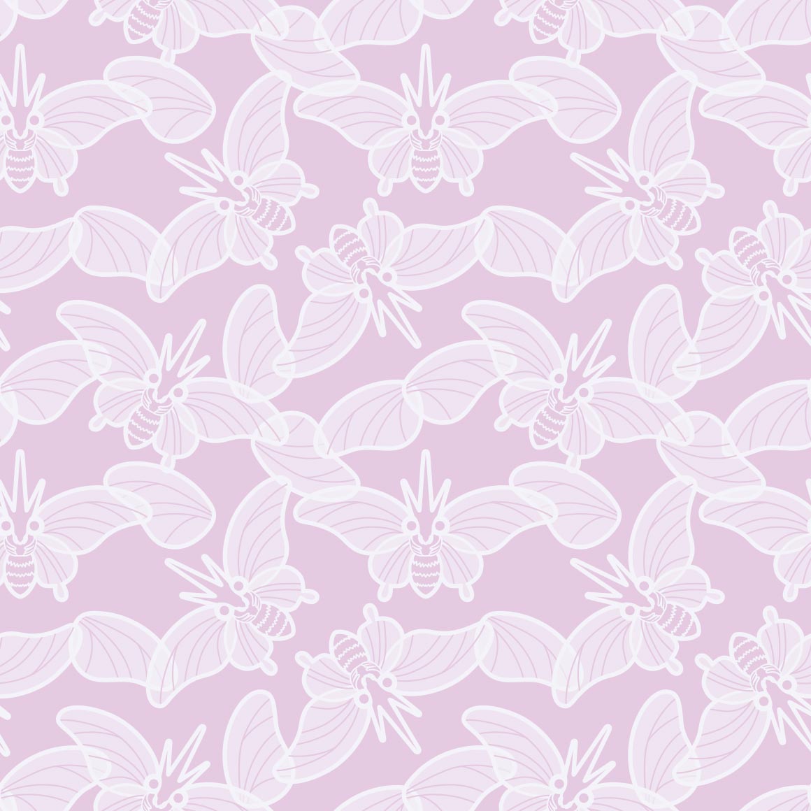
the patterns nice AND the inclusion of ledyba and yanma? superb. would Maybe wear this.
hehe its tentacles are the pattern
what can i say but its ok, nothing to write home about
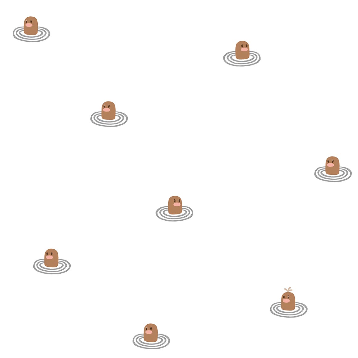
rock climbing wall? but i didnt even Register it as geodude, at first.
uv mapping failure
looks like something my uncle would wear
i like the lineless art + colors
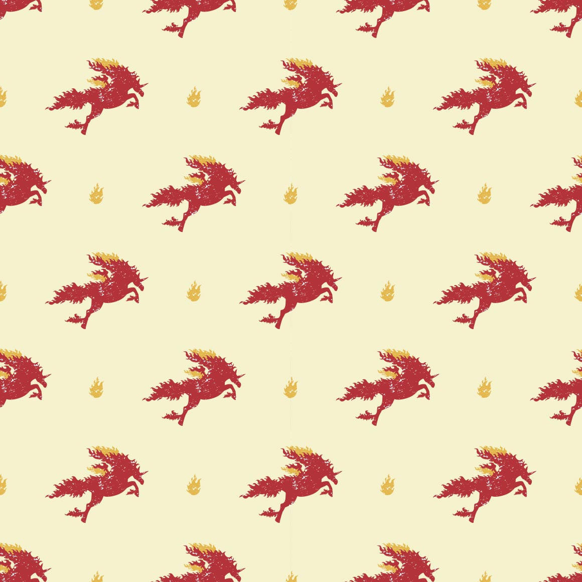
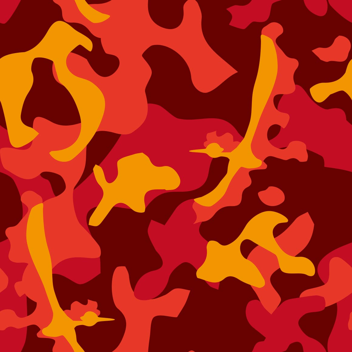
this fucks but doesnt resemble the pokemon anymore its just a flaming horse
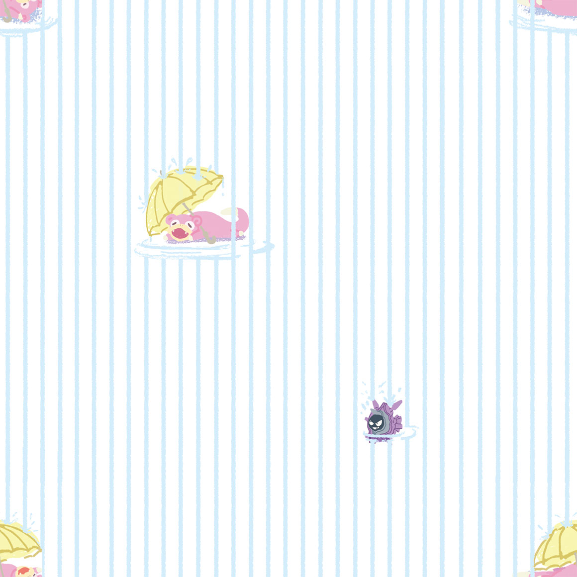
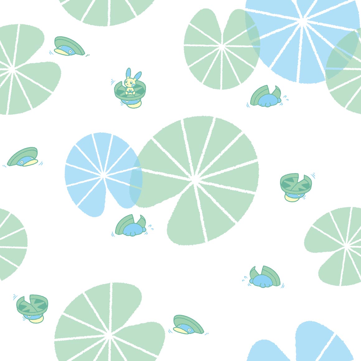
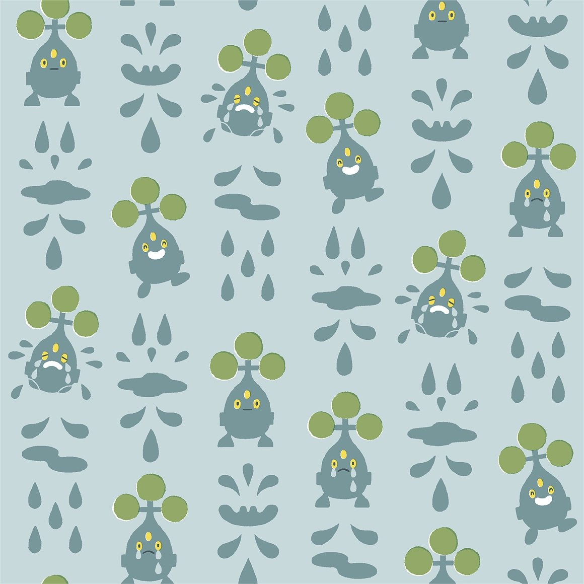
oh no its raining :cry: cloyster is there too
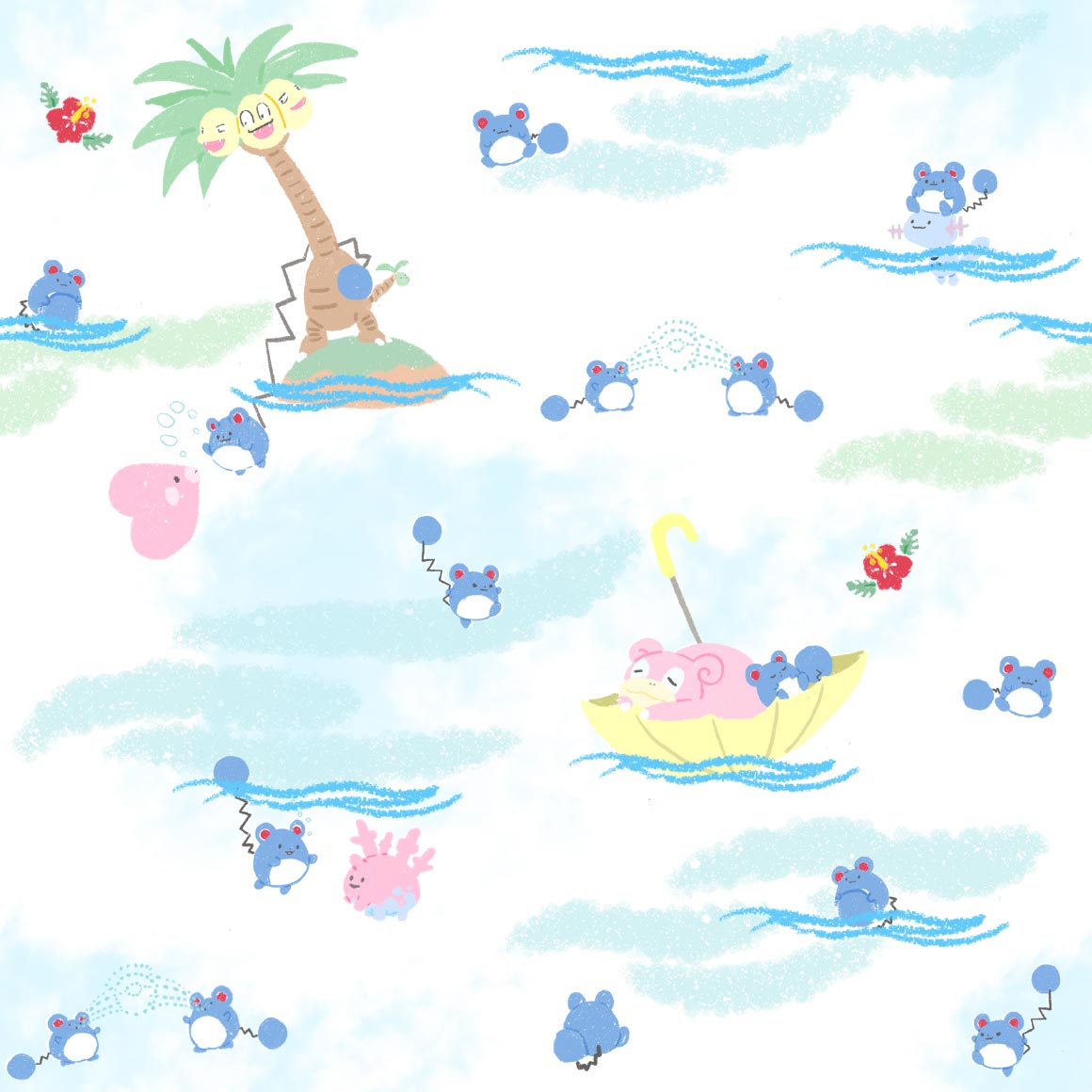
another hawaii shirt? nice. hi pyukumuku
a nice pattern, id wear it
kinda boring but the colors are nice?
this fucks but not really a fan of the lines between everything, i know its trying to resemble pixels but its just not working

EW this is so cute
this patterns sucks but if i stare at it a while it makes the dodrio move up and down like a elevator
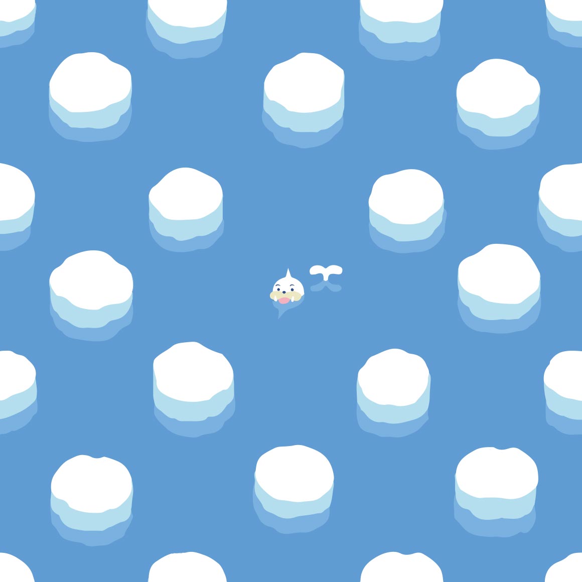
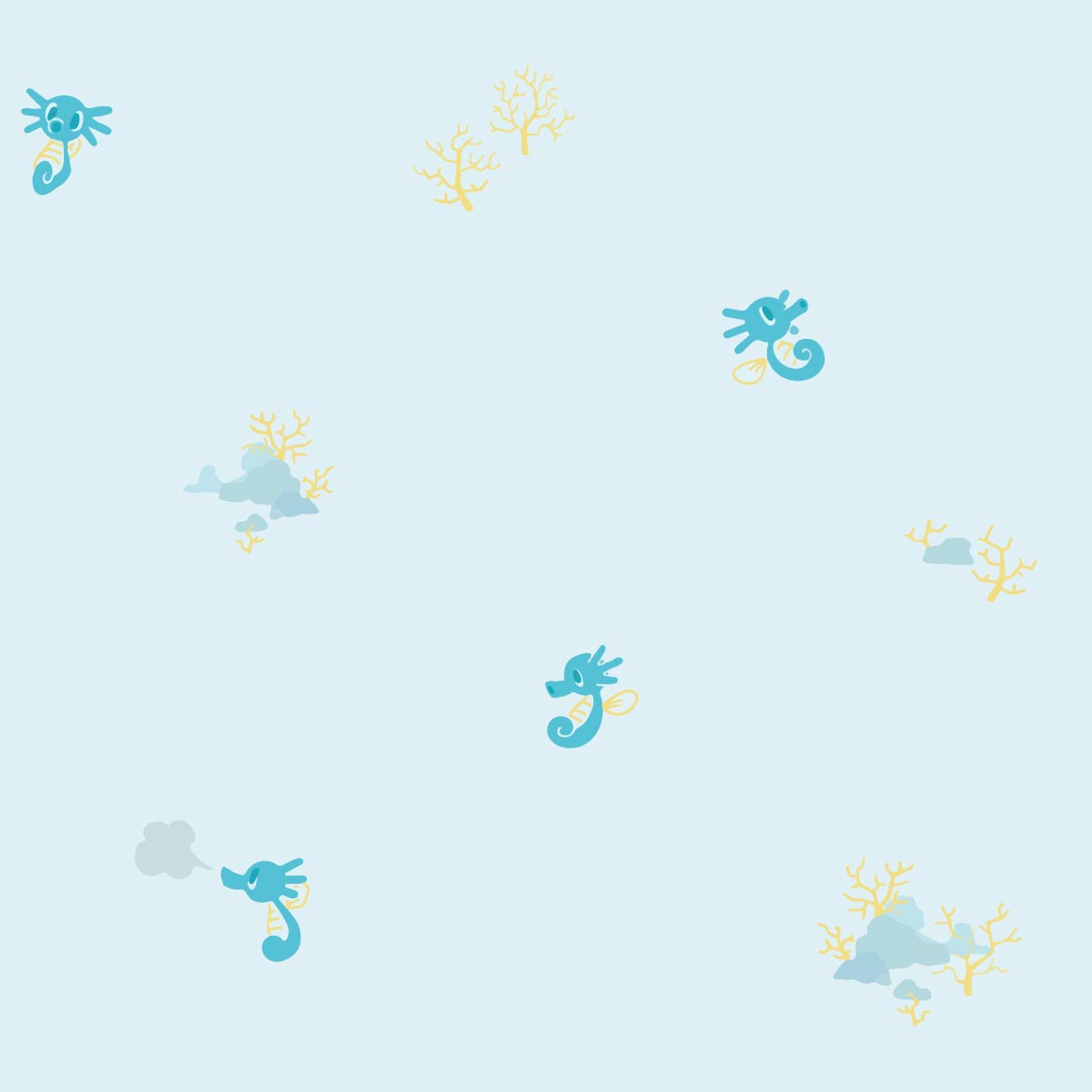
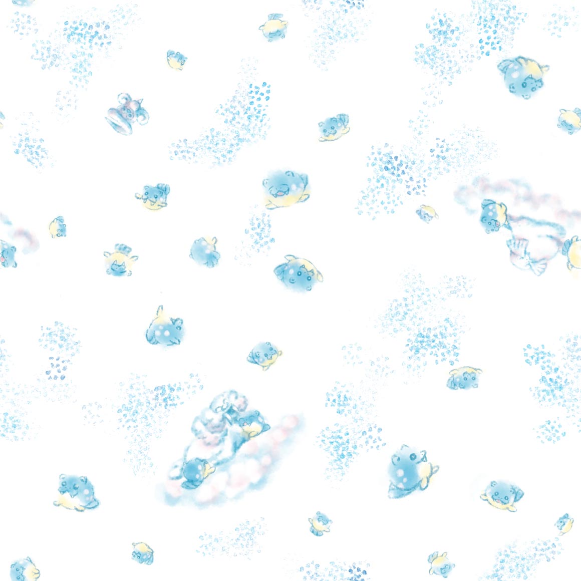
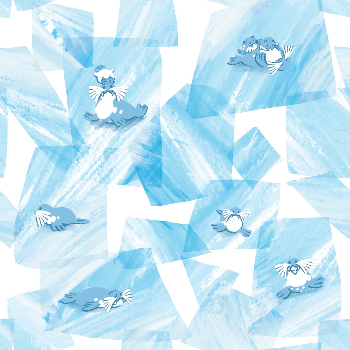
theres only one seel but its really nice the icebergs take up a lot of space but its ok bc seel is in the middle
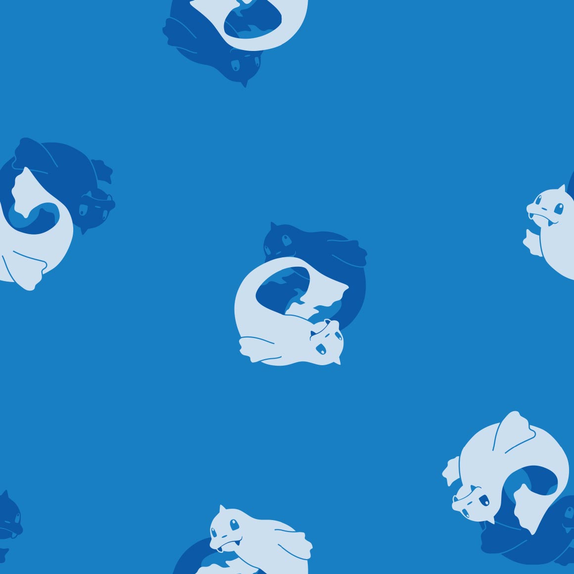
yin yang dewgong
sludge in rows with grimer coming out rarely? ok
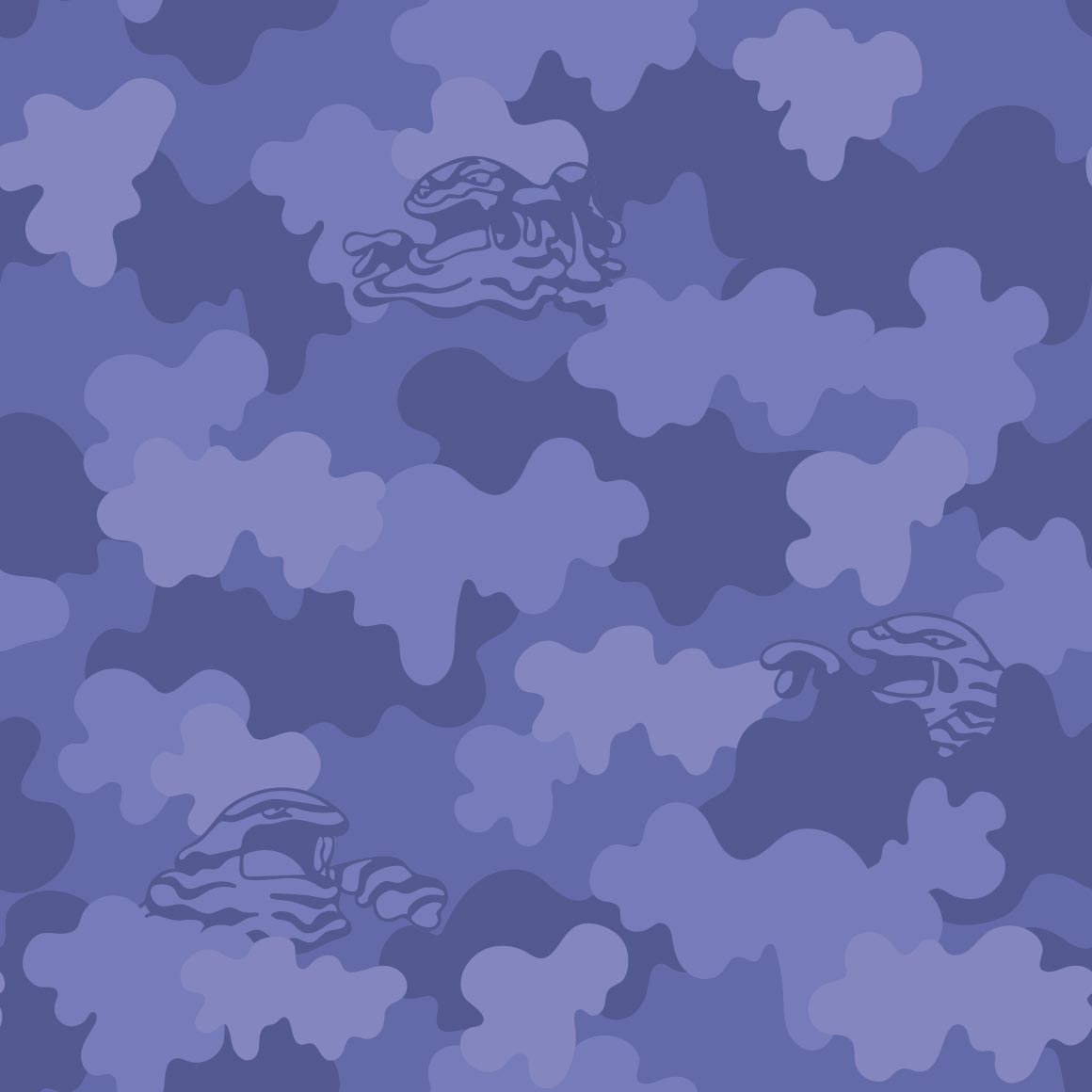
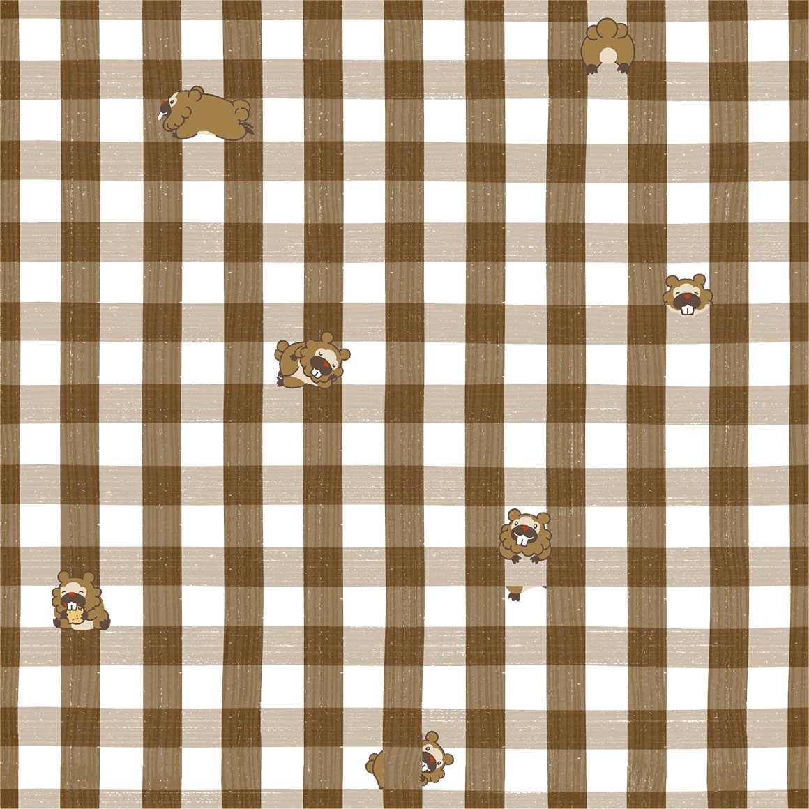
dude why did muk get unique art for every iteration? :sob:
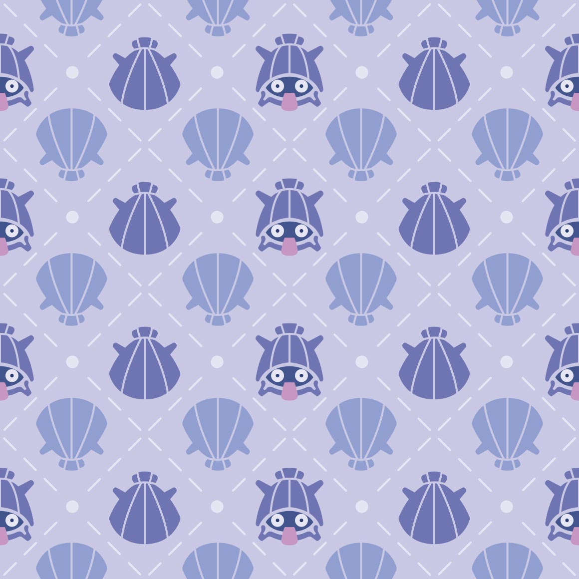
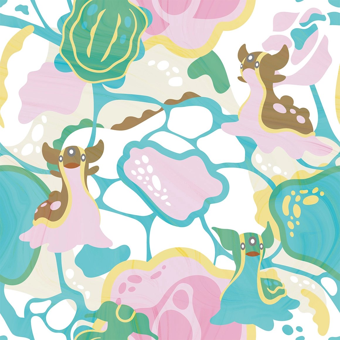
yummy colors? clam
its nice?
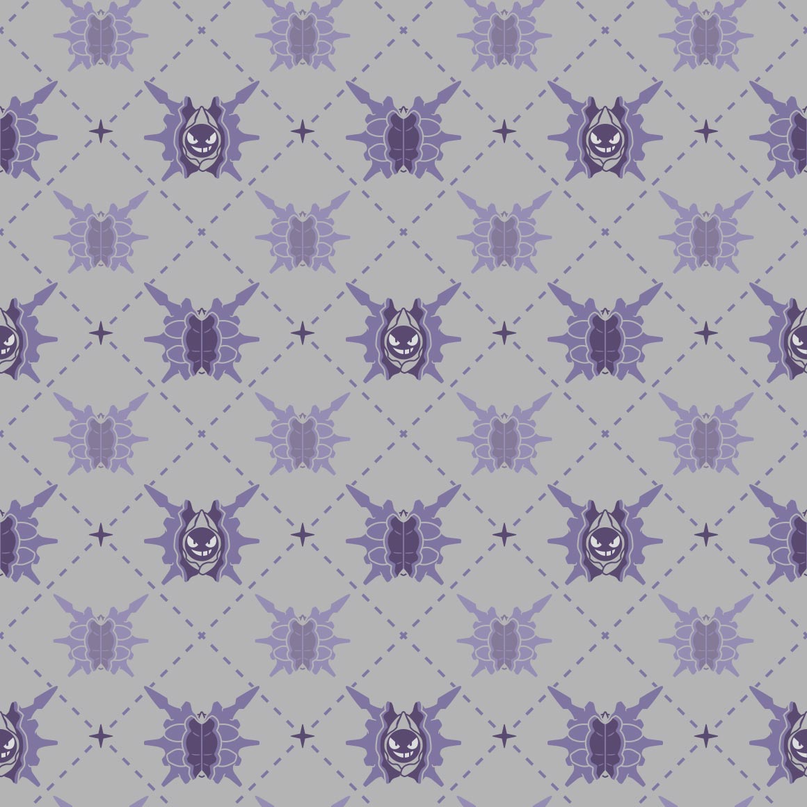
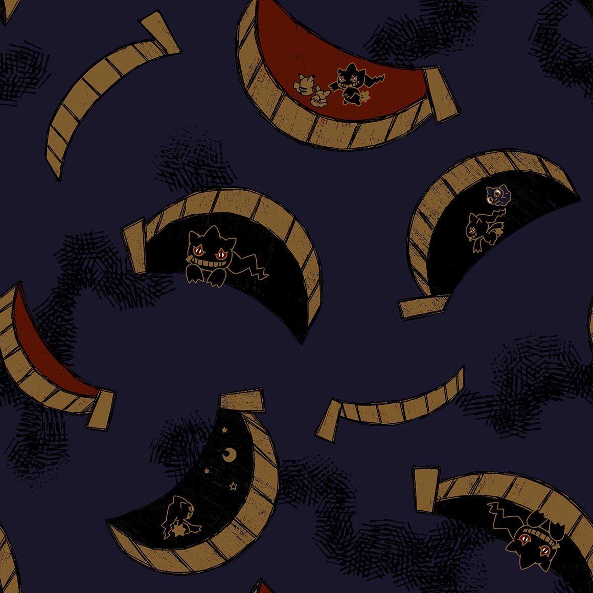
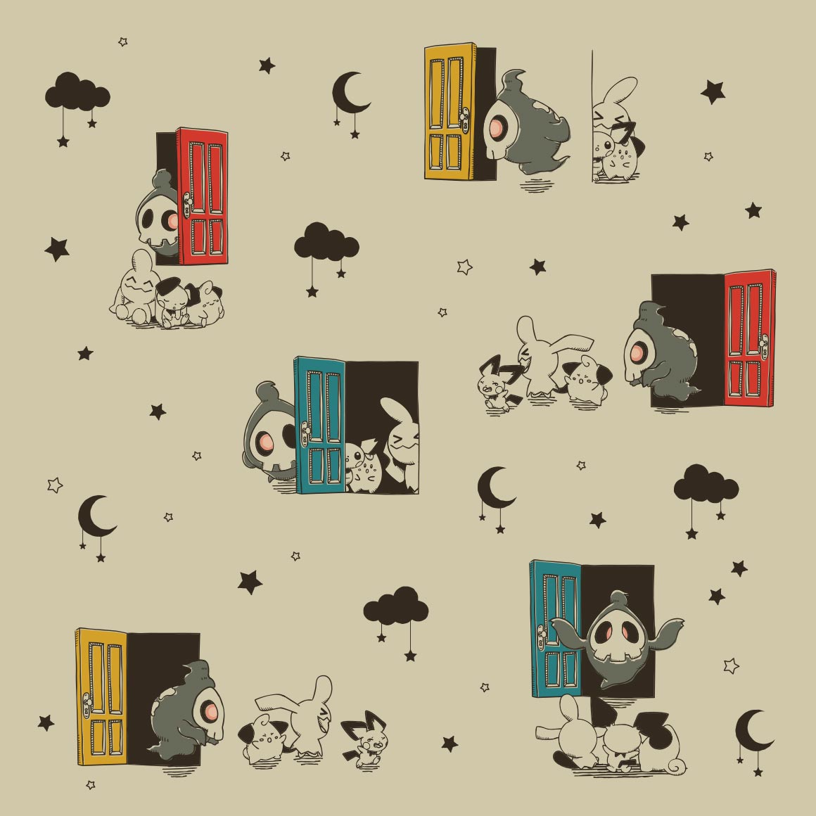
cofagrigus what are you doing here
they couldve had every empty space and full space be haunter but they didnt go for that i guess
its nice
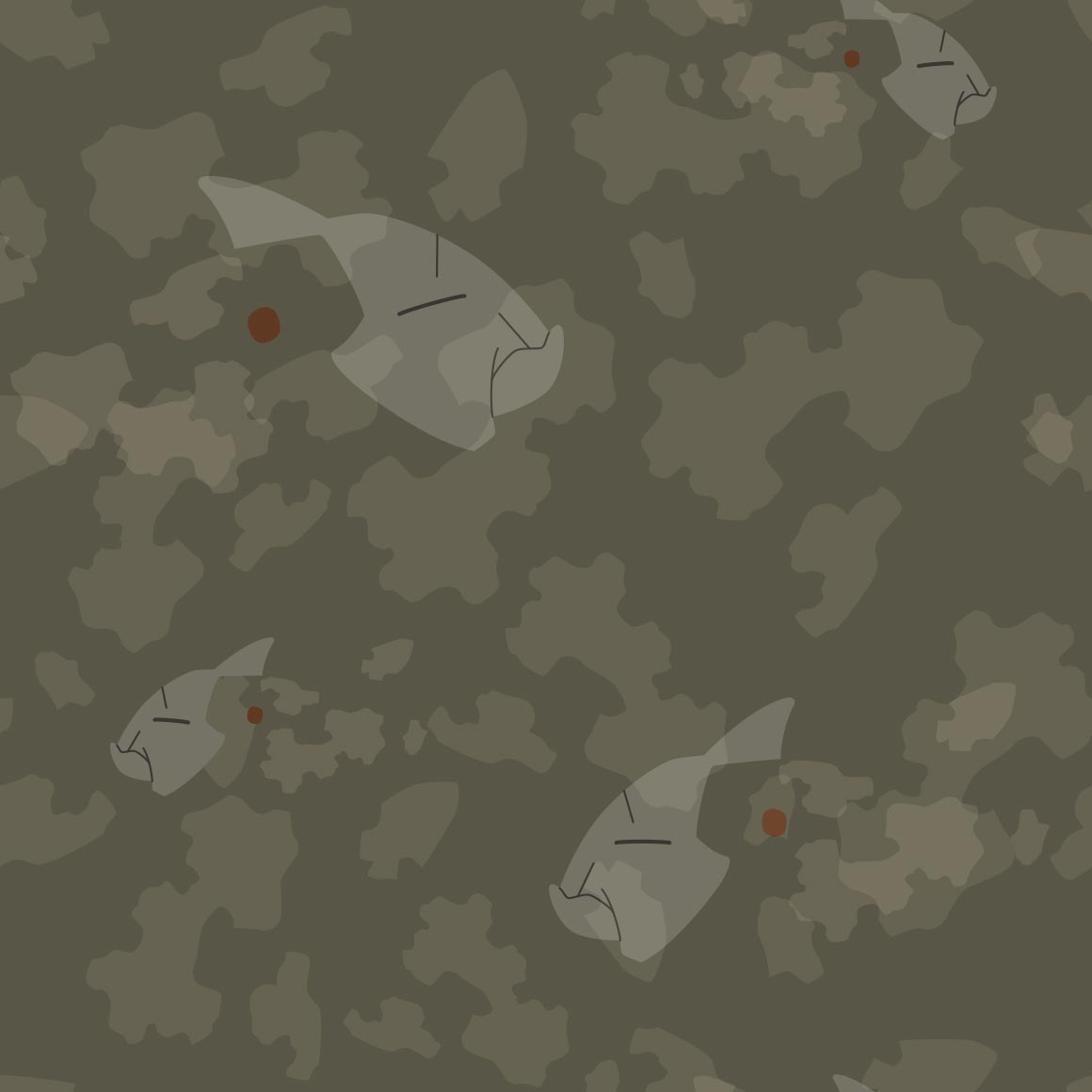
this hurts my eyes and also where is onix

it looks nice
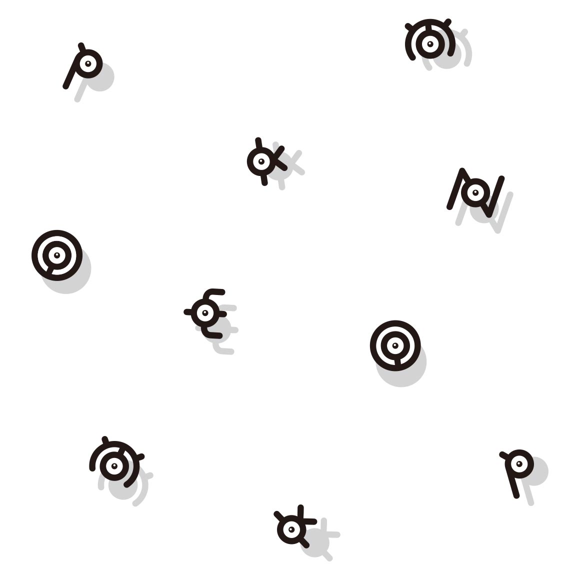
i like how the empty space is z's
love the art! very nice
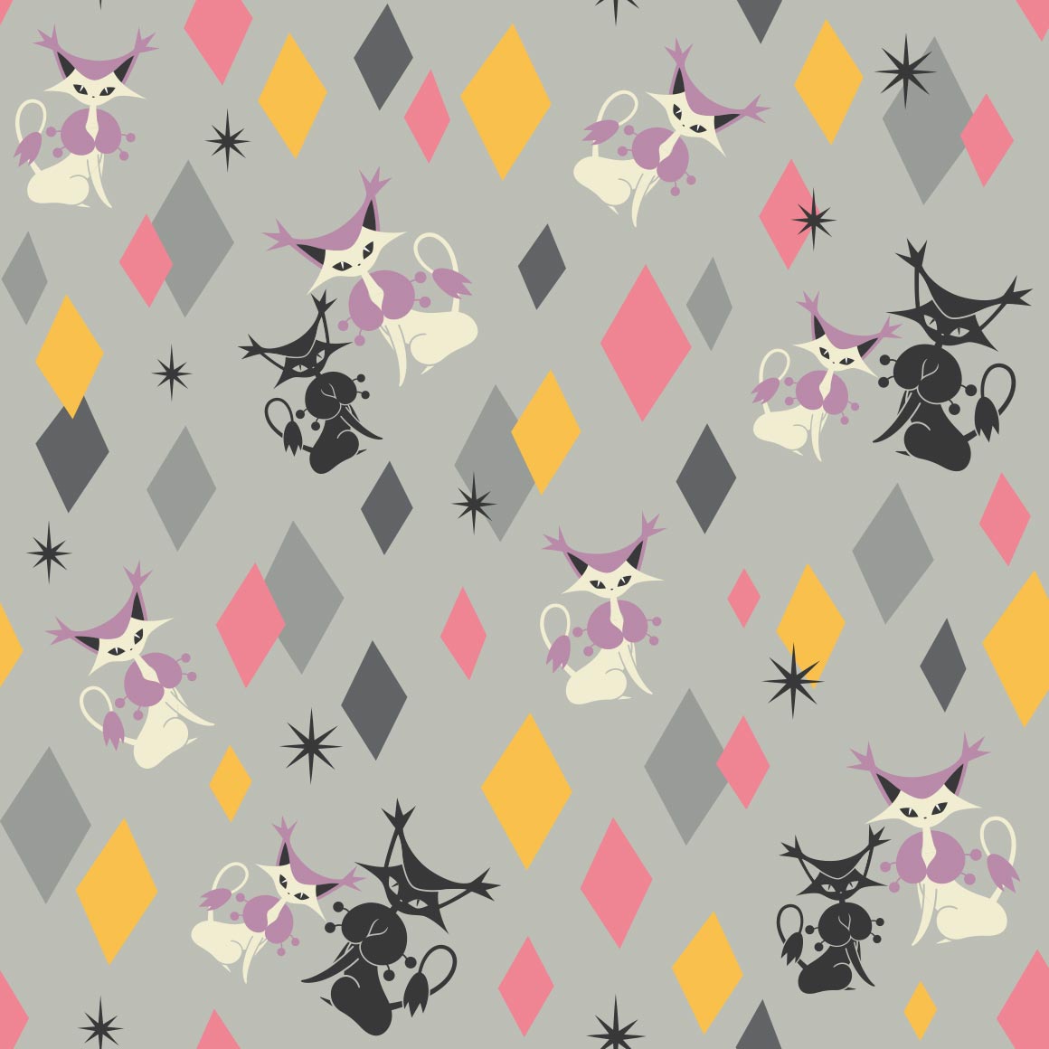
this is like either the persian art but even more mid
voltorb is hiding! can you find him?
i love the art here its so sofd
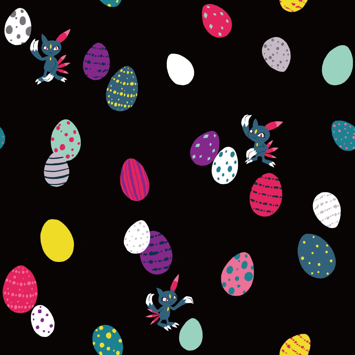
only a few eggs
where is alolan exeggutor its been on so many other pokemons art but its not here??
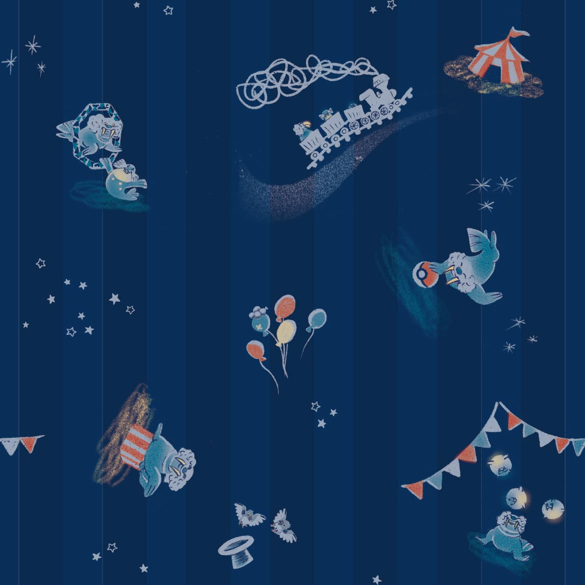
oh god fearow is there because it Eats Cubones
mandibuzz is also here because it Eats Cubones
its nice, do you think the other hitmons + tyrogue match?
hitmonchan at least does!
:P
round and for what reason, wait on second look its actually NOT round, but pretty rounded

funky, i like it
kind of a boring pattern
what is with these shirts and making the pokemon really hard to find in a bad bad way
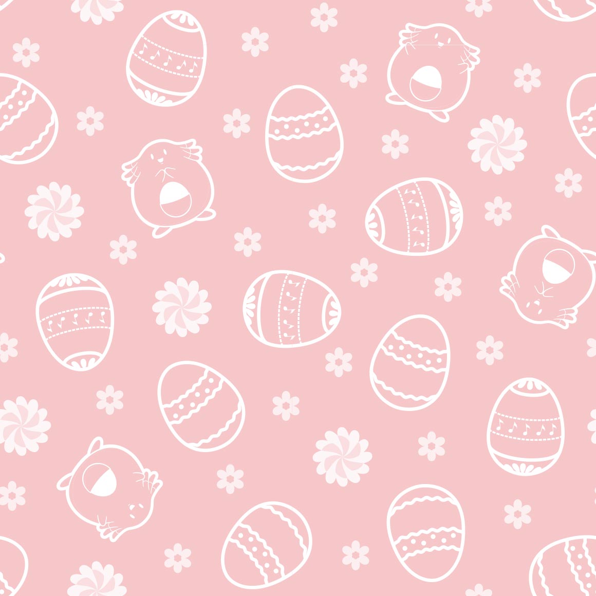
egg. HAPPY EASTER
see at least this one works with hiding the pokemon bc its tangela
oo same art style as raticate, chanseys there too
its hard to see anything but horsea and thats kinda bad
Interesting. art style. it does pop
something thatd be on a bandana
dude this is even more like the last description i put huh
i like this one! its very nice
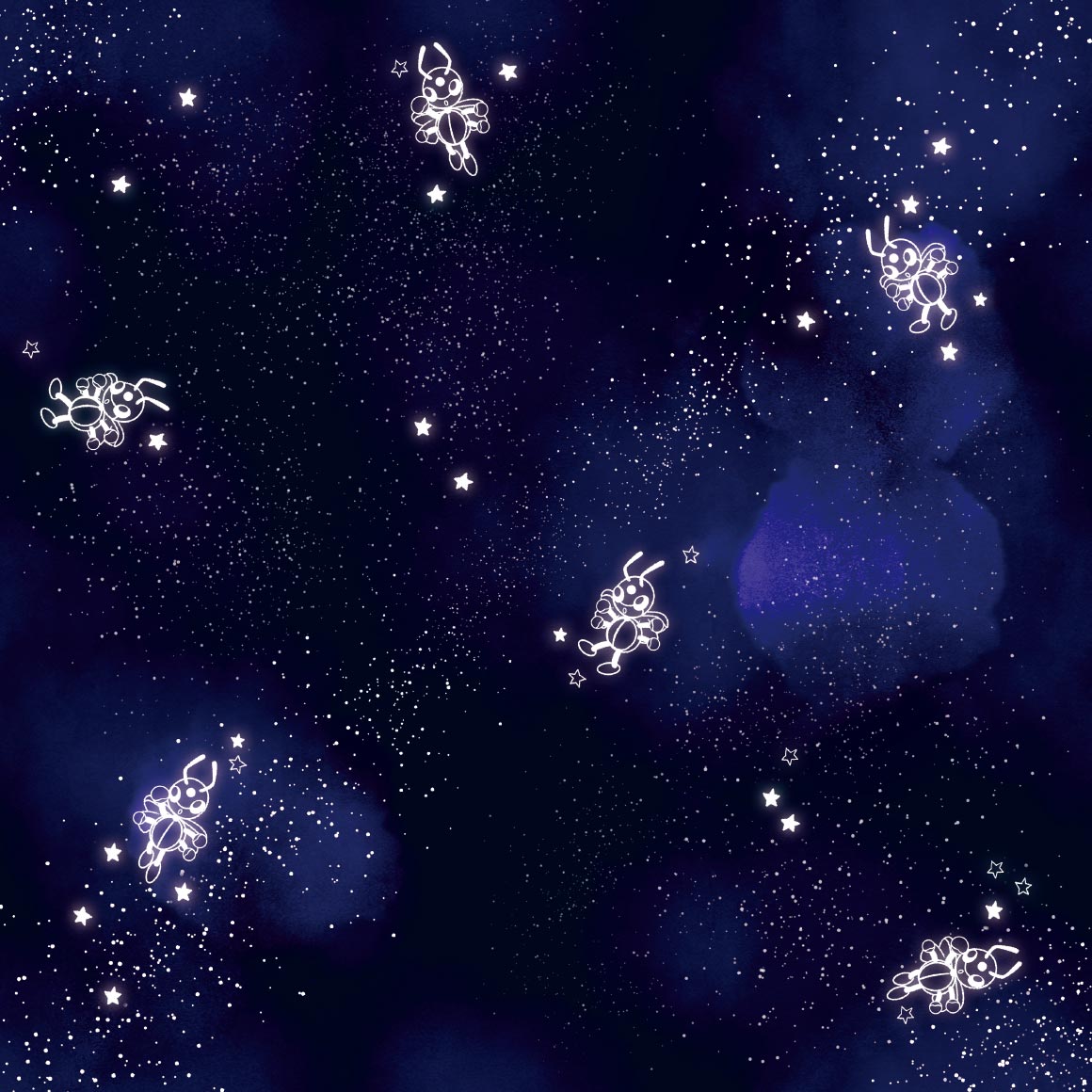
we are in space (and shellders here too)

hehe its a fake transparent pattern because mr mime makes transparent barriers
most generic scyther art ever smh
its ok
this pops but not really my style of clothing. my sisterd like it though

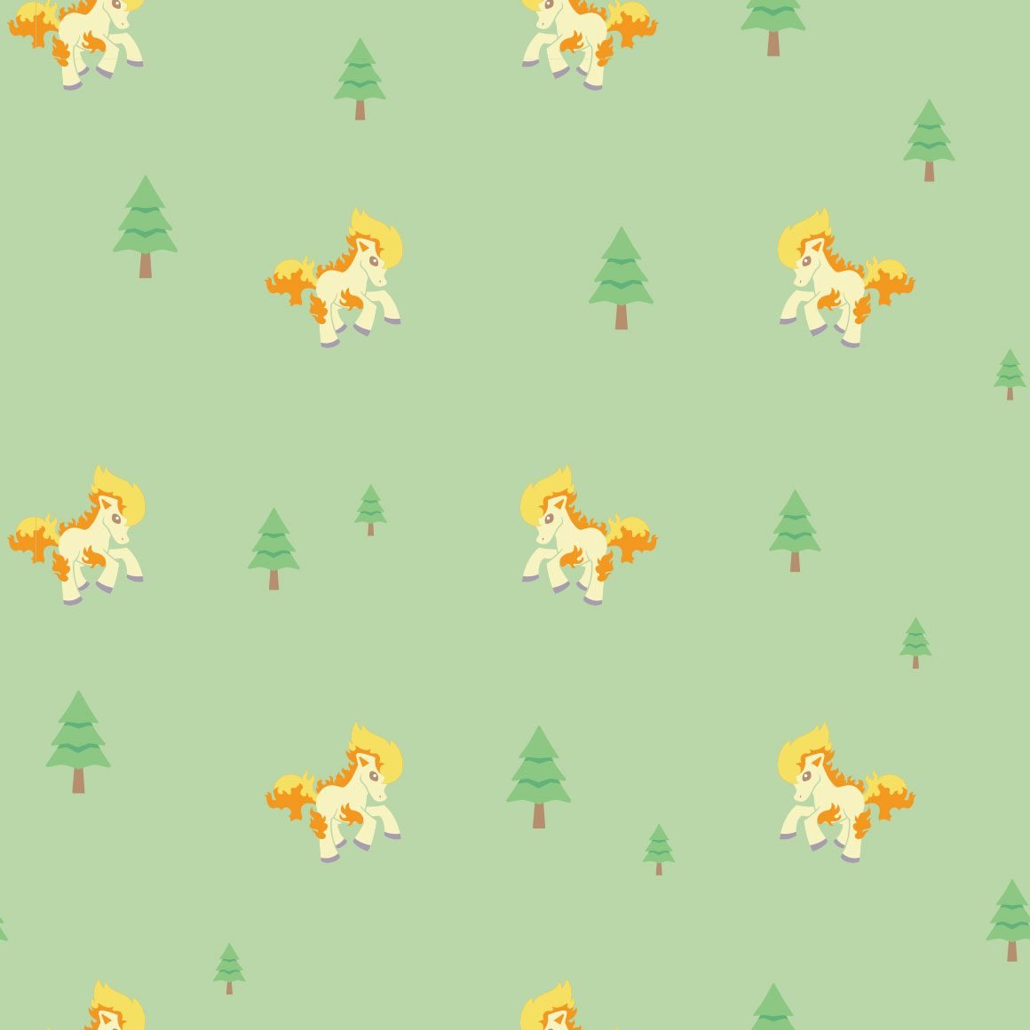
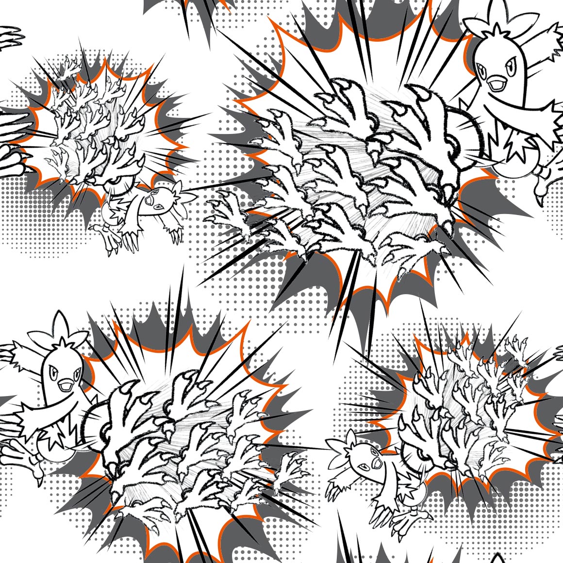
hehe its shooting the fire

this kind of sucks
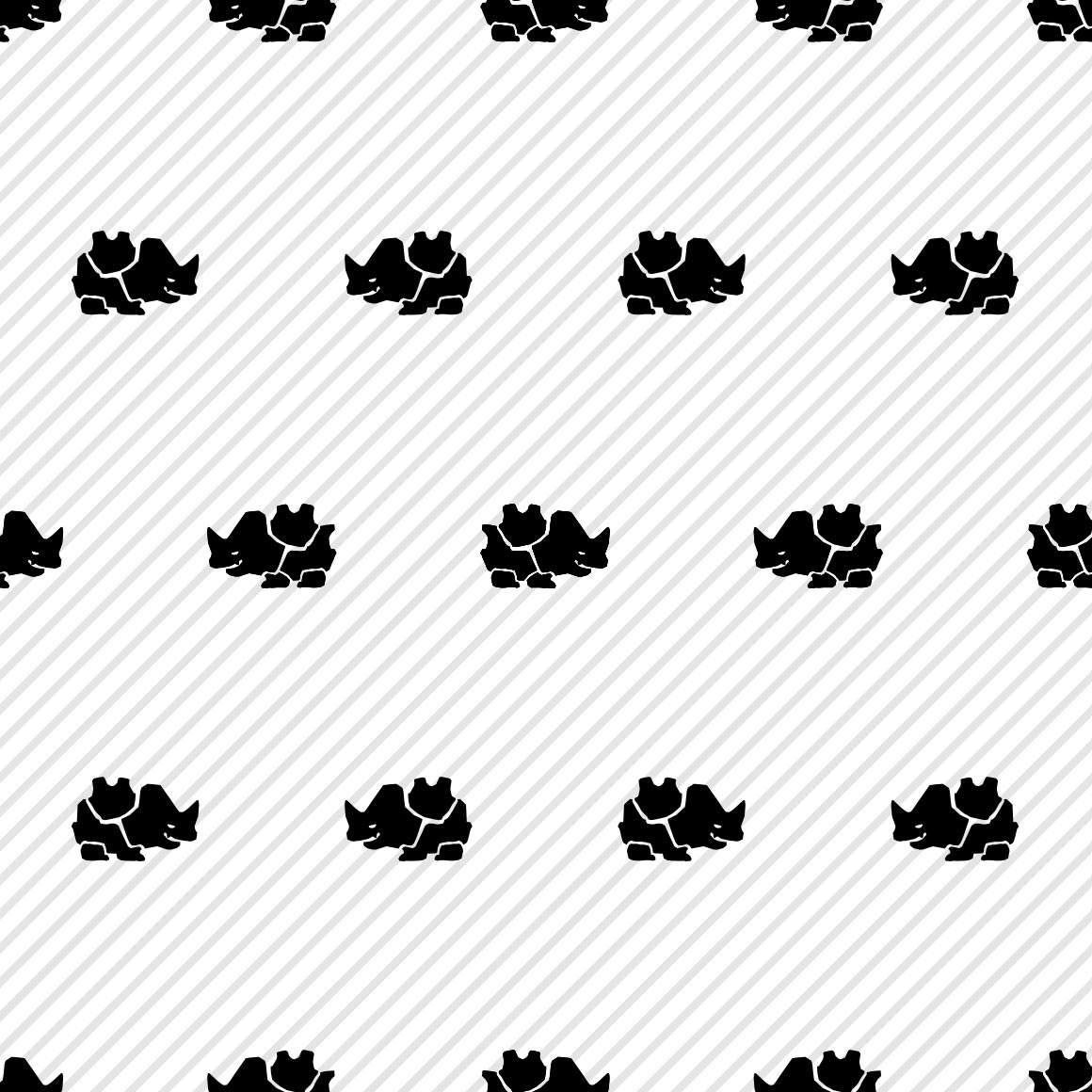
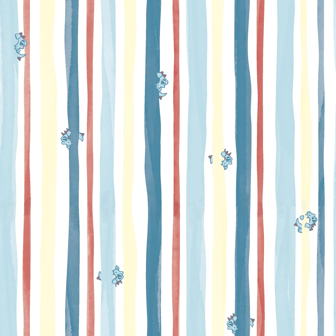
ill be honest this didnt register as tauros at first i was like what fucking regi is this
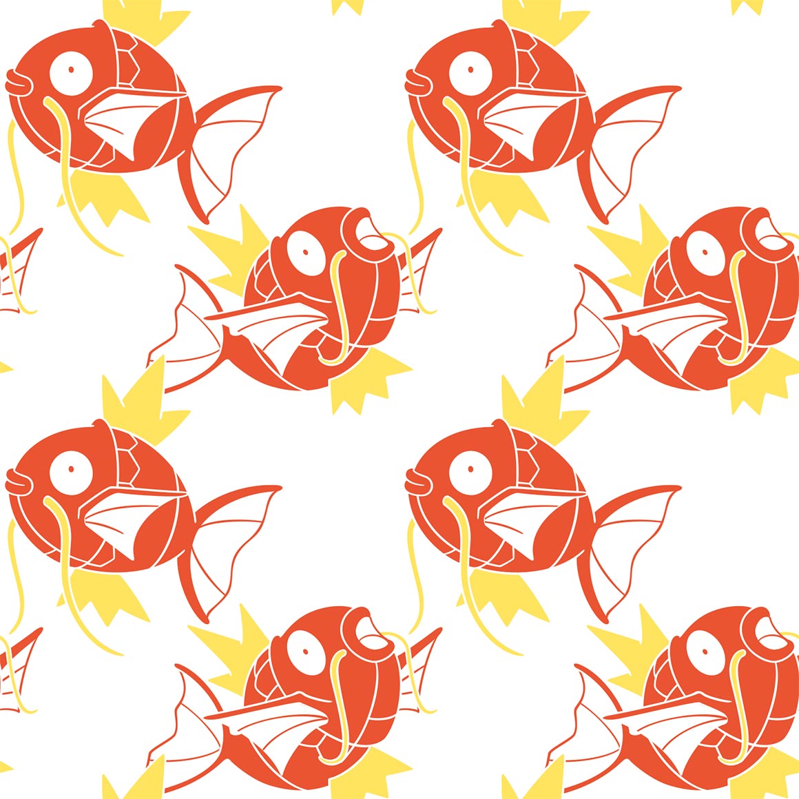
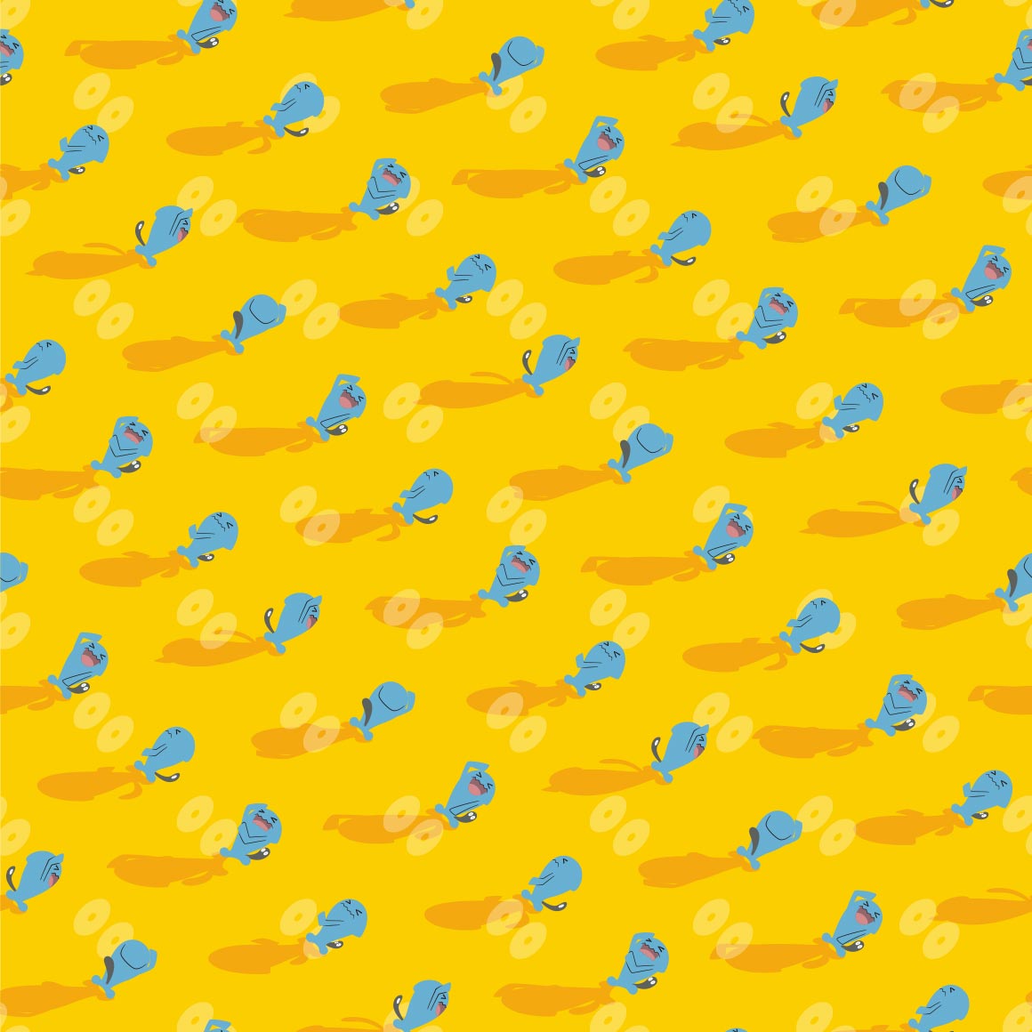
sure is magikarp
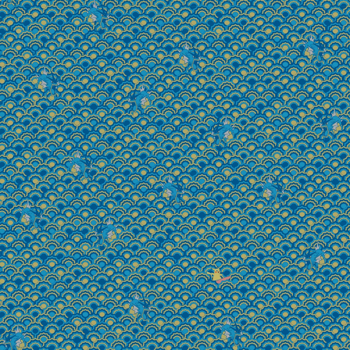
wow they really used stock art for GYARADOS huh
not sure if same art style as the raticate and kangaskhan but i like it
this is so soft and sweet :sob:
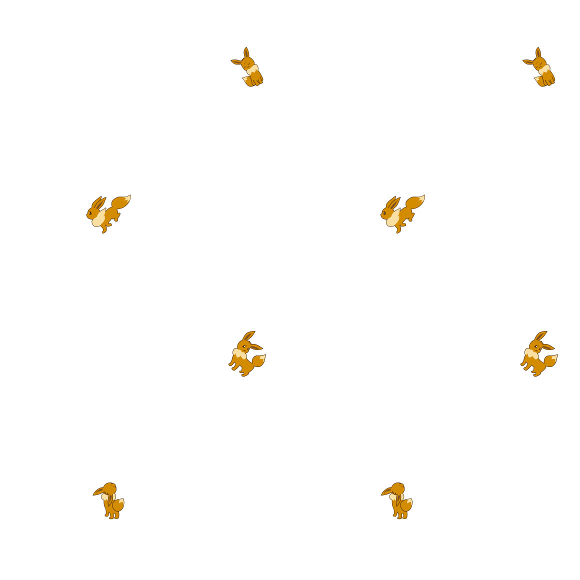
god please tell me not all the eeveelutions follow this sucky pattern
OK GOOD THEY DONT. this is really nice!
and this one sucks!

colors are nice?
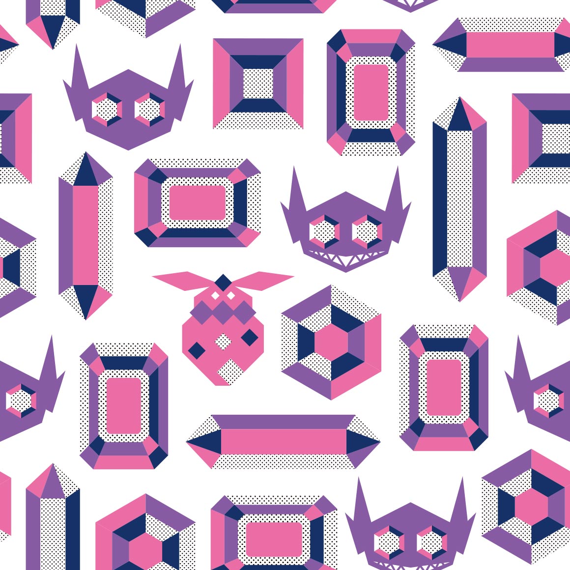
wireframe. nice
dude the colors are so nice as is the pattern. i love it! lets hope kabutos just as good

he looks emaciated :sob:

i know they cant do the spiral pattern for kabuto but they couldve at LEAST done something similar :sob:
this is nice though, step up from omastar
Eh

he is melting into the pattern oh no
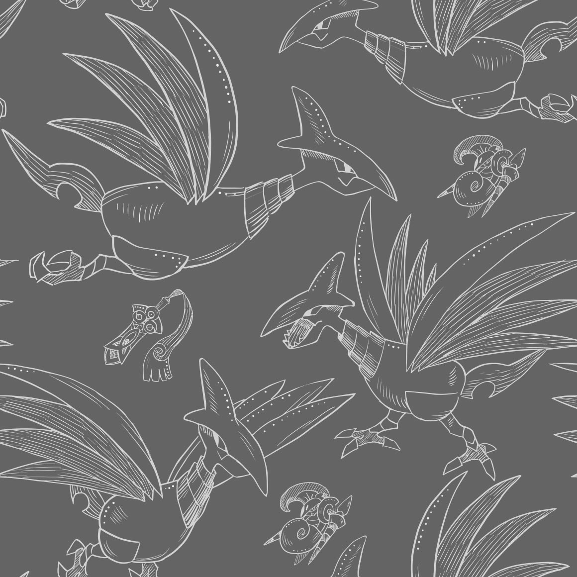
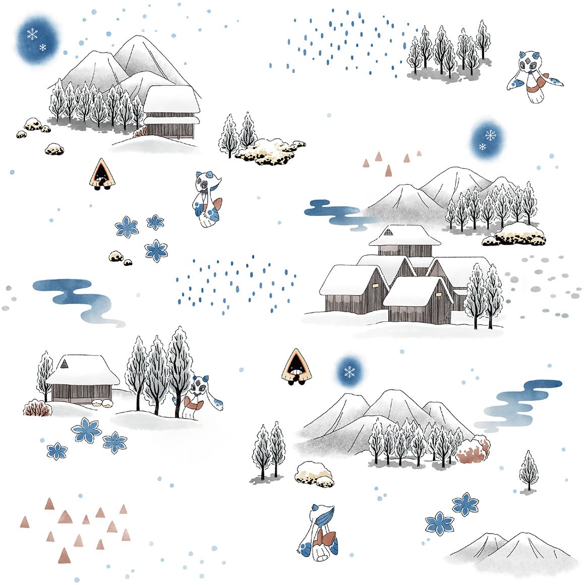
did they try to mimic pokemon gos art style for these birds here? we will see with the others
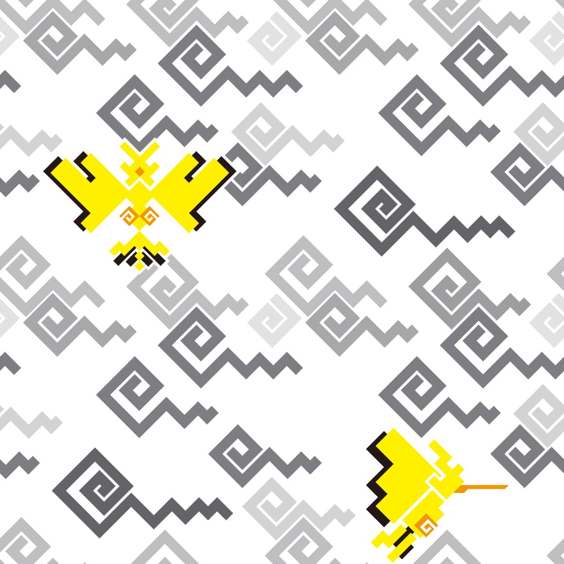
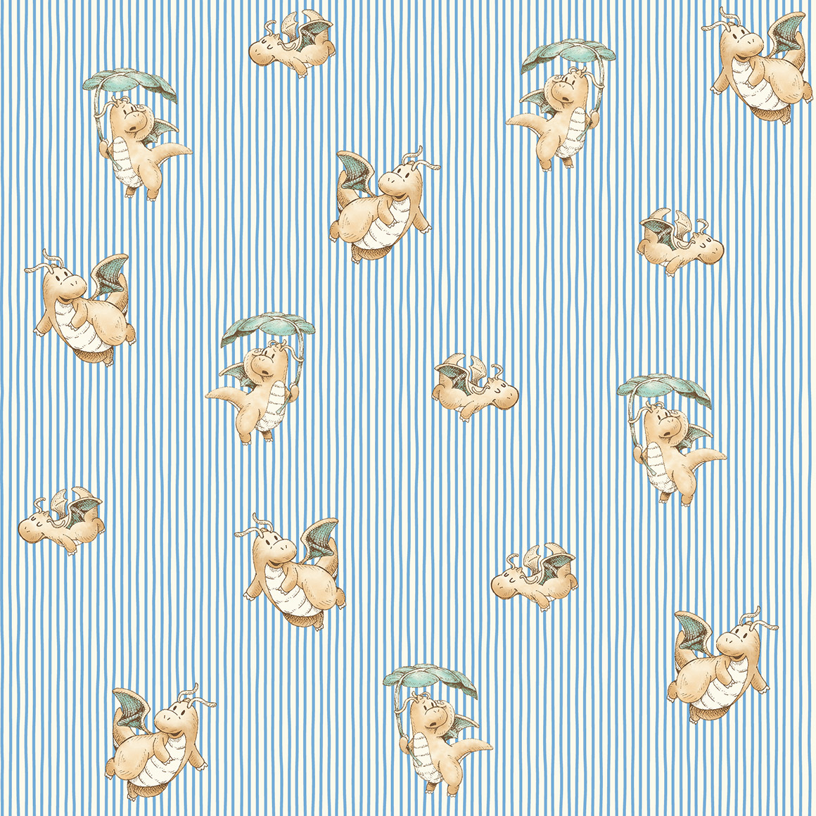
clearly not. as zapdos is way better than the articuno shirt. i like this one. looks very Hummingbird
thisd make good stealth merch..
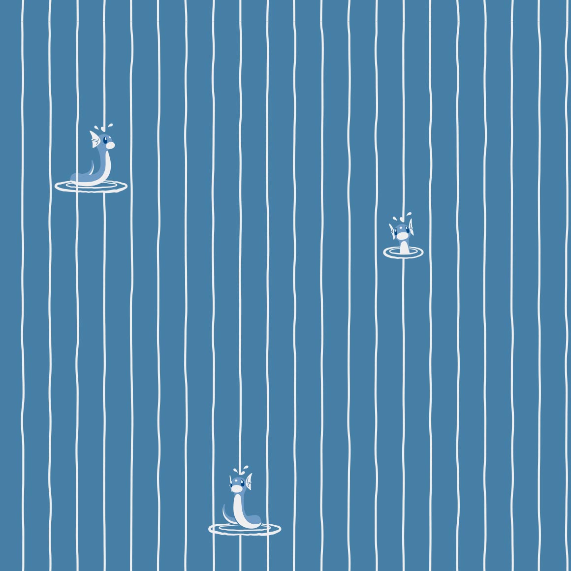
water on his head but he doesnt care, kinda a boring pattern though

this pops but again i wouldnt wear it, not my style
again with the old childrens picture book artstyle! its very cute.
this looks like a aesthetic post id see on tumblr! its very nice

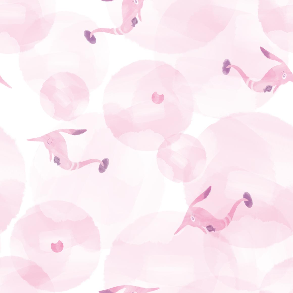
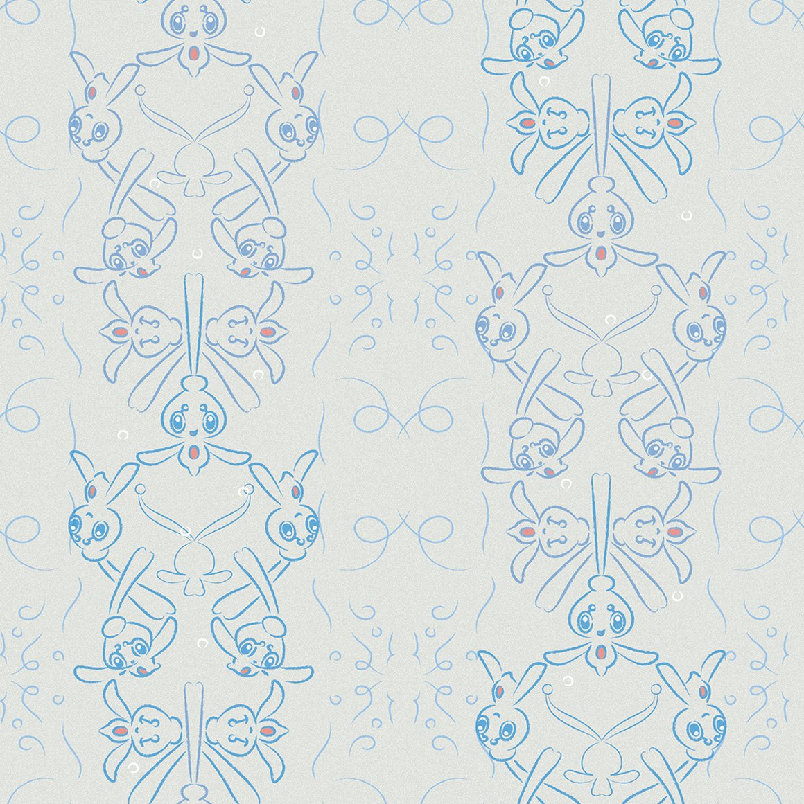
hehe shiny mew. very nice
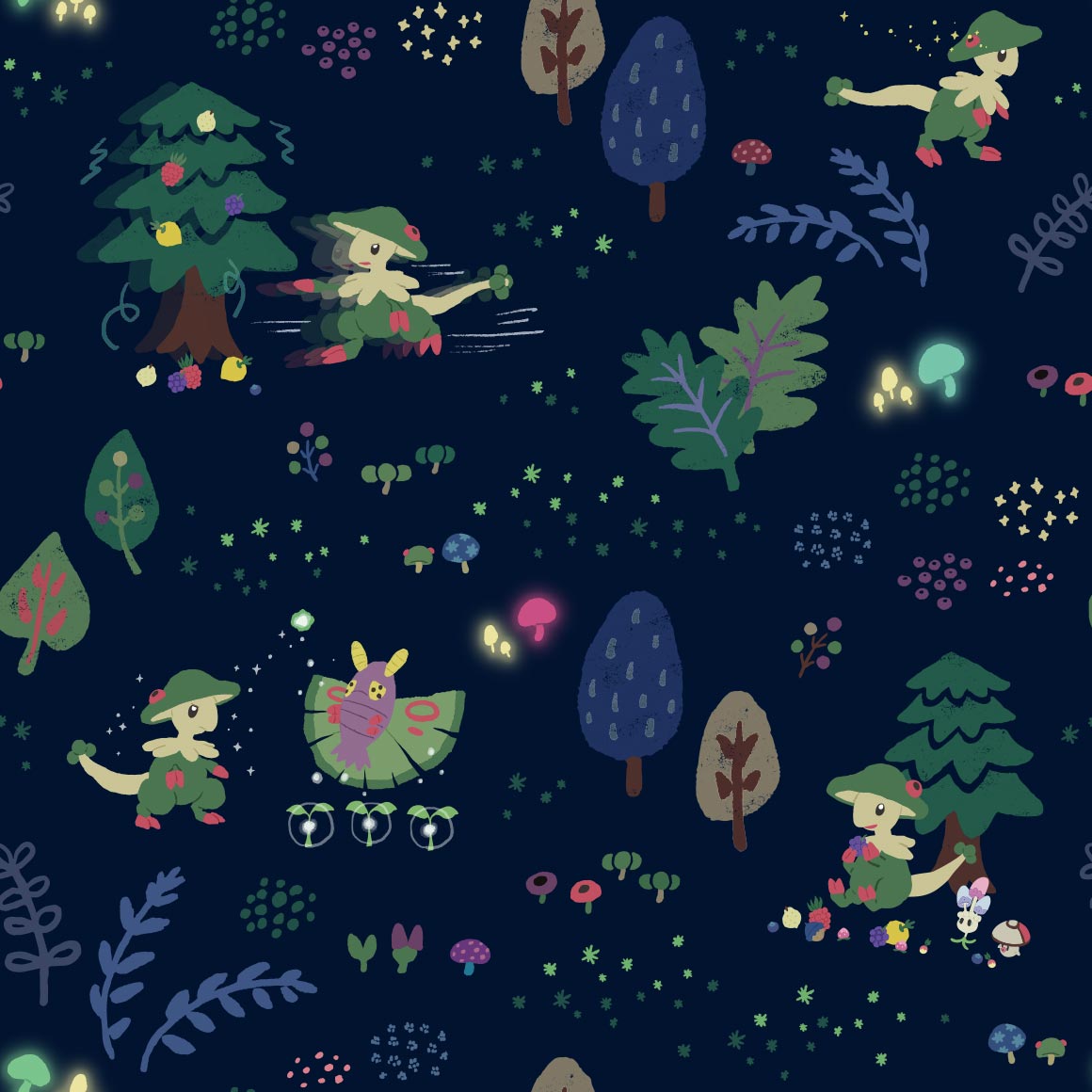
gen 2/johto

a promising start to a new set of patterns. nice colors and lineless art
seems we are continuing with that style for bayleef, nice because kantos lineup didnt really copy styles for evolutionary families, wonder if meganium will too
it doesnt but i dont mind. its very nice, something id see on a bandana given to me by my mom
lots of inactive cyndaquil then a couple erupting ones. nice
this style doesnt really work for quilava in my onion

its hidden between the flames and somewhat hard to see. they fumbled the rest of this line. shame
cuuute. its gnawing on the columns!
i dont know what to call this art style other than I like it
thick line art once more, though this time more pointy
the colors are very pleasing to the eye! i love it!
kind of cluttered but it Doesnt work here.
hes just eyes
i like it!
ledyba looks so derpy here (can i say that? its 2024 can i say that? or is that too 2014) wait is vileplume here too?
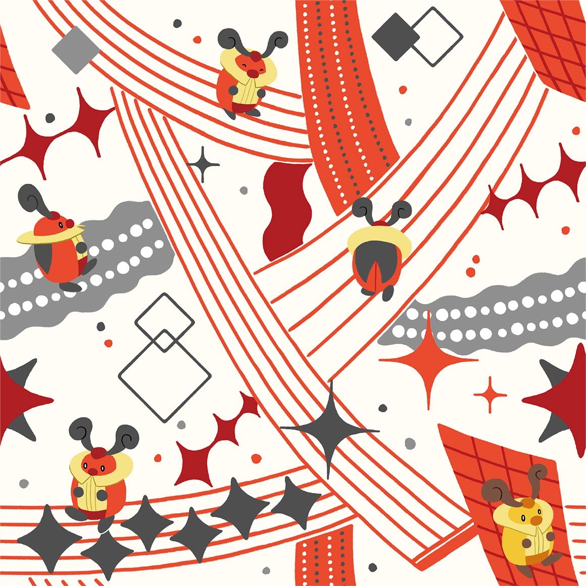
this fucks severely, but why did they give LEDIAN of all pokemon this good a pattern
its kind of hard to see the pokemon. on my pokemon shirt
storybook artstyle again! nice
i didnt realise crobat was so early in the johto dex god damn. nice pattern tho
its nice? not sure what else to say
we are in space! again. very nice
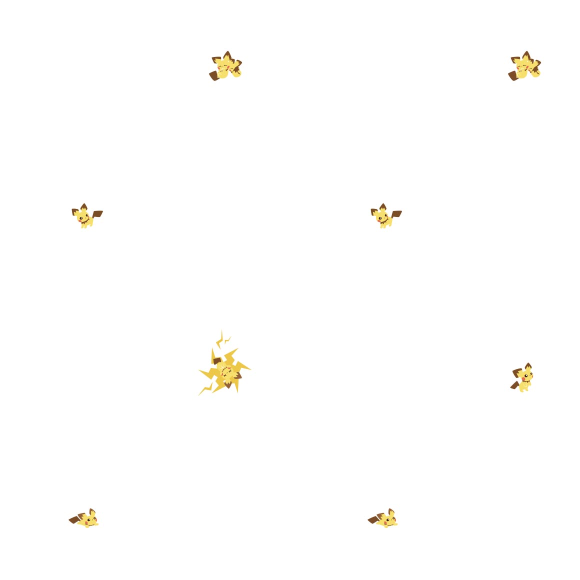
very sparse, just like pikachus. shame
this is so cute :sob: hi minior too
they went with a poliwag approach instead of what i was expecting! its very cute, id wear it.
is this supposed to be togepi?? its not spikey at all..
this is so soft and sweet, very nice
natu
oo they made it into an egyptian hieroglyphic pattern instead of what its actually based on! its very nice regardless
very cute! plus theres a shiny here, so points for that, love seeing shinies in official art. WAIT I JUST NOTICED THE NAKED MAREEP thats funny
oo more neon sign style. nice. it fits with flaaffy too! (but why is alolan exeggutor here?)
interesting pattern. i like how they conjoin!
well you definitely see the pokemon this time, and its nicer looking than vileplumes
so many cameos by other pokemon! i love the art here its very cute
uh ok i guess, strangeish
interesting. art style, wonder if bonsly will follow up
the art of the pokemon is cute but the colors and pattern kinda suck
this is so cute! another bandana pattern to me
interesting?
so soft! just like the pokemon itself

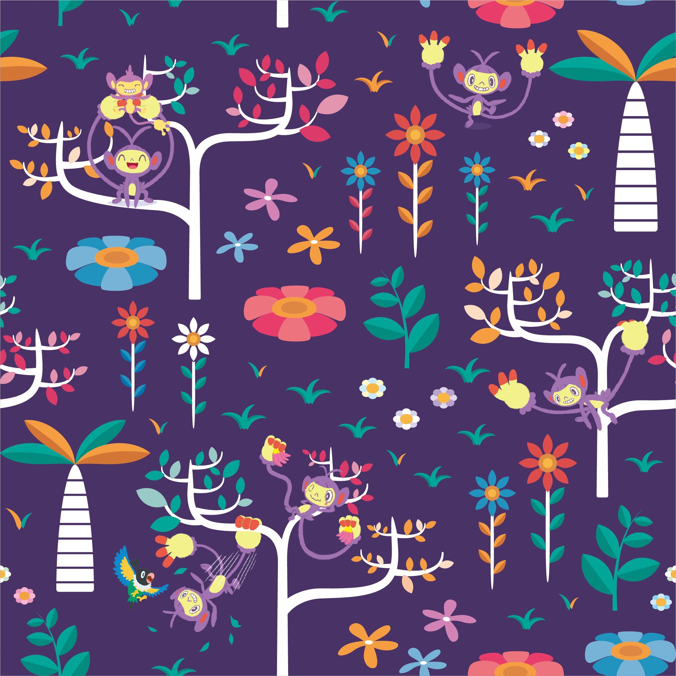
im not really an aipom fan but this is nice
this is like the lickitung shirt! but with a single variation

watercolors i think? nice
id wear it

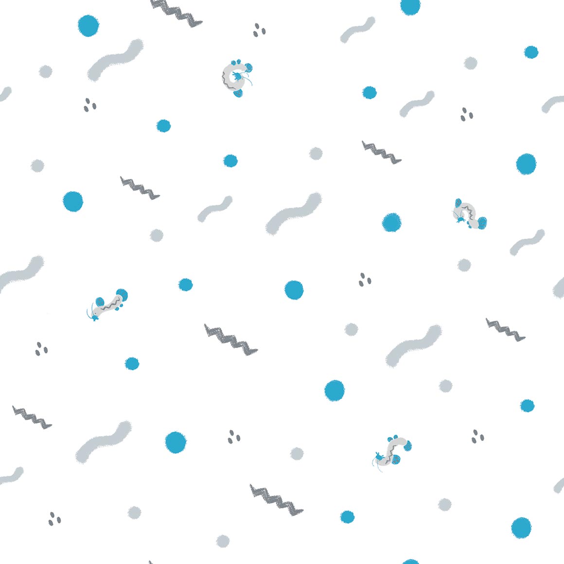
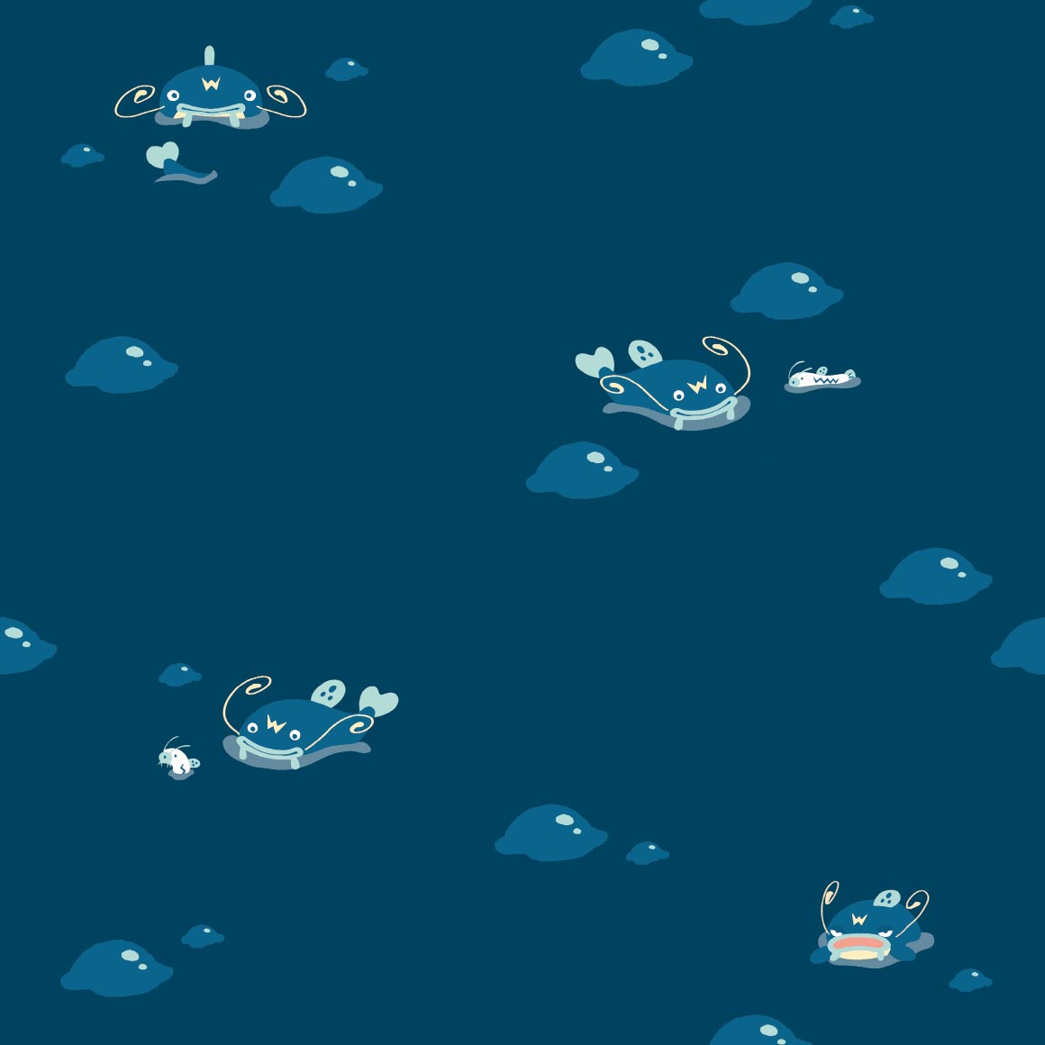
very nice pattern and colors! but at first i was gonna complain about why corsola only got one slot on its own pattern (before i realised it was woopers)
plaid, quagsire flannel would fuck tho
i love this one, at one point i had a shiny edit i did of it as a background to an older website i made
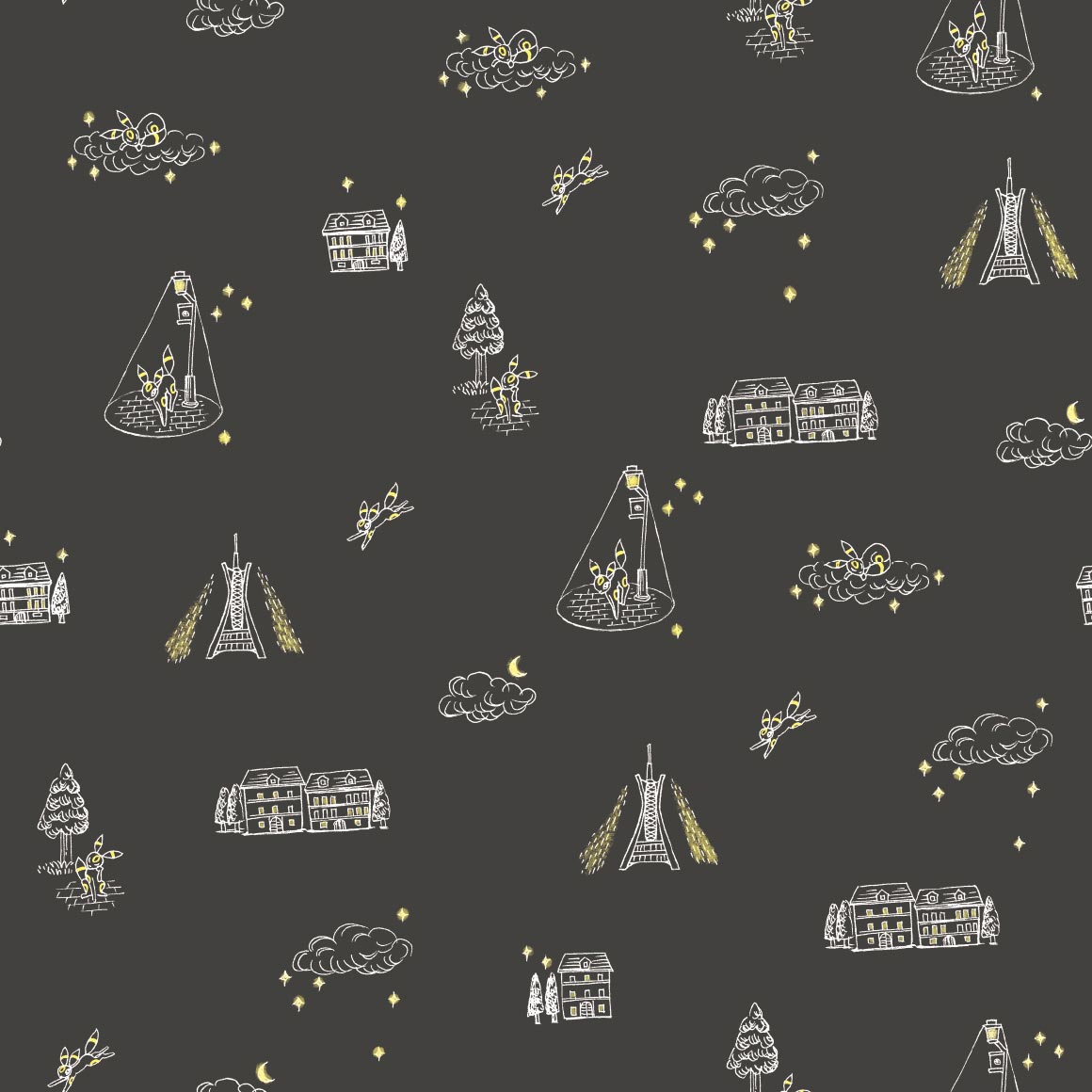
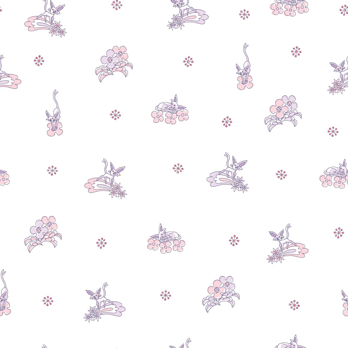
it looks nice, its sure umbreon colors
huhu pixel art
slowking is barely on its own pattern! slowpoke is more prominent and visible than it :sob:
strange choice to not include the face, considering misdreavus is a floating head
hehe they spell out pokemon. itd be a fun shirt to wear!
whats with the yellow :?
these look like scratch and sniff stickers that are also fuzzy
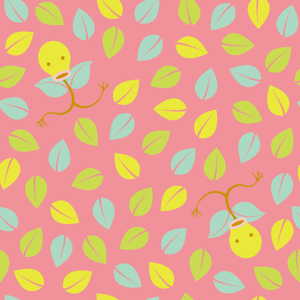
missed opportunity for pineco to be with pinecones or in a pine tree... why pineapples.. ludicolo is already a pineapple
after having no plaid/flannel in kanto, there sure is a lot in johto! (only two so far. still a lot)
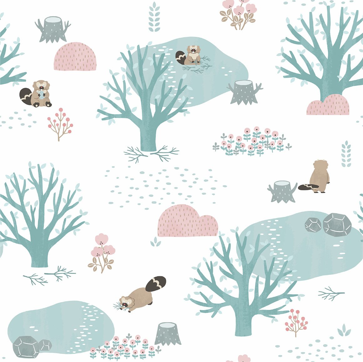
very cute, its in tunnels with diglett and dugtrio about, though i wish it had more poses
not a gligar fan really either but this art is so very nice! it reminds me of youtube animations of like. mid 2010s
once again onix is outclassed by its evolution in every way
this is cute, more bandana art
i like the colors! its very cute too
hehe the waves are qwilfish tails
its pretty hard to see scizor in its own art huh, at least the leaves have its claws too
kind of a boring pattern but its nice to look at
i like this one! another ive used on a website ive made. vikavolts here too
whats with the easter eggs :?
obviously the teddy bear pokemon would have a old childrens book artstyle! still nice, and combees there too
this pattern sure pops
im not really sure what to say about this one its just like paisley esque patterns and a few slugmas
they actually did paisleys for the next one!
very boring pattern but i think it works here
this one sucks though
hehe shiny corsola and some strange yellow variation too
ive seen this style before but i dont know the name. very nice though
if you had no idea this was pokemon youd think its just a normal shirt! shiny is there though, as is miltank
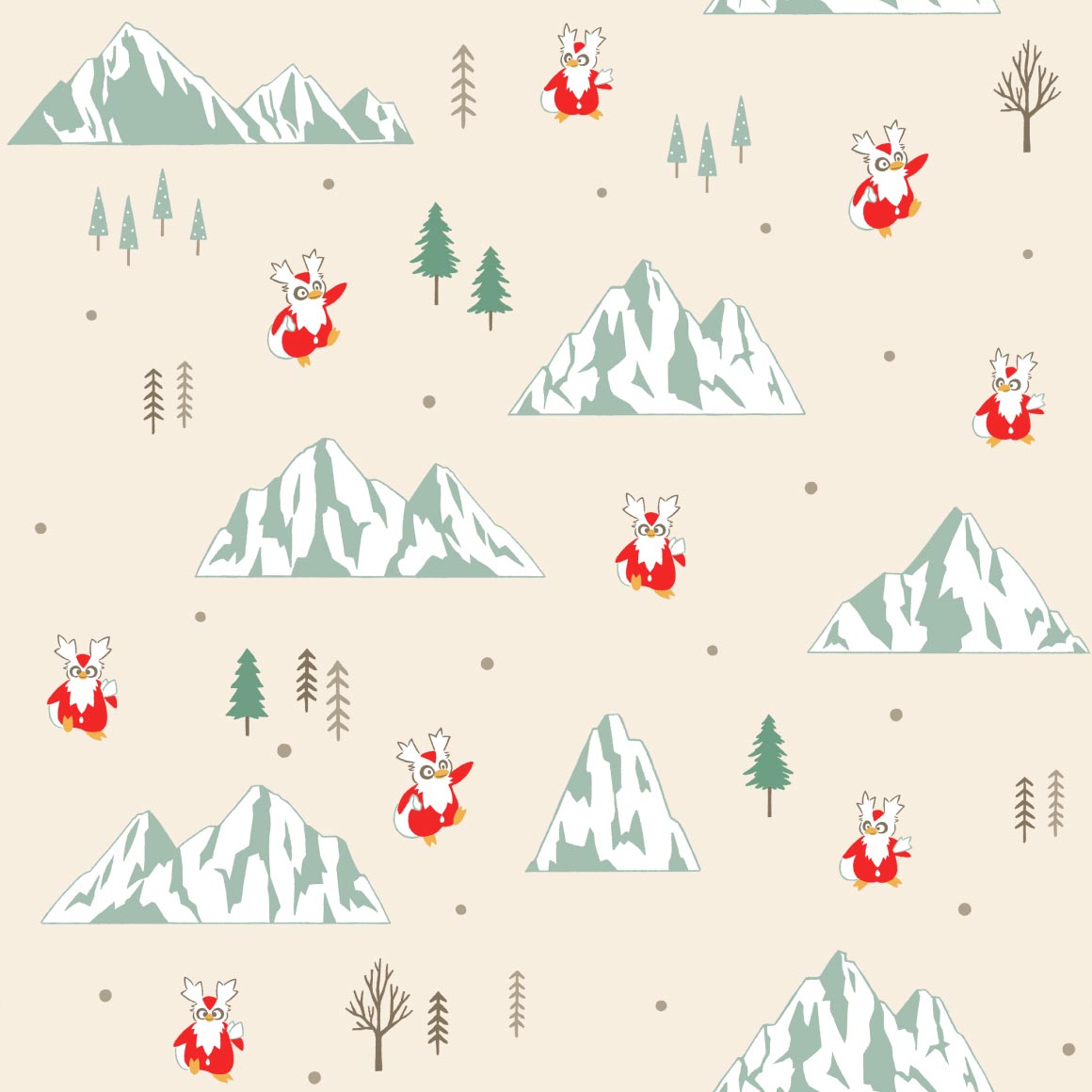
christmas wrapping paper pattern, fitting as it IS delibird
string
strangely detailed for a pokemon shirt that only does a outline
boring pattern but im sure someoned wear it
oh is it corroding because of the venom in its bite? cool!

eh i expected more from a kingdra pattern
very nice colors! and the columns have its little nose there hehe

looks like something youd see in video game ruins on the wall
hehe its body is the 2
dare i say trippy
this is cute! i like the colors too
oo they did continue the hitmon themeing!
glad they did
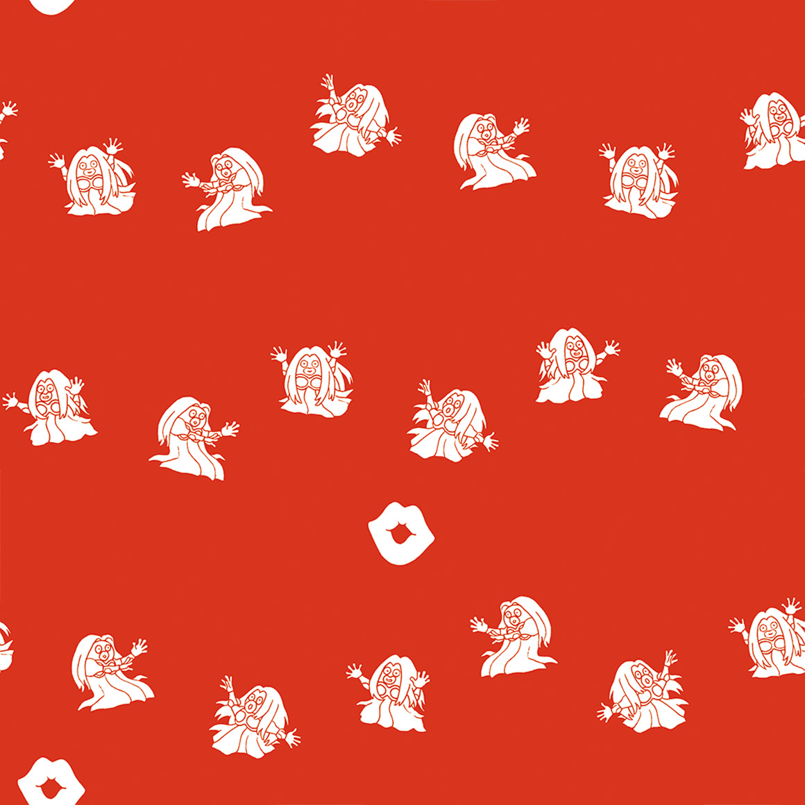
this pattern is so fucking nice and for what pokemon? smoochum? if you told me itd get one of the best patterns id assume you were lying.
the fake 3d effect kind of hurts my eyes but its nice
they did it with magby too??
christmas wrapping paper type beat, unfitting this time
this is cute
wtf is that thing in the bottom middle
i guess all of the beasts have a pattern like this. a shame
yep
this pops and is very cute, for a strange choice of pokemon
whats with the cactuses? colors are nice though
the negative space IS the pokemon!
its strange looking, but i bet ho-oh follows suit
like clockwork
love the colors! but its hard to see celebi.
gen 3/hoenn
another promising start! i like how it interacts with the spaces and columns
kind of hard to see grovyle, but thats clearly the intent.

big fan of the colors but not a fan of sceptile just kind of being strewn around randomly
unique art for every pose, thats a first with this many poses! very cute art at that too
comic book panel
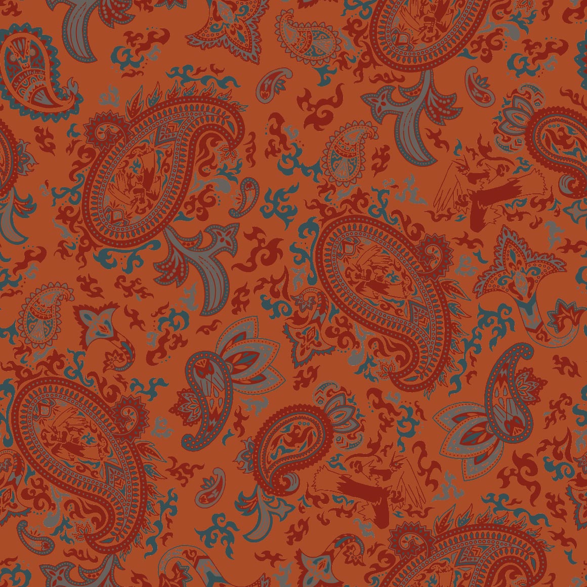
blaziken is a strange choice for paisleys
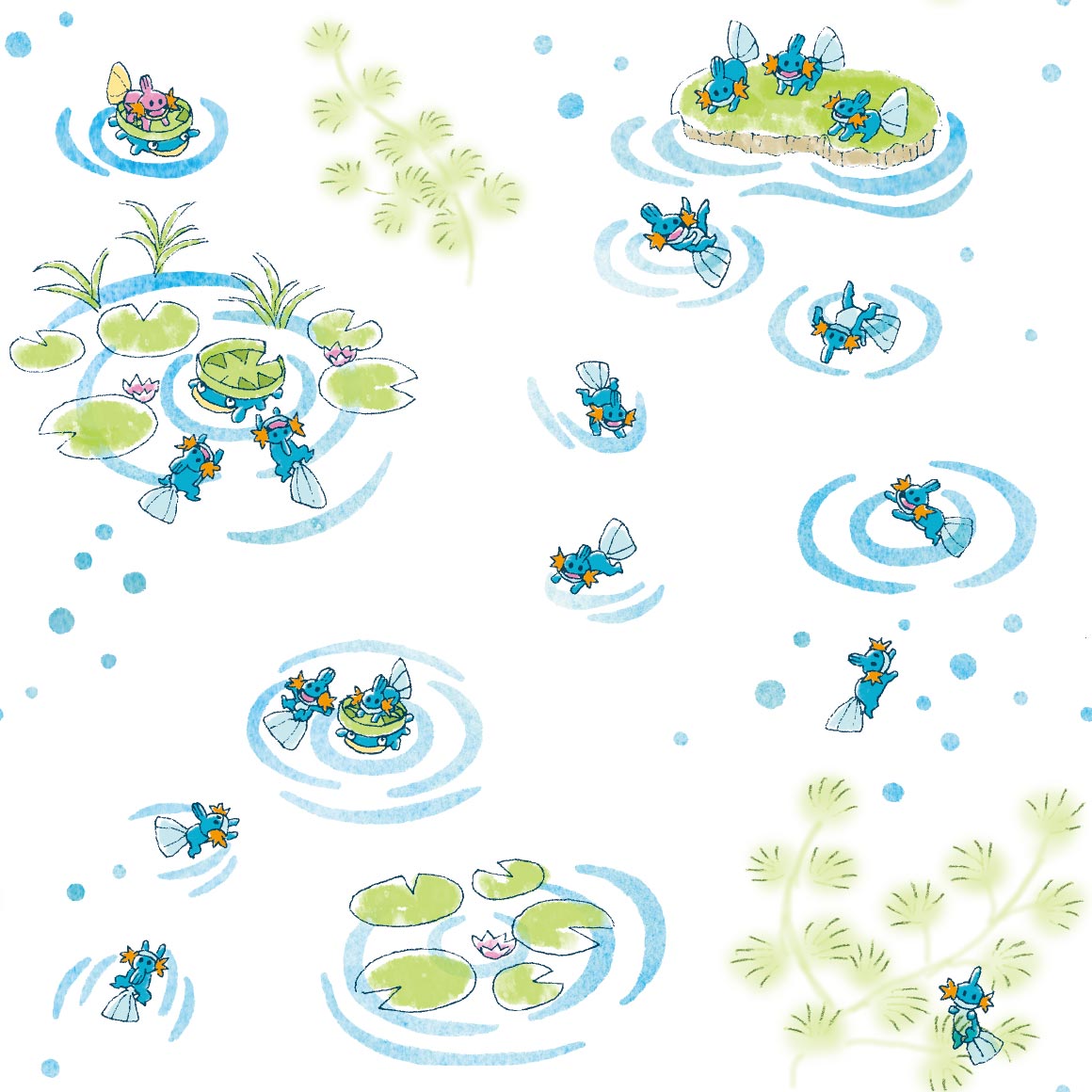
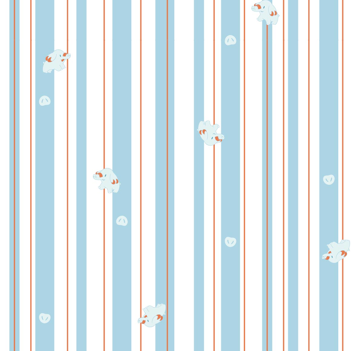
this is so cute! and theres a shiny mudkip here too!
im not sure what this reminds me of, but it does of something
its pushing the rocks!
the pattern is tiny poochyena heads! i see, though the actual heads are kind of just strewn about
this is very nice, though not something id wear
reminds me of cookies but im not sure why
its running on the lines
its also climbing on the lines! and theres a few shinies too!
its a struggle to see silcoon
whats the deal with the differently colored ones? its not shiny

its nicer than the silcoon one thats for sure

strange choice for a neon sign style but its very pleasing to the eye
this is so sweet and just nice to look at

are these all shiny??? its very nice
i want more patterns in this style. not a single repeating drawing, its so nice. why did they give LUDICOLO out of everything this style and privilege!

cute
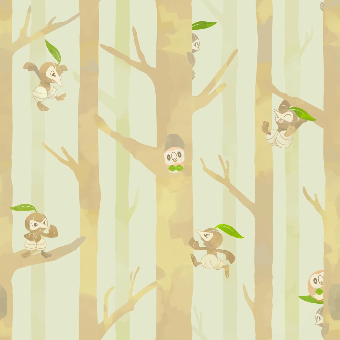
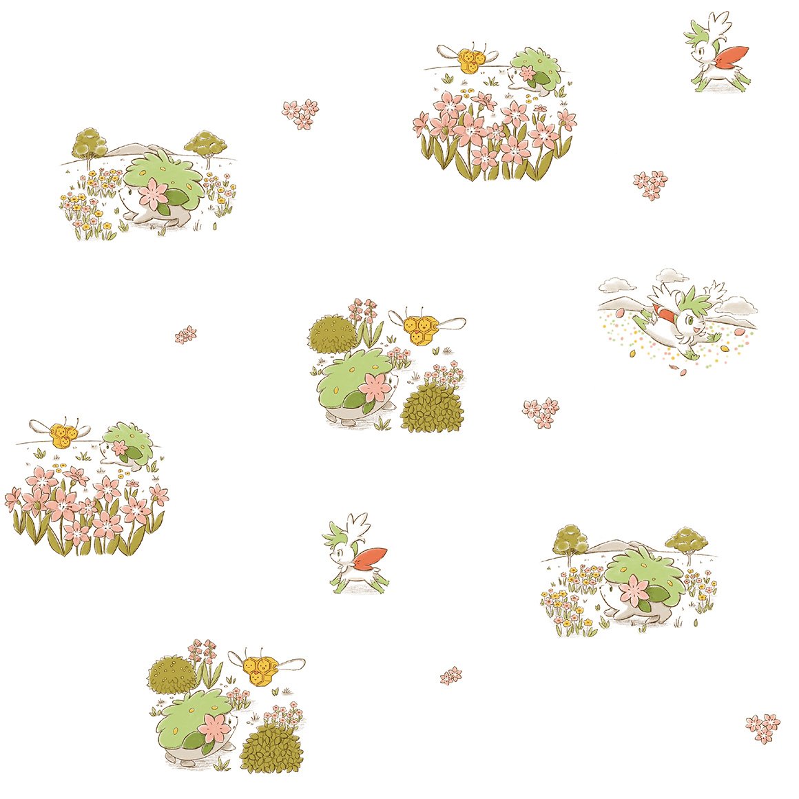
noticing a lot of unique art this generation! very nice. rowlet
tattoo style

very nice colors! oh no wurmple is going to get eaten
kind of a lot going on for my tastes, in a bad way
well at least theres a shiny... very Nothing pattern

dammit why did pelipper have to have cute art
very cute, lots of gen 4 cameos

not a fan of how the pokemon are just dropped wherever
very nice to look at
i think this is my personal favorite from this generation, though we are only a third through. i used it on my tumblr! like right now! i like the cameos too.
i wish my favorite pokemon got a better pattern :crypae:
cute..
reminds me of the parasect one! id wear it.
a lazy pattern for a lazy pokemon
this pattern is so energetic in comparison! just like the pokemon
slaking has more variation than slakoth
its incredibly hard to see the pokemon on its pokemon shirt
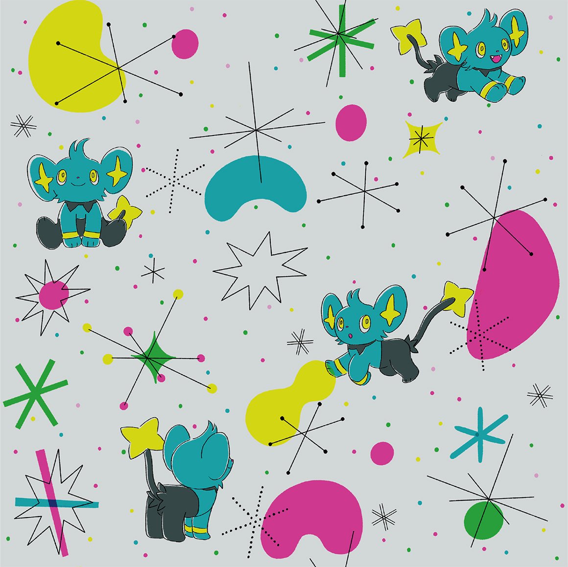
very nice pattern but why is regieleki here

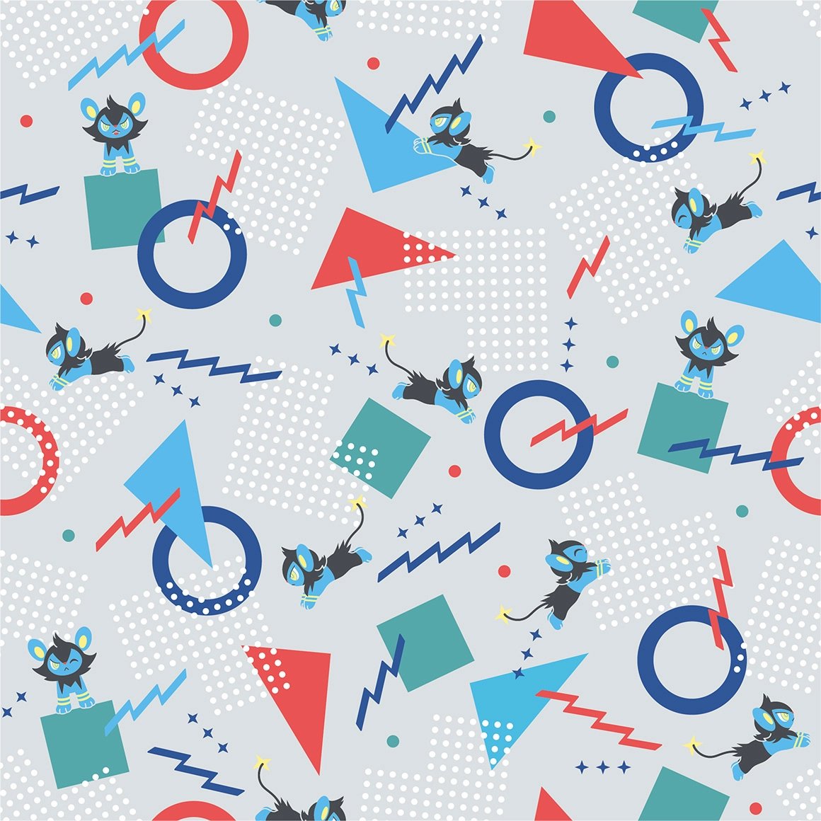
cool
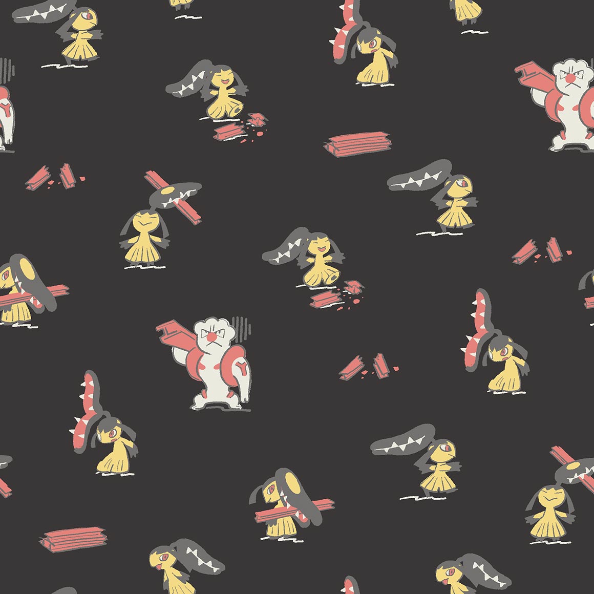
at first i thought this was a fake pixel art style again but its actually stitches! its cute and i like how its all unique art except at the loops
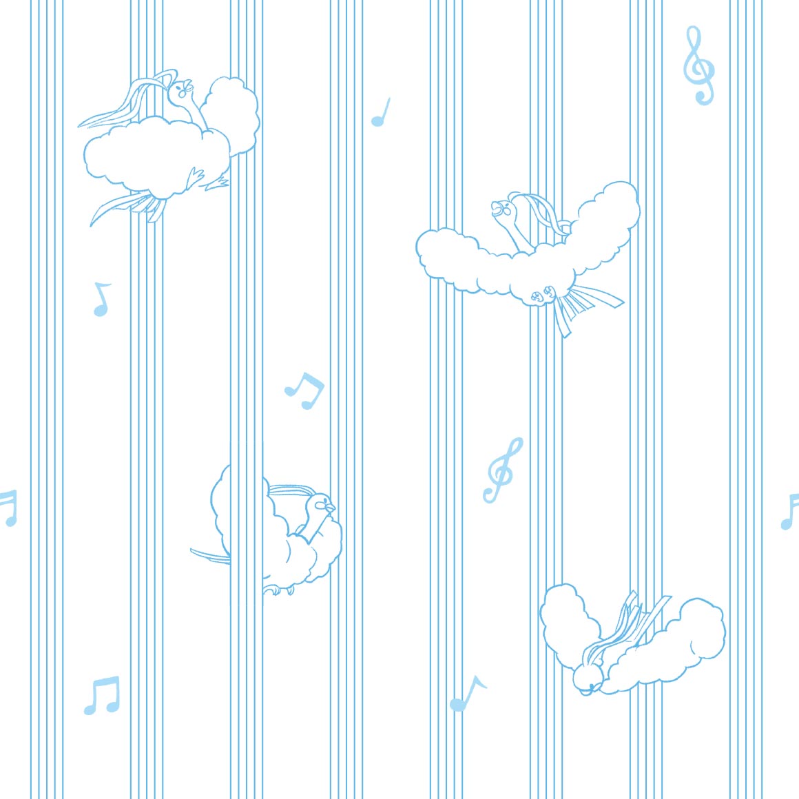
theres a lot going on here! but it works here, im a fan of the various music devices everywhere
comic book art style
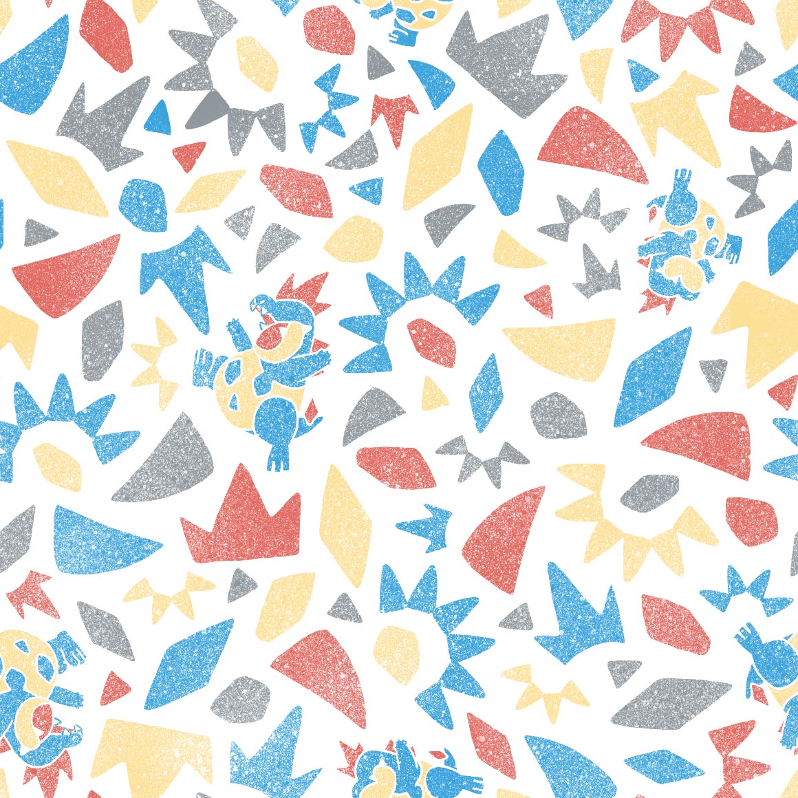
have makuhita and machop always been rivals? -pulls up bulbapedia- huh. yes, actually, according to the ultra sun pokedex. the more you know.
i like how it blocks off the lines, though i wish it had more variation in poses
cute
nose pass! i like this one

very cute! reminds me of gotchibams art
they made delcatty look even less desirable to me!
cabink cameo. nice colors
cute even though im not a mawile fan

awww its eating the pattern, so cute
interesting art style? shiny spotted
something my bf'd wear
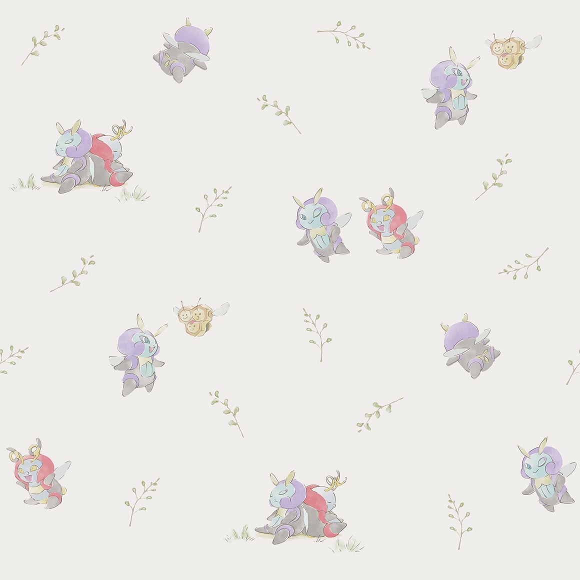
this is really cute, the shiny, the throh and sawk cameo, its all around very good.
and this ones just Ok

those may be my colors, but for some reason this art just isnt with Me
it really pops but i wish it looped earlier
so cute, glad they didnt go the pikachu route
wrapping paper
why do so many bugs have space themed patterns?
old childrens book style once more
very cluttered but it works?
this is just really cute! and i noticed goomy there too!
kind of a basic pattern but its cute so
im not sure what to say about this one its nice?
not really a fan of this

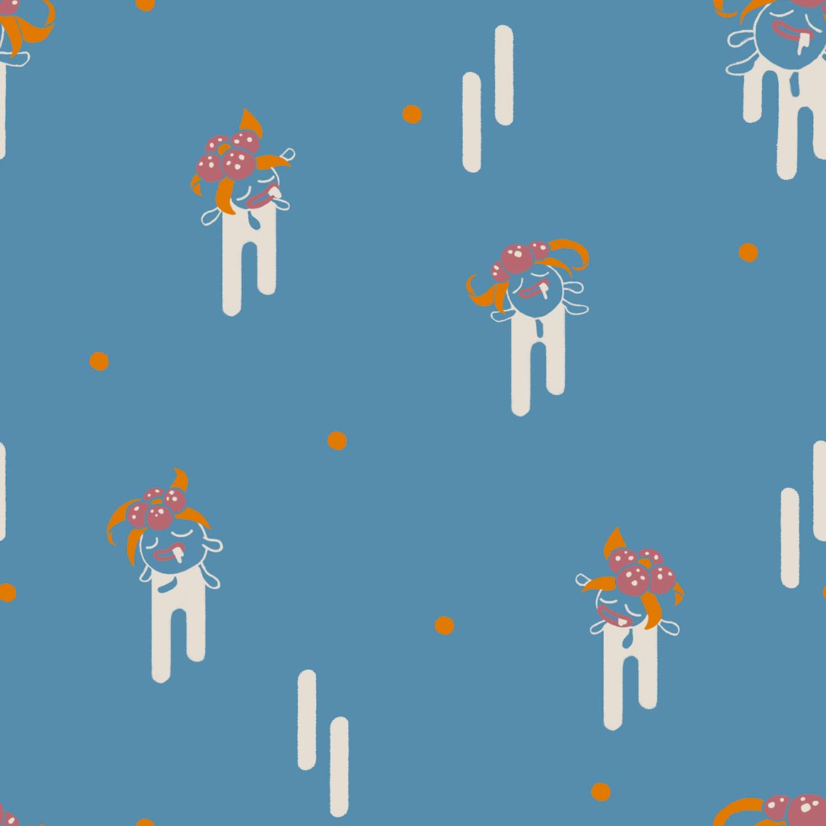
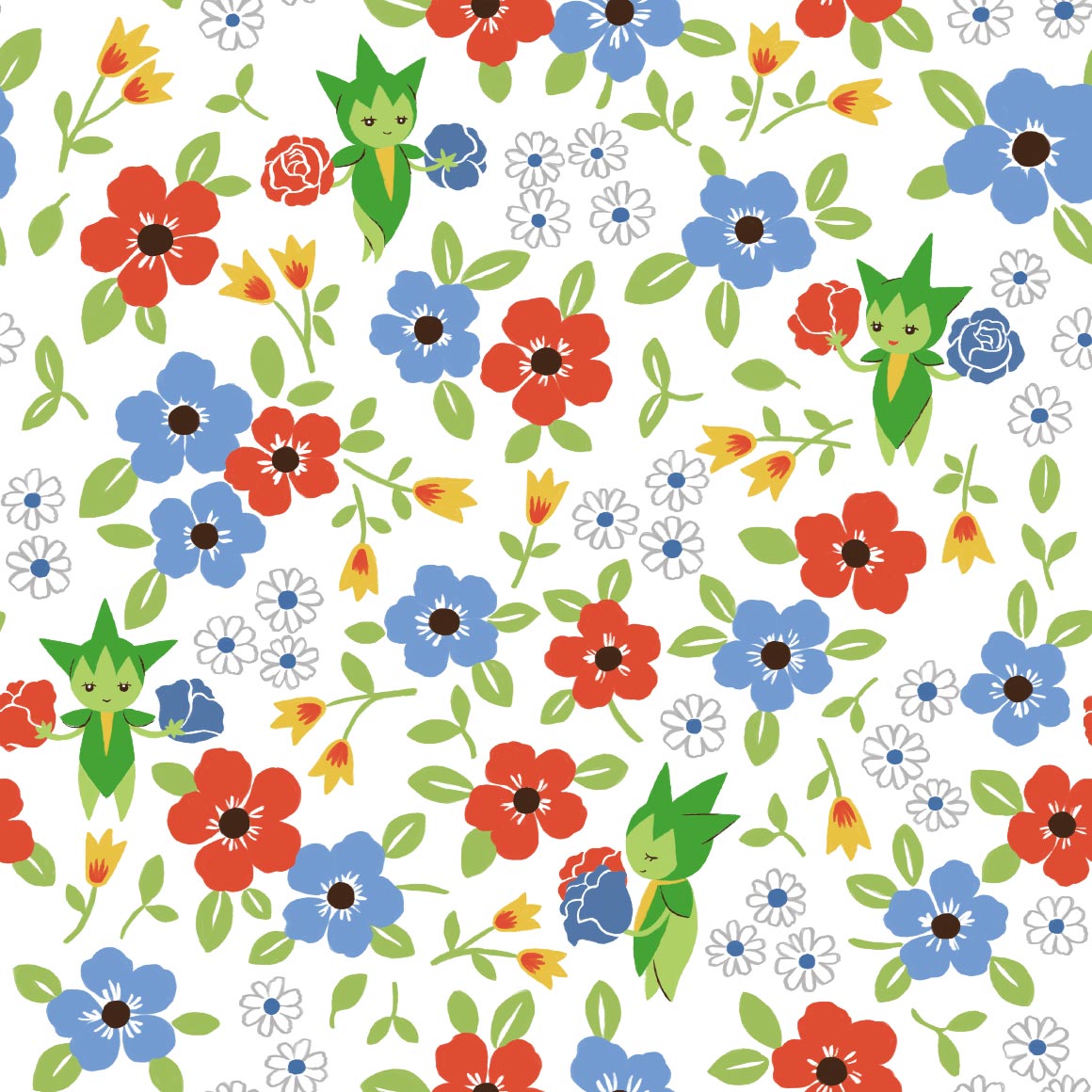
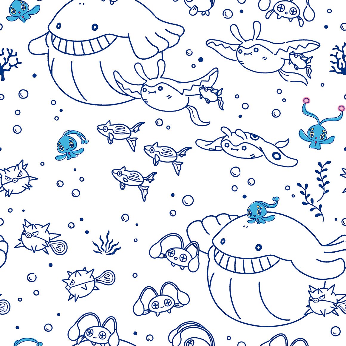
really cute! shiny wailmer, luvdisc, marill, piplup, spheal, mudkip, psyduck, and slowpoke are all there too!
hawaii for no real reason ok
thick lines return
poor torkoal gets shitty art...
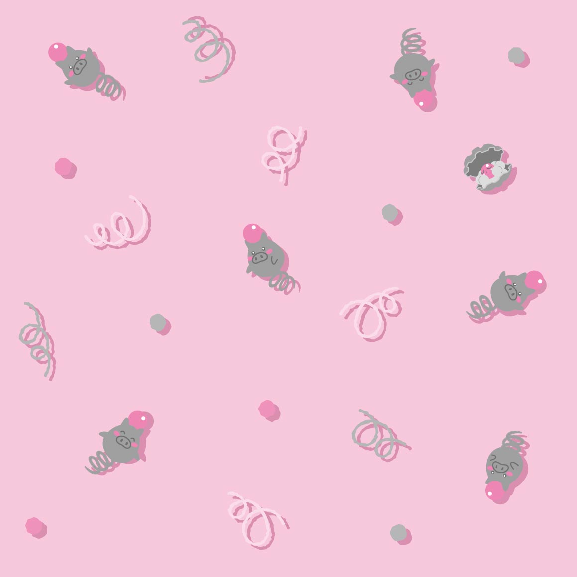
cute! clamperl is there too, referencing its dex entries
another kaleidoscope pattern i see, much more a fan of spoinks
smh they dont all have unique spot patterns smh smh

cute, though i wish it had more variety in the design
a boring pattern imo
i wish it had more than two poses... this is just like mega flygon
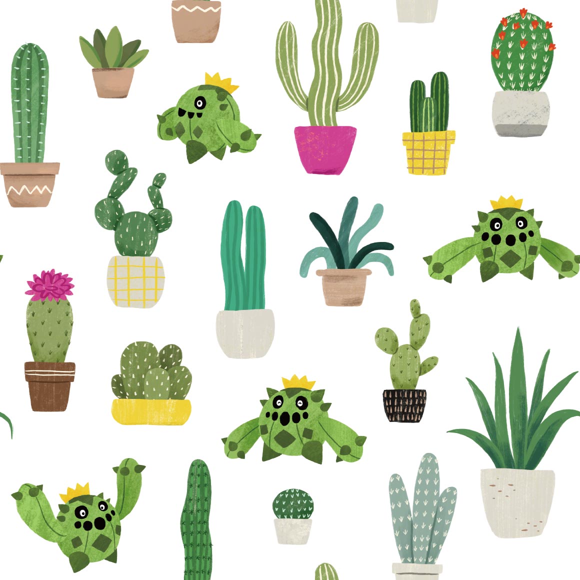
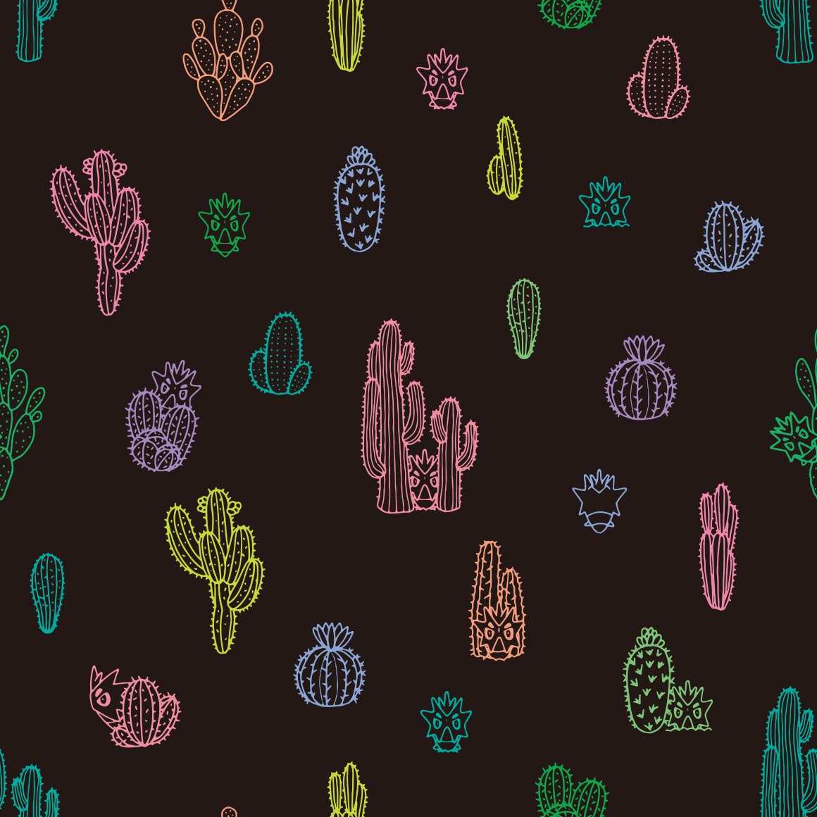
love seeing all the cactus types!
the background changes more than the pokemons art
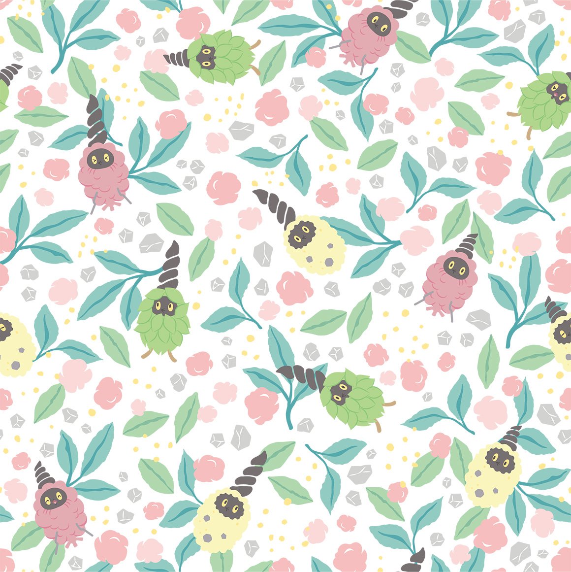
very soft and fluffy. alolan vulpix is there too
the just lineart style works here! its very nice
very visible, wonder if seviper will match
it doesnt and im not very okay with this considering it just uses stock art...

at least this looks nice
not really a fan of solrocks though
very basic pattern but i like it, it features aspects of the pokemons design too
cute

interesting pattern
its just a looping single image...

paper dolls hehe
this one scares me and i dont know why, but the upside down one reminds me of the one autism meme
strange choice of colors, but at least it emotes
reminds me of gotchibam again
this is very nice! reminds me of a bandana
very nice but im not sure about on a shirt...

hehe it is square
why is it mirrored
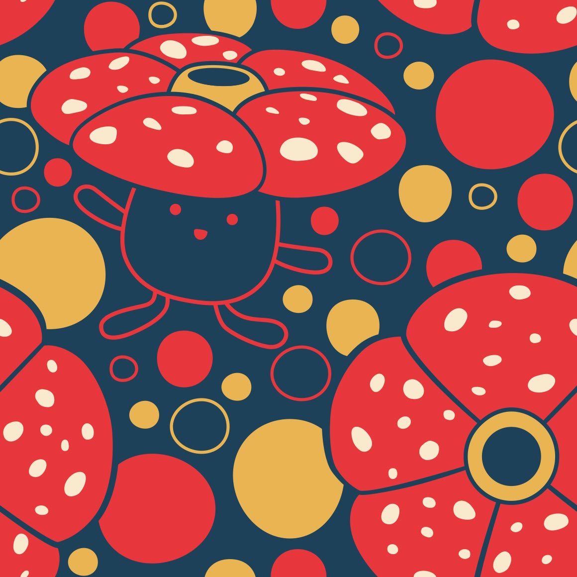
castform did not deserve a pattern this nice.
very cluttered.
neon sign art again
the pattern is the zipper lips!
cute and almost tells a story
dusclops twins
such a good pattern. and for what?
kind of a boring pattern. shame
again reminds me of something sam'd make

cute! and hehe. shiny wynaut

very visible! its my bfs favorite colors too
is it bad that i noticed vanillite before glalie...
very soft
cute and love the unique art for every iteration
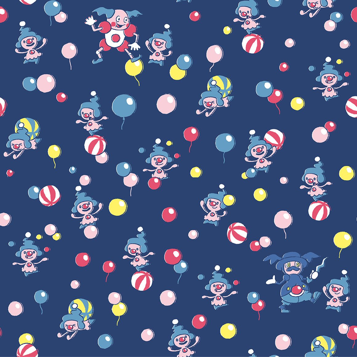
circus themeing? strange. isnt that popplios job?
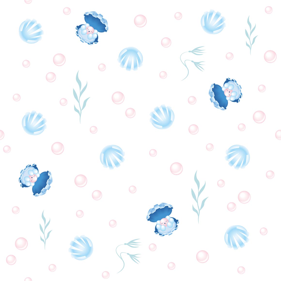
very nice colors! clam
not really a fan of this one
very pretty
it sure is relicanth

would be very good stealthy merch, i wish the shiny was there though. or that they did something like the oras young couple shirts
strange choice of pattern for bagon

not what i was expecting for shelgon either
kind of hurts my eyes
i know this is beldum but it reminds me of protophantoms from animal jam
like the clefairy one, the pokemon is not fully there, not sure im a fan
oh this ones like the mewtwo one! nice
this kind of sucks :{ was expecting like the tauros one
at least the colors are nice?
the regis were so underwhelming. i hope regigigas is better
very cute
stained glass art!
oo very nice
i like the mini art pieces more than the main art lol
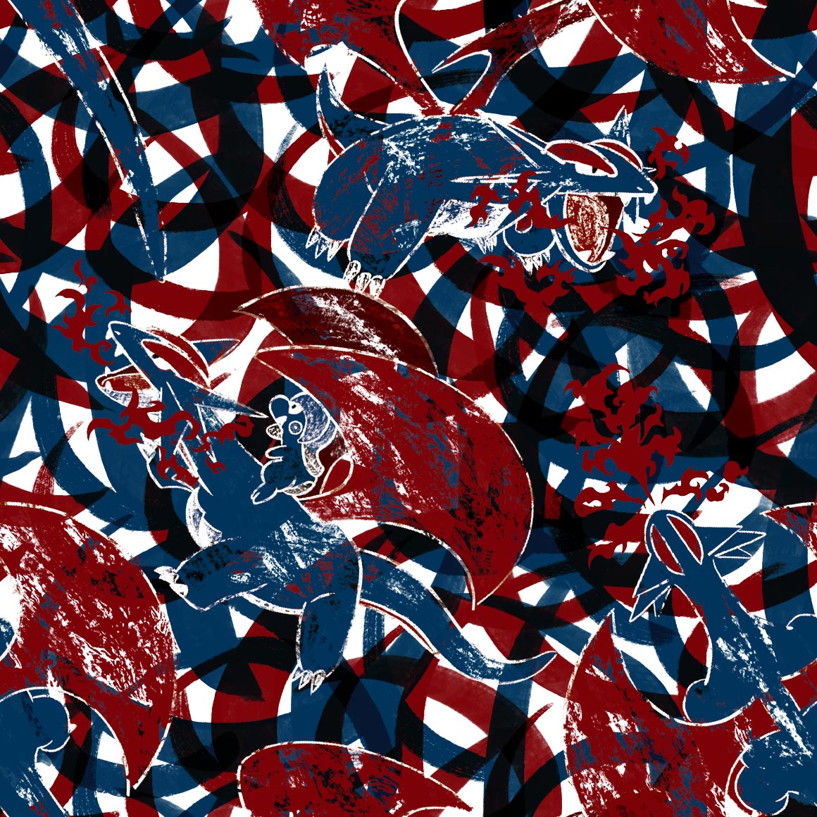
this sucks, surprising they fumbled rayquaza
this is 100% by the smile artist. i can tell

kind of a boring end, but still nice
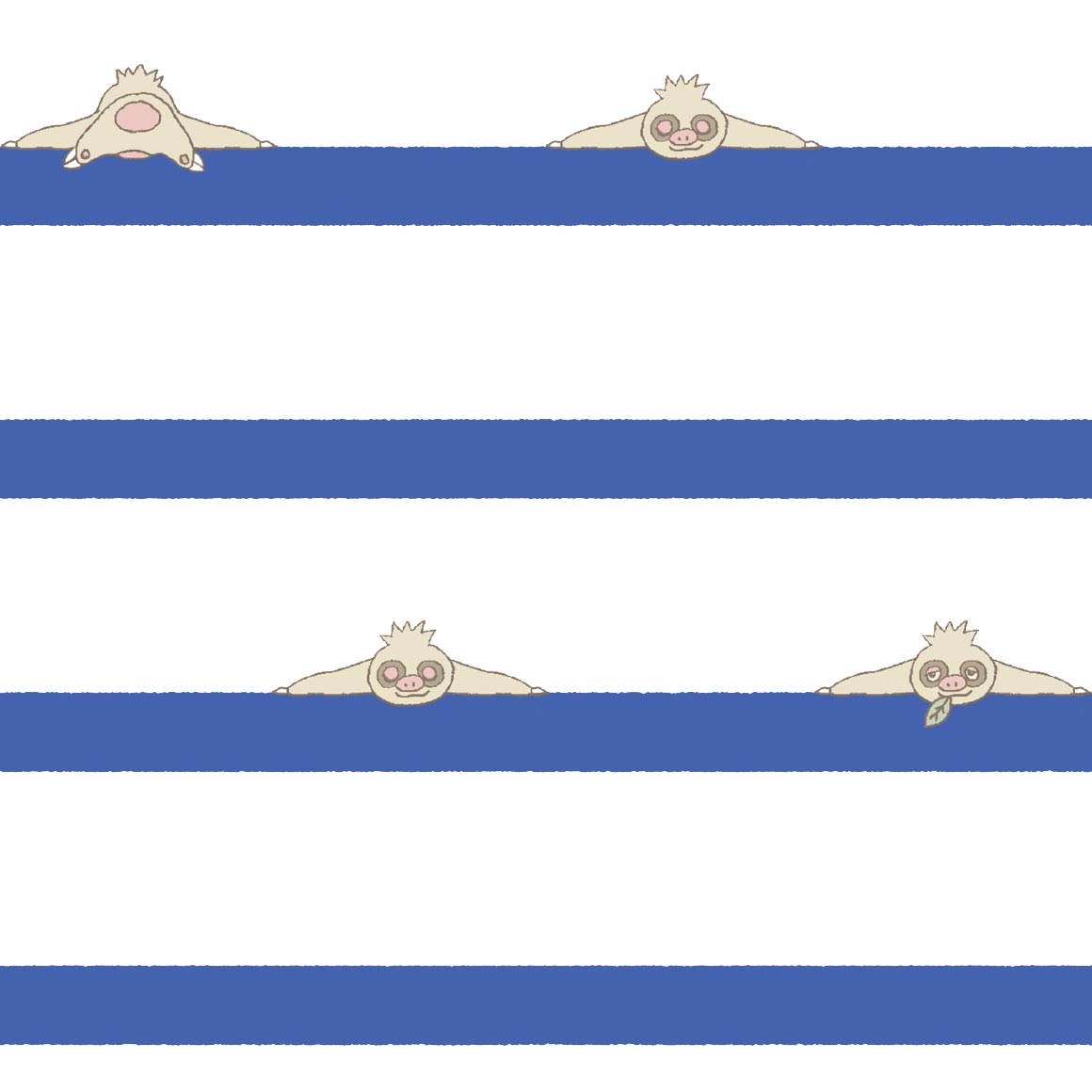
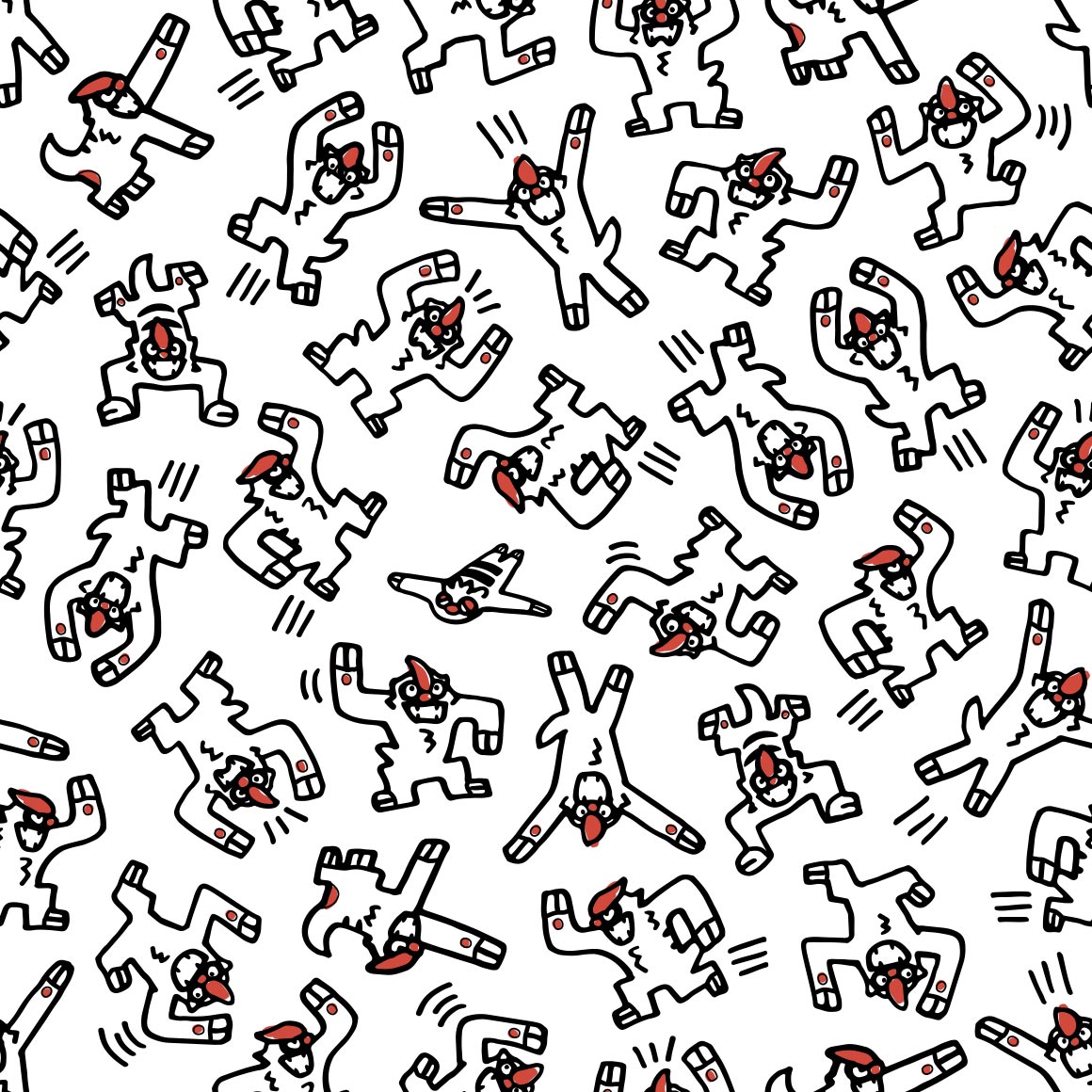
gen 4/sinnoh
compared to the other grass starters, kind of weak in patterns, but very nice regardless.
very nice! a middle stage that doesnt fumble. love the kricketot riding on it
very nice and i like to look at it

very nothing to me
its better? though lacking in poses
not really a fan, as cool as this is

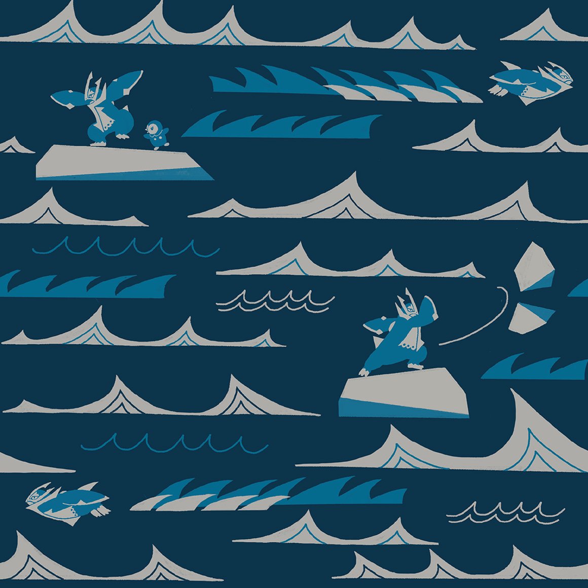
cute, like how the waves are interacted with

it broke the columns :SHOCKED:
its just two colors huh
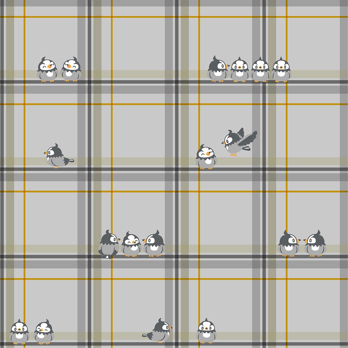
birds on a wire esque

strange choice for a paisley
oh this fucks
i guess johto and sinnoh really are friends because theres so much plaid here!
i like the colors
ohhh this is so nice and lice, and the shiny, and the colors and the fact it doesnt loop and the
this is nice too!
for some reason this one reminds me of smoochums? in a good way
ohhh i like this one. its very nice. id wear it

nice, i like how the pokemon merges with the background but not fully
is this crayon art? its cute
its kind of hard to see roserade it blends in too well
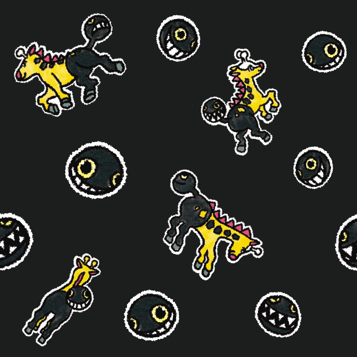
sure is cranidos in a mesozoic era
ohhh this goes hard. its good.
strange choice of pattern for shieldon, especially compared to cranidos
interesting, better than the last for sure
love the colors! and just very cute.
a lot going on here. its kind of distracting from wormadam
hehe combee is here because mothim steals from it

this is so cute :sob: and i love the colors
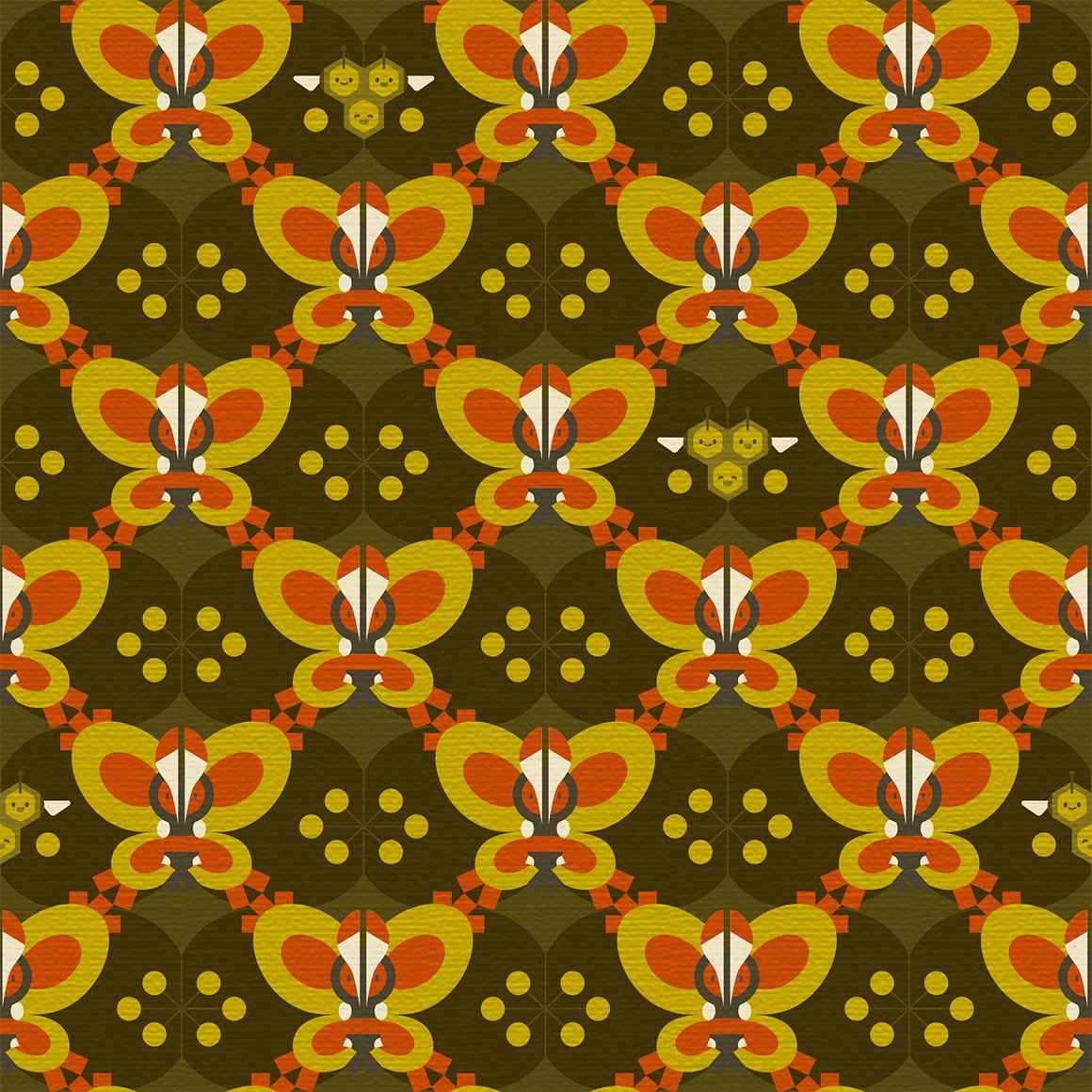
reminds me of an actual bees shirt i have
not sure what to say about this one at all, its nice?

why do the images (except wingull for some reason) have weird white backgrounds...
this is too nice for floatzel.

looks nice
again just nice
cute, wonder if gastrodon will be similar
i mean the patterns fitting but its kind of ugly
kind of similar to the aipom one!

cute but drifloon is kidnapping a child (or trying to)
interesting pattern
whats with the dandelions? they look nice but why specifically them
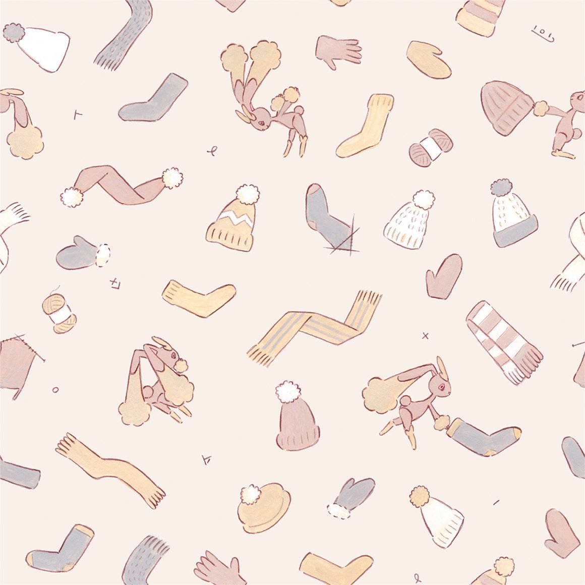
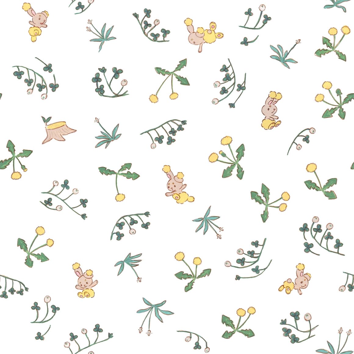
this has the same artist as the buneary, i think
both glad and sad that they didnt go with something similar to misdreavus's
damn i kind of wish they did more pixel art...
ohhh this is really nice and cute. could see it as actual wallpaper
i like how it blocks off the lines, though i wish it had more variation in poses

i wish the drawings were more centered on the colors
LA
interesting art for the stunky, not so much the flowers

i wish there was more variety on the poses, the spirals are funny though
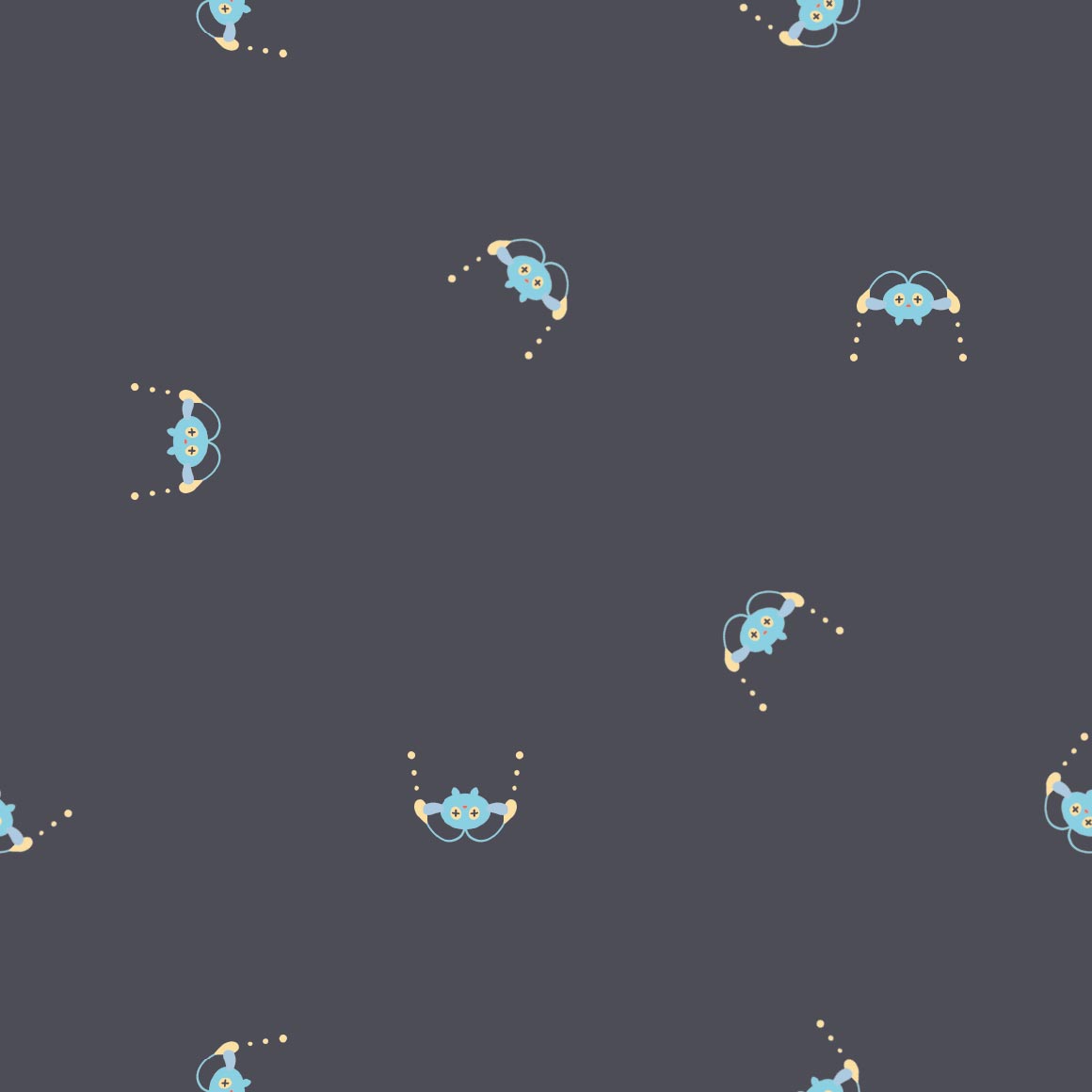
i like it! not really much you can do with bronzor, as its just a plate
ohhh the colors are really nice but i cant think of what they remind me of right now damn, maybe 1950s art?
cute, it goes through the whole span of emotion except anger
is it just me or does this really pop off the background

i like how it grabs the dots hehe
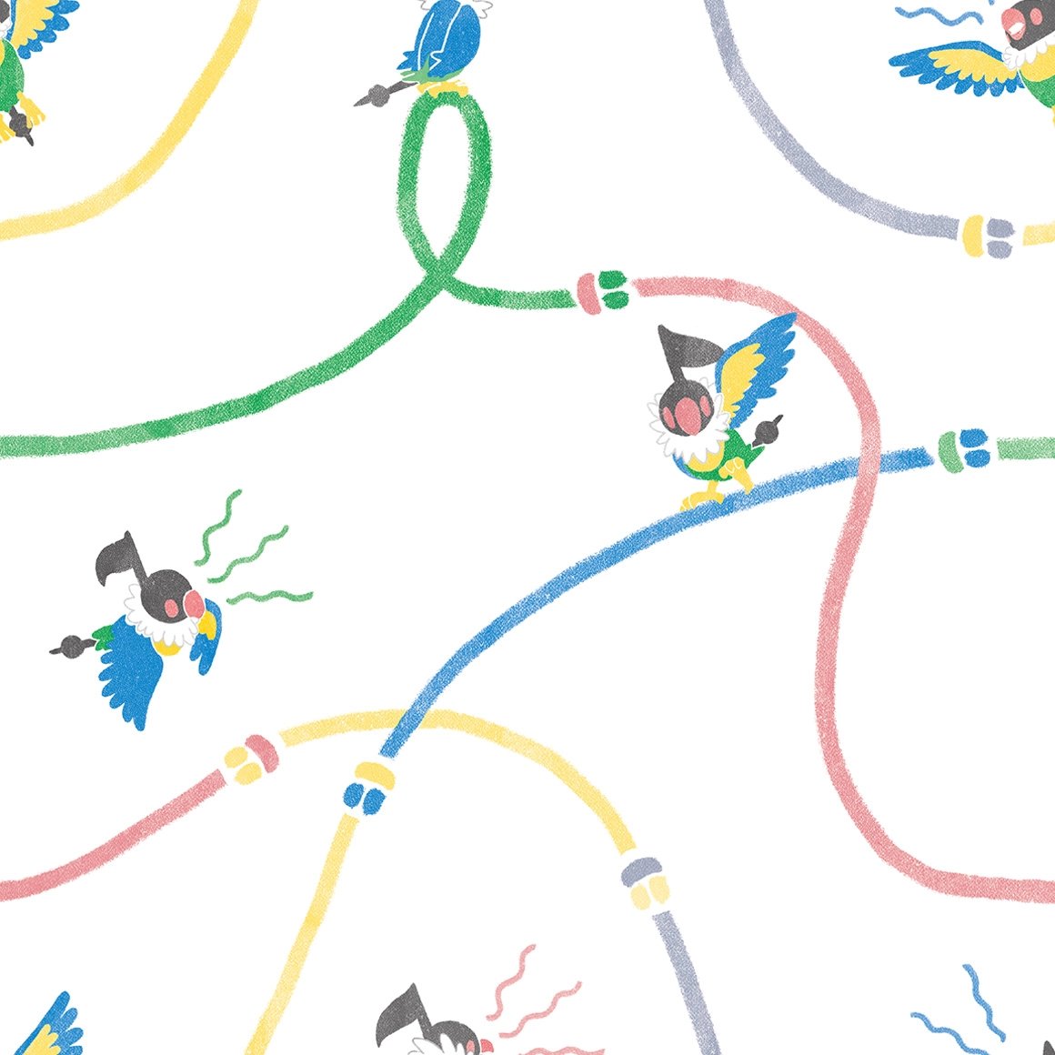
the cables being there is kind of strange... chatot never really used cables right
water color

yay two poses only! and monochrome!
oo this ones nice. especially compared to gible
not really a fan
the berries are kind of a boring pattern but i like that all the munchlaxes are unique
interesting. using orbs. and a shiny!
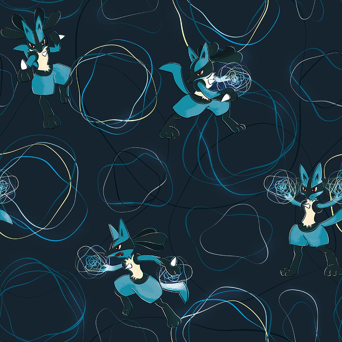
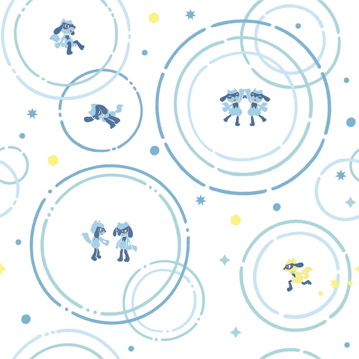
definitely reminds me of aura
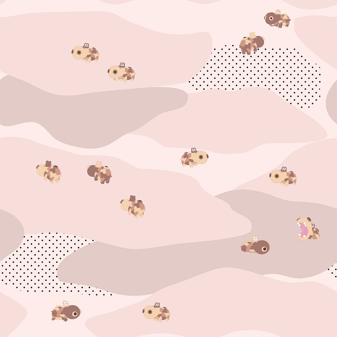
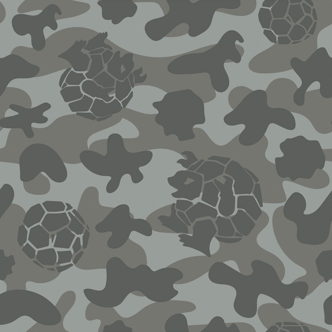
its camo i guess

aw this ones cute. love seeing dwebble there
yay for unique poses! and wavey lines! and gliscor
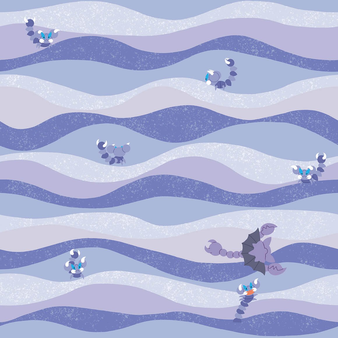
not what i was expecting from drapion at all
not really a fan
this ones nice and raw though
not really a fan of this one either, something about how carnivine is colored throws it off..
i like the colors

interesting pattern, why is lanturn there though?
this is way nicer than mantines
i like the colors, very nice to look at

not much a fan of this style
not very good imo, but not really sure why i think that
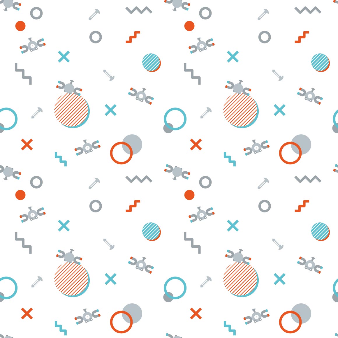
why are we in space? is magnezone associated with space? i guess it does look like a ufo
awww the tongues are the columns!
really nice colors and pattern
i like how the pattern IS the pokemon, but like tangled up with other tangrowth
the outlines are kind of hard to see.
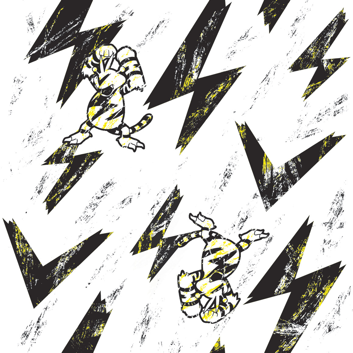
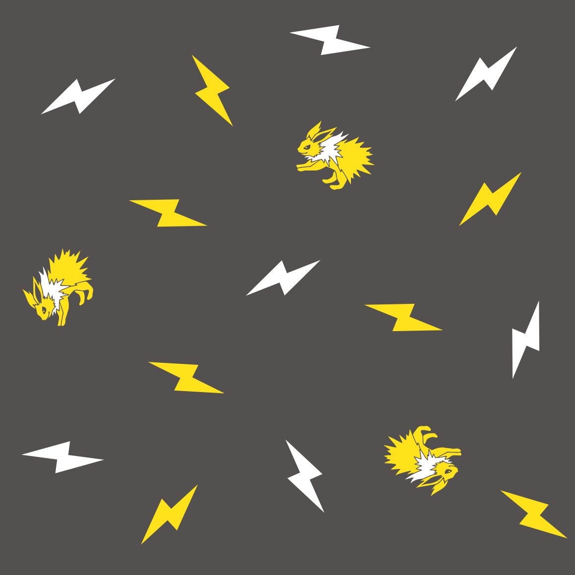
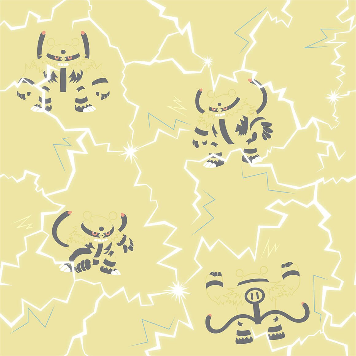
i much prefer this pattern to electivire, it just is nicer to me
very soft
not really a fan of this variation of the kaleidoscope pattern
very pretty
same artist as leafeons i think, still pretty
the sharks tooth pattern with gliscor is sure a choice, especially considering each of the actual gliscors is different
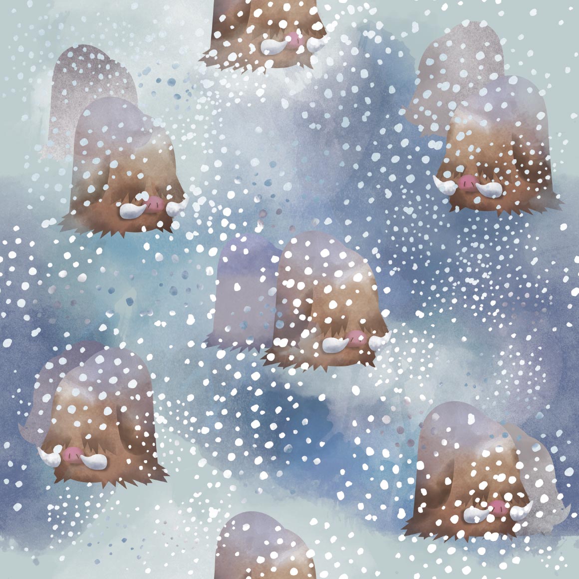
its better than piloswines! its nice
very very nice. ive seen many a tumblr theme use it (not my own though, not really my style.)
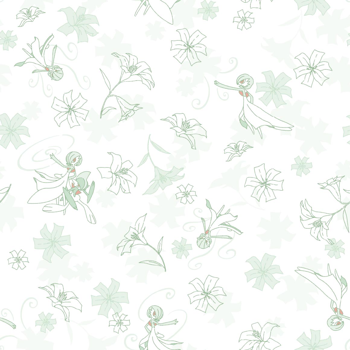
i wish it was more like gardevoirs style
awww this ones cute, i like the lines only style
kind of a boring pattern
the backgrounds have more love than the pokemon :sob:

very pleasing to the eye, love the colors
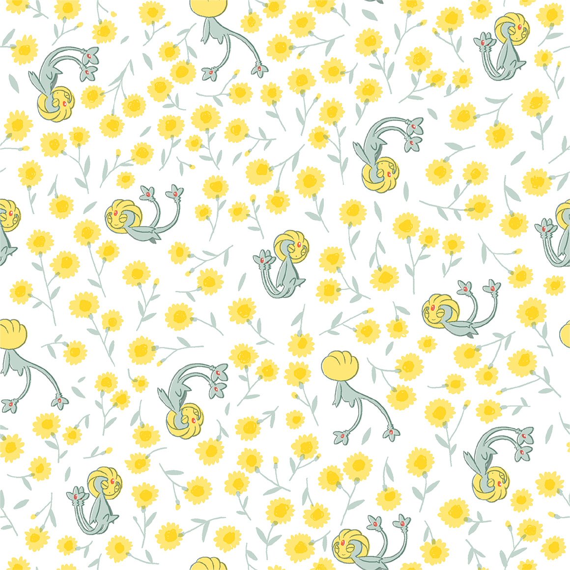
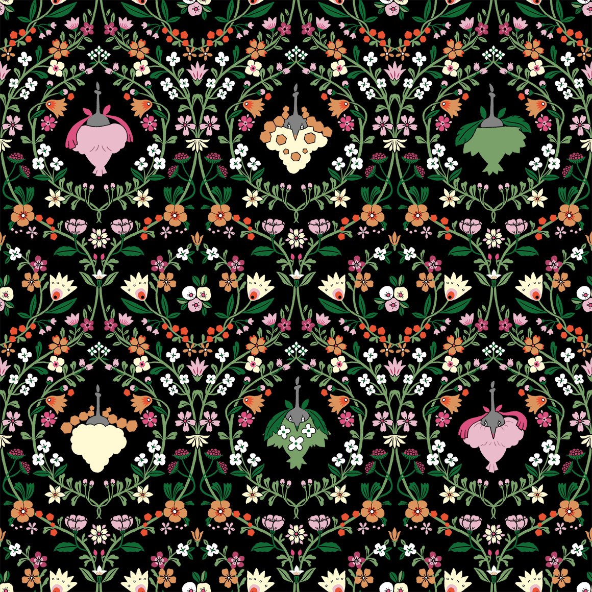
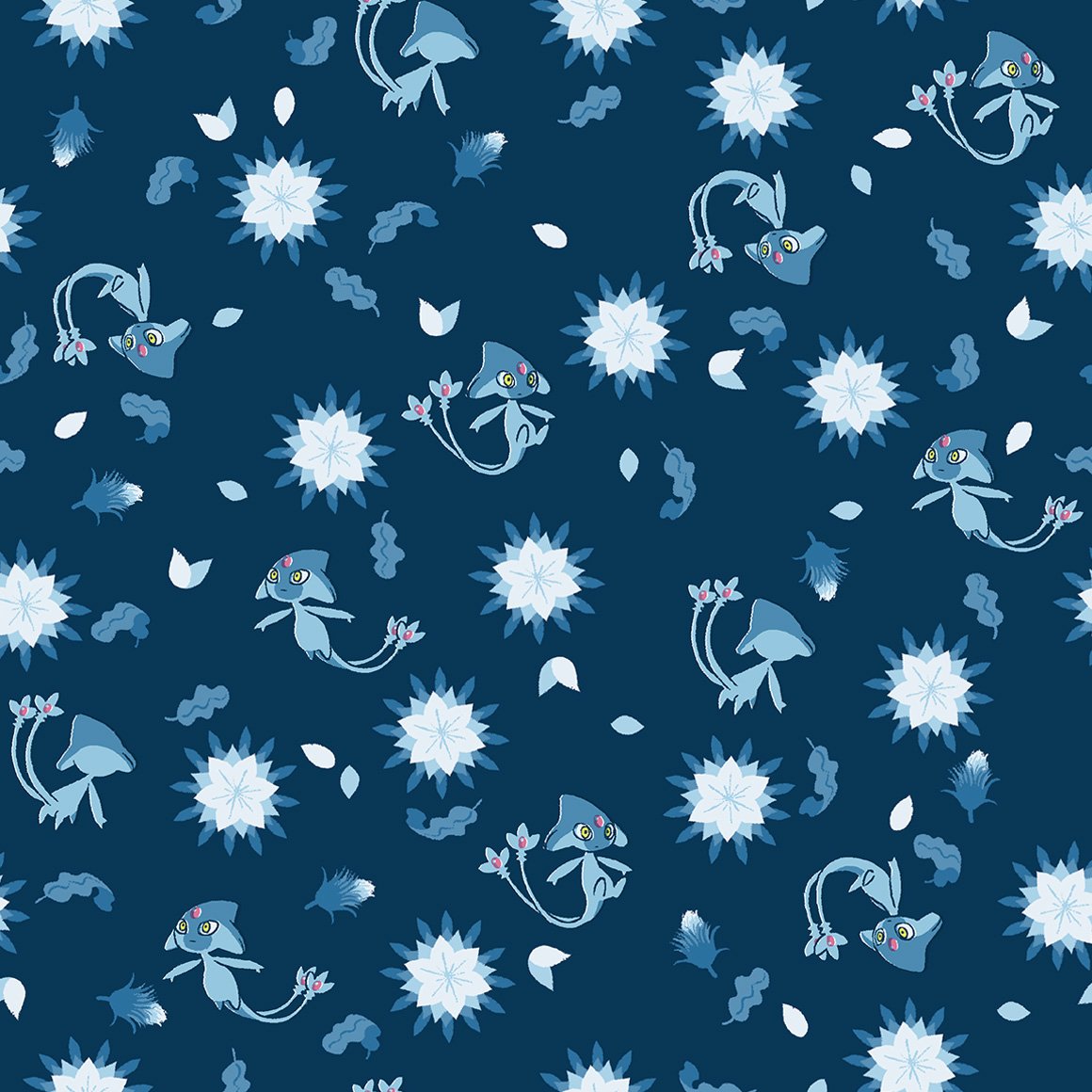
i hope all the lake trio follow this pattern with the flowers, it looks very nice with uxie
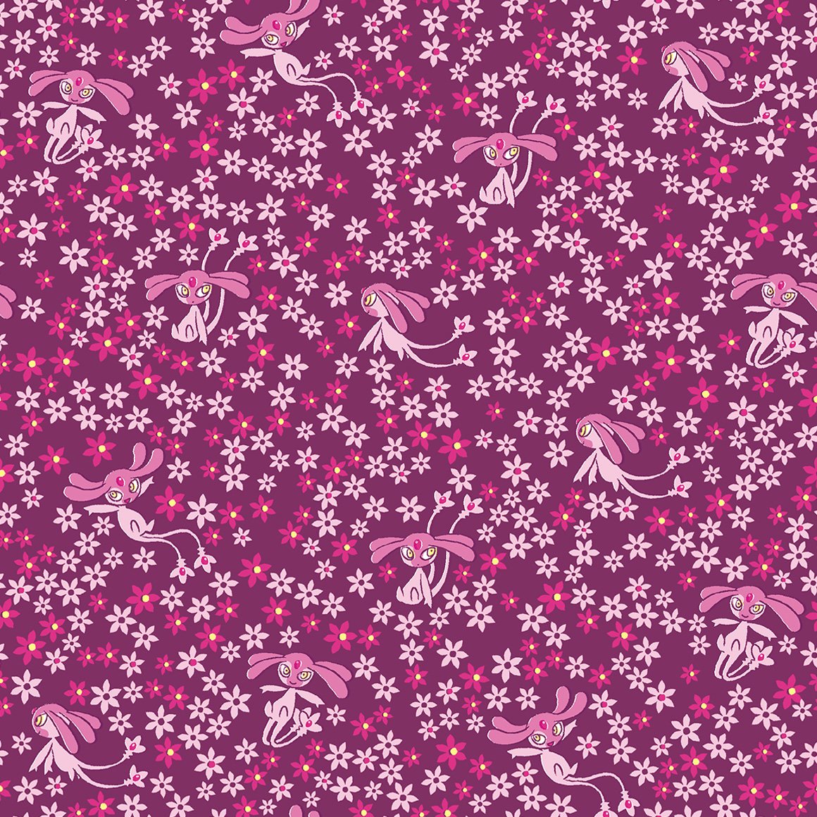
seems as if they do!
i wish azelf got less stock art looking poses though...
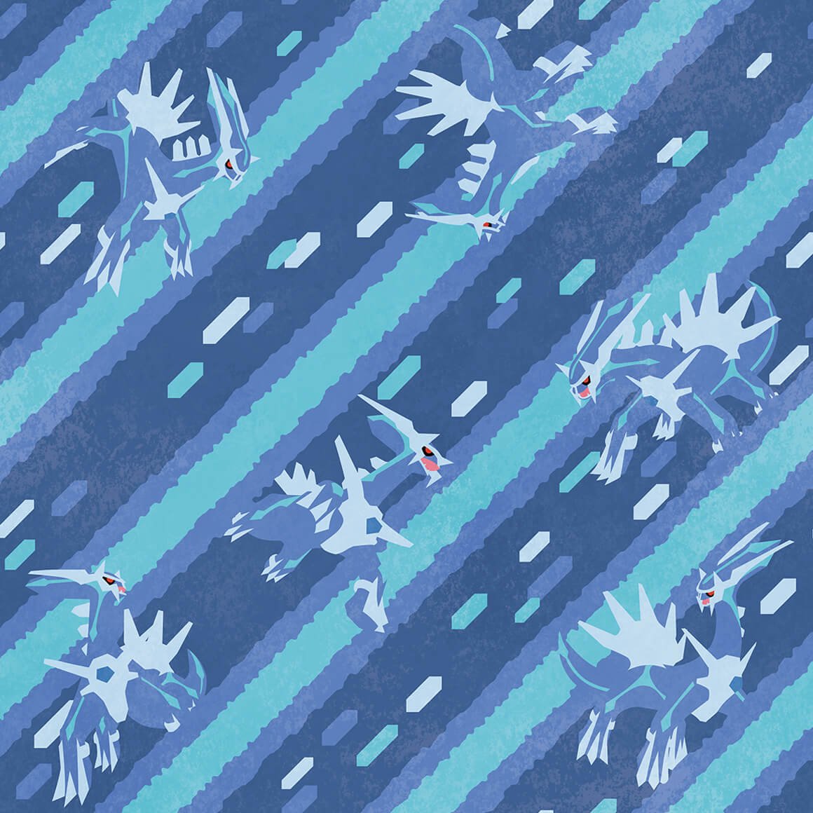
oh oh will all of the creation trio have their signature move in their art?

appears so! i like how palkia (and dialga) interact with the beams
this is more trozei / shuffle esque than anything

damn they really did continue the regi theme damn.
yay both forms of giratina! and its signature move
ohhh the colors on this are so nice and lice
the way phione gets better art than manaphy
why is this like a coloring book but manaphy is like stock art :sob:
ohhhh raw
this is so cute :sob:
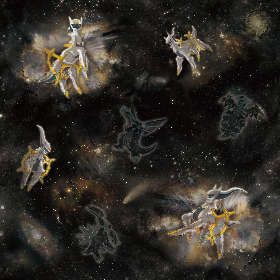
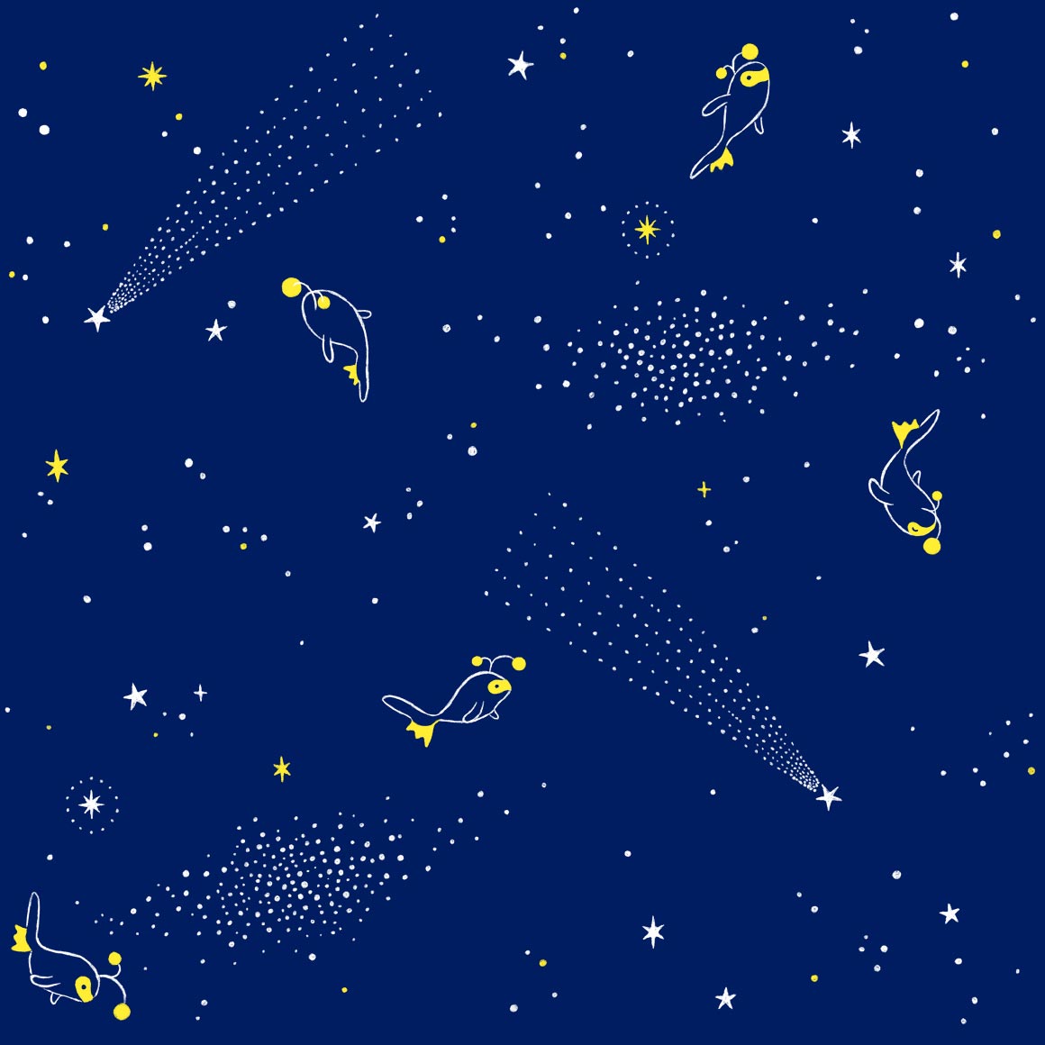
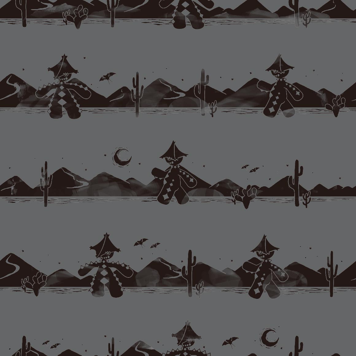
of course arceus gets space themeing! very high note to end on
thats all
i wish there was unova ones but there wont ever be because the company who made pokemon shirts patterns shut down last year :sob:
Widget is loading comments...
|
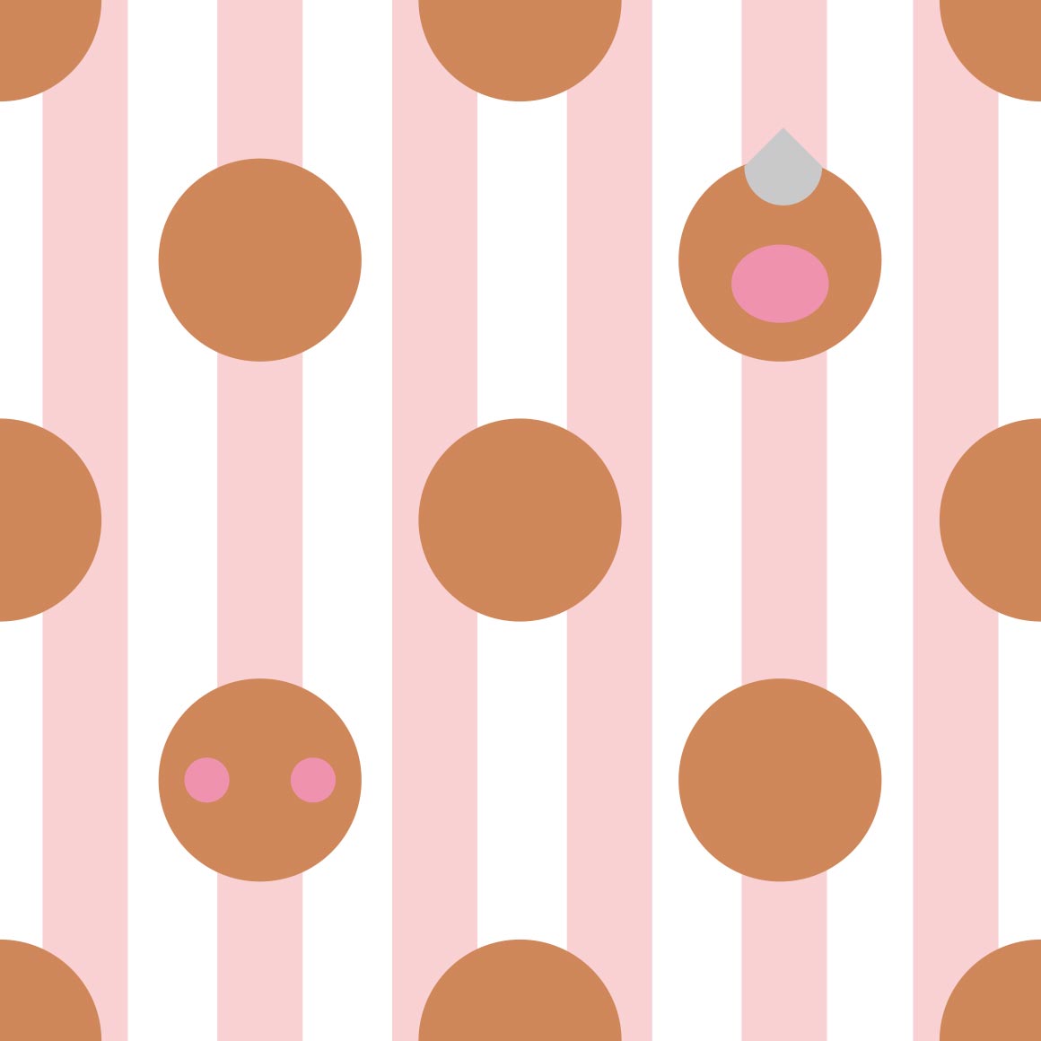
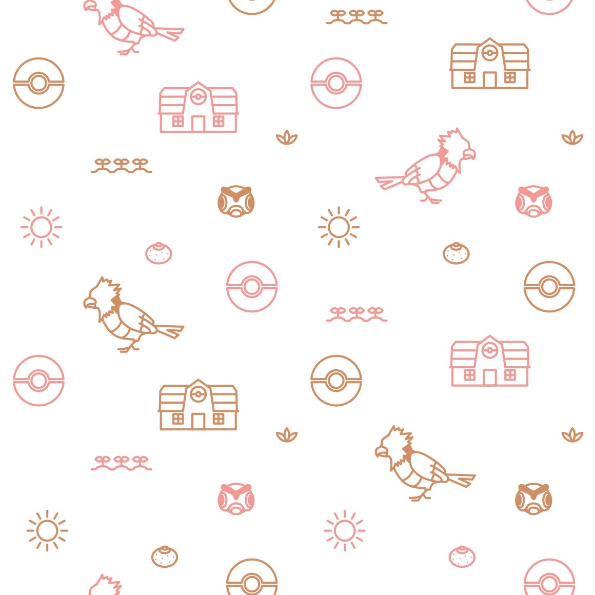
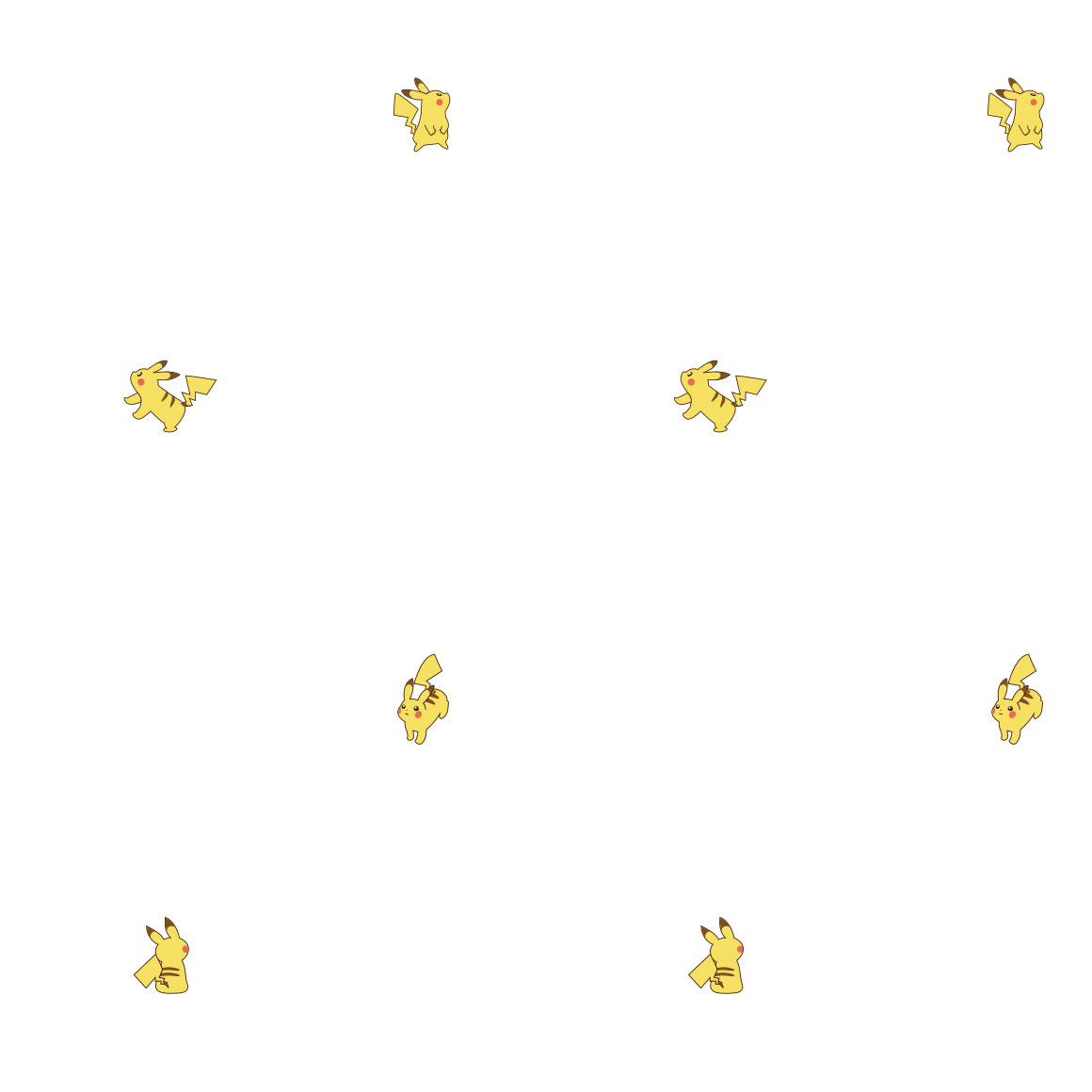
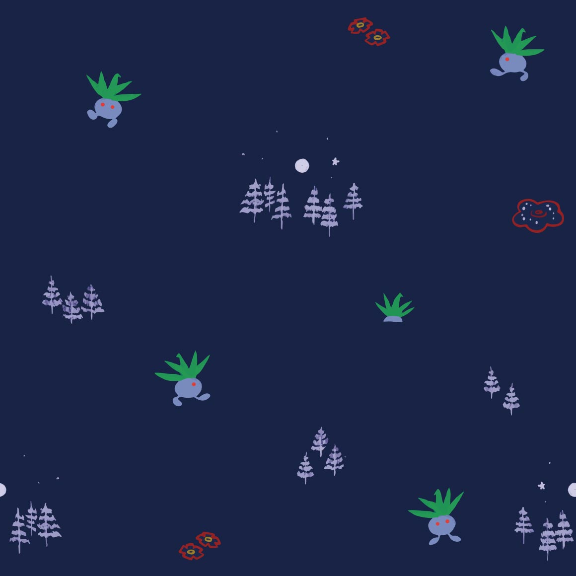
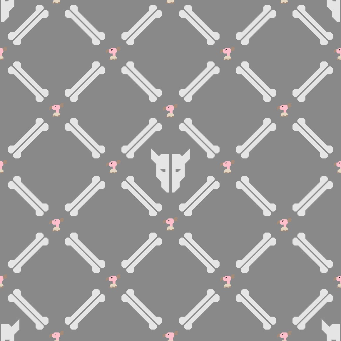
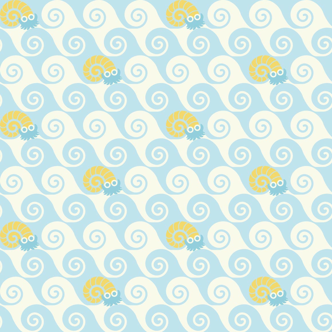
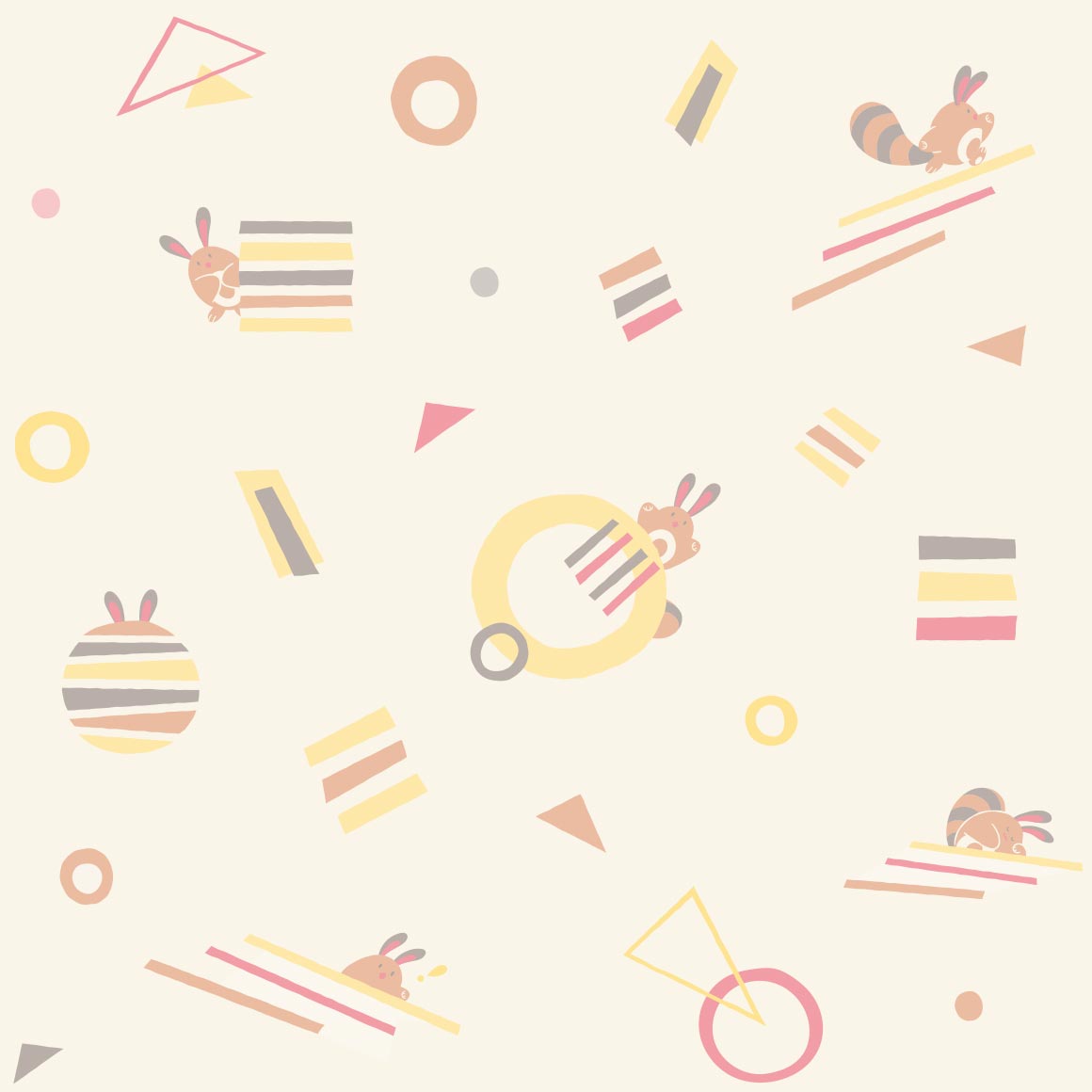
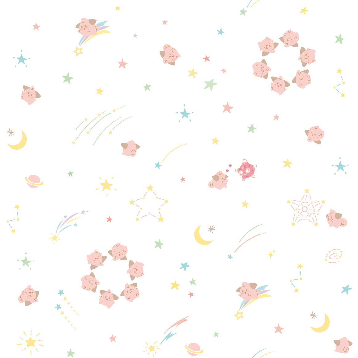
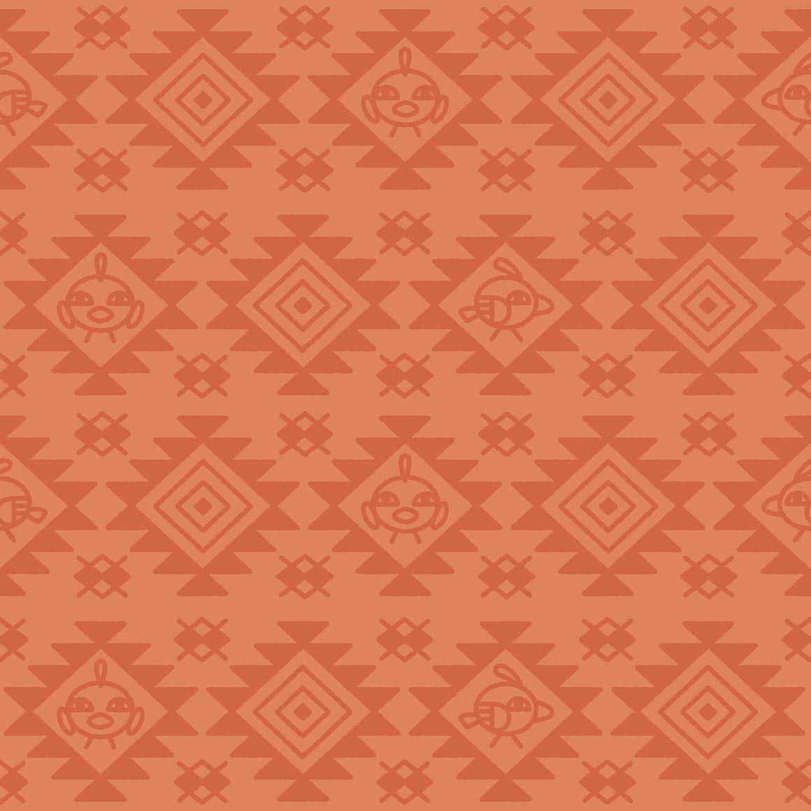
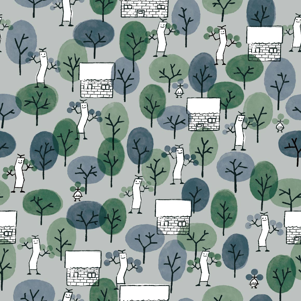
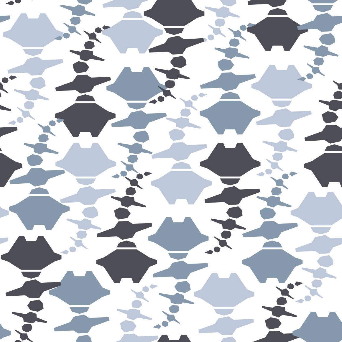
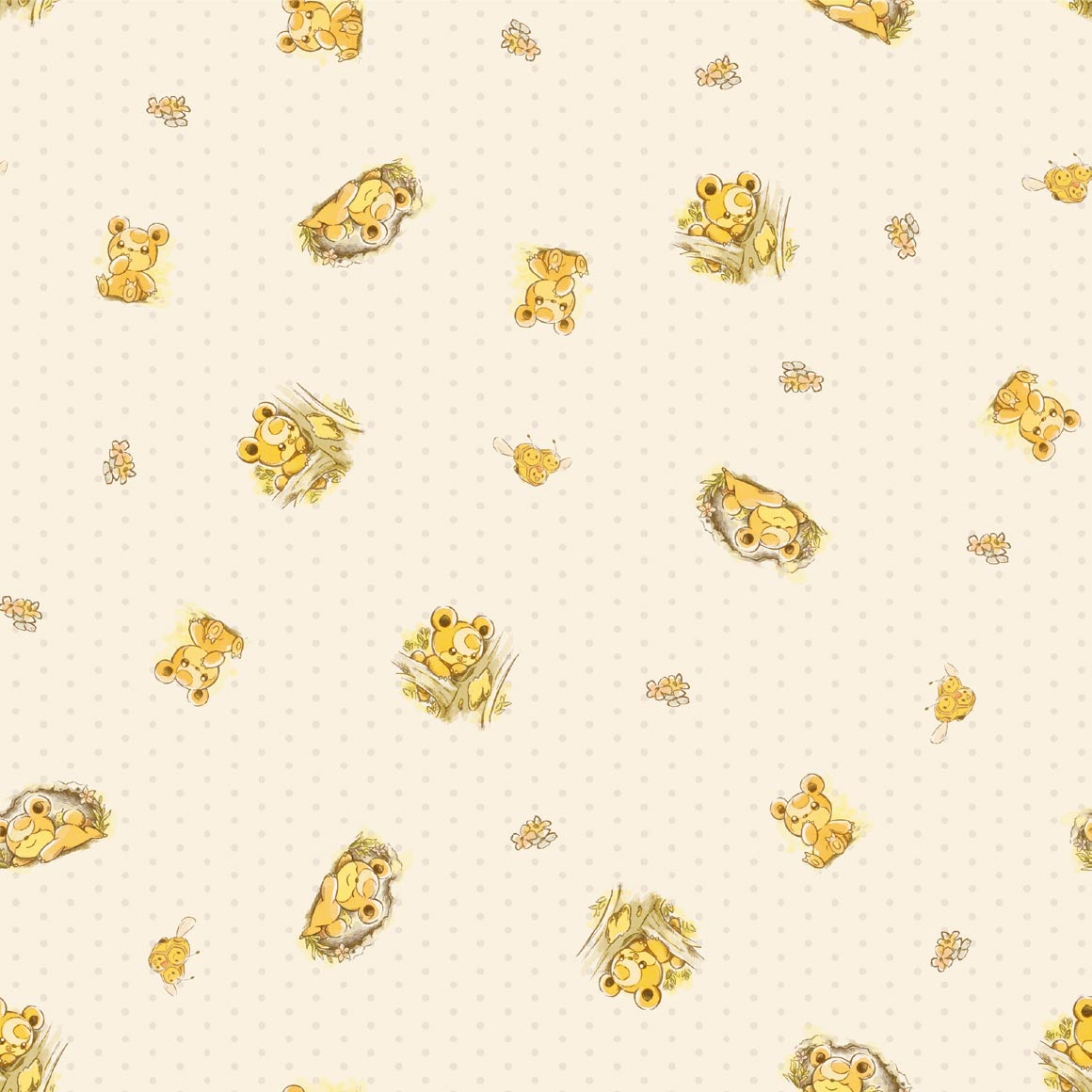
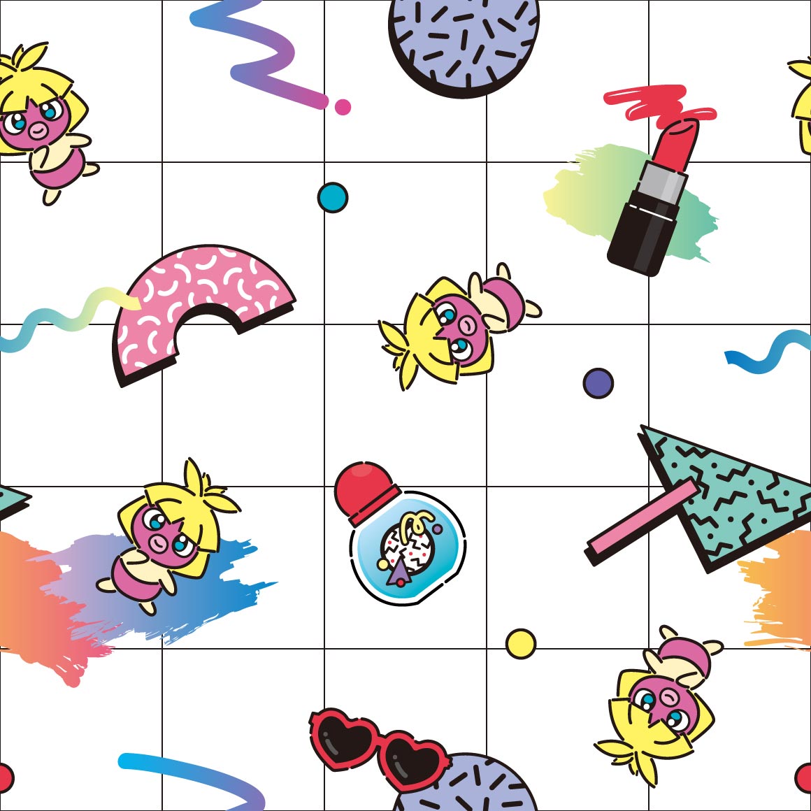
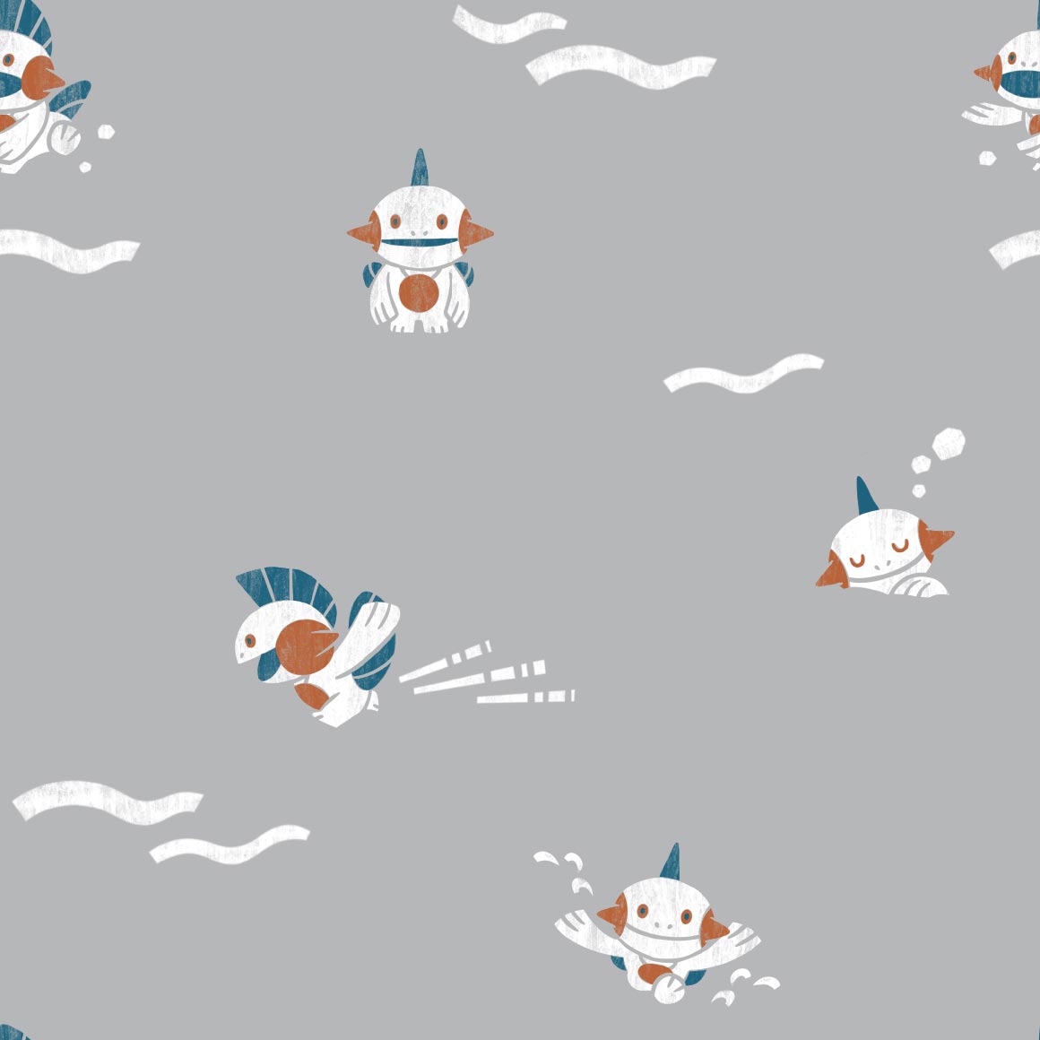
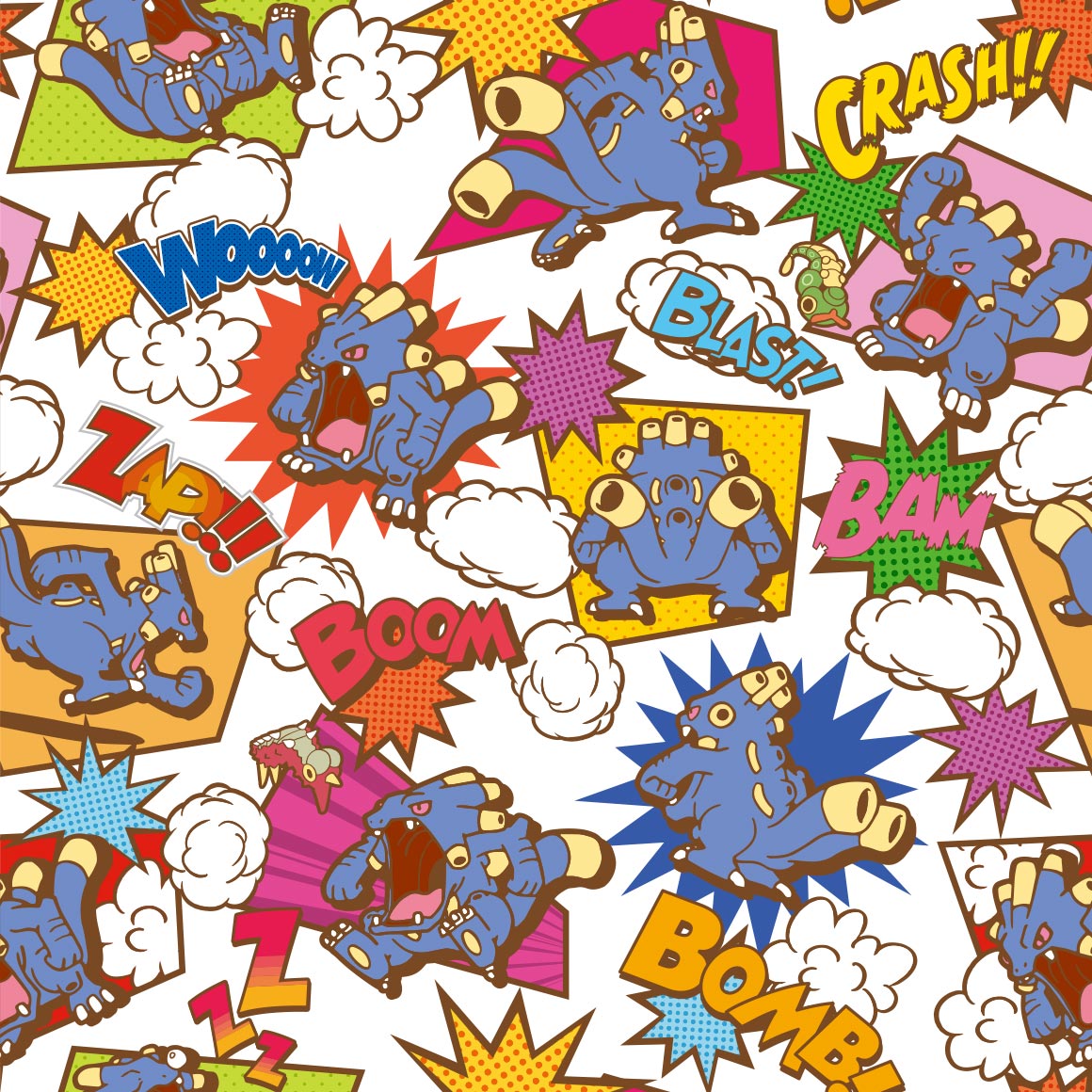
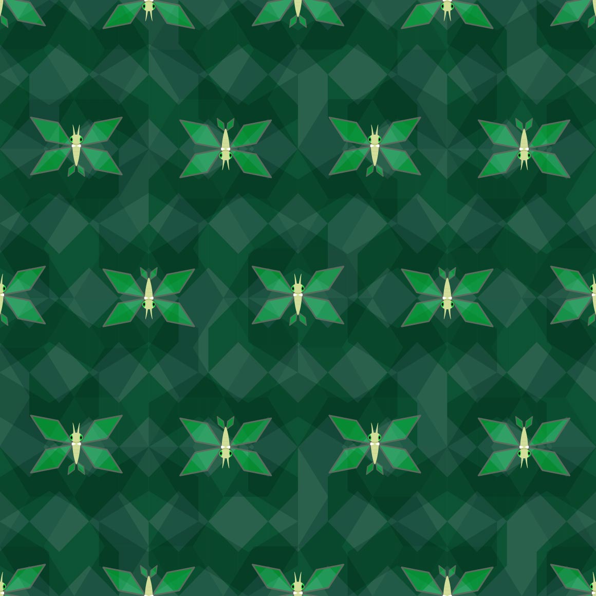
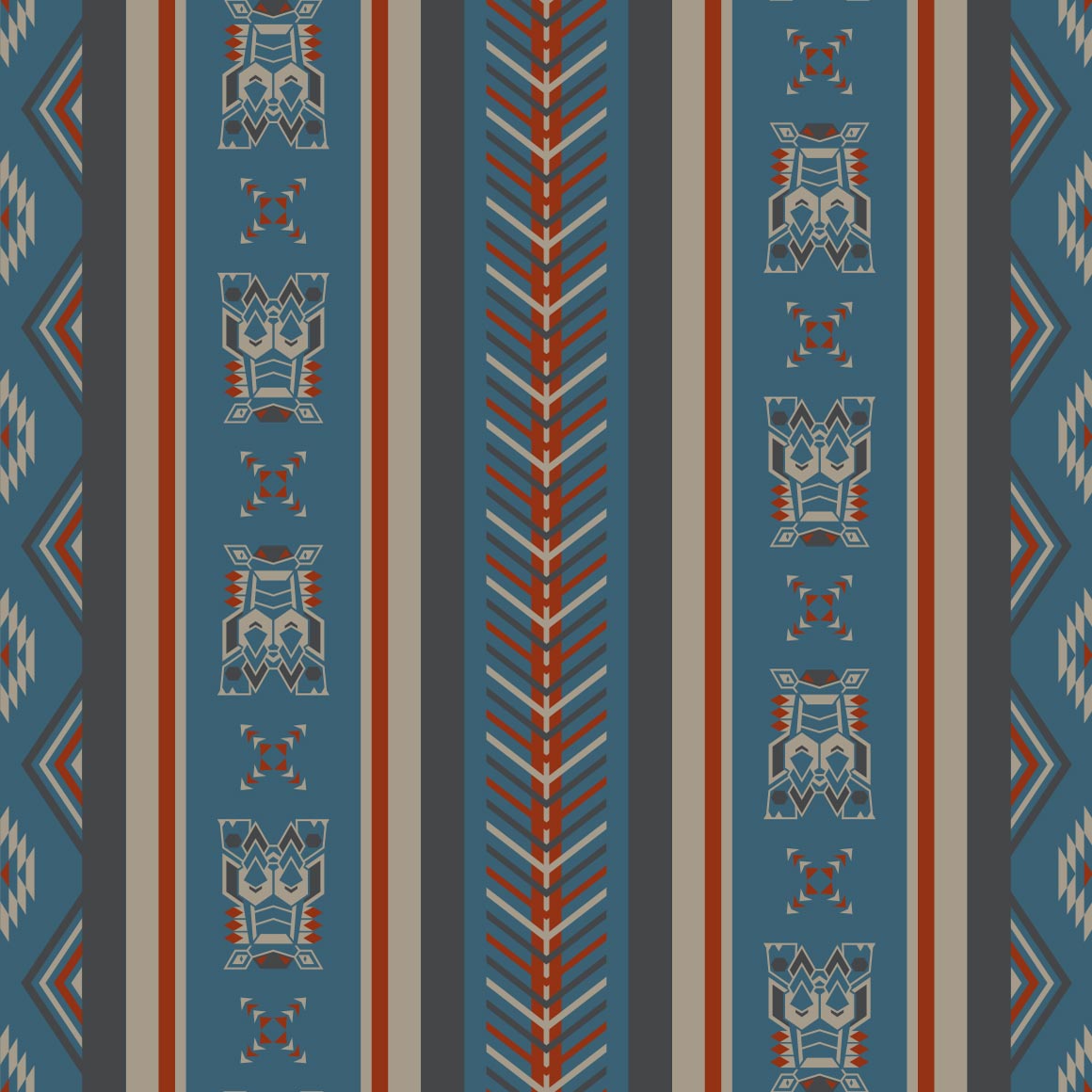
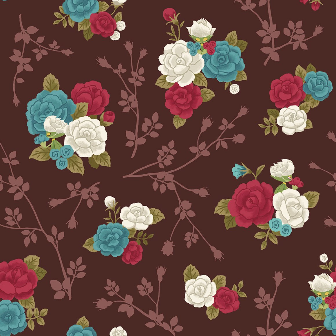
i like bulbasaur! i like how it interacts with the pattern itself (besides the pokemon) | not really a fan of this one. something about it seems. off | i like the scattered petals but not the Everything else | big fan of this one. im not really a charmander line fan, but i like camping. |
i GUESS i like the colors but everything about it is so. corporate. to me. it doesnt work with this mon | of course CHARIZARD gets really good art. its nice. |
its round. like how the squirtle shells are the bubbles | DIGGING the art style here. reminds me of stickers. i like how squirtles here too! |
|
|---|---|---|---|---|---|---|---|---|
blastoise once again gets shafted. how sad. it shouldve been steel type | the very hungry caterpie! i love it, childrens book artstyle. id wear it | its nice but nothing to write home about | this is hurting my eyes. | again with the corporate art style. its not good | this is funky but i wouldnt wear it | this fucks severely | sure is shapes. would these make good cookies? | |
egg. and a few birds. rather boring. | i fuck with the art style. | rattata didnt deserve art this good bro | it reminds me of old biology books with drawn pictures | its spearow colored. i like the lineart? | this is also hurting my eyes but i like it i think? not sure | lineless art with spirals, nice | ill be honest i didnt even realise the actual pokemon was here at all | |
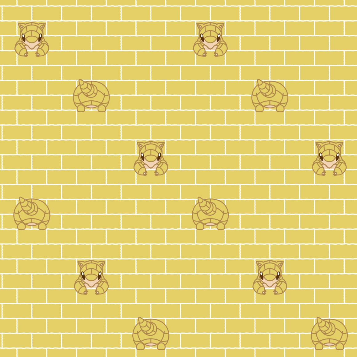
| where is the background | funky! i like this pattern. | they built my sandshrew into a wall cant have shit in kanto | the only actual pokemon in this is the heads god bless | i like it! i hope nidoran male matches, its very pleasing to the eye | wtf is the other shape, glad we kept with the colors tho |
they fumbled it. | YESSSS IM SO GLAD THEY MATCH | |
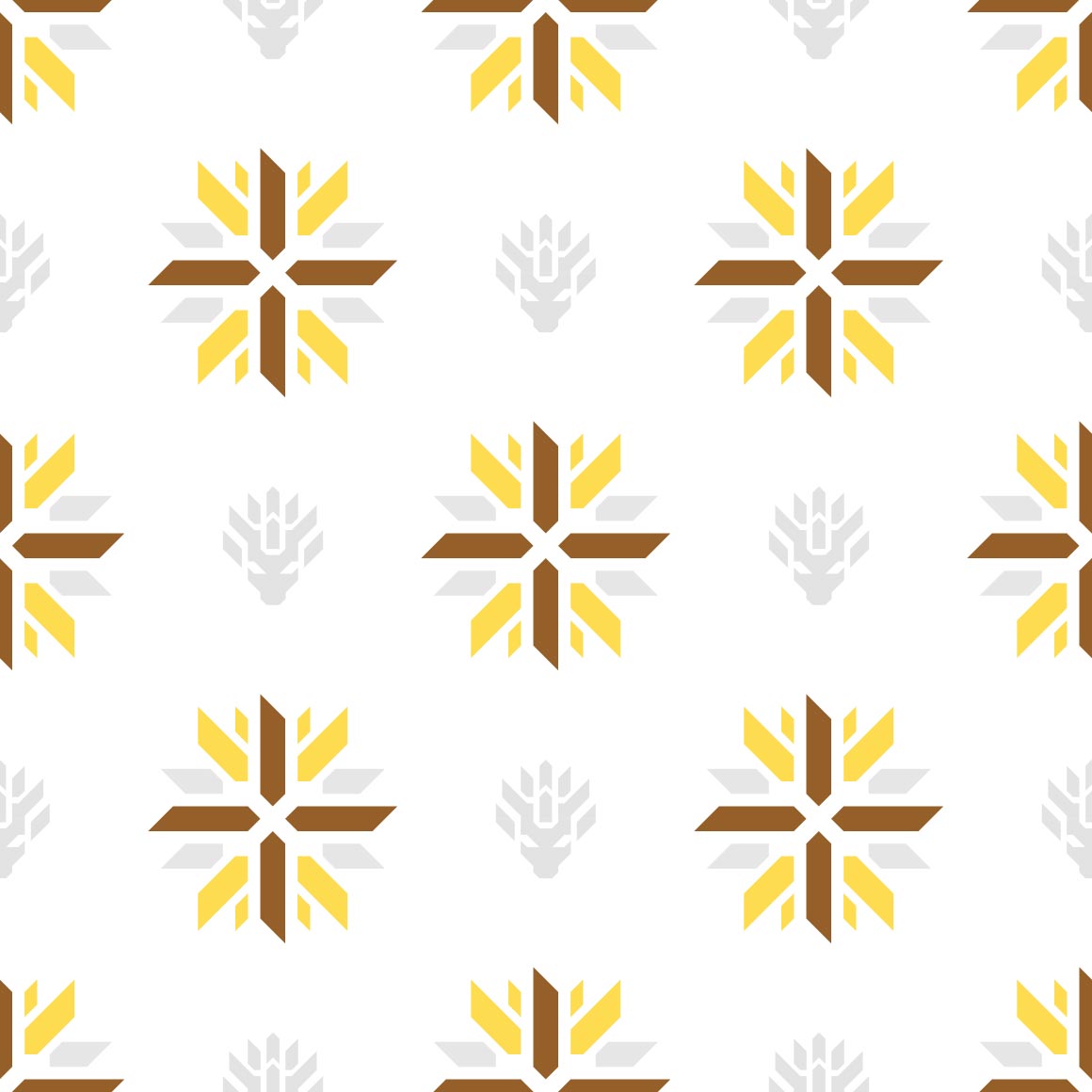
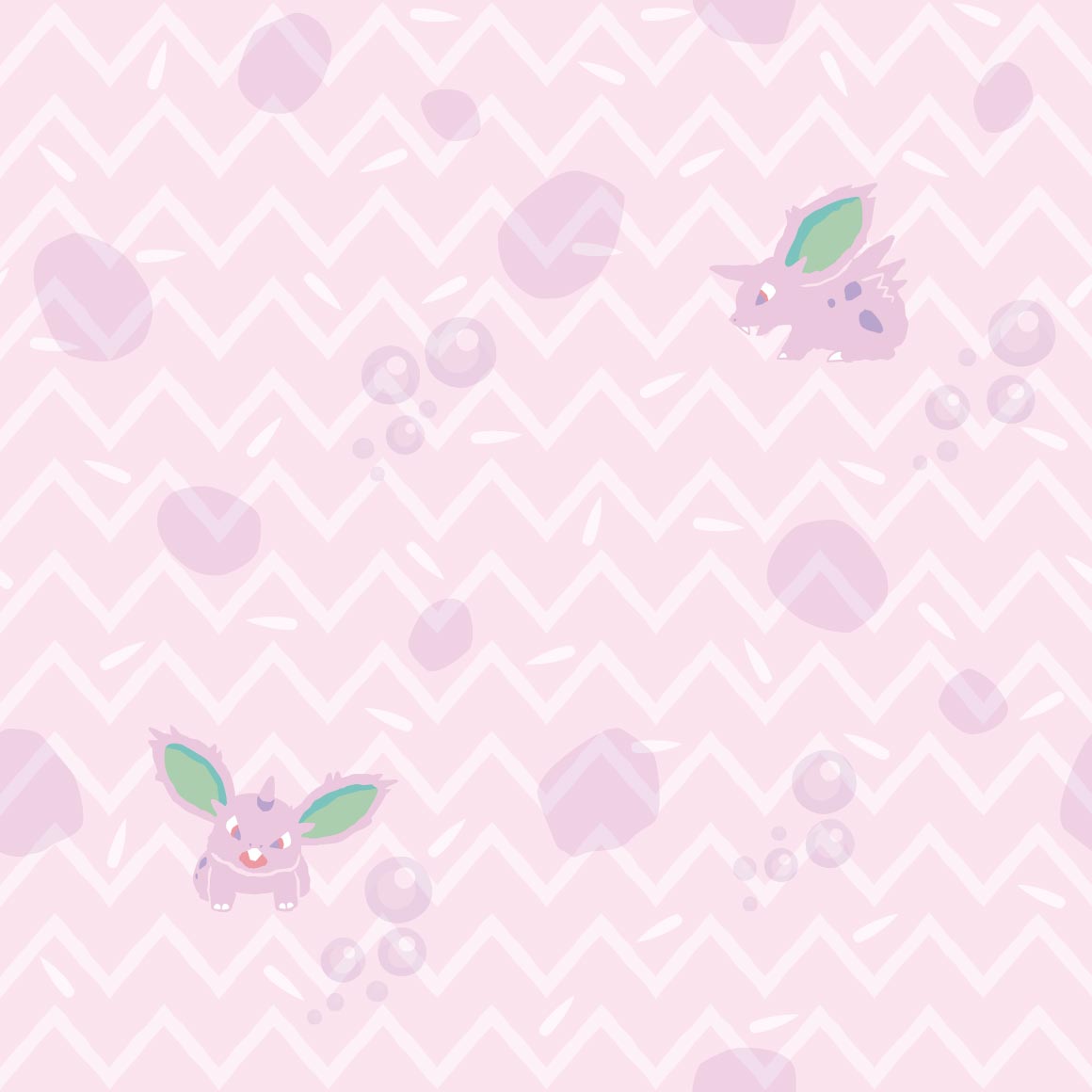
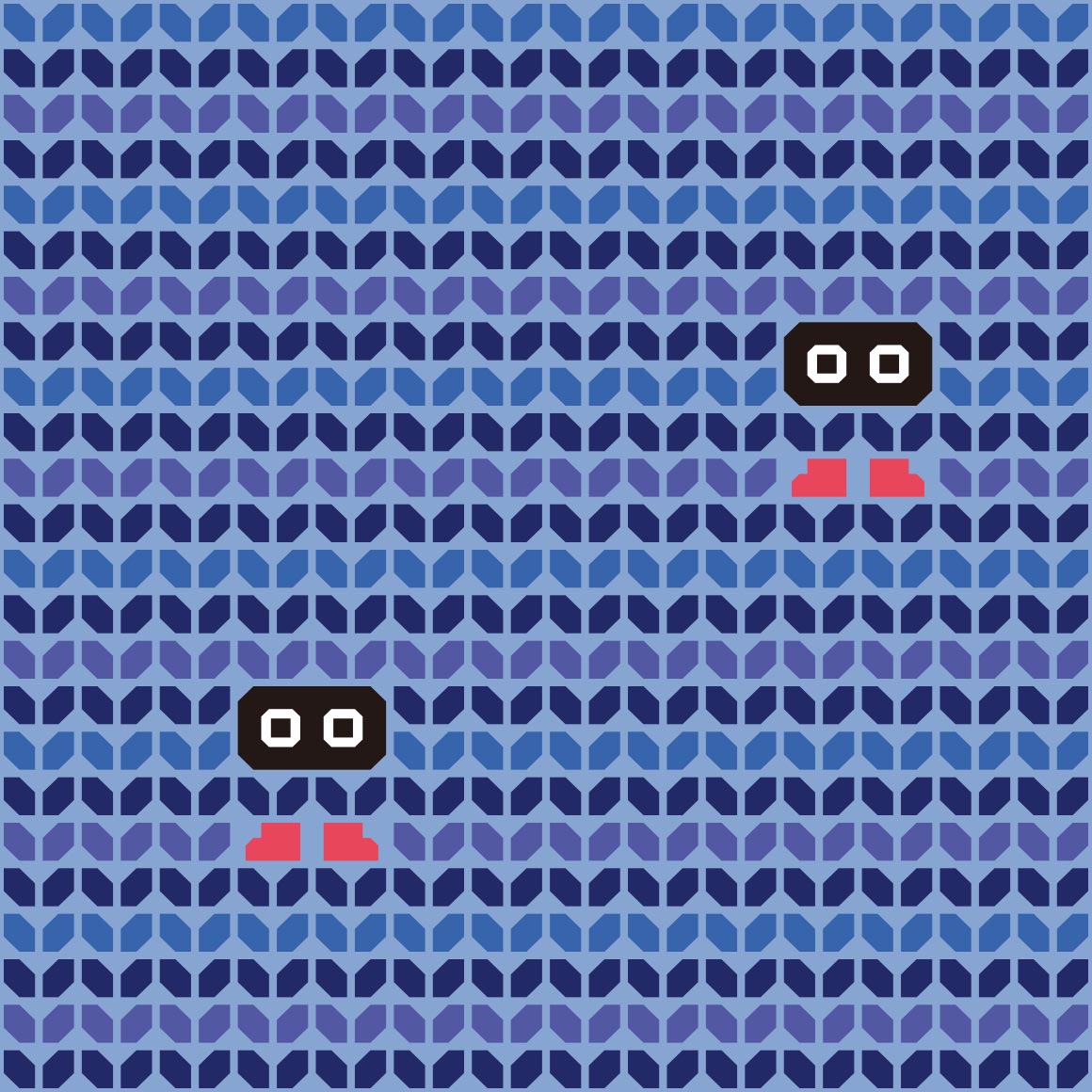
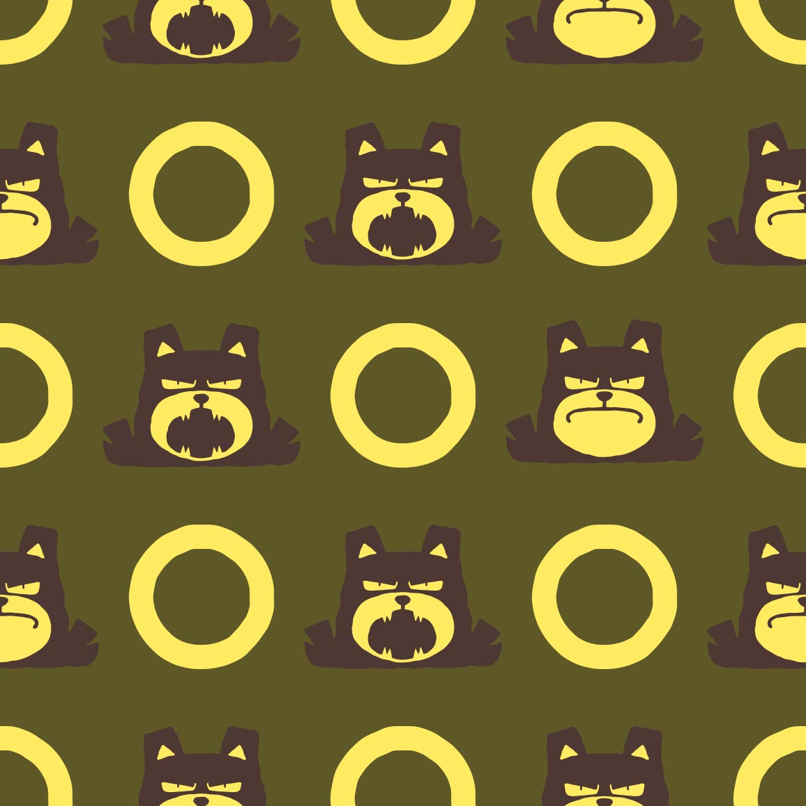
do all the nidos match? oh no nidoking will suck then | booo | this barely looks like clefairy but i guess would make good stealthy merch | i get WHY they have the moons but it just looks strange here. especially as theres only 3 clefables | i like it! its nicely colored and i like the silohuettes of vulpix | THIS is how the nidoqueen and nidoking shirts should have done it | i like how every single space is a jigglypuff, its cute | oh a sideways variation for wigglytuff! interesting. wonder if igglybuff will be the other direction? | |
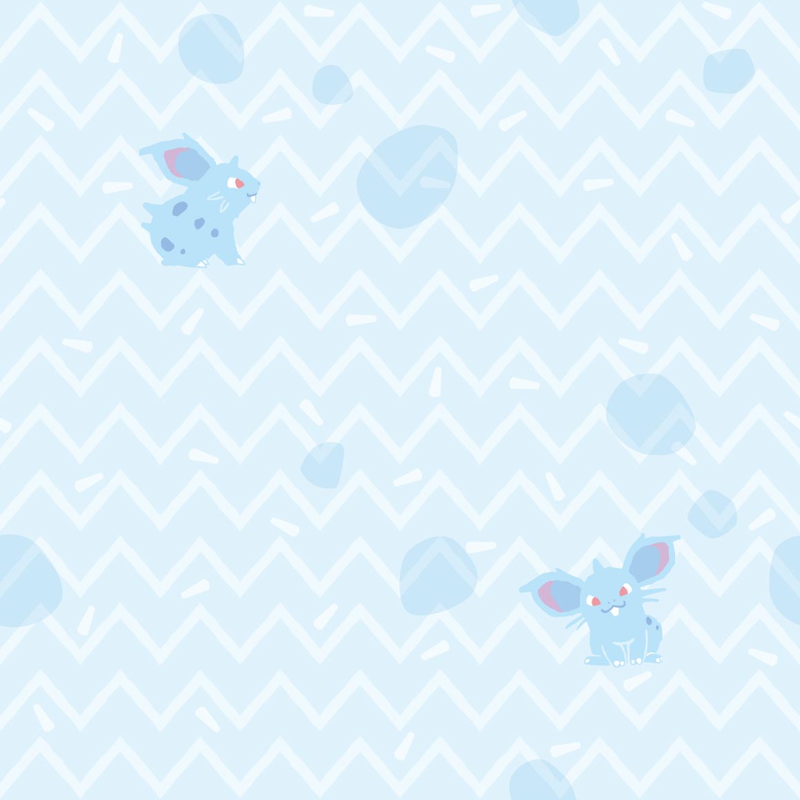
zubat looks so fucking strange without its wings out dude | as does golbat. ewww | its nice? i wish oddish featured more in it though | i like it! im not a gloom fan, but this pattern is nice and lice | not a fan. | this is so nice it reminds me of old childrens books love the art here | DUDE ENTIRE PARAS LINE'S ART IS BANGER?? THIS IS NICE AS HELL TOO, possibly my favorite so far | why is venonat with hexagons when its not a bee, and only there twice. colors are nice though | |
| it just looks like the same image copypasted a bunch :sob: | i like how the dirt is drawn lol, n the little alolan one | this art looks like something my buddy sam would make, not sure itd work as a shirt tho | i like it! the patterns nice as are the colors |
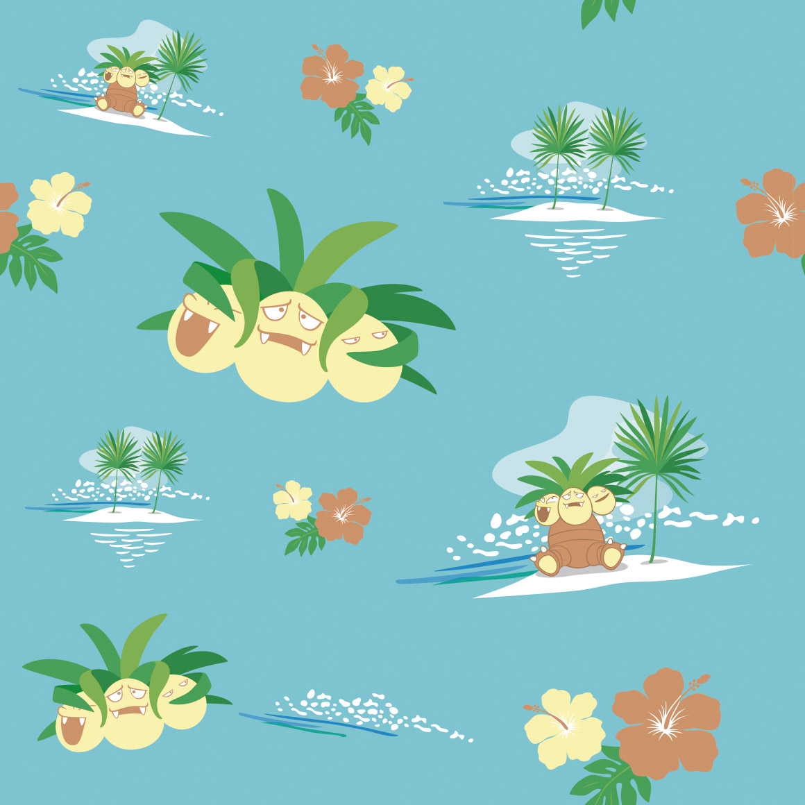
thats just a very boring silohuette | this is so pleasing to the eye! i love it when pokemon shirts patterns feature other unrelated pokemon too, so the alolan exeggutor is nice. hawaii |
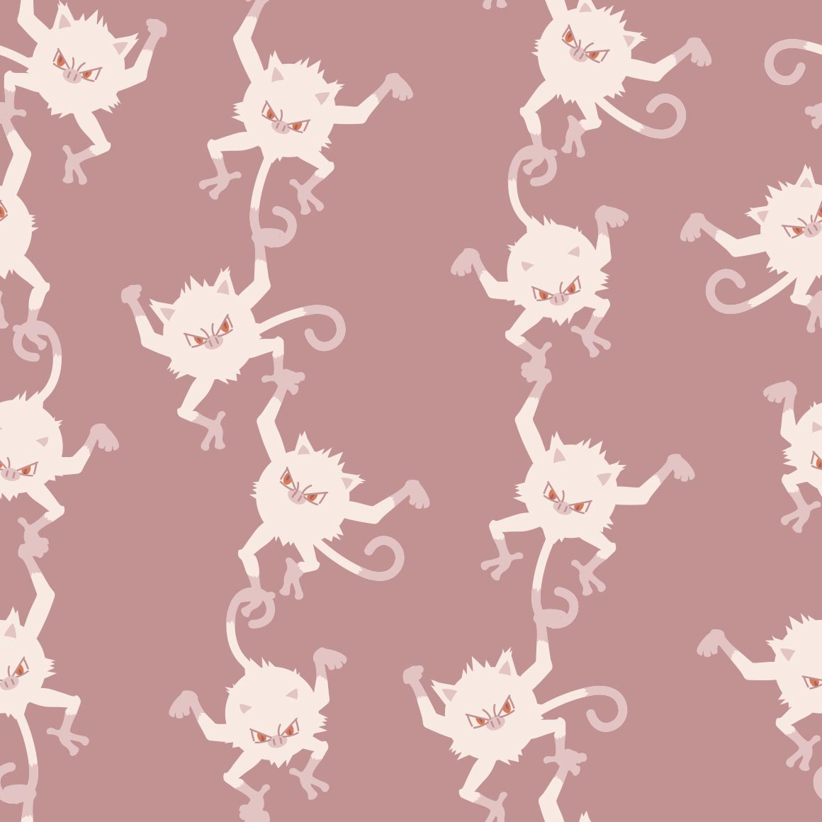
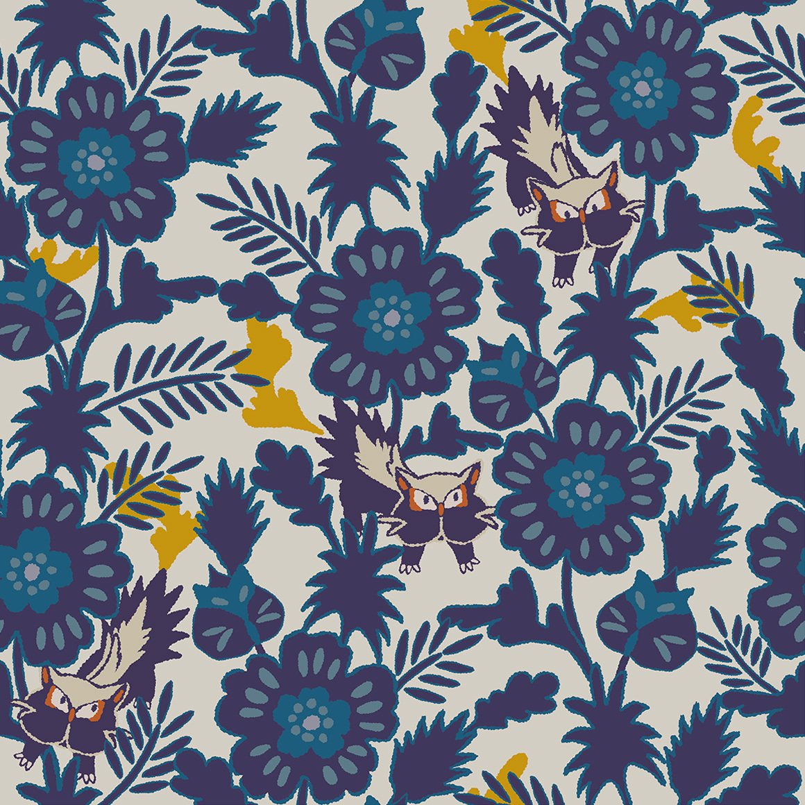
gross and hurts my eyes | they are like monkeys in a barrel :sob: its cute and i like how they grab each other |
|
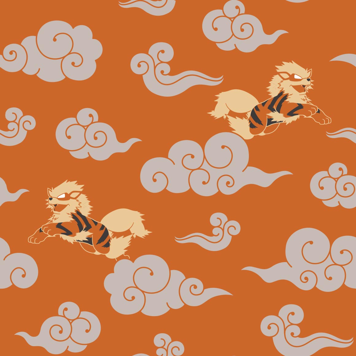
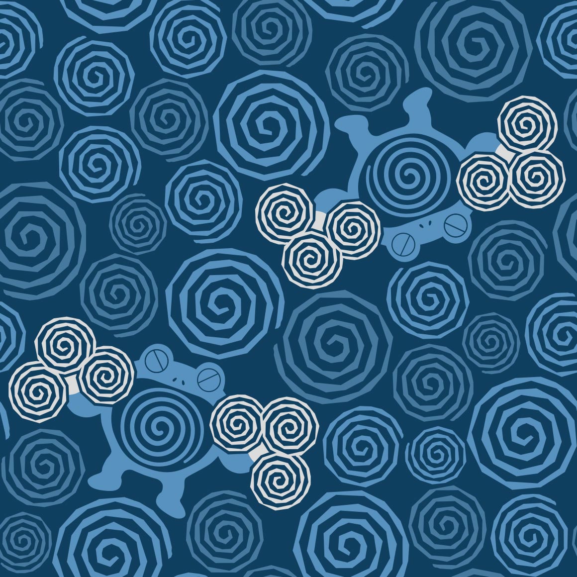
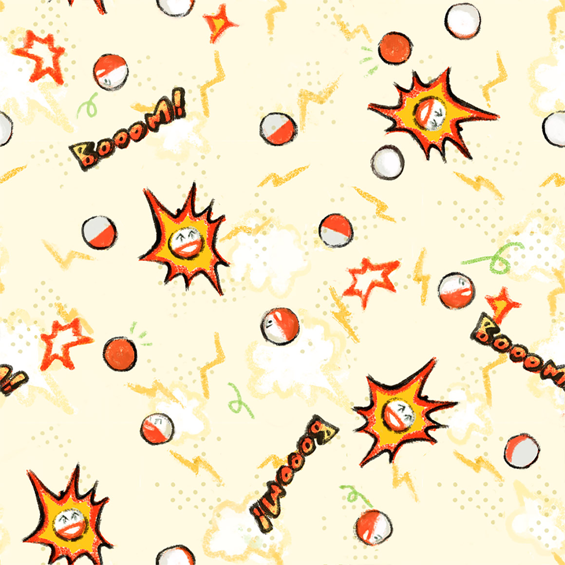
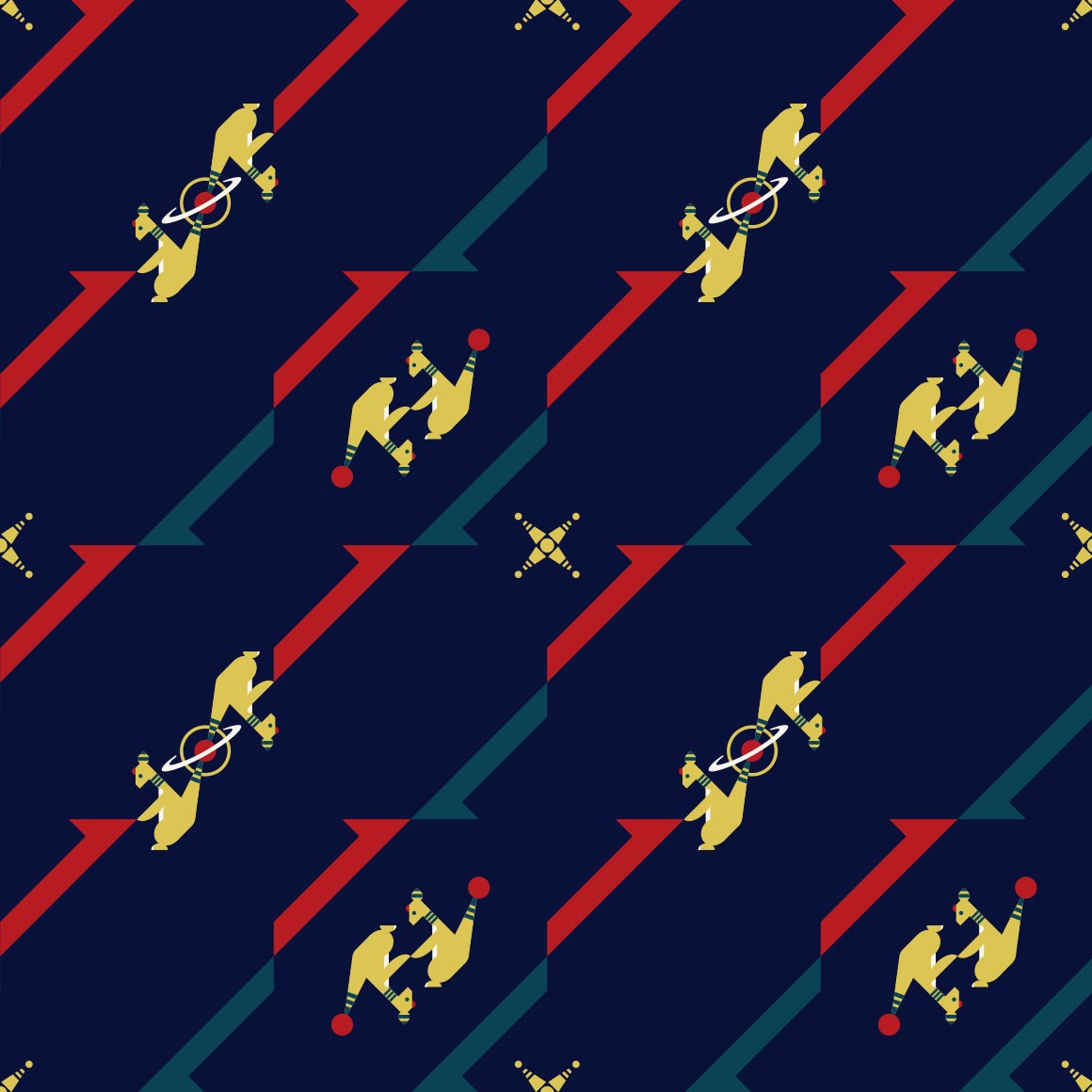
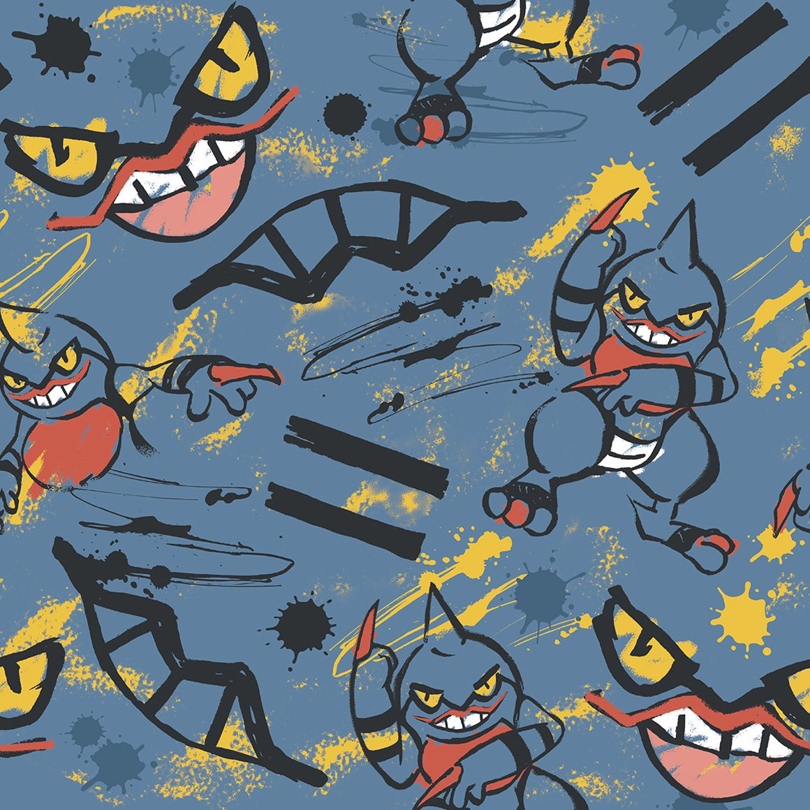
this really pops! it would also work as stealth merch like the clefairy shirt | this looks like something my mom would have on a bandana | n then they fumbled arcanine. arcanine itself looks very unfitting in its OWN PATTERN | aquarium gravel type beat! i love it | i wish the silohuettes were doing Anything but just standing there | theres only two poliwraths but it works here, okay? why are the fingers like that tho | they are like a weird kaleidoscope pattern | uri geller is Quaking | |
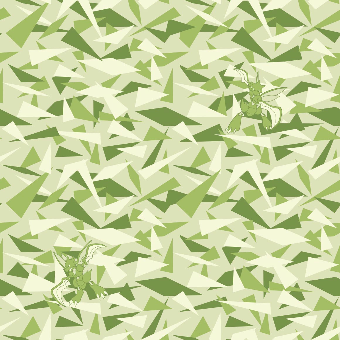
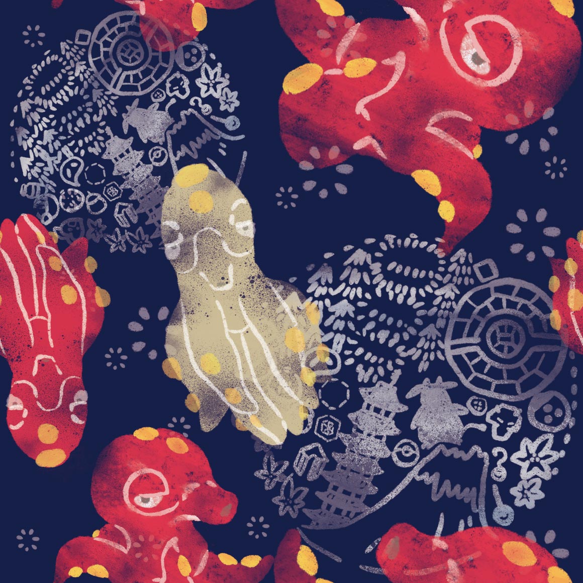
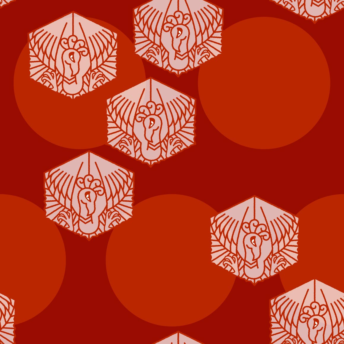
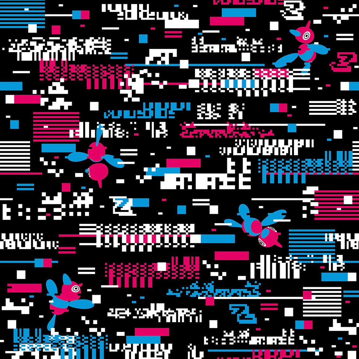
is this meant to resemble a pirates flag? but a pattern? with alakazam? interesting. | the colors are nice, i like how the fighting type icon is there? | its ok | where is the pokemon on my Pokemon Shirt | YUMMY COLORS i love this | reminds me of a neon sign | the patterns nice AND the inclusion of ledyba and yanma? superb. would Maybe wear this. | hehe its tentacles are the pattern | |
| what can i say but its ok, nothing to write home about | rock climbing wall? but i didnt even Register it as geodude, at first. | uv mapping failure | looks like something my uncle would wear | i like the lineless art + colors | this fucks but doesnt resemble the pokemon anymore its just a flaming horse | oh no its raining :cry: cloyster is there too | another hawaii shirt? nice. hi pyukumuku | |
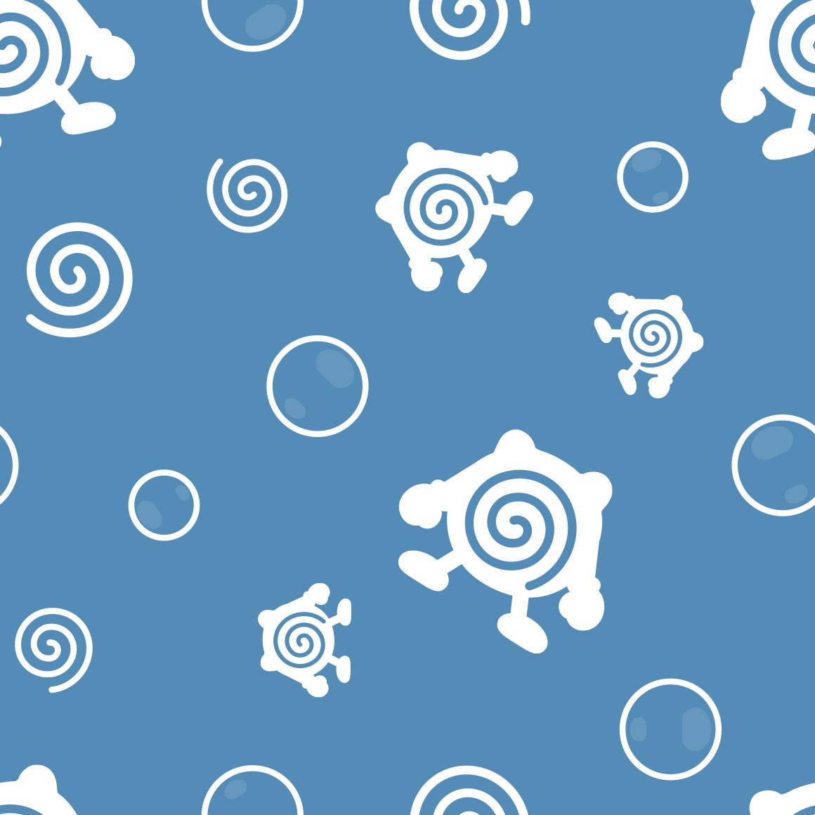
a nice pattern, id wear it | kinda boring but the colors are nice? | this fucks but not really a fan of the lines between everything, i know its trying to resemble pixels but its just not working | EW this is so cute | this patterns sucks but if i stare at it a while it makes the dodrio move up and down like a elevator | theres only one seel but its really nice the icebergs take up a lot of space but its ok bc seel is in the middle | yin yang dewgong | sludge in rows with grimer coming out rarely? ok | |
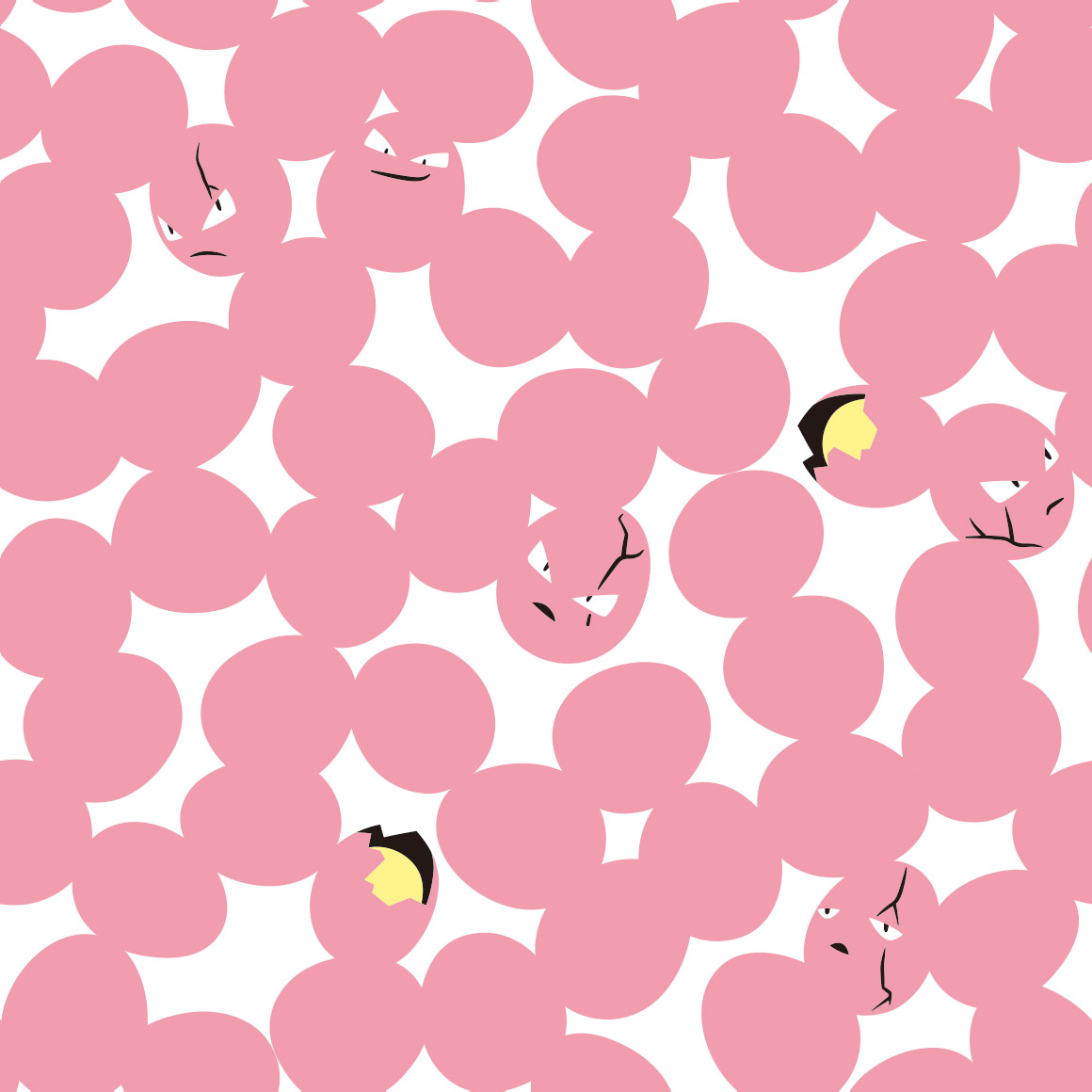
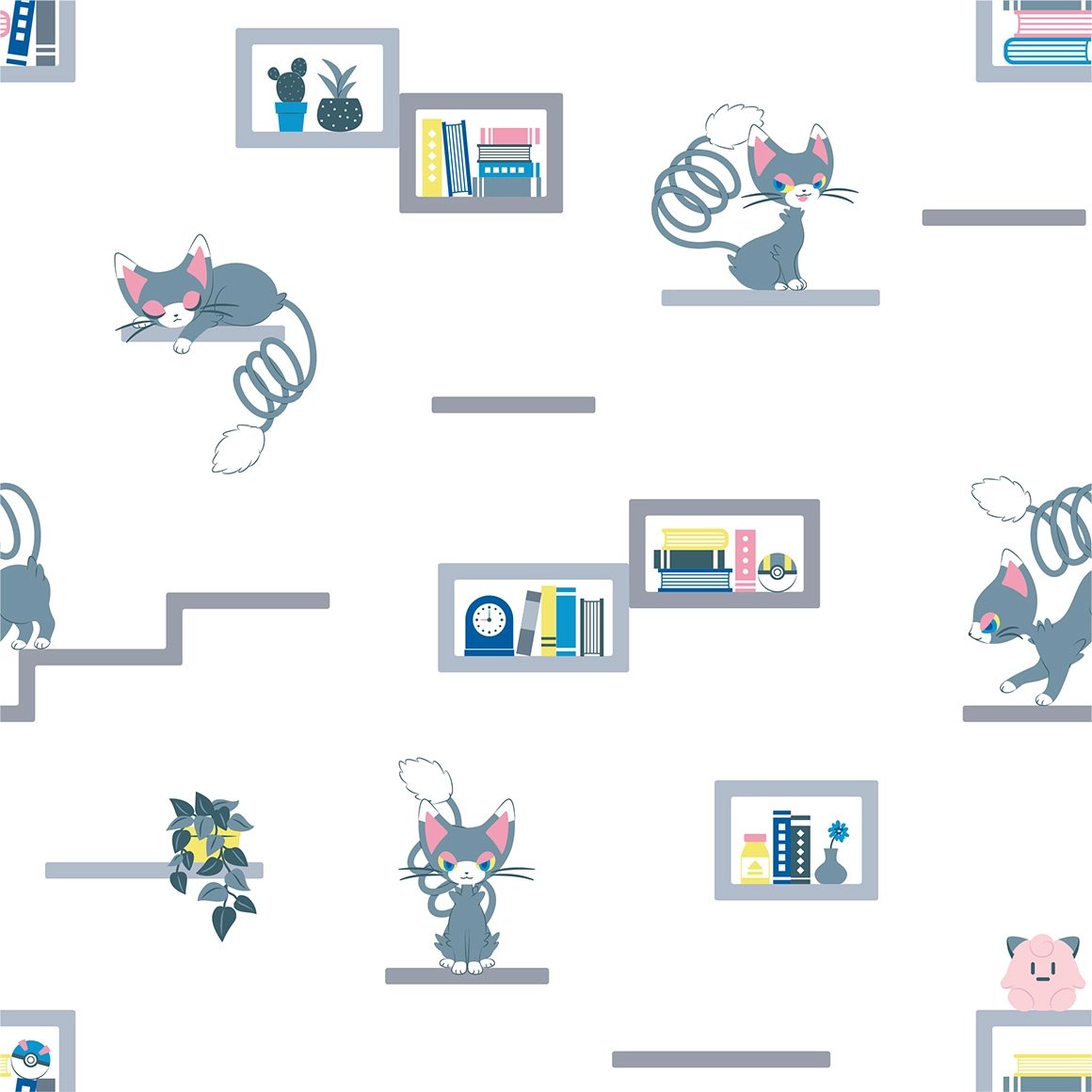
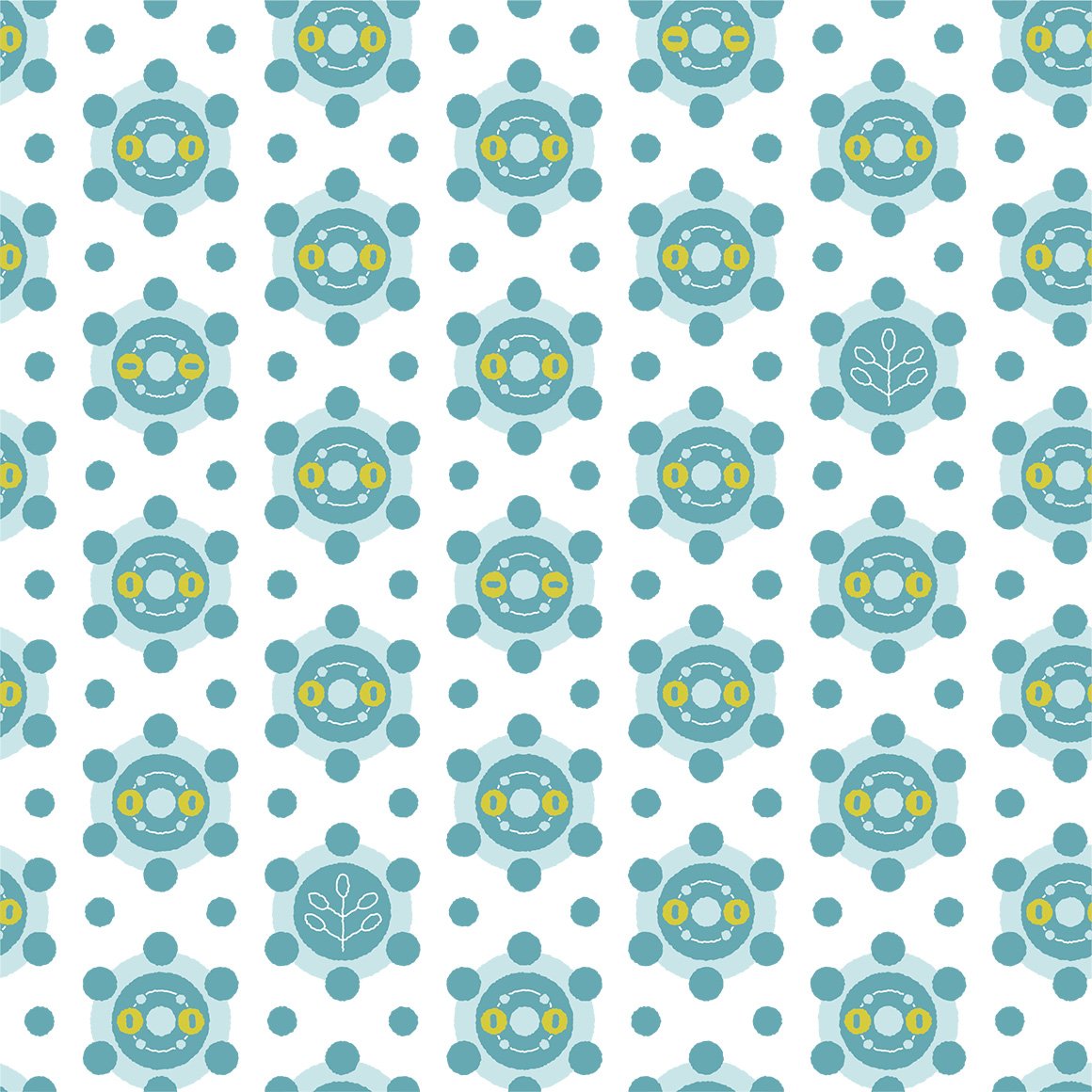
dude why did muk get unique art for every iteration? :sob: | yummy colors? clam | its nice? | cofagrigus what are you doing here | they couldve had every empty space and full space be haunter but they didnt go for that i guess | its nice | this hurts my eyes and also where is onix | it looks nice | |
| i like how the empty space is z's | love the art! very nice | this is like either the persian art but even more mid | voltorb is hiding! can you find him? |
i love the art here its so sofd | only a few eggs |
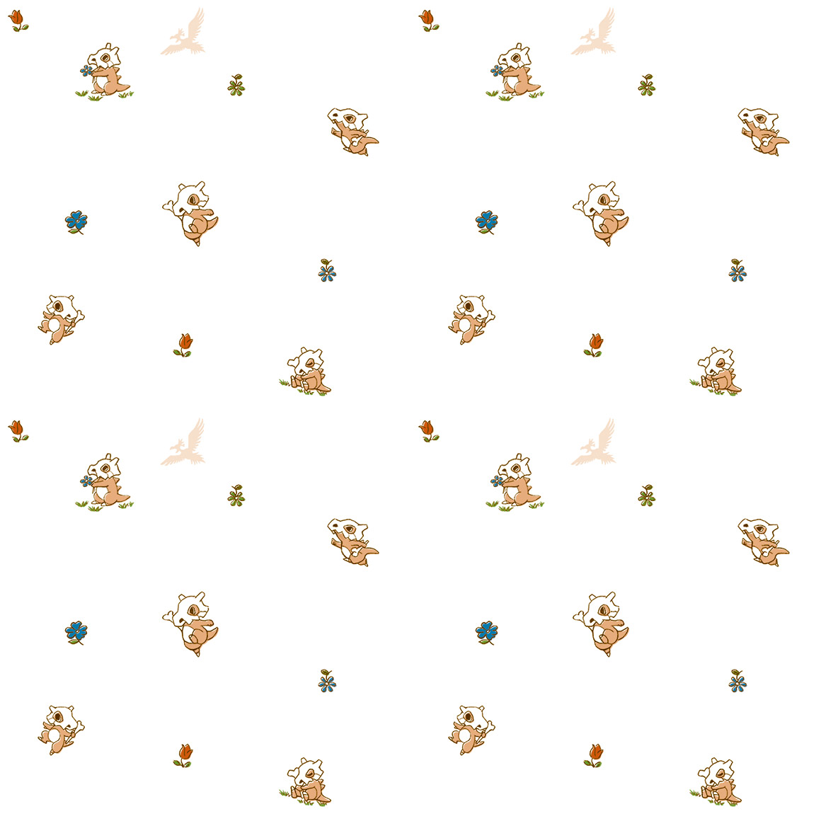
where is alolan exeggutor its been on so many other pokemons art but its not here?? | oh god fearow is there because it Eats Cubones |
|
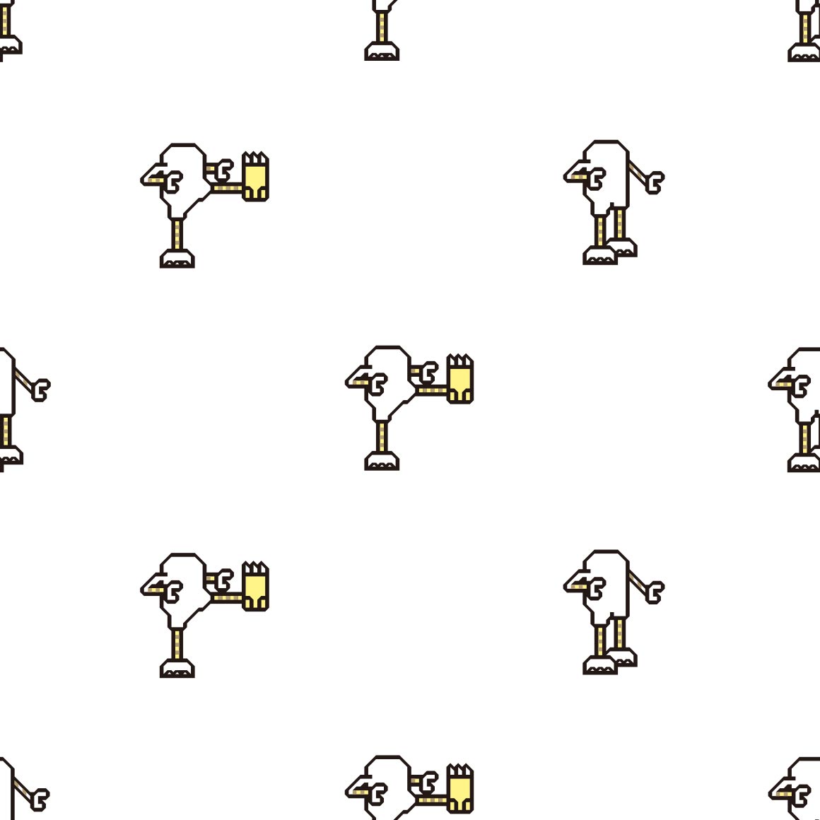
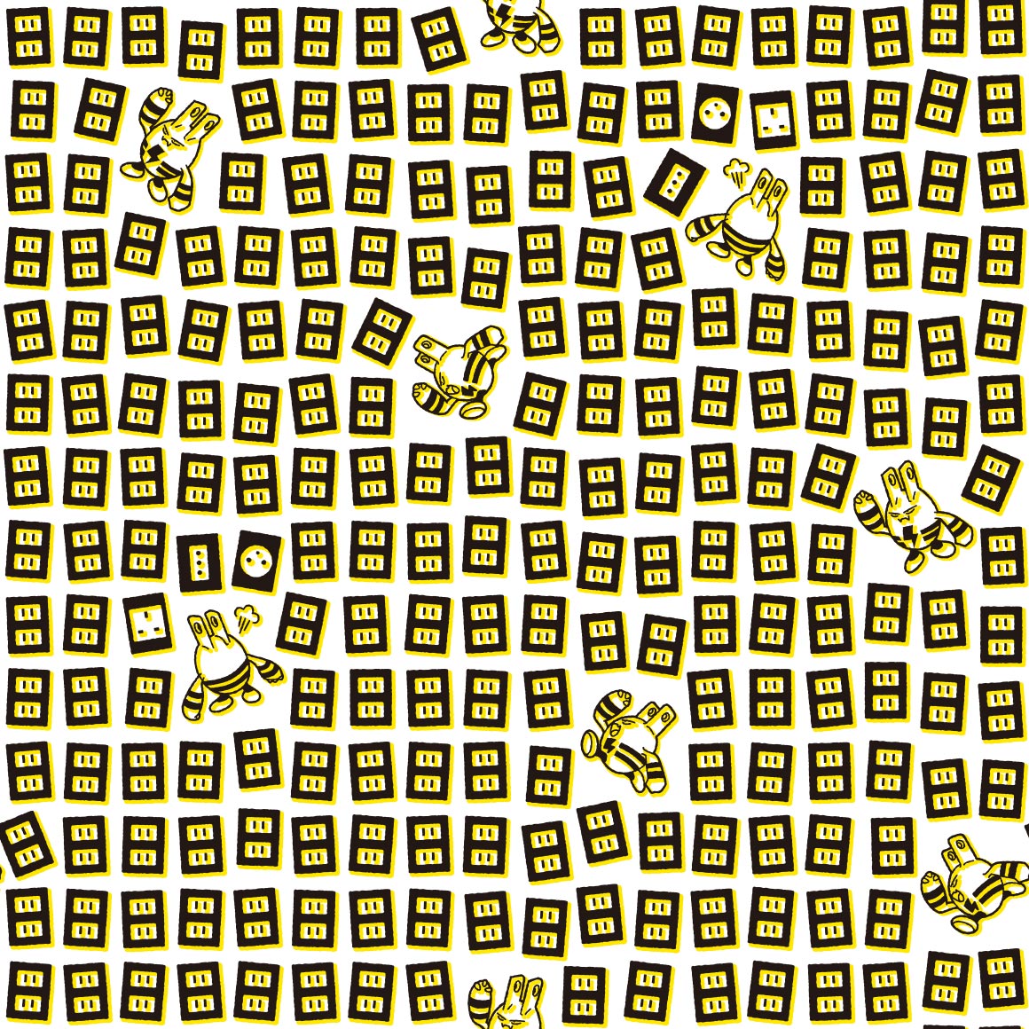
mandibuzz is also here because it Eats Cubones | its nice, do you think the other hitmons + tyrogue match? | hitmonchan at least does! | :P | round and for what reason, wait on second look its actually NOT round, but pretty rounded | funky, i like it | kind of a boring pattern | what is with these shirts and making the pokemon really hard to find in a bad bad way | |
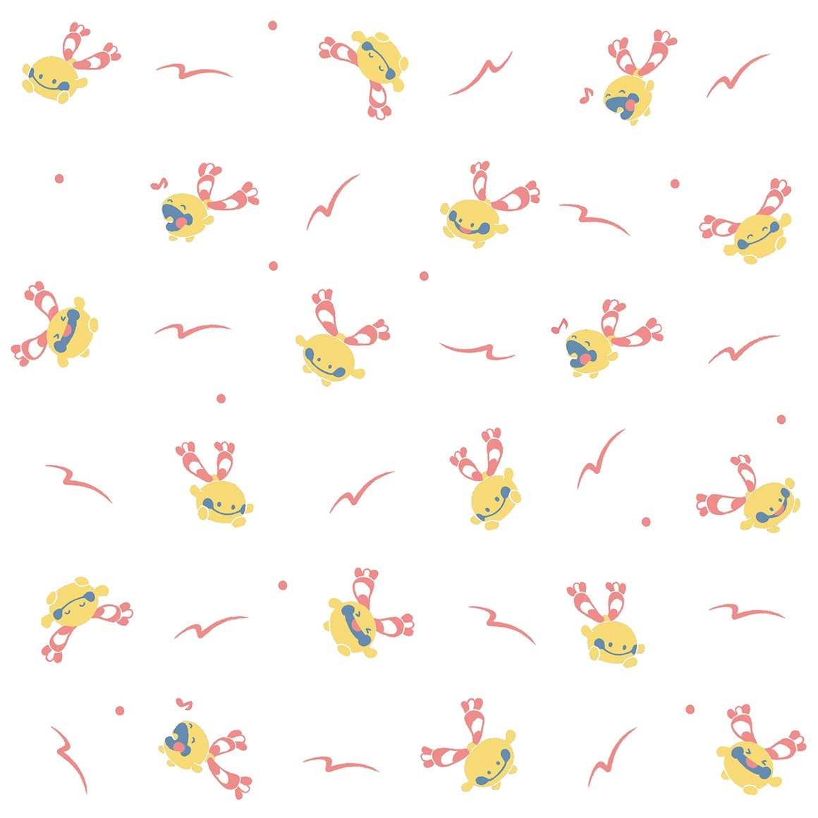
egg. HAPPY EASTER | see at least this one works with hiding the pokemon bc its tangela | oo same art style as raticate, chanseys there too | its hard to see anything but horsea and thats kinda bad | Interesting. art style. it does pop | something thatd be on a bandana | dude this is even more like the last description i put huh | i like this one! its very nice | |
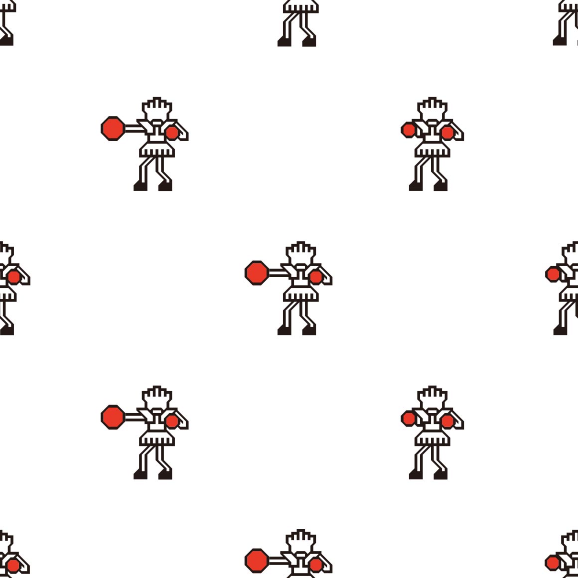
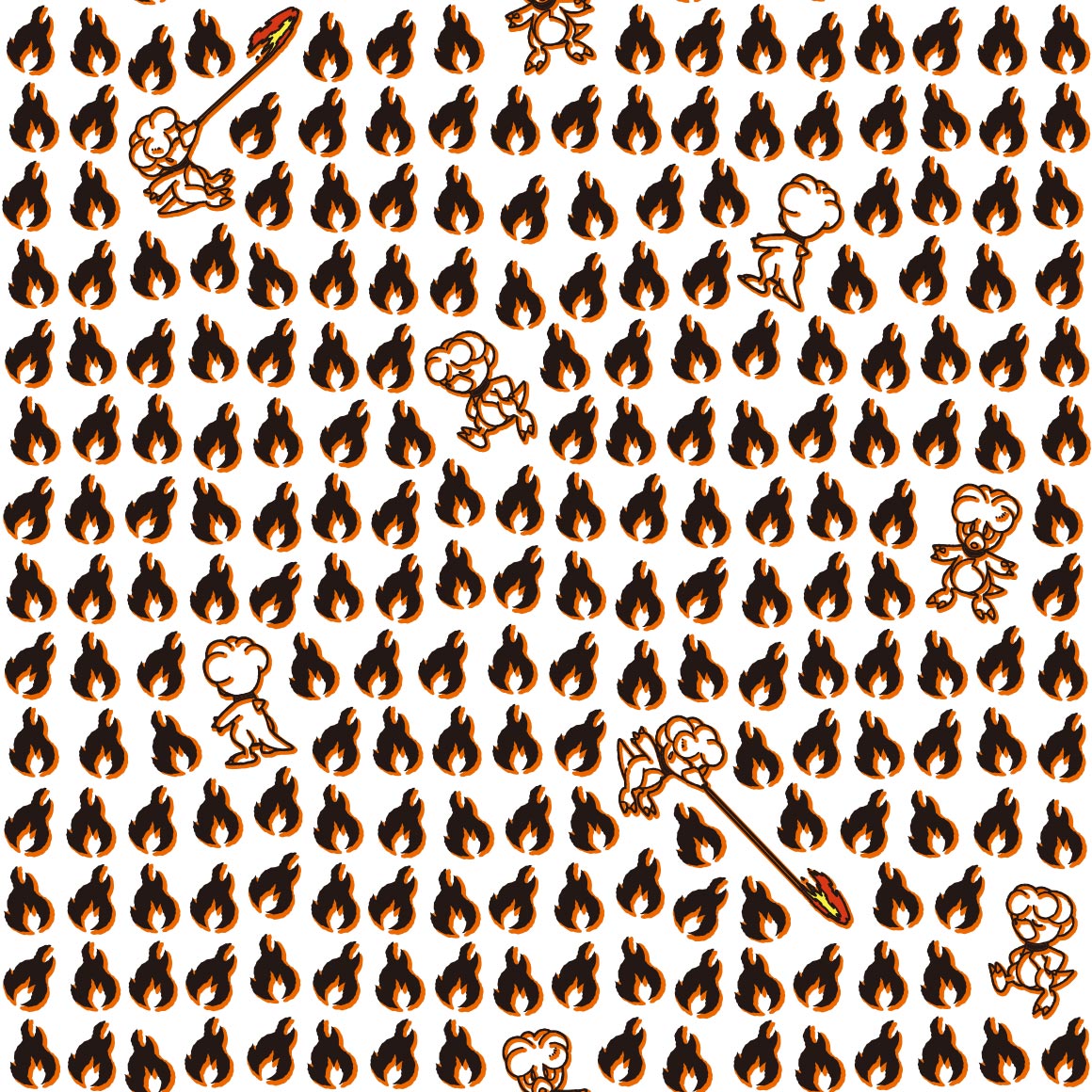
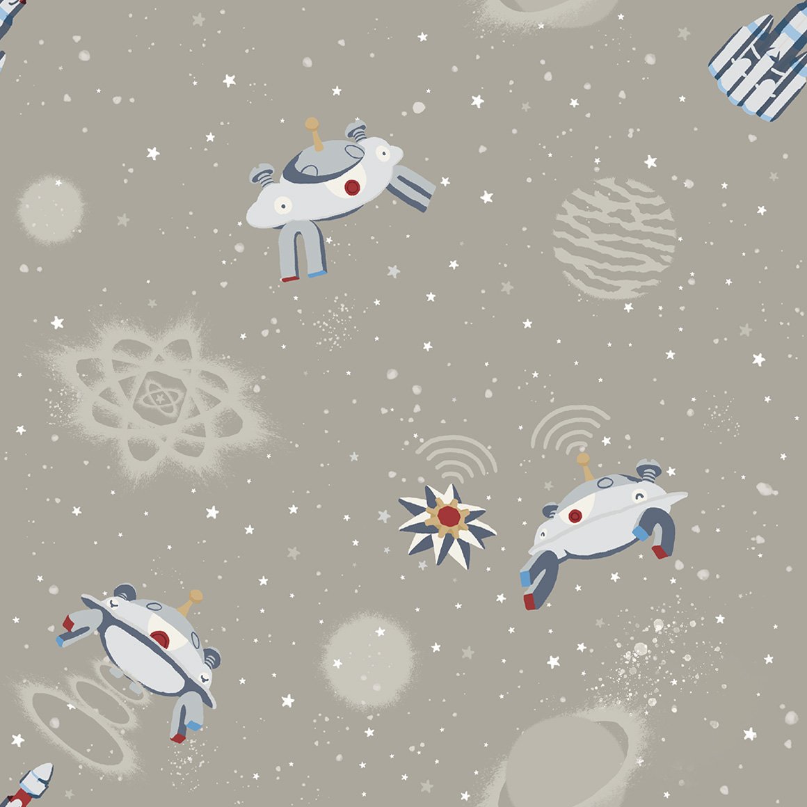
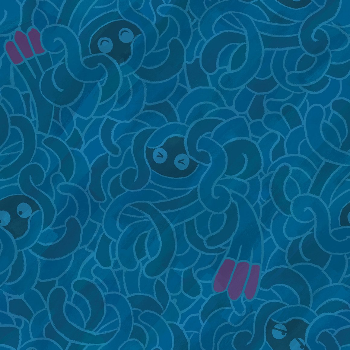
| we are in space (and shellders here too) | hehe its a fake transparent pattern because mr mime makes transparent barriers | most generic scyther art ever smh | its ok | this pops but not really my style of clothing. my sisterd like it though | hehe its shooting the fire |
this kind of sucks | ill be honest this didnt register as tauros at first i was like what fucking regi is this | |
sure is magikarp | wow they really used stock art for GYARADOS huh | not sure if same art style as the raticate and kangaskhan but i like it | this is so soft and sweet :sob: | god please tell me not all the eeveelutions follow this sucky pattern | OK GOOD THEY DONT. this is really nice! | and this one sucks! | colors are nice? | |
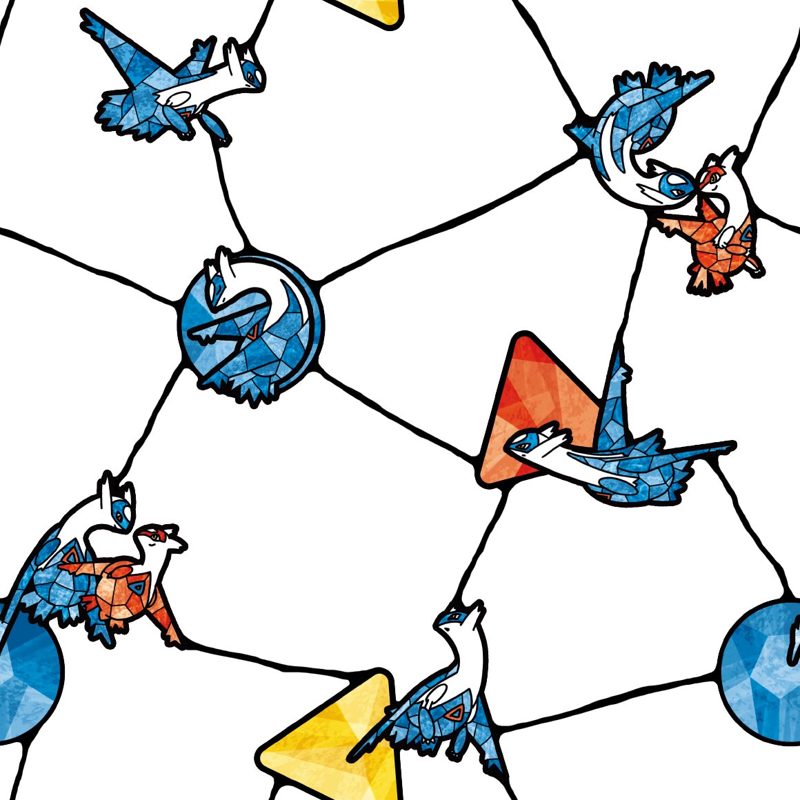
wireframe. nice | dude the colors are so nice as is the pattern. i love it! lets hope kabutos just as good | he looks emaciated :sob: | i know they cant do the spiral pattern for kabuto but they couldve at LEAST done something similar :sob: | this is nice though, step up from omastar | Eh | he is melting into the pattern oh no | did they try to mimic pokemon gos art style for these birds here? we will see with the others | |
| clearly not. as zapdos is way better than the articuno shirt. i like this one. looks very Hummingbird | thisd make good stealth merch.. | water on his head but he doesnt care, kinda a boring pattern though | this pops but again i wouldnt wear it, not my style |
again with the old childrens picture book artstyle! its very cute. | this looks like a aesthetic post id see on tumblr! its very nice |
hehe shiny mew. very nice |
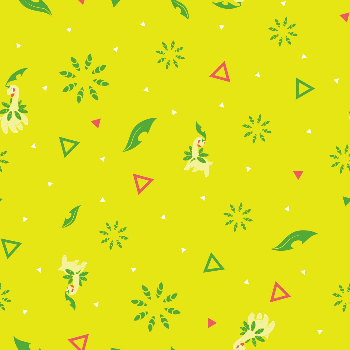
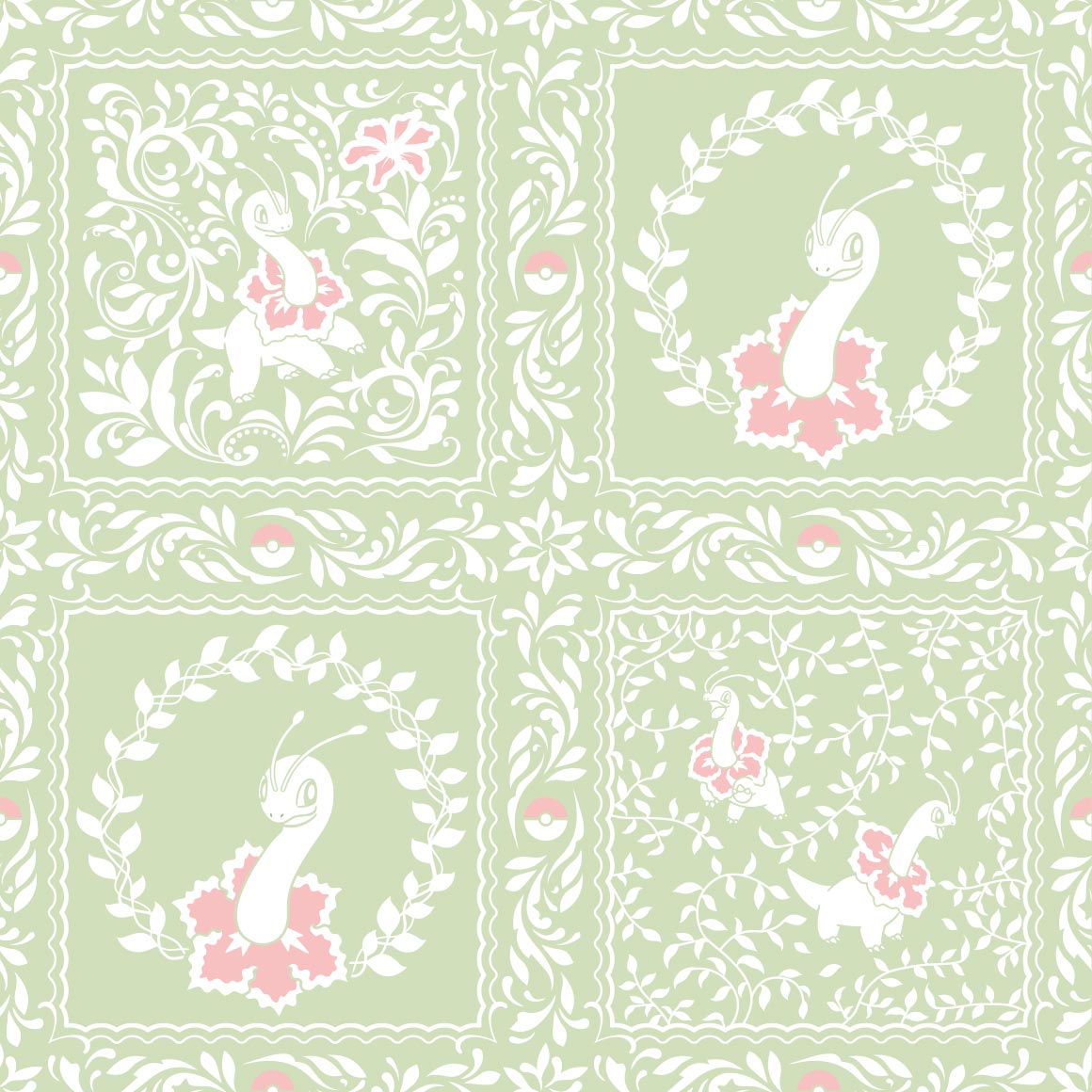
gen 2/johto
a promising start to a new set of patterns. nice colors and lineless art
seems we are continuing with that style for bayleef, nice because kantos lineup didnt really copy styles for evolutionary families, wonder if meganium will too
it doesnt but i dont mind. its very nice, something id see on a bandana given to me by my mom
lots of inactive cyndaquil then a couple erupting ones. nice
this style doesnt really work for quilava in my onion
its hidden between the flames and somewhat hard to see. they fumbled the rest of this line. shame
cuuute. its gnawing on the columns!
i dont know what to call this art style other than I like it
thick line art once more, though this time more pointy
the colors are very pleasing to the eye! i love it!
kind of cluttered but it Doesnt work here.
hes just eyes
i like it!
ledyba looks so derpy here (can i say that? its 2024 can i say that? or is that too 2014) wait is vileplume here too?
this fucks severely, but why did they give LEDIAN of all pokemon this good a pattern
its kind of hard to see the pokemon. on my pokemon shirt
storybook artstyle again! nice
i didnt realise crobat was so early in the johto dex god damn. nice pattern tho
its nice? not sure what else to say
we are in space! again. very nice
very sparse, just like pikachus. shame
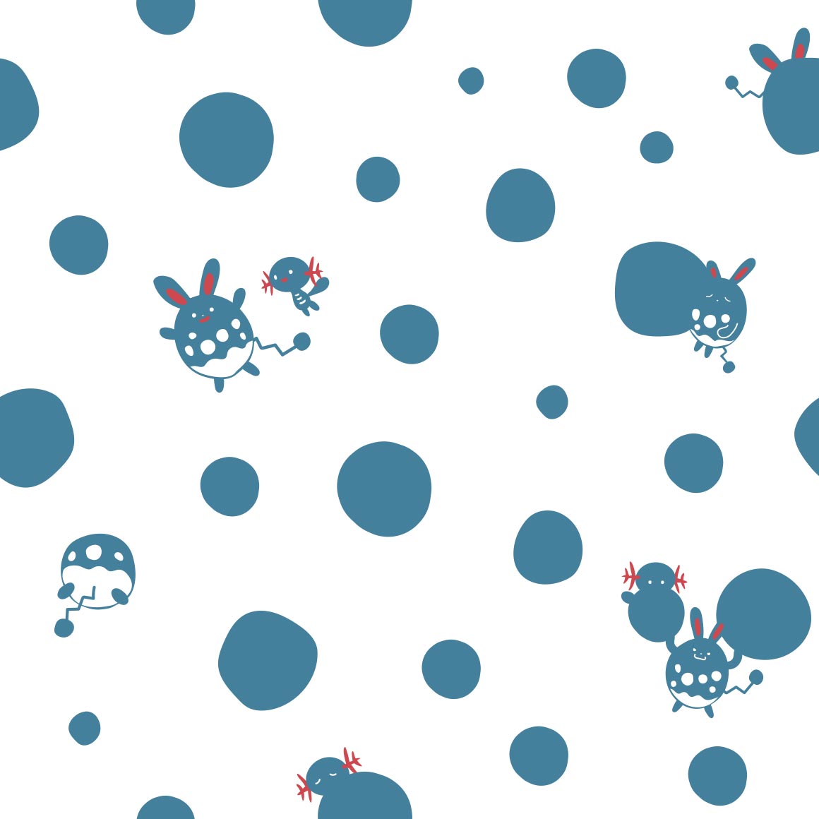
this is so cute :sob: hi minior too
they went with a poliwag approach instead of what i was expecting! its very cute, id wear it.
is this supposed to be togepi?? its not spikey at all..
this is so soft and sweet, very nice
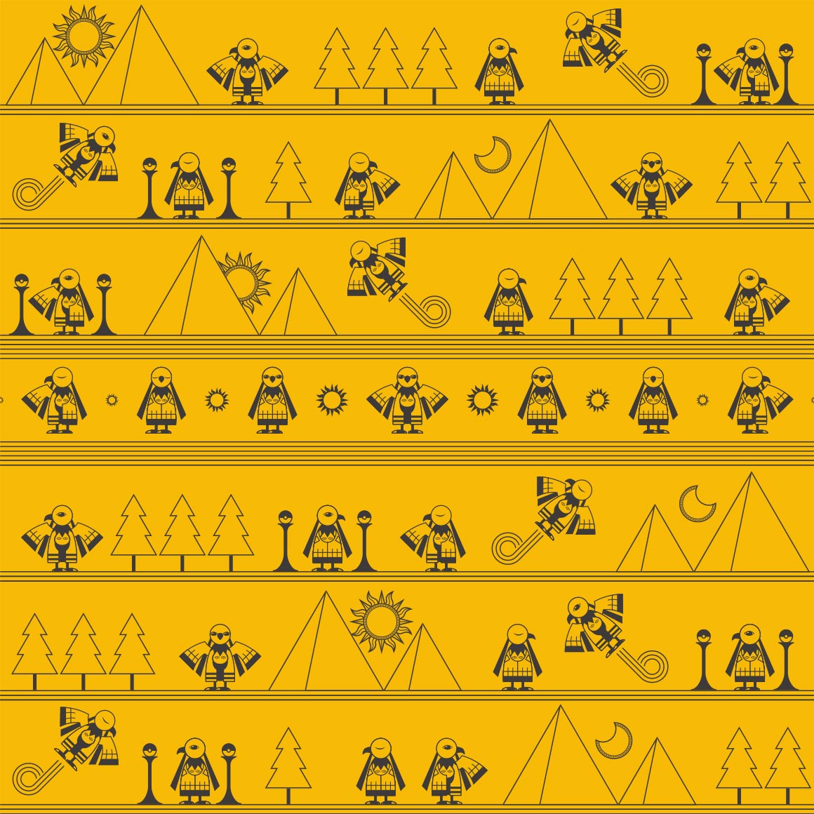
natu
oo they made it into an egyptian hieroglyphic pattern instead of what its actually based on! its very nice regardless
very cute! plus theres a shiny here, so points for that, love seeing shinies in official art. WAIT I JUST NOTICED THE NAKED MAREEP thats funny
oo more neon sign style. nice. it fits with flaaffy too! (but why is alolan exeggutor here?)
interesting pattern. i like how they conjoin!
well you definitely see the pokemon this time, and its nicer looking than vileplumes
so many cameos by other pokemon! i love the art here its very cute
uh ok i guess, strangeish
interesting. art style, wonder if bonsly will follow up
the art of the pokemon is cute but the colors and pattern kinda suck
this is so cute! another bandana pattern to me
interesting?
so soft! just like the pokemon itself
im not really an aipom fan but this is nice
this is like the lickitung shirt! but with a single variation
watercolors i think? nice
id wear it
very nice pattern and colors! but at first i was gonna complain about why corsola only got one slot on its own pattern (before i realised it was woopers)
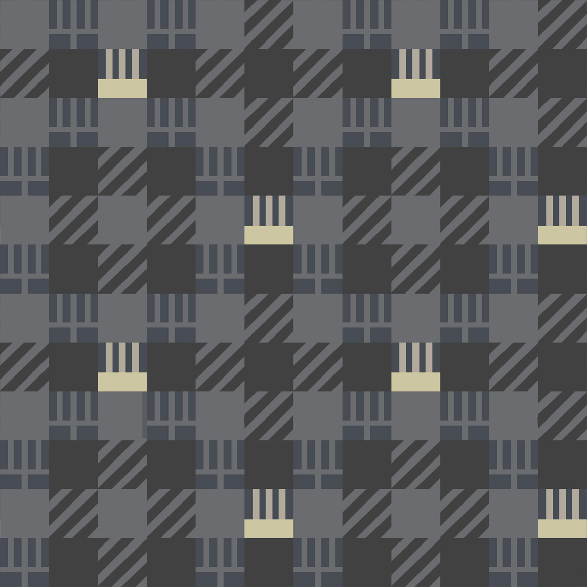
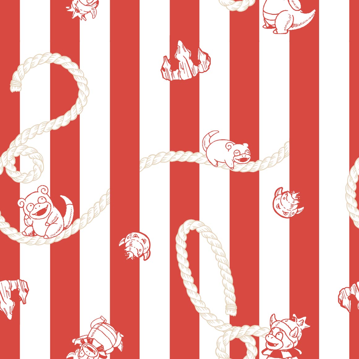
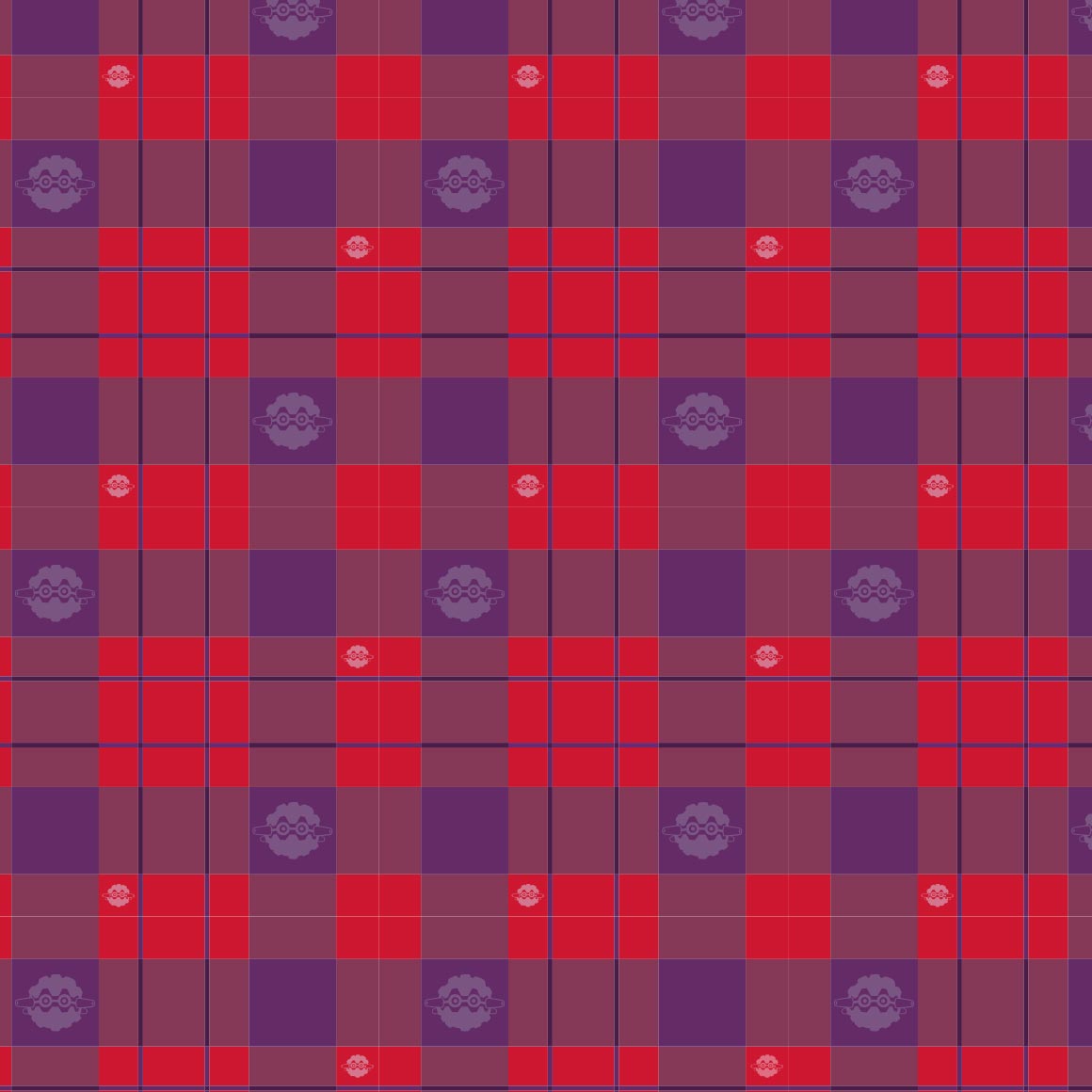
plaid, quagsire flannel would fuck tho
i love this one, at one point i had a shiny edit i did of it as a background to an older website i made
it looks nice, its sure umbreon colors
huhu pixel art
slowking is barely on its own pattern! slowpoke is more prominent and visible than it :sob:
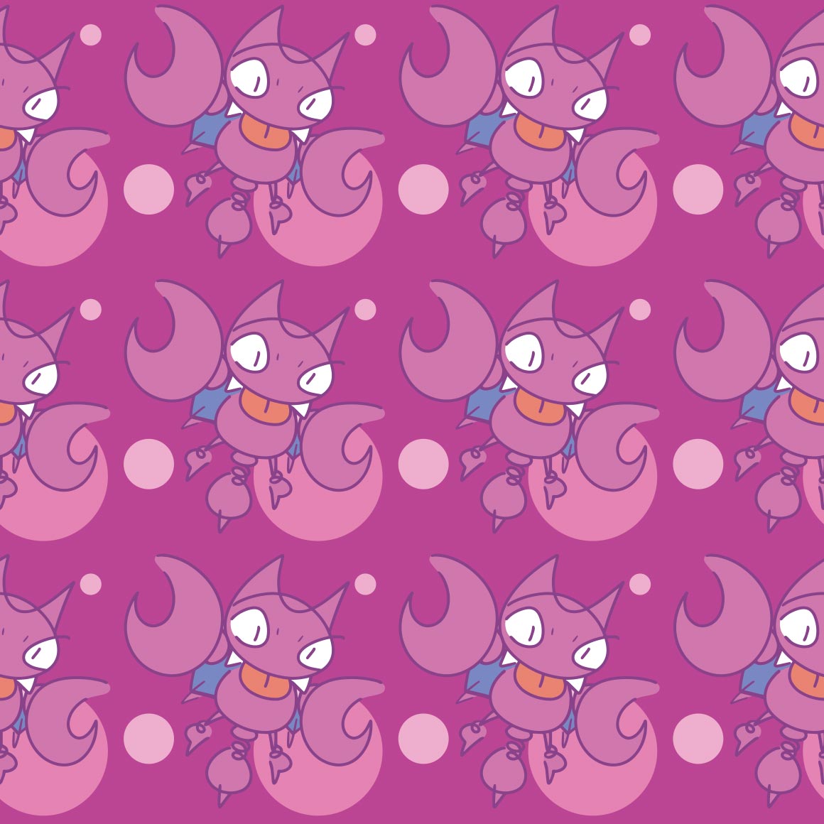
strange choice to not include the face, considering misdreavus is a floating head
hehe they spell out pokemon. itd be a fun shirt to wear!
whats with the yellow :?
these look like scratch and sniff stickers that are also fuzzy
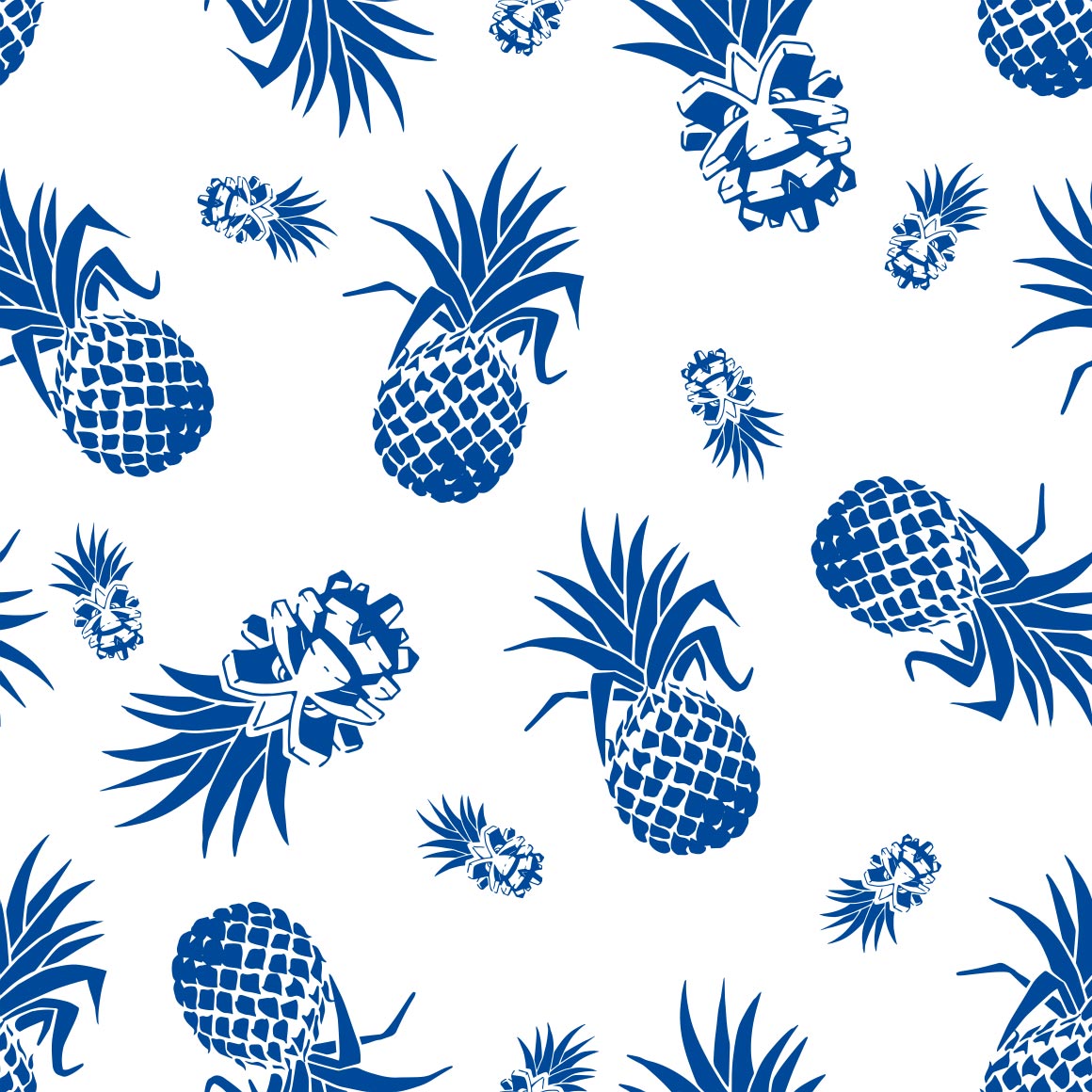
missed opportunity for pineco to be with pinecones or in a pine tree... why pineapples.. ludicolo is already a pineapple
after having no plaid/flannel in kanto, there sure is a lot in johto! (only two so far. still a lot)
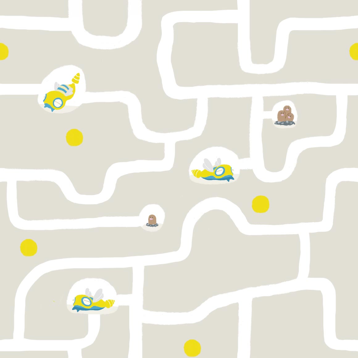
very cute, its in tunnels with diglett and dugtrio about, though i wish it had more poses
not a gligar fan really either but this art is so very nice! it reminds me of youtube animations of like. mid 2010s
once again onix is outclassed by its evolution in every way
this is cute, more bandana art
i like the colors! its very cute too
hehe the waves are qwilfish tails
its pretty hard to see scizor in its own art huh, at least the leaves have its claws too
kind of a boring pattern but its nice to look at
i like this one! another ive used on a website ive made. vikavolts here too
whats with the easter eggs :?
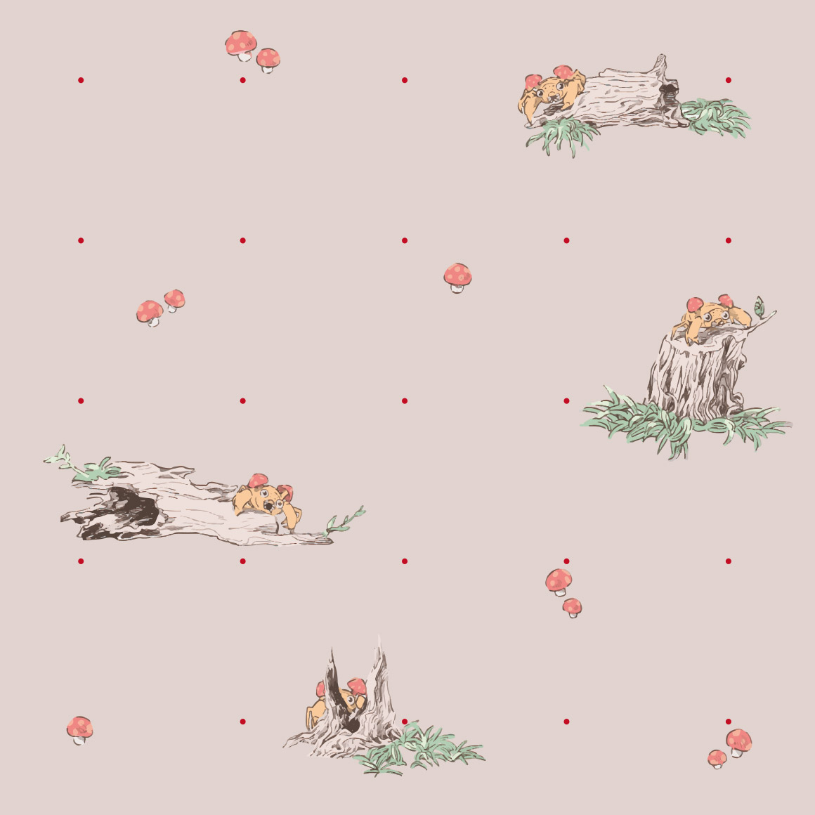
obviously the teddy bear pokemon would have a old childrens book artstyle! still nice, and combees there too
this pattern sure pops
im not really sure what to say about this one its just like paisley esque patterns and a few slugmas
they actually did paisleys for the next one!
very boring pattern but i think it works here
this one sucks though
hehe shiny corsola and some strange yellow variation too
ive seen this style before but i dont know the name. very nice though
if you had no idea this was pokemon youd think its just a normal shirt! shiny is there though, as is miltank
christmas wrapping paper pattern, fitting as it IS delibird
string
strangely detailed for a pokemon shirt that only does a outline
boring pattern but im sure someoned wear it
oh is it corroding because of the venom in its bite? cool!
eh i expected more from a kingdra pattern
very nice colors! and the columns have its little nose there hehe
looks like something youd see in video game ruins on the wall
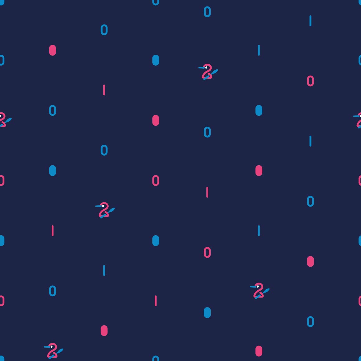
hehe its body is the 2
dare i say trippy
this is cute! i like the colors too
oo they did continue the hitmon themeing!
glad they did
this pattern is so fucking nice and for what pokemon? smoochum? if you told me itd get one of the best patterns id assume you were lying.
the fake 3d effect kind of hurts my eyes but its nice
they did it with magby too??
christmas wrapping paper type beat, unfitting this time
this is cute
wtf is that thing in the bottom middle
i guess all of the beasts have a pattern like this. a shame
yep
this pops and is very cute, for a strange choice of pokemon
whats with the cactuses? colors are nice though
the negative space IS the pokemon!
its strange looking, but i bet ho-oh follows suit
like clockwork
love the colors! but its hard to see celebi.
gen 3/hoenn
another promising start! i like how it interacts with the spaces and columns
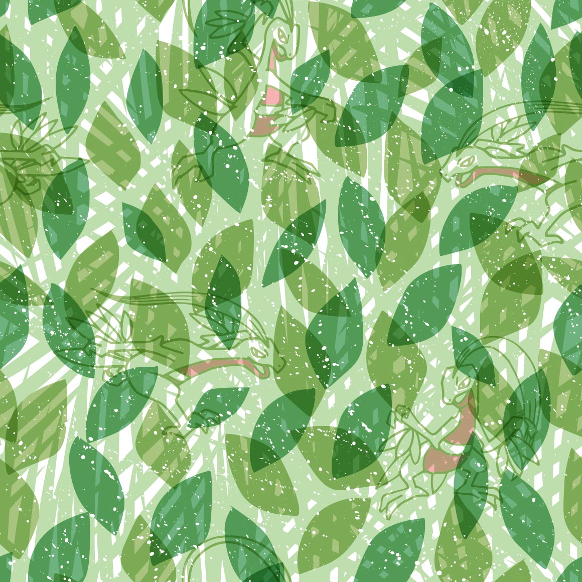
kind of hard to see grovyle, but thats clearly the intent.
big fan of the colors but not a fan of sceptile just kind of being strewn around randomly
unique art for every pose, thats a first with this many poses! very cute art at that too
comic book panel
blaziken is a strange choice for paisleys
this is so cute! and theres a shiny mudkip here too!
im not sure what this reminds me of, but it does of something
its pushing the rocks!
the pattern is tiny poochyena heads! i see, though the actual heads are kind of just strewn about
this is very nice, though not something id wear
reminds me of cookies but im not sure why
its running on the lines
its also climbing on the lines! and theres a few shinies too!
its a struggle to see silcoon
whats the deal with the differently colored ones? its not shiny
its nicer than the silcoon one thats for sure
strange choice for a neon sign style but its very pleasing to the eye
this is so sweet and just nice to look at
are these all shiny??? its very nice
i want more patterns in this style. not a single repeating drawing, its so nice. why did they give LUDICOLO out of everything this style and privilege!
cute
noticing a lot of unique art this generation! very nice. rowlet
tattoo style
very nice colors! oh no wurmple is going to get eaten
kind of a lot going on for my tastes, in a bad way
well at least theres a shiny... very Nothing pattern
dammit why did pelipper have to have cute art
very cute, lots of gen 4 cameos
not a fan of how the pokemon are just dropped wherever
very nice to look at
i think this is my personal favorite from this generation, though we are only a third through. i used it on my tumblr! like right now! i like the cameos too.
i wish my favorite pokemon got a better pattern :crypae:
cute..
reminds me of the parasect one! id wear it.
a lazy pattern for a lazy pokemon
this pattern is so energetic in comparison! just like the pokemon
slaking has more variation than slakoth
its incredibly hard to see the pokemon on its pokemon shirt
very nice pattern but why is regieleki here
cool
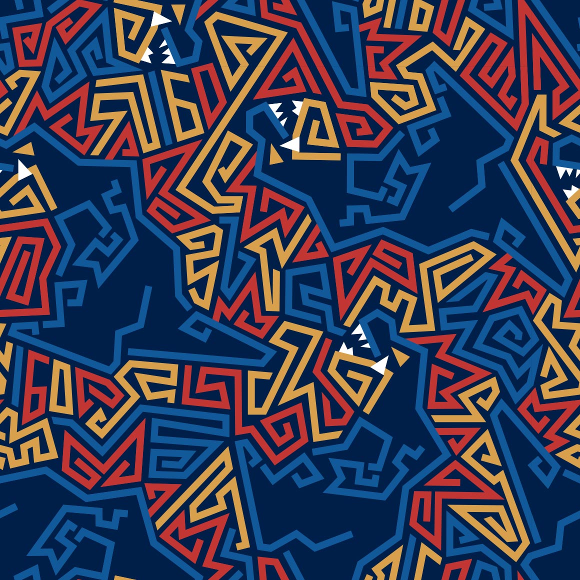
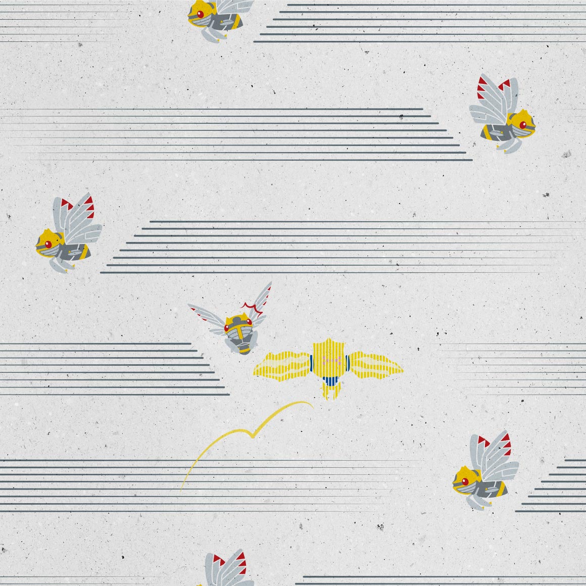
at first i thought this was a fake pixel art style again but its actually stitches! its cute and i like how its all unique art except at the loops
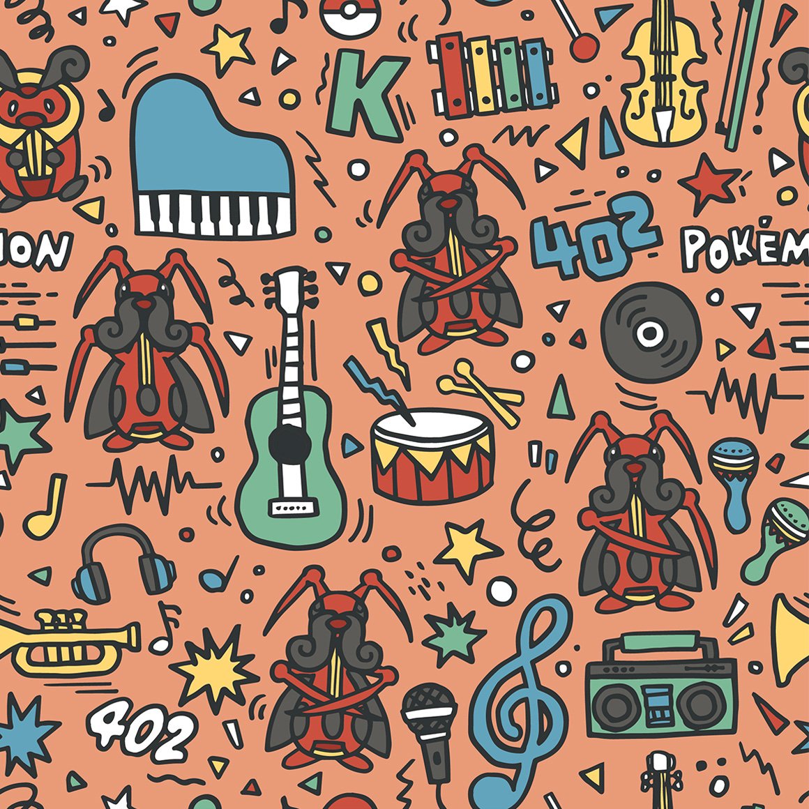
theres a lot going on here! but it works here, im a fan of the various music devices everywhere
comic book art style
have makuhita and machop always been rivals? -pulls up bulbapedia- huh. yes, actually, according to the ultra sun pokedex. the more you know.
i like how it blocks off the lines, though i wish it had more variation in poses
cute
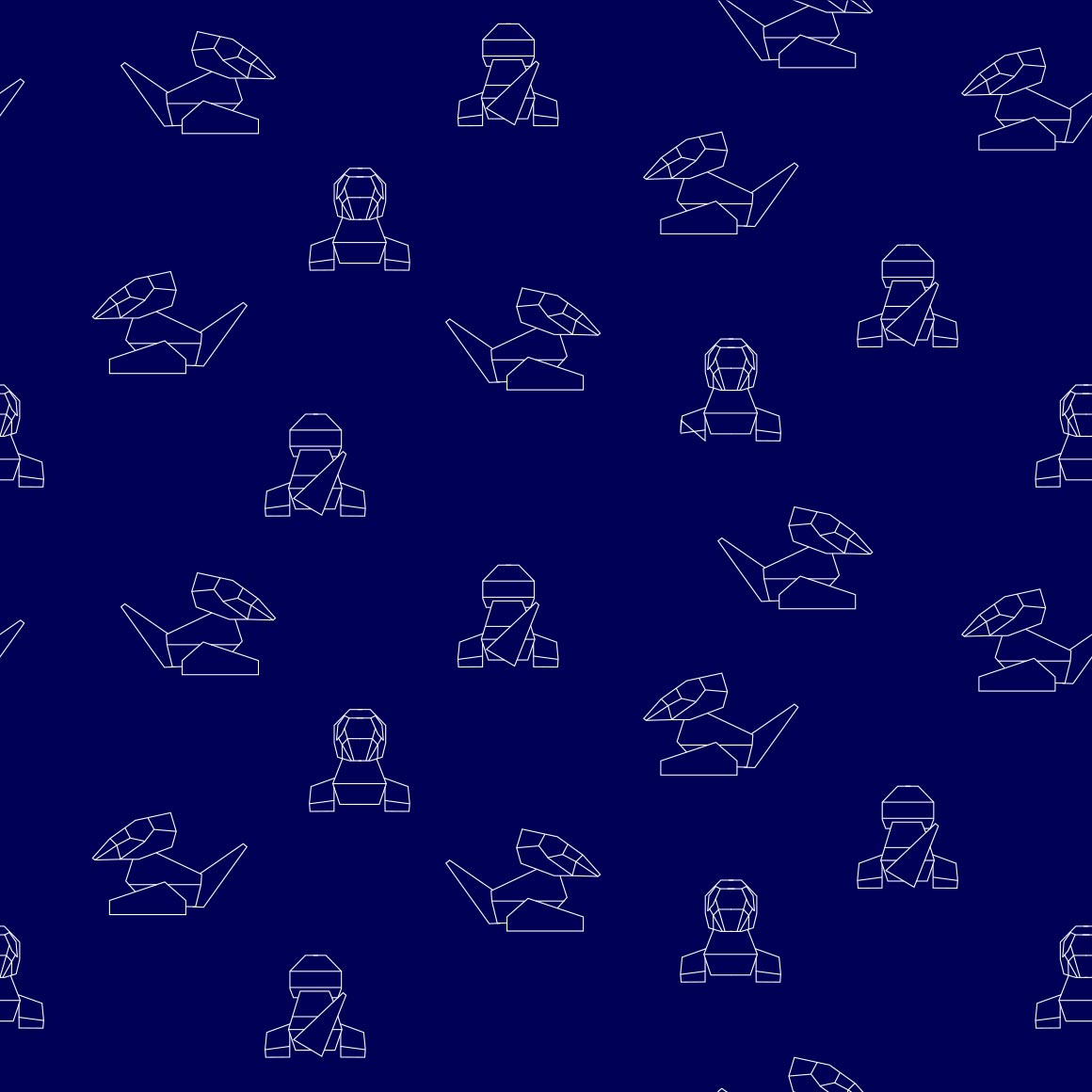
nose pass! i like this one
very cute! reminds me of gotchibams art
they made delcatty look even less desirable to me!
cabink cameo. nice colors
cute even though im not a mawile fan
awww its eating the pattern, so cute
interesting art style? shiny spotted
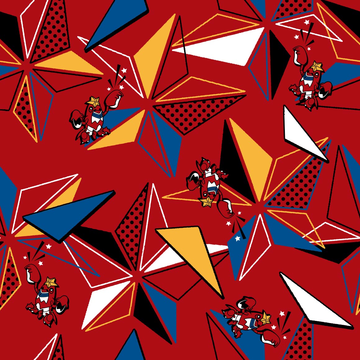
something my bf'd wear
this is really cute, the shiny, the throh and sawk cameo, its all around very good.
and this ones just Ok
those may be my colors, but for some reason this art just isnt with Me
it really pops but i wish it looped earlier
so cute, glad they didnt go the pikachu route
wrapping paper
why do so many bugs have space themed patterns?
old childrens book style once more
very cluttered but it works?
this is just really cute! and i noticed goomy there too!
kind of a basic pattern but its cute so
im not sure what to say about this one its nice?
not really a fan of this
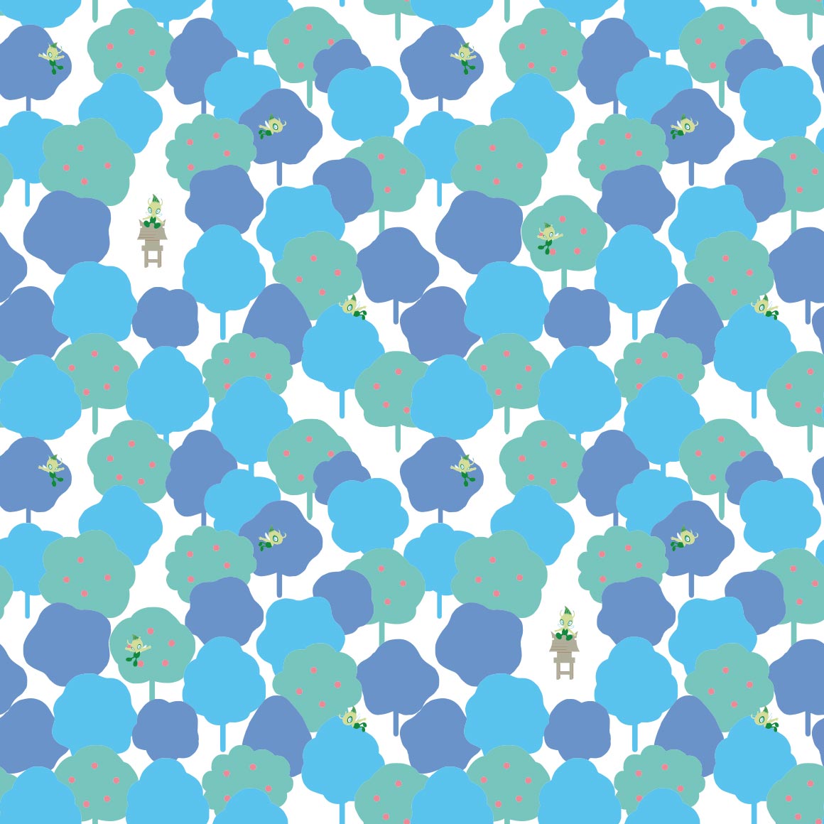
really cute! shiny wailmer, luvdisc, marill, piplup, spheal, mudkip, psyduck, and slowpoke are all there too!
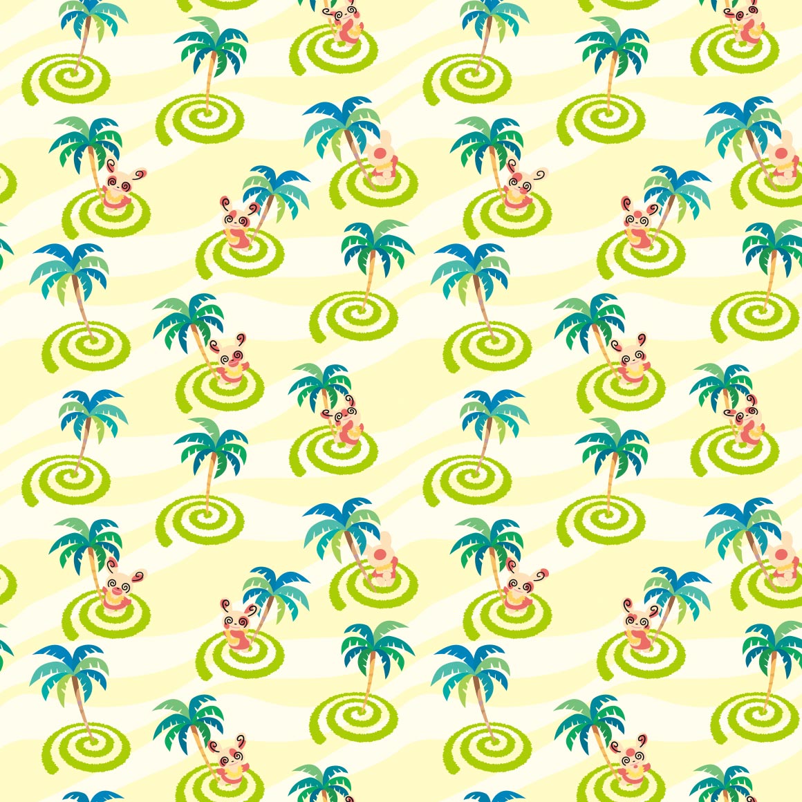
hawaii for no real reason ok
thick lines return
poor torkoal gets shitty art...
cute! clamperl is there too, referencing its dex entries
another kaleidoscope pattern i see, much more a fan of spoinks
smh they dont all have unique spot patterns smh smh
cute, though i wish it had more variety in the design
a boring pattern imo
i wish it had more than two poses... this is just like mega flygon
love seeing all the cactus types!
the background changes more than the pokemons art
very soft and fluffy. alolan vulpix is there too
the just lineart style works here! its very nice
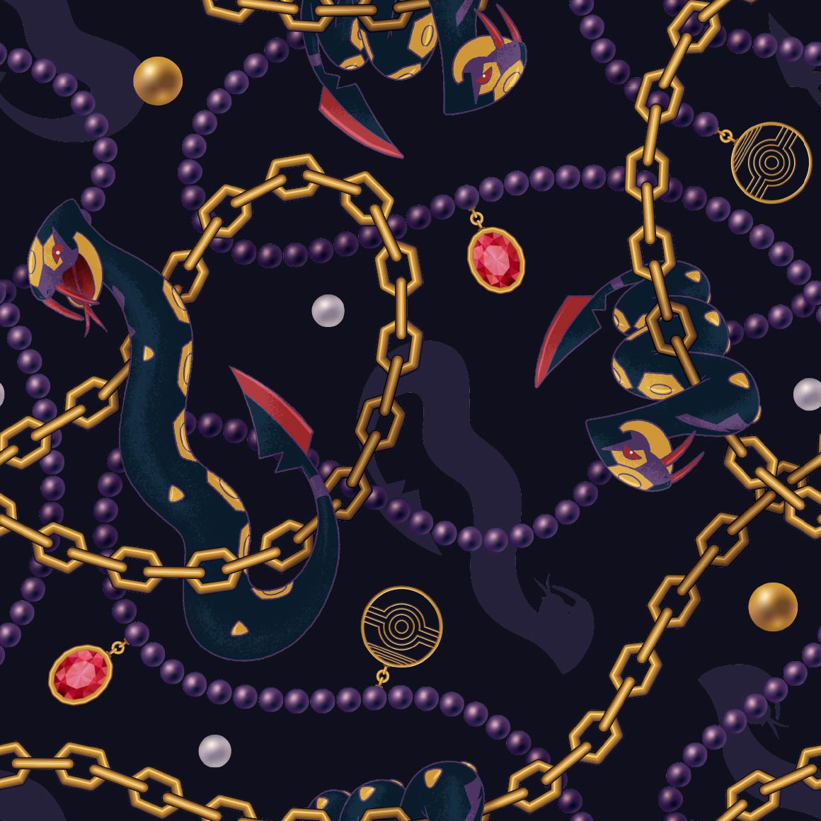
very visible, wonder if seviper will match
it doesnt and im not very okay with this considering it just uses stock art...
at least this looks nice
not really a fan of solrocks though
very basic pattern but i like it, it features aspects of the pokemons design too
cute
interesting pattern
its just a looping single image...
paper dolls hehe
this one scares me and i dont know why, but the upside down one reminds me of the one autism meme
strange choice of colors, but at least it emotes
reminds me of gotchibam again
this is very nice! reminds me of a bandana
very nice but im not sure about on a shirt...
hehe it is square
why is it mirrored
castform did not deserve a pattern this nice.
very cluttered.
neon sign art again
the pattern is the zipper lips!
cute and almost tells a story
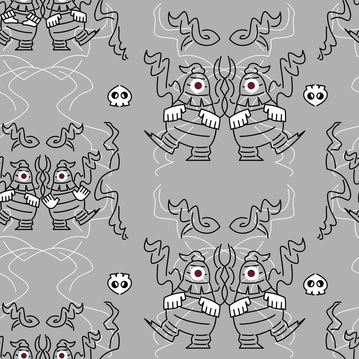
dusclops twins
such a good pattern. and for what?
kind of a boring pattern. shame
again reminds me of something sam'd make
cute! and hehe. shiny wynaut
very visible! its my bfs favorite colors too
is it bad that i noticed vanillite before glalie...
very soft
cute and love the unique art for every iteration
circus themeing? strange. isnt that popplios job?
very nice colors! clam
not really a fan of this one
very pretty
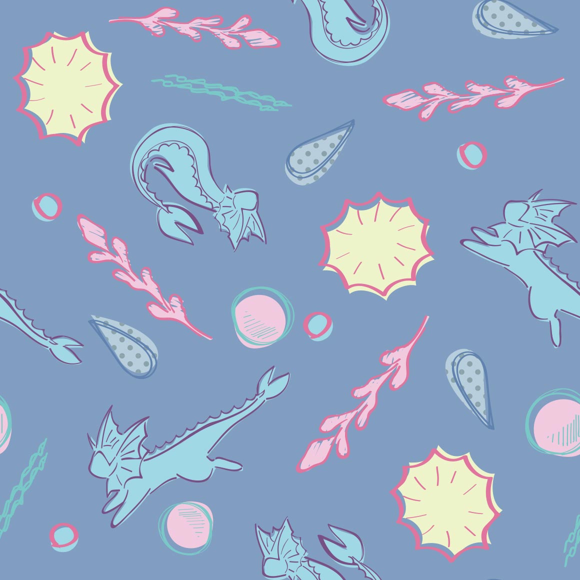
it sure is relicanth
would be very good stealthy merch, i wish the shiny was there though. or that they did something like the oras young couple shirts
strange choice of pattern for bagon
not what i was expecting for shelgon either
kind of hurts my eyes
i know this is beldum but it reminds me of protophantoms from animal jam
like the clefairy one, the pokemon is not fully there, not sure im a fan
oh this ones like the mewtwo one! nice
this kind of sucks :{ was expecting like the tauros one
at least the colors are nice?
the regis were so underwhelming. i hope regigigas is better
very cute
stained glass art!
oo very nice
i like the mini art pieces more than the main art lol
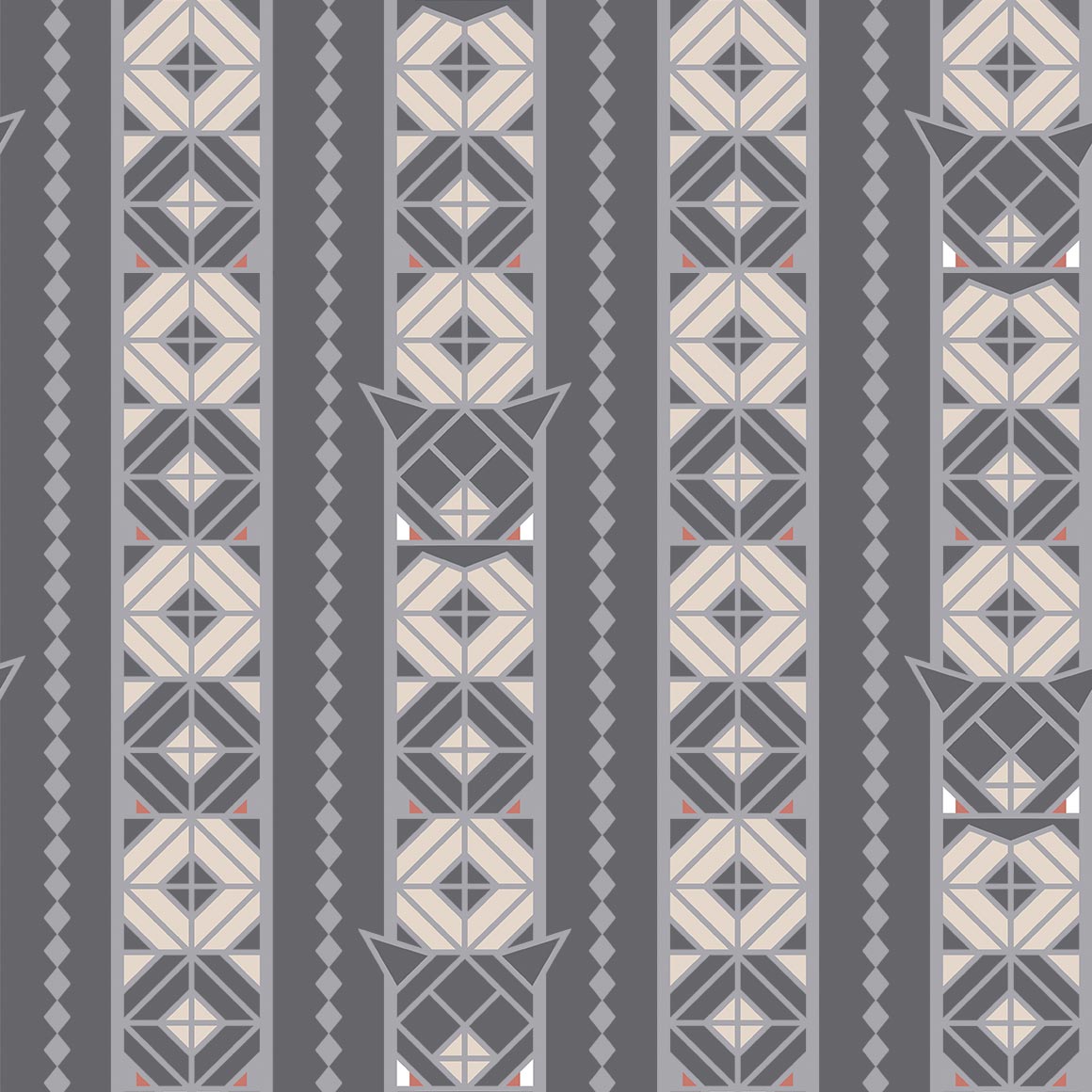
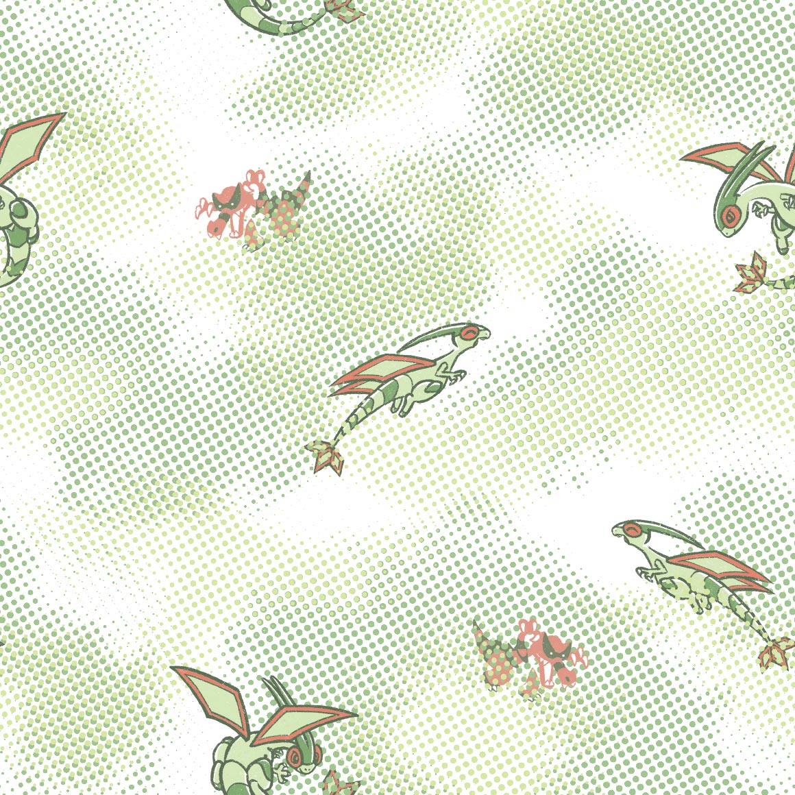
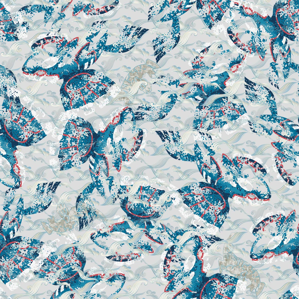
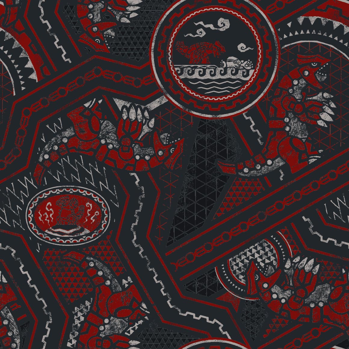
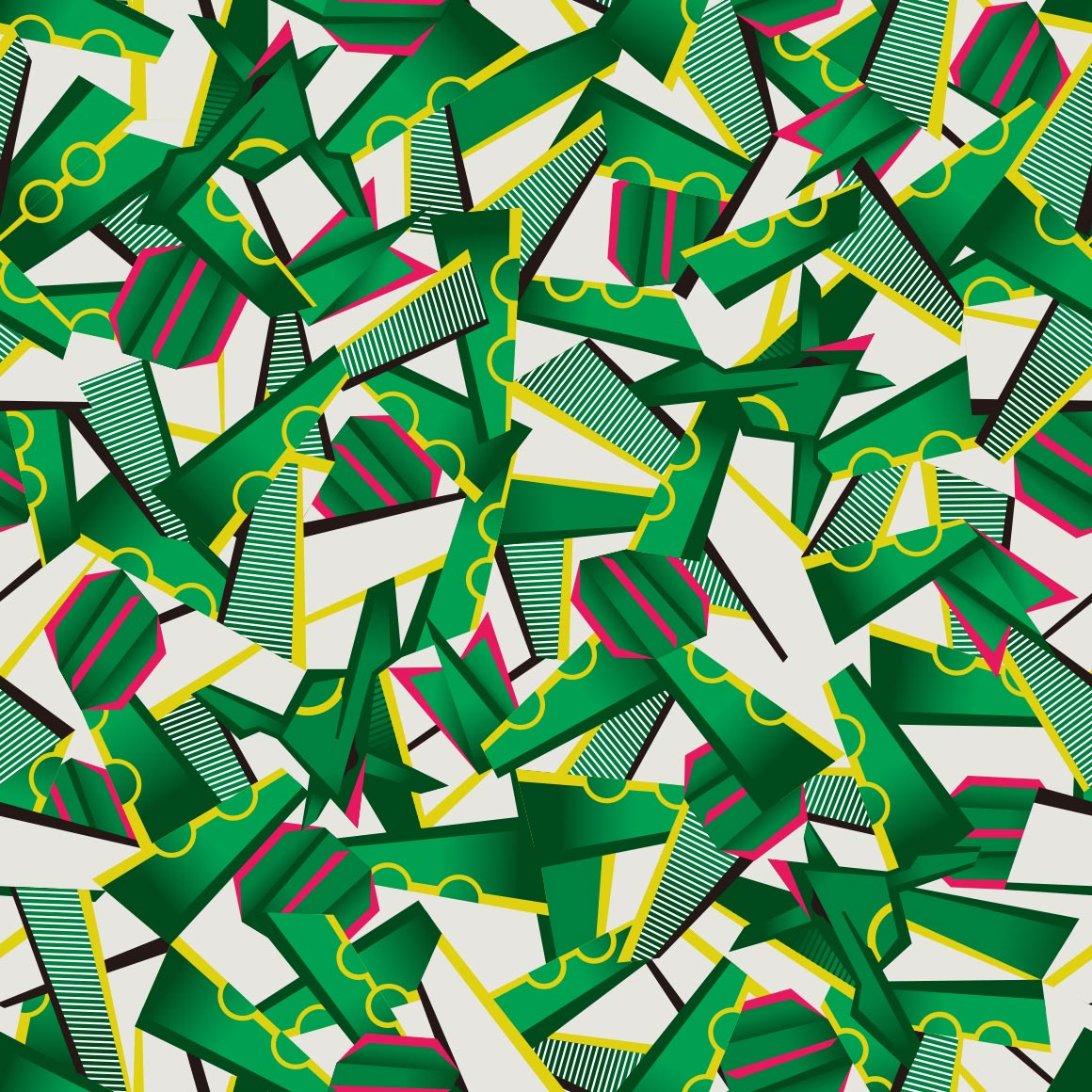
this sucks, surprising they fumbled rayquaza
this is 100% by the smile artist. i can tell
kind of a boring end, but still nice
gen 4/sinnoh
compared to the other grass starters, kind of weak in patterns, but very nice regardless.
very nice! a middle stage that doesnt fumble. love the kricketot riding on it
very nice and i like to look at it
very nothing to me
its better? though lacking in poses
not really a fan, as cool as this is
cute, like how the waves are interacted with
it broke the columns :SHOCKED:
its just two colors huh
birds on a wire esque
strange choice for a paisley
oh this fucks
i guess johto and sinnoh really are friends because theres so much plaid here!
i like the colors
ohhh this is so nice and lice, and the shiny, and the colors and the fact it doesnt loop and the
this is nice too!
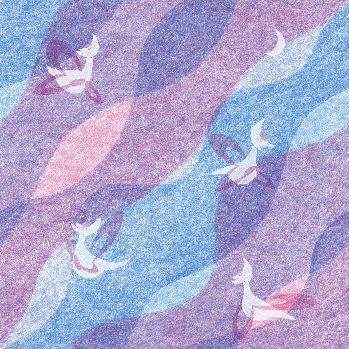
for some reason this one reminds me of smoochums? in a good way
ohhh i like this one. its very nice. id wear it
nice, i like how the pokemon merges with the background but not fully
is this crayon art? its cute
its kind of hard to see roserade it blends in too well
sure is cranidos in a mesozoic era
ohhh this goes hard. its good.
strange choice of pattern for shieldon, especially compared to cranidos
interesting, better than the last for sure
love the colors! and just very cute.
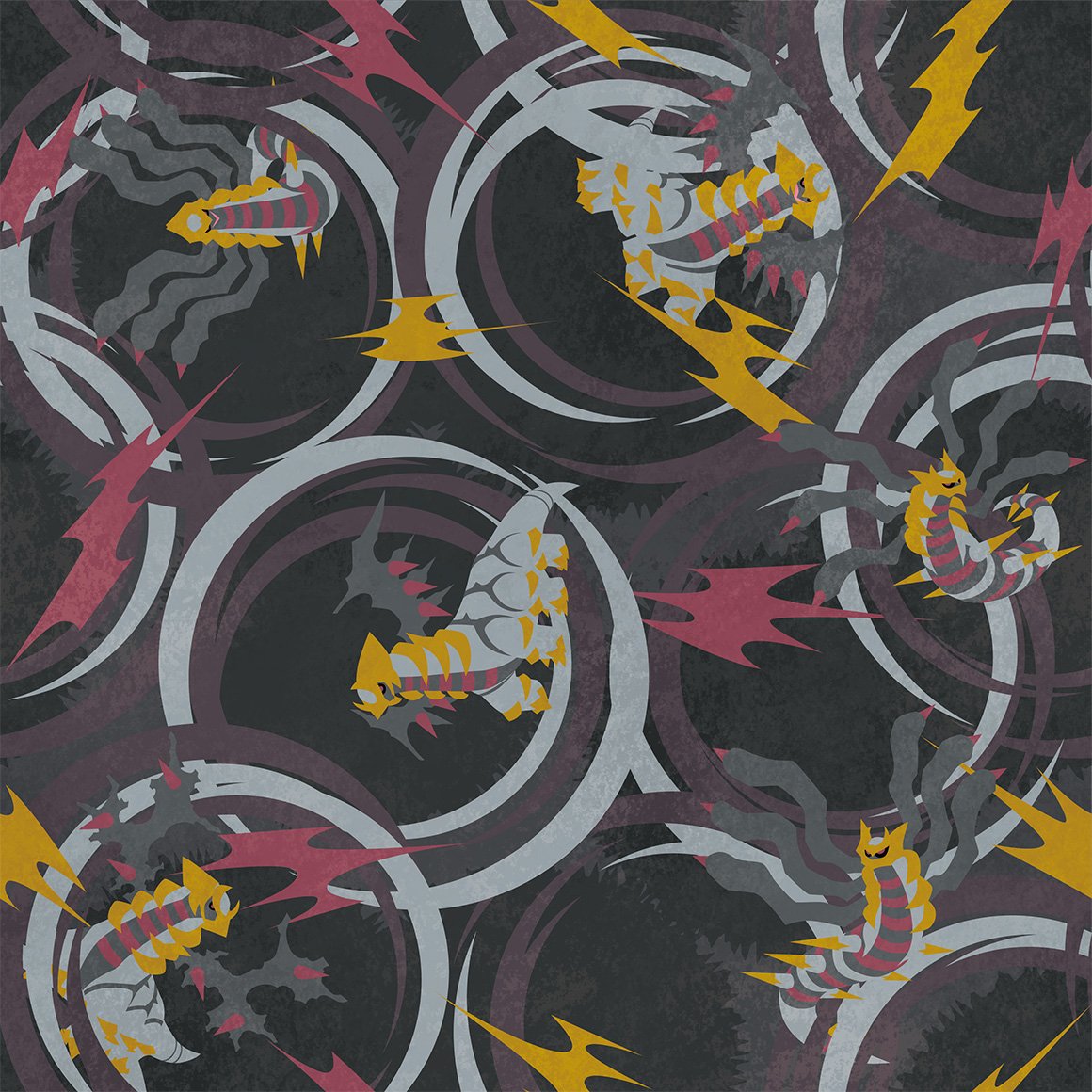
a lot going on here. its kind of distracting from wormadam
hehe combee is here because mothim steals from it
this is so cute :sob: and i love the colors
reminds me of an actual bees shirt i have
not sure what to say about this one at all, its nice?
why do the images (except wingull for some reason) have weird white backgrounds...
this is too nice for floatzel.
looks nice
again just nice
cute, wonder if gastrodon will be similar
i mean the patterns fitting but its kind of ugly
kind of similar to the aipom one!
cute but drifloon is kidnapping a child (or trying to)
interesting pattern
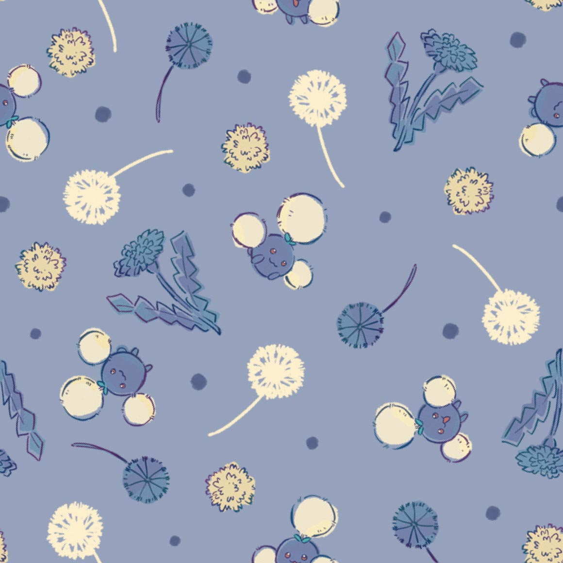
whats with the dandelions? they look nice but why specifically them
this has the same artist as the buneary, i think
both glad and sad that they didnt go with something similar to misdreavus's
damn i kind of wish they did more pixel art...
ohhh this is really nice and cute. could see it as actual wallpaper
i like how it blocks off the lines, though i wish it had more variation in poses
i wish the drawings were more centered on the colors
LA
interesting art for the stunky, not so much the flowers
i wish there was more variety on the poses, the spirals are funny though
i like it! not really much you can do with bronzor, as its just a plate
ohhh the colors are really nice but i cant think of what they remind me of right now damn, maybe 1950s art?
cute, it goes through the whole span of emotion except anger
is it just me or does this really pop off the background
i like how it grabs the dots hehe
the cables being there is kind of strange... chatot never really used cables right
water color
yay two poses only! and monochrome!
oo this ones nice. especially compared to gible
not really a fan
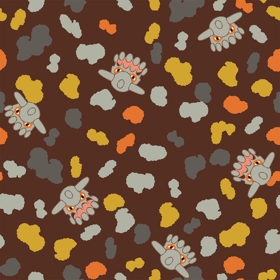
the berries are kind of a boring pattern but i like that all the munchlaxes are unique
interesting. using orbs. and a shiny!
definitely reminds me of aura
its camo i guess
aw this ones cute. love seeing dwebble there
yay for unique poses! and wavey lines! and gliscor
not what i was expecting from drapion at all
not really a fan
this ones nice and raw though
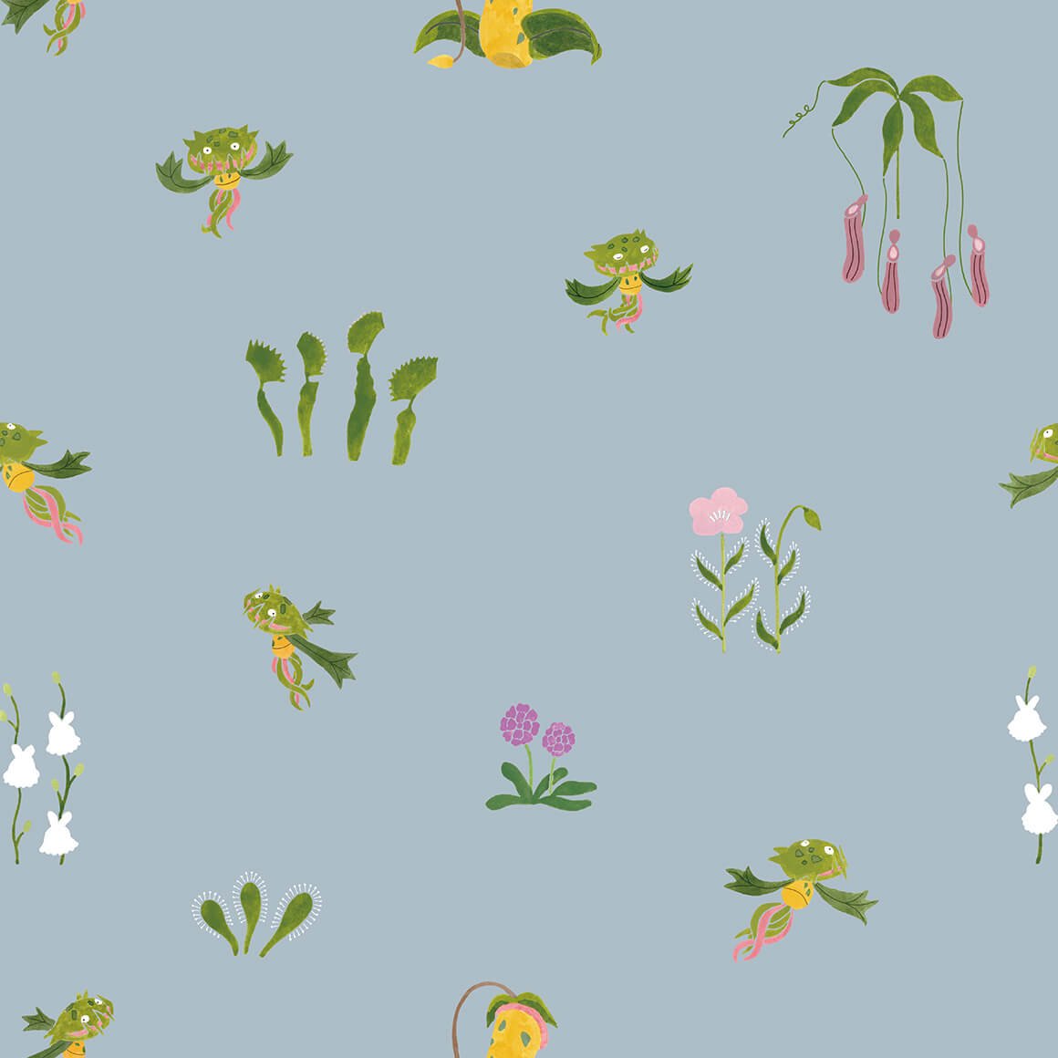
not really a fan of this one either, something about how carnivine is colored throws it off..
i like the colors
interesting pattern, why is lanturn there though?
this is way nicer than mantines
i like the colors, very nice to look at
not much a fan of this style
not very good imo, but not really sure why i think that
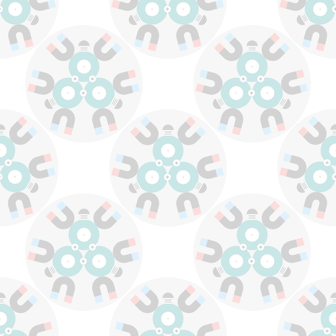
why are we in space? is magnezone associated with space? i guess it does look like a ufo
awww the tongues are the columns!
really nice colors and pattern
i like how the pattern IS the pokemon, but like tangled up with other tangrowth
the outlines are kind of hard to see.
i much prefer this pattern to electivire, it just is nicer to me
very soft
not really a fan of this variation of the kaleidoscope pattern
very pretty
same artist as leafeons i think, still pretty
the sharks tooth pattern with gliscor is sure a choice, especially considering each of the actual gliscors is different
its better than piloswines! its nice
very very nice. ive seen many a tumblr theme use it (not my own though, not really my style.)
i wish it was more like gardevoirs style
awww this ones cute, i like the lines only style
kind of a boring pattern
the backgrounds have more love than the pokemon :sob:
very pleasing to the eye, love the colors
i hope all the lake trio follow this pattern with the flowers, it looks very nice with uxie
seems as if they do!
i wish azelf got less stock art looking poses though...
oh oh will all of the creation trio have their signature move in their art?
appears so! i like how palkia (and dialga) interact with the beams
this is more trozei / shuffle esque than anything
damn they really did continue the regi theme damn.
yay both forms of giratina! and its signature move
ohhh the colors on this are so nice and lice
the way phione gets better art than manaphy
why is this like a coloring book but manaphy is like stock art :sob:
ohhhh raw
this is so cute :sob:
of course arceus gets space themeing! very high note to end on
thats all
i wish there was unova ones but there wont ever be because the company who made pokemon shirts patterns shut down last year :sob:
Widget is loading comments...
a promising start to a new set of patterns. nice colors and lineless art
seems we are continuing with that style for bayleef, nice because kantos lineup didnt really copy styles for evolutionary families, wonder if meganium will too
it doesnt but i dont mind. its very nice, something id see on a bandana given to me by my mom
lots of inactive cyndaquil then a couple erupting ones. nice
this style doesnt really work for quilava in my onion
its hidden between the flames and somewhat hard to see. they fumbled the rest of this line. shame
cuuute. its gnawing on the columns!
i dont know what to call this art style other than I like it
thick line art once more, though this time more pointy
the colors are very pleasing to the eye! i love it!
kind of cluttered but it Doesnt work here.
hes just eyes
i like it!
ledyba looks so derpy here (can i say that? its 2024 can i say that? or is that too 2014) wait is vileplume here too?
this fucks severely, but why did they give LEDIAN of all pokemon this good a pattern
its kind of hard to see the pokemon. on my pokemon shirt
storybook artstyle again! nice
i didnt realise crobat was so early in the johto dex god damn. nice pattern tho
its nice? not sure what else to say
we are in space! again. very nice
very sparse, just like pikachus. shame
this is so cute :sob: hi minior too
they went with a poliwag approach instead of what i was expecting! its very cute, id wear it.
is this supposed to be togepi?? its not spikey at all..
this is so soft and sweet, very nice
natu
oo they made it into an egyptian hieroglyphic pattern instead of what its actually based on! its very nice regardless
very cute! plus theres a shiny here, so points for that, love seeing shinies in official art. WAIT I JUST NOTICED THE NAKED MAREEP thats funny
oo more neon sign style. nice. it fits with flaaffy too! (but why is alolan exeggutor here?)
interesting pattern. i like how they conjoin!
well you definitely see the pokemon this time, and its nicer looking than vileplumes
so many cameos by other pokemon! i love the art here its very cute
uh ok i guess, strangeish
interesting. art style, wonder if bonsly will follow up
the art of the pokemon is cute but the colors and pattern kinda suck
this is so cute! another bandana pattern to me
interesting?
so soft! just like the pokemon itself
im not really an aipom fan but this is nice
this is like the lickitung shirt! but with a single variation
watercolors i think? nice
id wear it
very nice pattern and colors! but at first i was gonna complain about why corsola only got one slot on its own pattern (before i realised it was woopers)
plaid, quagsire flannel would fuck tho
i love this one, at one point i had a shiny edit i did of it as a background to an older website i made
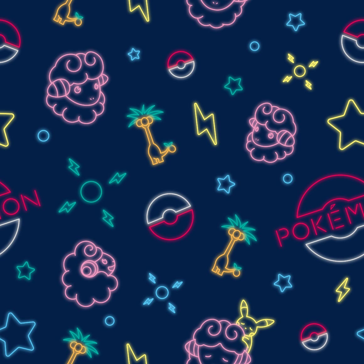
it looks nice, its sure umbreon colors
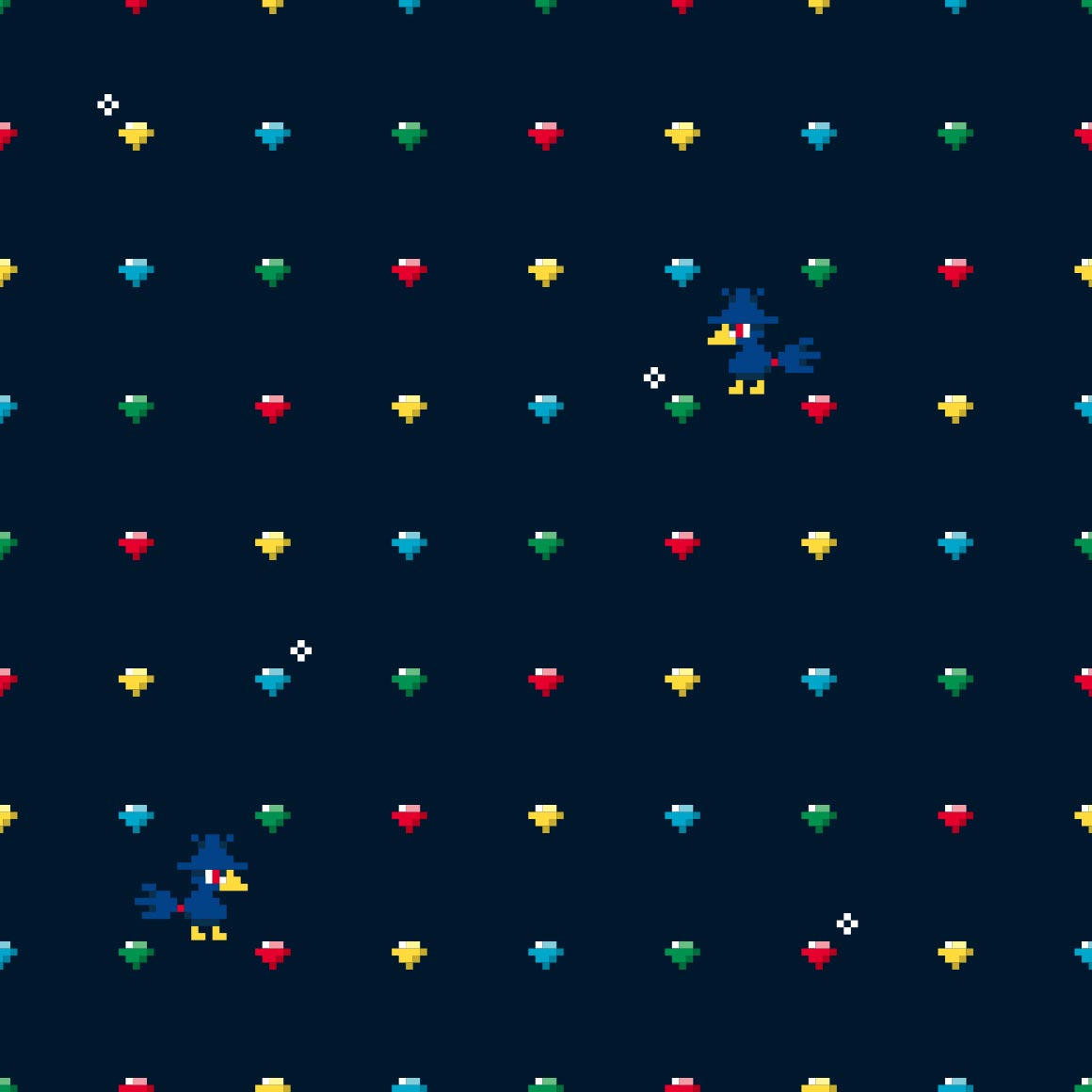
huhu pixel art
slowking is barely on its own pattern! slowpoke is more prominent and visible than it :sob:
strange choice to not include the face, considering misdreavus is a floating head
hehe they spell out pokemon. itd be a fun shirt to wear!
whats with the yellow :?
these look like scratch and sniff stickers that are also fuzzy
missed opportunity for pineco to be with pinecones or in a pine tree... why pineapples.. ludicolo is already a pineapple
after having no plaid/flannel in kanto, there sure is a lot in johto! (only two so far. still a lot)
very cute, its in tunnels with diglett and dugtrio about, though i wish it had more poses
not a gligar fan really either but this art is so very nice! it reminds me of youtube animations of like. mid 2010s
once again onix is outclassed by its evolution in every way
this is cute, more bandana art
i like the colors! its very cute too
hehe the waves are qwilfish tails
its pretty hard to see scizor in its own art huh, at least the leaves have its claws too
kind of a boring pattern but its nice to look at
i like this one! another ive used on a website ive made. vikavolts here too
whats with the easter eggs :?
obviously the teddy bear pokemon would have a old childrens book artstyle! still nice, and combees there too
this pattern sure pops
im not really sure what to say about this one its just like paisley esque patterns and a few slugmas
they actually did paisleys for the next one!
very boring pattern but i think it works here
this one sucks though
hehe shiny corsola and some strange yellow variation too
ive seen this style before but i dont know the name. very nice though
if you had no idea this was pokemon youd think its just a normal shirt! shiny is there though, as is miltank
christmas wrapping paper pattern, fitting as it IS delibird
string
strangely detailed for a pokemon shirt that only does a outline
boring pattern but im sure someoned wear it
oh is it corroding because of the venom in its bite? cool!
eh i expected more from a kingdra pattern
very nice colors! and the columns have its little nose there hehe
looks like something youd see in video game ruins on the wall
hehe its body is the 2
dare i say trippy
this is cute! i like the colors too
oo they did continue the hitmon themeing!
glad they did
this pattern is so fucking nice and for what pokemon? smoochum? if you told me itd get one of the best patterns id assume you were lying.
the fake 3d effect kind of hurts my eyes but its nice
they did it with magby too??
christmas wrapping paper type beat, unfitting this time
this is cute
wtf is that thing in the bottom middle
i guess all of the beasts have a pattern like this. a shame
yep
this pops and is very cute, for a strange choice of pokemon
whats with the cactuses? colors are nice though
the negative space IS the pokemon!
its strange looking, but i bet ho-oh follows suit
like clockwork
love the colors! but its hard to see celebi.
| another promising start! i like how it interacts with the spaces and columns | kind of hard to see grovyle, but thats clearly the intent. | big fan of the colors but not a fan of sceptile just kind of being strewn around randomly | unique art for every pose, thats a first with this many poses! very cute art at that too |
comic book panel | blaziken is a strange choice for paisleys |
this is so cute! and theres a shiny mudkip here too! | im not sure what this reminds me of, but it does of something |
|
|---|---|---|---|---|---|---|---|---|
its pushing the rocks! | the pattern is tiny poochyena heads! i see, though the actual heads are kind of just strewn about | this is very nice, though not something id wear | reminds me of cookies but im not sure why | its running on the lines | its also climbing on the lines! and theres a few shinies too! | its a struggle to see silcoon | whats the deal with the differently colored ones? its not shiny | |
its nicer than the silcoon one thats for sure | strange choice for a neon sign style but its very pleasing to the eye | this is so sweet and just nice to look at | are these all shiny??? its very nice | i want more patterns in this style. not a single repeating drawing, its so nice. why did they give LUDICOLO out of everything this style and privilege! | cute | noticing a lot of unique art this generation! very nice. rowlet | tattoo style | |
| very nice colors! oh no wurmple is going to get eaten | kind of a lot going on for my tastes, in a bad way | well at least theres a shiny... very Nothing pattern | dammit why did pelipper have to have cute art | very cute, lots of gen 4 cameos | not a fan of how the pokemon are just dropped wherever |
very nice to look at | i think this is my personal favorite from this generation, though we are only a third through. i used it on my tumblr! like right now! i like the cameos too. | |
i wish my favorite pokemon got a better pattern :crypae: | cute.. | reminds me of the parasect one! id wear it. | a lazy pattern for a lazy pokemon | this pattern is so energetic in comparison! just like the pokemon | slaking has more variation than slakoth | its incredibly hard to see the pokemon on its pokemon shirt | very nice pattern but why is regieleki here | |
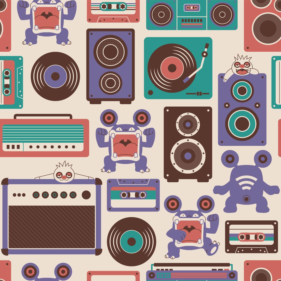
cool | at first i thought this was a fake pixel art style again but its actually stitches! its cute and i like how its all unique art except at the loops | theres a lot going on here! but it works here, im a fan of the various music devices everywhere | comic book art style | have makuhita and machop always been rivals? -pulls up bulbapedia- huh. yes, actually, according to the ultra sun pokedex. the more you know. | i like how it blocks off the lines, though i wish it had more variation in poses | cute | nose pass! i like this one | |
| very cute! reminds me of gotchibams art | they made delcatty look even less desirable to me! | cabink cameo. nice colors | cute even though im not a mawile fan |
awww its eating the pattern, so cute | interesting art style? shiny spotted |
something my bf'd wear | this is really cute, the shiny, the throh and sawk cameo, its all around very good. |
|
and this ones just Ok | those may be my colors, but for some reason this art just isnt with Me | it really pops but i wish it looped earlier | so cute, glad they didnt go the pikachu route | wrapping paper | why do so many bugs have space themed patterns? | old childrens book style once more | very cluttered but it works? | |
this is just really cute! and i noticed goomy there too! | kind of a basic pattern but its cute so | im not sure what to say about this one its nice? | not really a fan of this | really cute! shiny wailmer, luvdisc, marill, piplup, spheal, mudkip, psyduck, and slowpoke are all there too! | hawaii for no real reason ok | thick lines return | poor torkoal gets shitty art... | |
| cute! clamperl is there too, referencing its dex entries | another kaleidoscope pattern i see, much more a fan of spoinks | smh they dont all have unique spot patterns smh smh | cute, though i wish it had more variety in the design | a boring pattern imo | i wish it had more than two poses... this is just like mega flygon | love seeing all the cactus types! | the background changes more than the pokemons art | |
very soft and fluffy. alolan vulpix is there too | the just lineart style works here! its very nice | very visible, wonder if seviper will match | it doesnt and im not very okay with this considering it just uses stock art... | at least this looks nice | not really a fan of solrocks though | very basic pattern but i like it, it features aspects of the pokemons design too | cute | |
interesting pattern | its just a looping single image... | paper dolls hehe | this one scares me and i dont know why, but the upside down one reminds me of the one autism meme | strange choice of colors, but at least it emotes | reminds me of gotchibam again | this is very nice! reminds me of a bandana | very nice but im not sure about on a shirt... | |
| hehe it is square | why is it mirrored | castform did not deserve a pattern this nice. | very cluttered. | neon sign art again | the pattern is the zipper lips! | cute and almost tells a story | dusclops twins | |
| such a good pattern. and for what? | kind of a boring pattern. shame | again reminds me of something sam'd make | cute! and hehe. shiny wynaut | very visible! its my bfs favorite colors too | is it bad that i noticed vanillite before glalie... | very soft | cute and love the unique art for every iteration | |
| circus themeing? strange. isnt that popplios job? | very nice colors! clam | not really a fan of this one | very pretty | it sure is relicanth | would be very good stealthy merch, i wish the shiny was there though. or that they did something like the oras young couple shirts | strange choice of pattern for bagon | not what i was expecting for shelgon either | |
| kind of hurts my eyes | i know this is beldum but it reminds me of protophantoms from animal jam | like the clefairy one, the pokemon is not fully there, not sure im a fan | oh this ones like the mewtwo one! nice | this kind of sucks :{ was expecting like the tauros one | at least the colors are nice? | the regis were so underwhelming. i hope regigigas is better | very cute | |
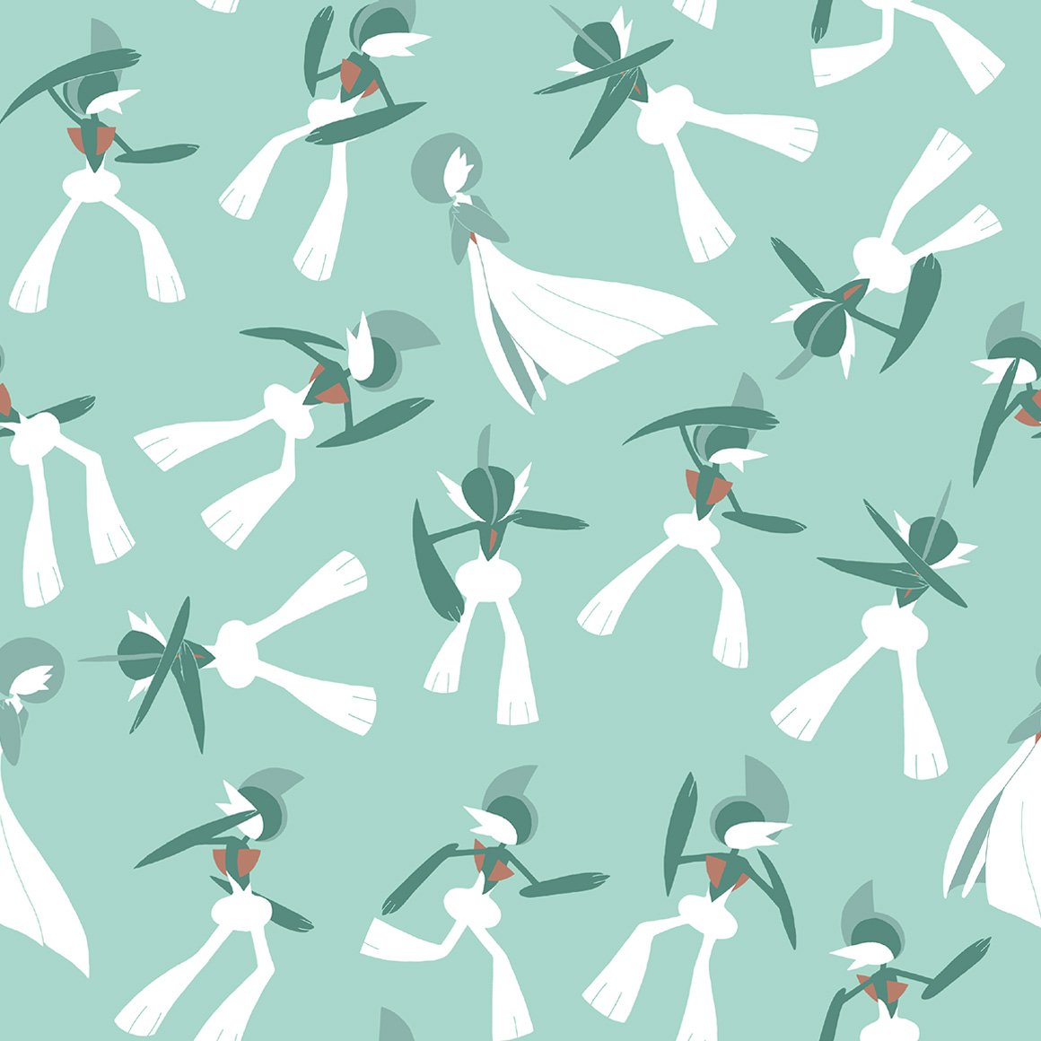
| stained glass art! | oo very nice | i like the mini art pieces more than the main art lol | this sucks, surprising they fumbled rayquaza | this is 100% by the smile artist. i can tell | kind of a boring end, but still nice |
gen 4/sinnoh
compared to the other grass starters, kind of weak in patterns, but very nice regardless.
very nice! a middle stage that doesnt fumble. love the kricketot riding on it
very nice and i like to look at it
very nothing to me
its better? though lacking in poses
not really a fan, as cool as this is
cute, like how the waves are interacted with
it broke the columns :SHOCKED:
its just two colors huh
birds on a wire esque
strange choice for a paisley
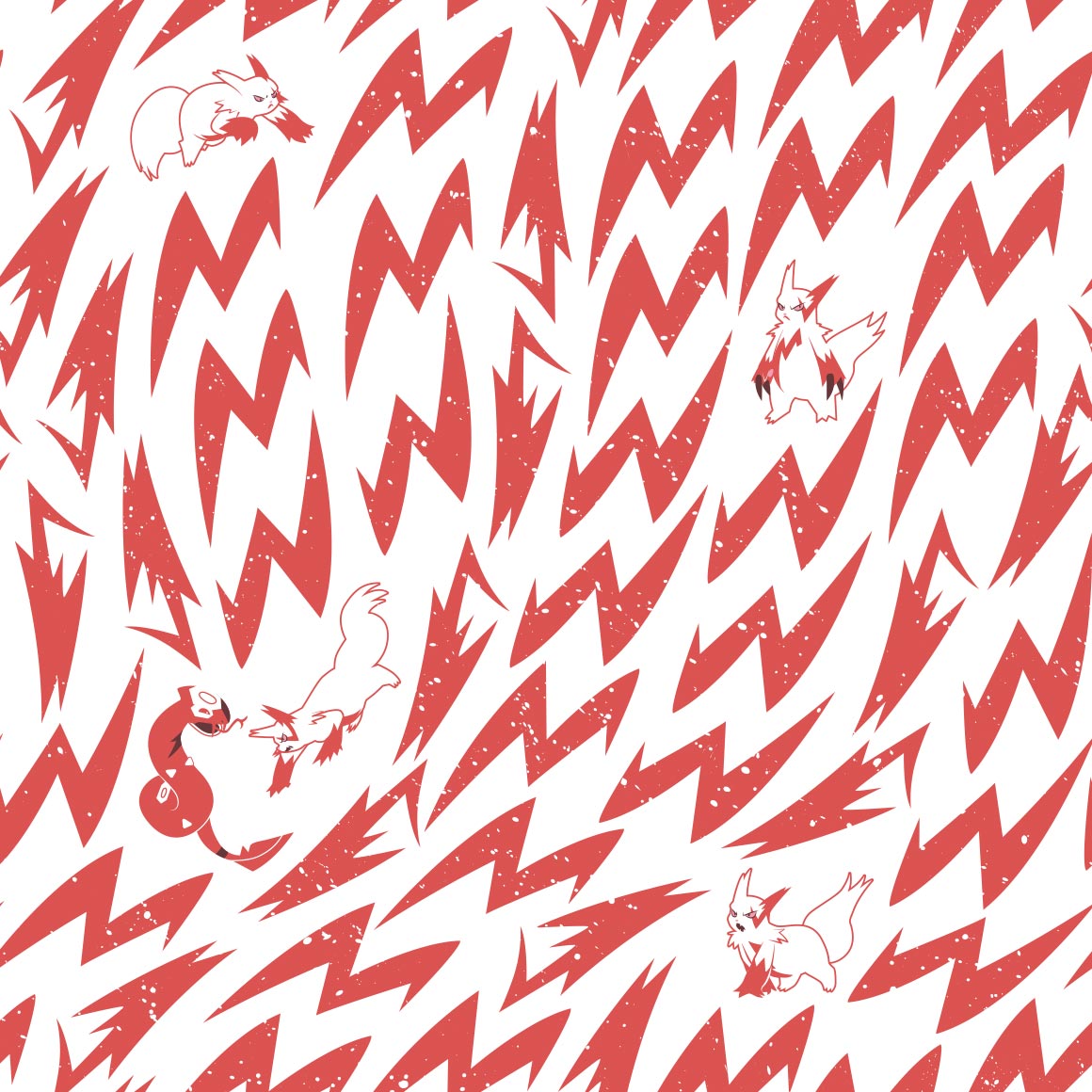
oh this fucks
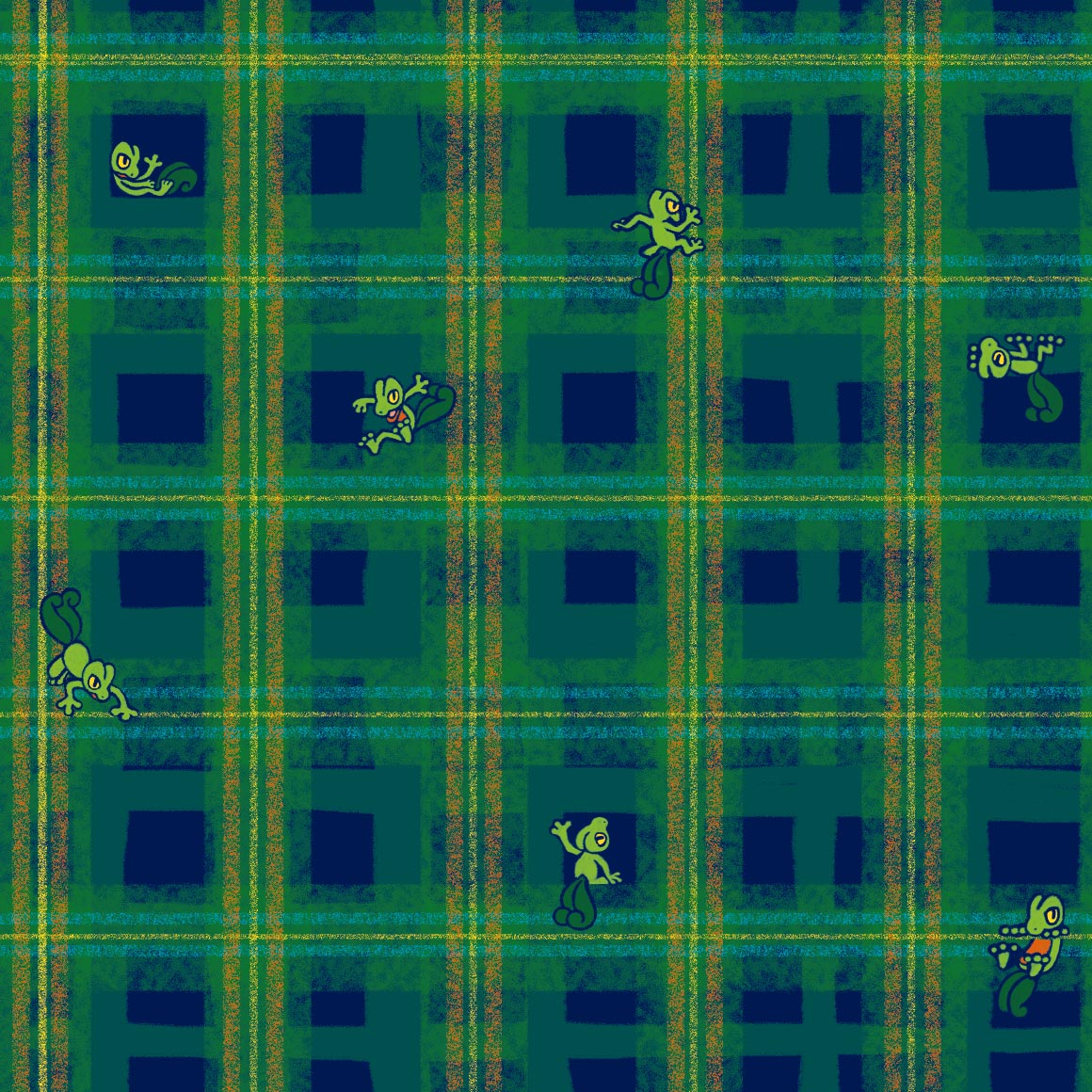
i guess johto and sinnoh really are friends because theres so much plaid here!
i like the colors
ohhh this is so nice and lice, and the shiny, and the colors and the fact it doesnt loop and the
this is nice too!
for some reason this one reminds me of smoochums? in a good way
ohhh i like this one. its very nice. id wear it
nice, i like how the pokemon merges with the background but not fully
is this crayon art? its cute
its kind of hard to see roserade it blends in too well
sure is cranidos in a mesozoic era
ohhh this goes hard. its good.
strange choice of pattern for shieldon, especially compared to cranidos
interesting, better than the last for sure
love the colors! and just very cute.
a lot going on here. its kind of distracting from wormadam
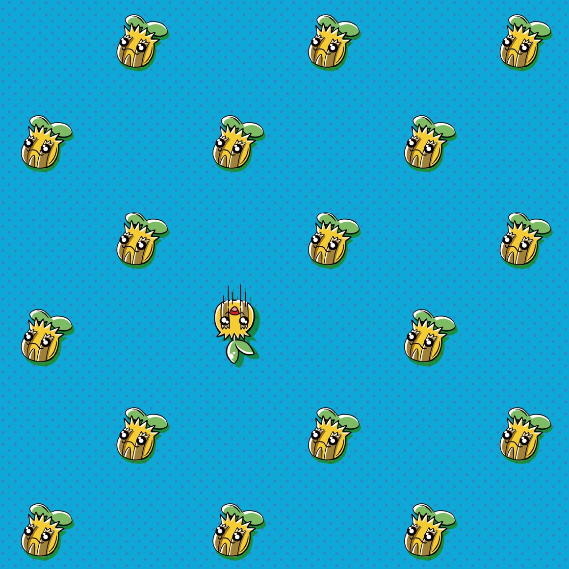
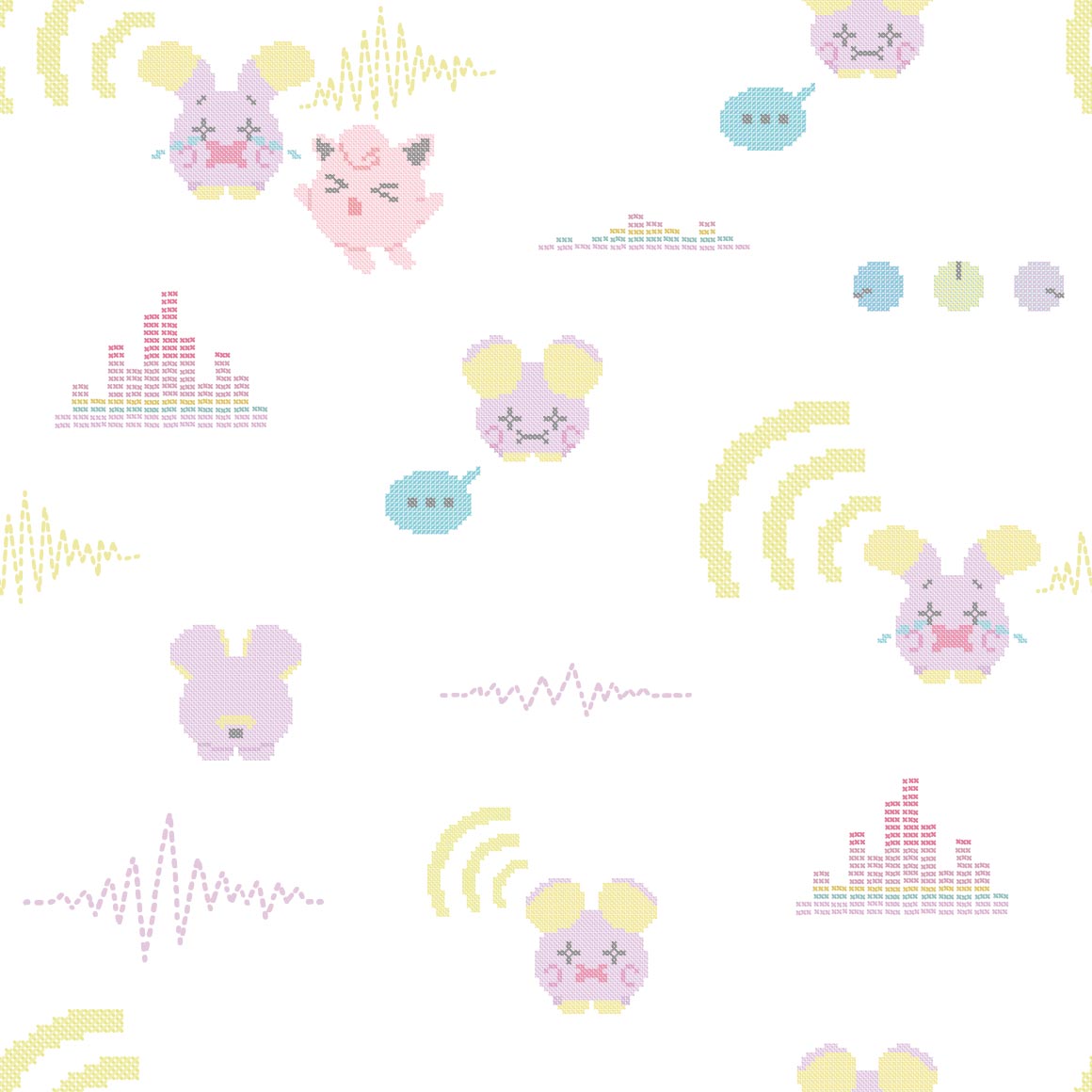
hehe combee is here because mothim steals from it
this is so cute :sob: and i love the colors
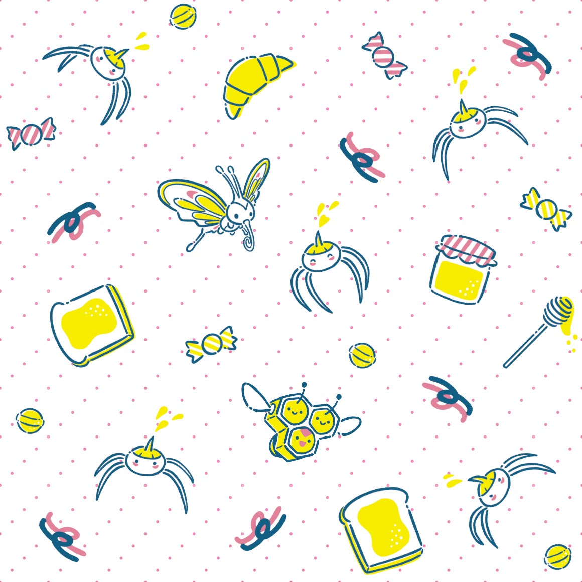
reminds me of an actual bees shirt i have
not sure what to say about this one at all, its nice?
why do the images (except wingull for some reason) have weird white backgrounds...
this is too nice for floatzel.
looks nice
again just nice
cute, wonder if gastrodon will be similar
i mean the patterns fitting but its kind of ugly
kind of similar to the aipom one!
cute but drifloon is kidnapping a child (or trying to)
interesting pattern
whats with the dandelions? they look nice but why specifically them
this has the same artist as the buneary, i think
both glad and sad that they didnt go with something similar to misdreavus's
damn i kind of wish they did more pixel art...
ohhh this is really nice and cute. could see it as actual wallpaper
i like how it blocks off the lines, though i wish it had more variation in poses
i wish the drawings were more centered on the colors
LA
interesting art for the stunky, not so much the flowers
i wish there was more variety on the poses, the spirals are funny though
i like it! not really much you can do with bronzor, as its just a plate
ohhh the colors are really nice but i cant think of what they remind me of right now damn, maybe 1950s art?
cute, it goes through the whole span of emotion except anger
is it just me or does this really pop off the background
i like how it grabs the dots hehe
the cables being there is kind of strange... chatot never really used cables right
water color
yay two poses only! and monochrome!
oo this ones nice. especially compared to gible
not really a fan
the berries are kind of a boring pattern but i like that all the munchlaxes are unique
interesting. using orbs. and a shiny!
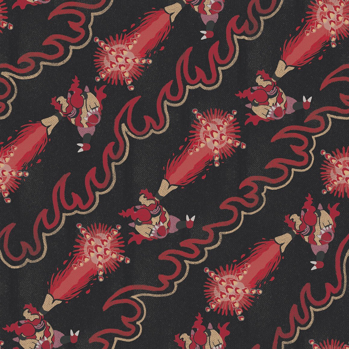
definitely reminds me of aura
its camo i guess
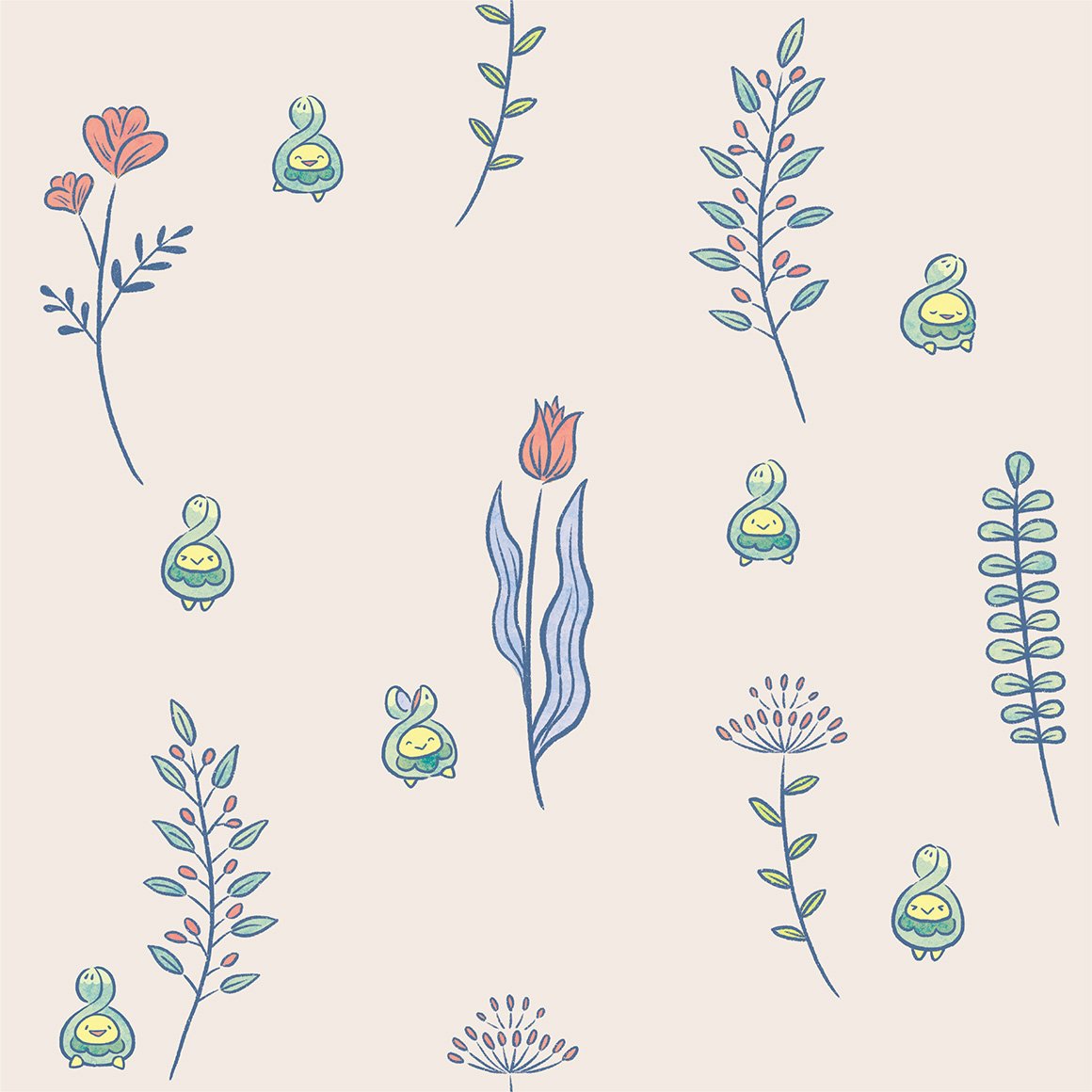
aw this ones cute. love seeing dwebble there
yay for unique poses! and wavey lines! and gliscor
not what i was expecting from drapion at all
not really a fan
this ones nice and raw though
not really a fan of this one either, something about how carnivine is colored throws it off..
i like the colors
interesting pattern, why is lanturn there though?
this is way nicer than mantines
i like the colors, very nice to look at
not much a fan of this style
not very good imo, but not really sure why i think that
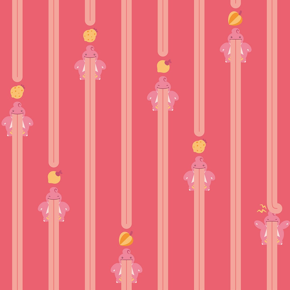
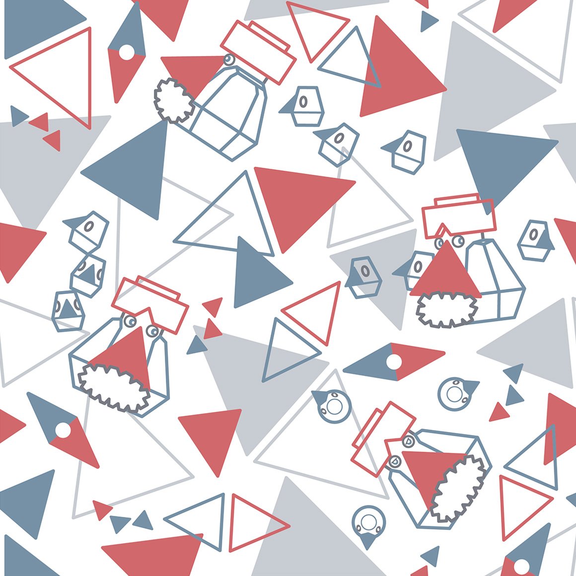
why are we in space? is magnezone associated with space? i guess it does look like a ufo
awww the tongues are the columns!
really nice colors and pattern
i like how the pattern IS the pokemon, but like tangled up with other tangrowth
the outlines are kind of hard to see.
i much prefer this pattern to electivire, it just is nicer to me
very soft
not really a fan of this variation of the kaleidoscope pattern
very pretty
same artist as leafeons i think, still pretty
the sharks tooth pattern with gliscor is sure a choice, especially considering each of the actual gliscors is different
its better than piloswines! its nice
very very nice. ive seen many a tumblr theme use it (not my own though, not really my style.)
i wish it was more like gardevoirs style
awww this ones cute, i like the lines only style
kind of a boring pattern
the backgrounds have more love than the pokemon :sob:
very pleasing to the eye, love the colors
i hope all the lake trio follow this pattern with the flowers, it looks very nice with uxie
seems as if they do!
i wish azelf got less stock art looking poses though...
oh oh will all of the creation trio have their signature move in their art?
appears so! i like how palkia (and dialga) interact with the beams
this is more trozei / shuffle esque than anything
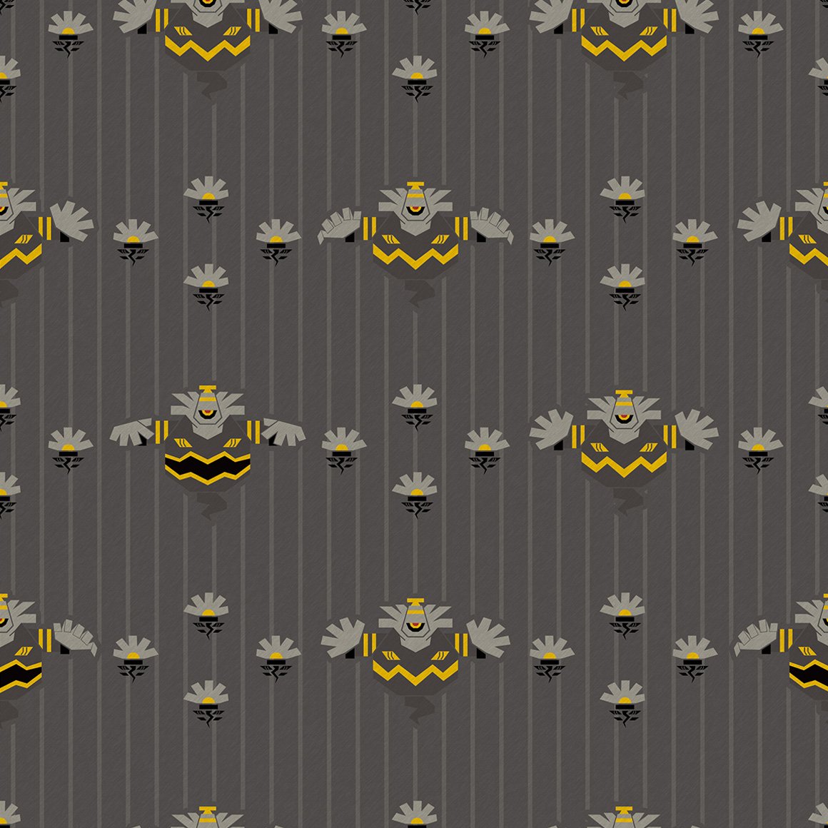
damn they really did continue the regi theme damn.
yay both forms of giratina! and its signature move
ohhh the colors on this are so nice and lice
the way phione gets better art than manaphy
why is this like a coloring book but manaphy is like stock art :sob:
ohhhh raw
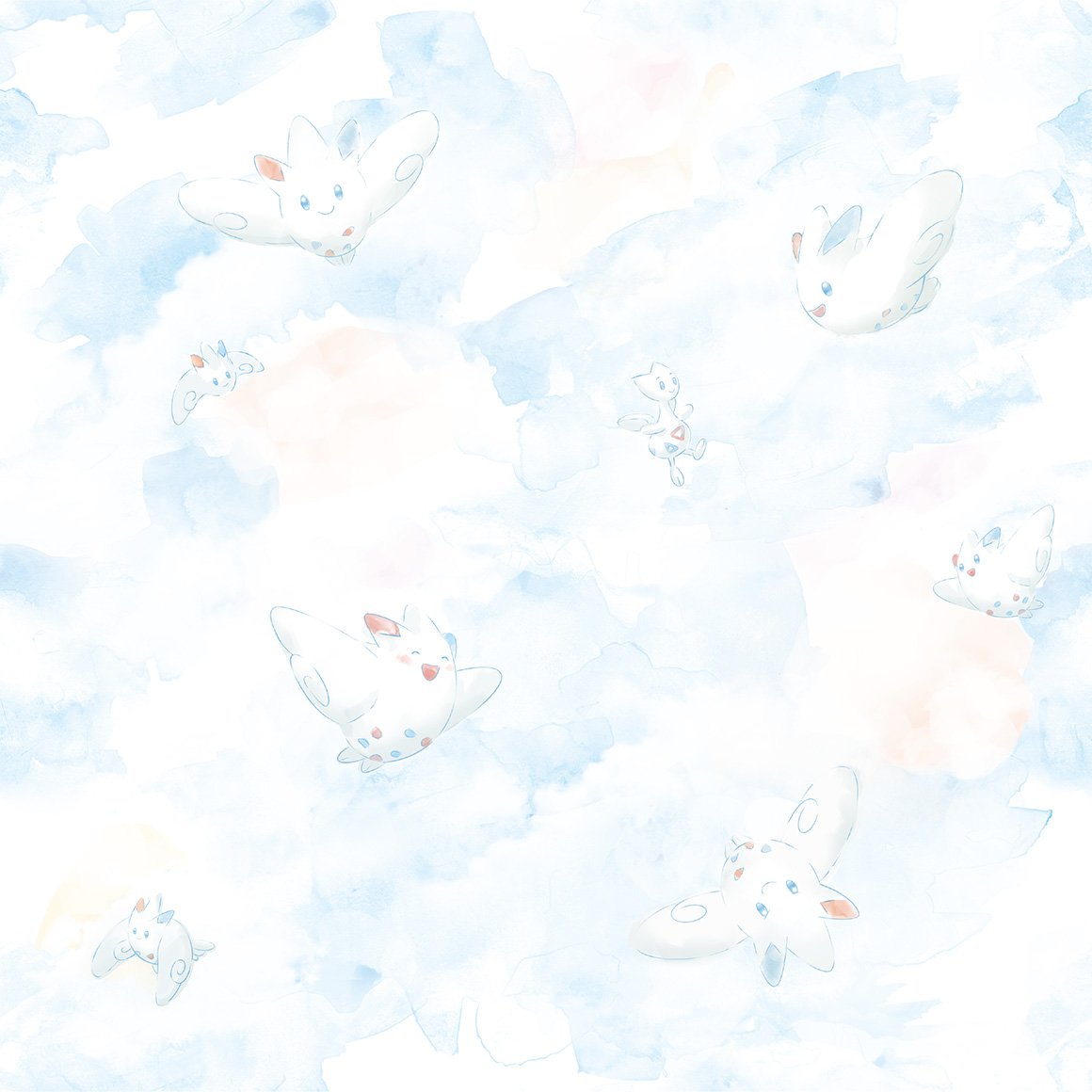
this is so cute :sob:
of course arceus gets space themeing! very high note to end on
thats all
i wish there was unova ones but there wont ever be because the company who made pokemon shirts patterns shut down last year :sob:
Widget is loading comments...
compared to the other grass starters, kind of weak in patterns, but very nice regardless.
very nice! a middle stage that doesnt fumble. love the kricketot riding on it
very nice and i like to look at it
very nothing to me
its better? though lacking in poses
not really a fan, as cool as this is
cute, like how the waves are interacted with
it broke the columns :SHOCKED:
its just two colors huh
birds on a wire esque
strange choice for a paisley
oh this fucks
i guess johto and sinnoh really are friends because theres so much plaid here!
i like the colors
ohhh this is so nice and lice, and the shiny, and the colors and the fact it doesnt loop and the
this is nice too!
for some reason this one reminds me of smoochums? in a good way
ohhh i like this one. its very nice. id wear it
nice, i like how the pokemon merges with the background but not fully
is this crayon art? its cute
its kind of hard to see roserade it blends in too well
sure is cranidos in a mesozoic era
ohhh this goes hard. its good.
strange choice of pattern for shieldon, especially compared to cranidos
interesting, better than the last for sure
love the colors! and just very cute.
a lot going on here. its kind of distracting from wormadam
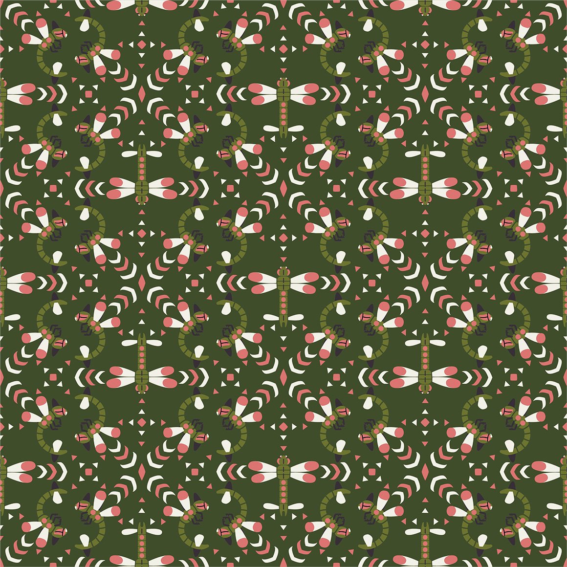
hehe combee is here because mothim steals from it
this is so cute :sob: and i love the colors
reminds me of an actual bees shirt i have
not sure what to say about this one at all, its nice?
why do the images (except wingull for some reason) have weird white backgrounds...
this is too nice for floatzel.
looks nice
again just nice
cute, wonder if gastrodon will be similar
i mean the patterns fitting but its kind of ugly
kind of similar to the aipom one!
cute but drifloon is kidnapping a child (or trying to)
interesting pattern
whats with the dandelions? they look nice but why specifically them
this has the same artist as the buneary, i think
both glad and sad that they didnt go with something similar to misdreavus's
damn i kind of wish they did more pixel art...
ohhh this is really nice and cute. could see it as actual wallpaper
i like how it blocks off the lines, though i wish it had more variation in poses
i wish the drawings were more centered on the colors
LA
interesting art for the stunky, not so much the flowers
i wish there was more variety on the poses, the spirals are funny though
i like it! not really much you can do with bronzor, as its just a plate
ohhh the colors are really nice but i cant think of what they remind me of right now damn, maybe 1950s art?
cute, it goes through the whole span of emotion except anger
is it just me or does this really pop off the background
i like how it grabs the dots hehe
the cables being there is kind of strange... chatot never really used cables right
water color
yay two poses only! and monochrome!
oo this ones nice. especially compared to gible
not really a fan
the berries are kind of a boring pattern but i like that all the munchlaxes are unique
interesting. using orbs. and a shiny!
definitely reminds me of aura
its camo i guess
aw this ones cute. love seeing dwebble there
yay for unique poses! and wavey lines! and gliscor
not what i was expecting from drapion at all
not really a fan
this ones nice and raw though
not really a fan of this one either, something about how carnivine is colored throws it off..
i like the colors
interesting pattern, why is lanturn there though?
this is way nicer than mantines
i like the colors, very nice to look at
not much a fan of this style
not very good imo, but not really sure why i think that
why are we in space? is magnezone associated with space? i guess it does look like a ufo
awww the tongues are the columns!
really nice colors and pattern
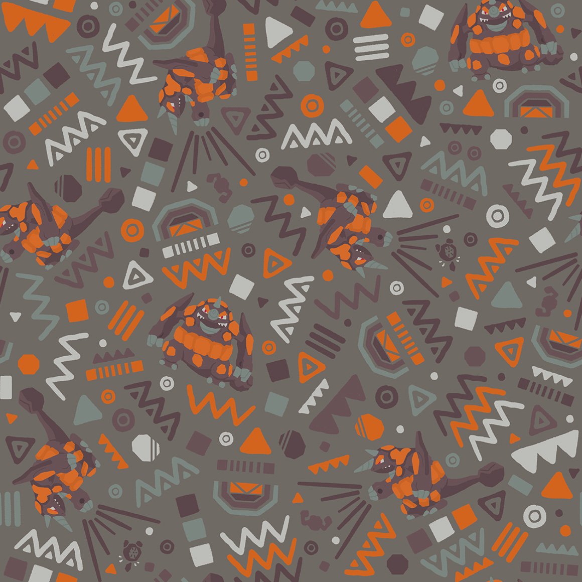
i like how the pattern IS the pokemon, but like tangled up with other tangrowth
the outlines are kind of hard to see.
i much prefer this pattern to electivire, it just is nicer to me
very soft
not really a fan of this variation of the kaleidoscope pattern
very pretty
same artist as leafeons i think, still pretty
the sharks tooth pattern with gliscor is sure a choice, especially considering each of the actual gliscors is different
its better than piloswines! its nice
very very nice. ive seen many a tumblr theme use it (not my own though, not really my style.)
i wish it was more like gardevoirs style
awww this ones cute, i like the lines only style
kind of a boring pattern
the backgrounds have more love than the pokemon :sob:
very pleasing to the eye, love the colors
i hope all the lake trio follow this pattern with the flowers, it looks very nice with uxie
seems as if they do!
i wish azelf got less stock art looking poses though...
oh oh will all of the creation trio have their signature move in their art?
appears so! i like how palkia (and dialga) interact with the beams
this is more trozei / shuffle esque than anything
damn they really did continue the regi theme damn.
yay both forms of giratina! and its signature move
ohhh the colors on this are so nice and lice
the way phione gets better art than manaphy
why is this like a coloring book but manaphy is like stock art :sob:
ohhhh raw
this is so cute :sob:
of course arceus gets space themeing! very high note to end on